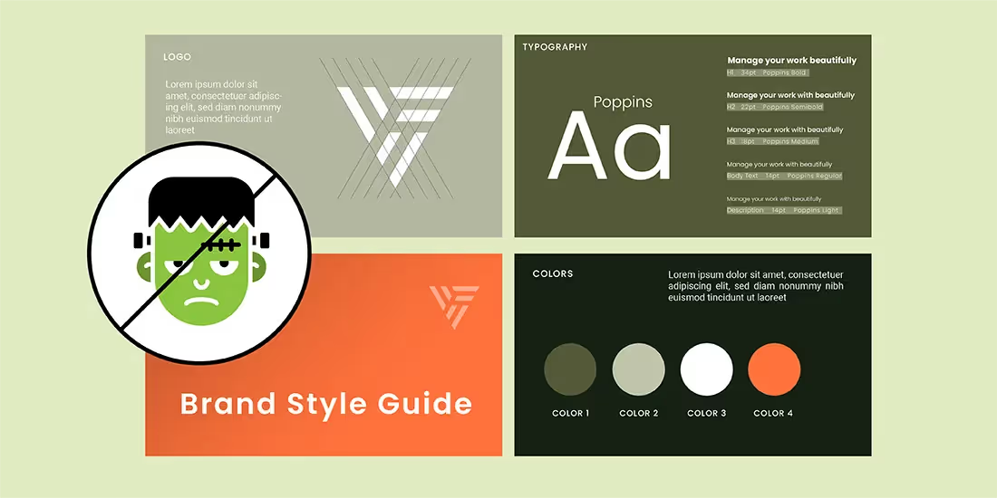
Without strong branding in place, company assets can look like a hodgepodge of designs. We’ve seen this a lot in presentations, and the lack of consistency can look unprofessional. Whether you realized it or not, you’ve probably encountered a Frankendeck (or 10). To put it simply, a Frankendeck is an excruciatingly bad presentation. Think outdated fonts, cluttered slides, and colors that clash with each other. It’s the cause of “death-by-PowerPoint”, and it’s more common than you may think. The infamously bad presentations are easier to avoid if your company has a brand style guide in place for employees to reference.
A great brand style guide tells the cohesive story of your company through thoughtful content that reveals not only your core values, but the strength of your brand. Building a recognizable identity is the first step to creating a lasting brand, but you can’t just throw together a brand style guide on a whim. There are a lot of moving pieces from font choices to tone of voice that have to work together to create that seamless company image.
While we can’t make all your branding decisions for you (sorry!), we can provide you with the tools you need to make your own brand style guide and avoid Frankendecks across your organization.
What to include in your brand style guide
Inconsistent branding is one of the key characteristics in a Frankendeck. By compiling all of your company’s brand assets in one place— a comprehensive brand style guide— you’re giving your employees the tools they need to stay on brand across every presentation.
Here’s what you should include in your brand style guide.
Mission and values
First and foremost, you should establish your company mission and values. Your company mission statement— who you are, why you do what you do, what you value as a company, and company culture— will establish what the branded assets below look like and the emotions you hope to evoke with them.
When creating a brand style guide presentation, this should be one of your first slides to set the tone for what’s to come.
Voice and tone
Are you mature and serious? Are you young and cheeky? Do you want to poke fun at the pain points your company is aiming to solve? Are you informational? Are you speaking to teams or individual consumers? These are all things you need to consider when mapping out the voice and tone for your brand. All of your external communications including marketing campaigns, sales collateral, emails, website design and copy, and company content should reflect this voice and tone.
We recommend creating 2-3 slides explaining the tone you want to achieve in communications, with examples such as “we’re this, not that”, and brand voice charts.
Logos
As a company evolves, logos may change with it. And that’s okay. What’s important is that each employee is provided with the most up-to-date company logo files so that there’s no confusion as to what they should be using. Logos are used in email signatures, marketing materials, sales pitches, business cards, and many other client-facing communications, so you’ll want them to be consistent.
In your presentation, you can include a slide with all of the different logo variations. Of course, you’ll want to add a link to those files on the slide so that your colleagues are able to download the hi-resolution files and use them as needed.
Color Palette
Another important aspect of branding is brand colors. As we mentioned above, your company colors should be determined by the emotions you’re hoping to evoke in alignment with your company mission.
In your presentation, you should showcase your brand’s color palette on one slide. You might also include the individual color code for each color so that team members can easily identify (or copy and paste) the correct hue when creating their own assets.
Typography
Typography is the fonts associated with your brand. This applies to things like your website font, text overlay on marketing assets, the fonts you choose for your presentations or emails, and the text you use within your product interface. They should all be the same, or within the same font families.
In your presentation, include the font names, the font weights, and examples of each so that the team can easily see what typography is approved to use. You can also include downloadable links within the deck, and install instructions, for easy access to getting those fonts uploaded on their own computers.
Iconography and photos
Last, but certainly not least, visual assets pull a lot of weight in brand identity. Your company’s design time will likely have an established library of pre-built custom icons and graphics, and they will all have a very distinct creative style. That’s intentional, and colleagues shouldn’t stray from that style when creating their own designs.
By sharing plenty of examples it makes it easier for teammates to reference down the road when they find themselve digging around for stock imagery.
Sharing brand guidelines with your organization
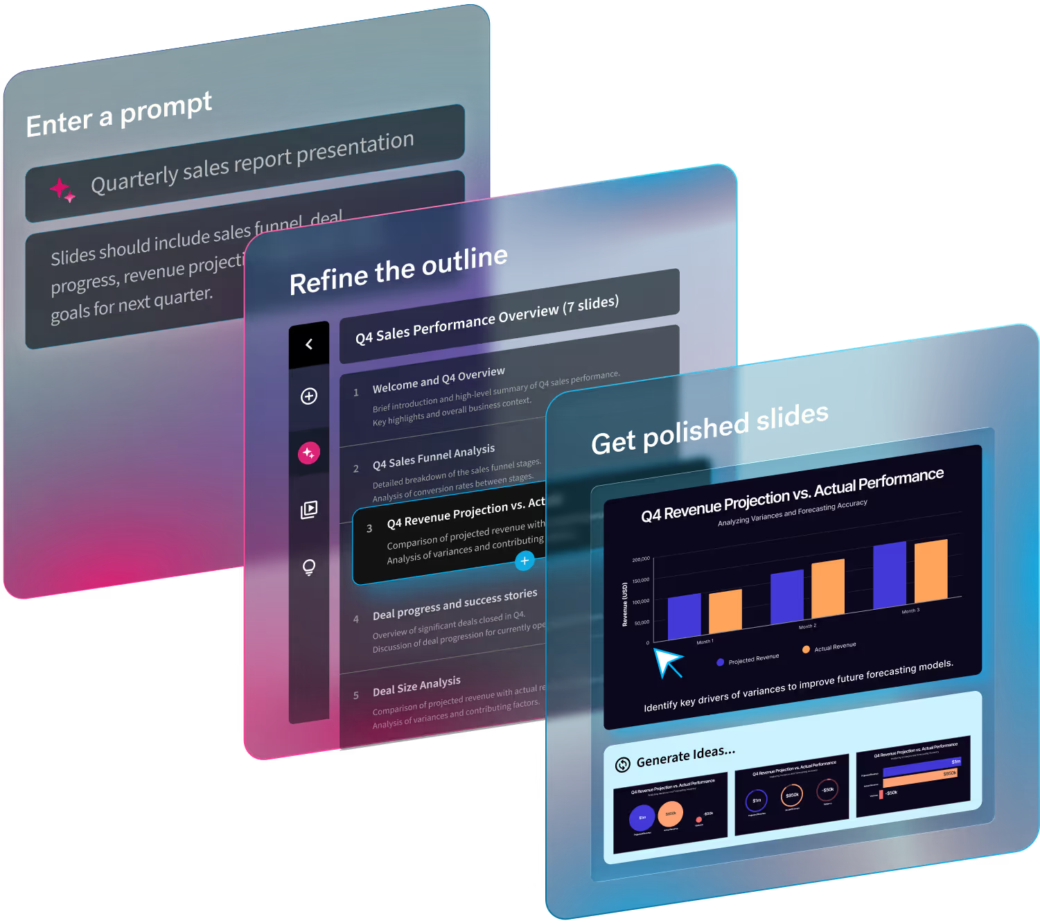
While some might opt to compile everything in a shared folder, we prefer presentations (we’re only a little biased). With Beautiful.ai’s brand guidelines presentation template, design teams can customize the slides to fit their own brand style guide needs. A brand style guide presentation makes it easy to organize and share crucial information and assets with the team to keep everyone on the same page.
Create a custom Team Theme for presentations within your organization
Sometimes a brand style guide isn’t enough to ensure your organization is staying within the parameters of your brand. In Beautiful.ai, teams can create custom Team Themes with the correct assets and apply it to every presentation across the business. With these guardrails, employees can “set it and forget it” without having to tinker with design characteristics every time they add a new slide. This ensures each deck is on brand— using the same fonts, colors, and logos— and there will never be a company Frankendeck circling in the wild.


.avif)
.gif)