We’ve all been there: forced to create a presentation with no idea where to start. Scary, right? It’s a commonly known fact that glossophobia— fear of public speaking— affects 75% of people. In fact, some even fear it more than death itself. But even if you remove the public speaking component, the design process in itself can be intimidating. For someone without professional design experience, creating a presentation from scratch can be messy. If you don’t have the right tools to help guide you through you’re likely to end up with a Frankendeck.
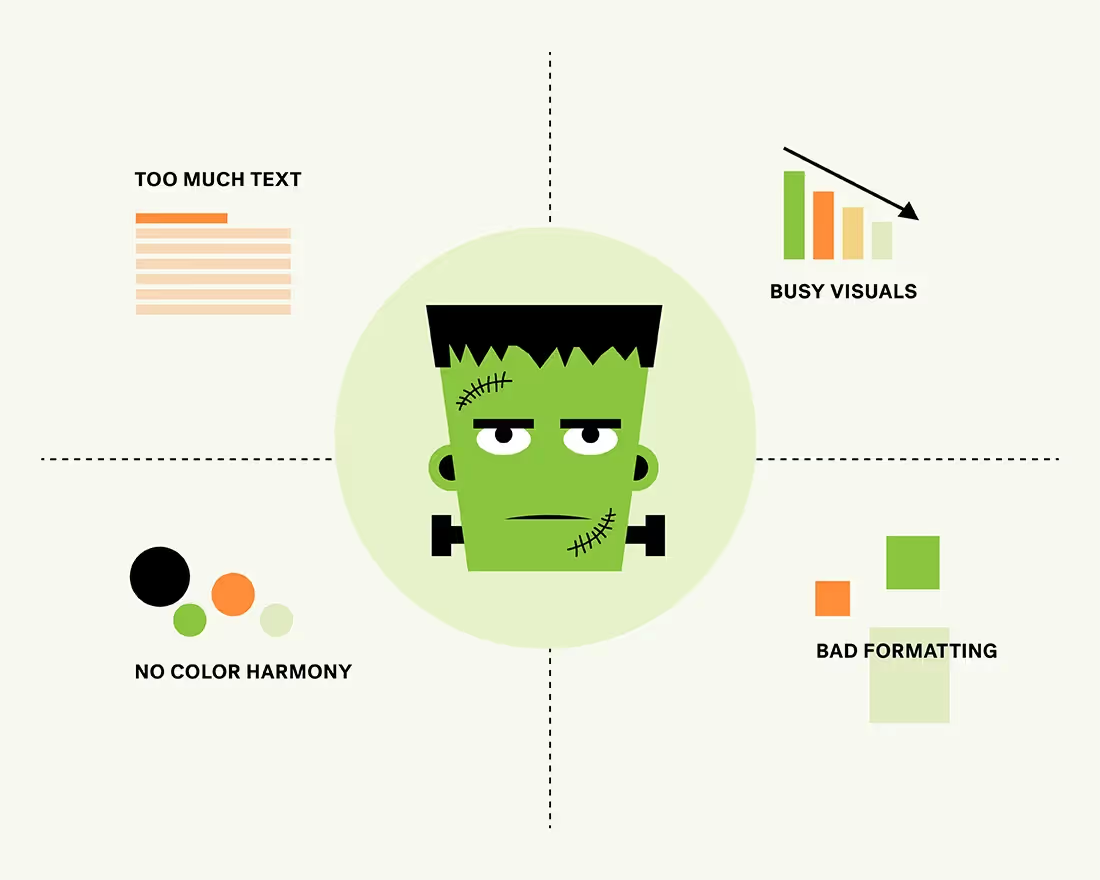
A Frankendeck by definition is an unsightly, disorganized presentation. Its claim to fame is cluttered slides, inconsistent design, lengthy blocks of text, and low-quality assets. To be frank, it’s a presentation-killer and is doing your story no justice.
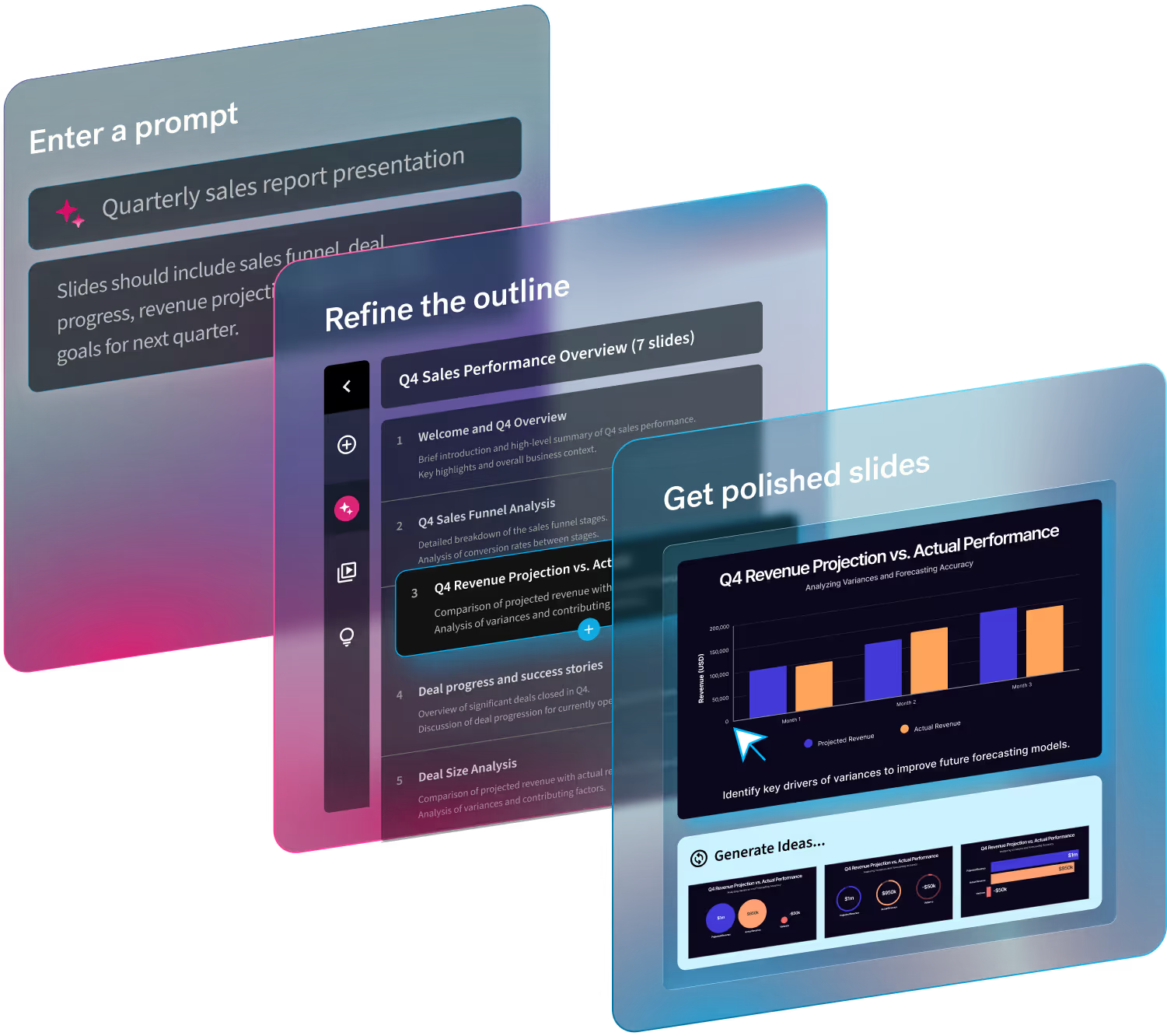
There’s nothing spookier to an audience than a Frankendeck. Luckily, with presentation software like Beautiful.ai they’re easy to avoid.
Kill bad presentation design with these 5 simple tips.
Use a branded theme
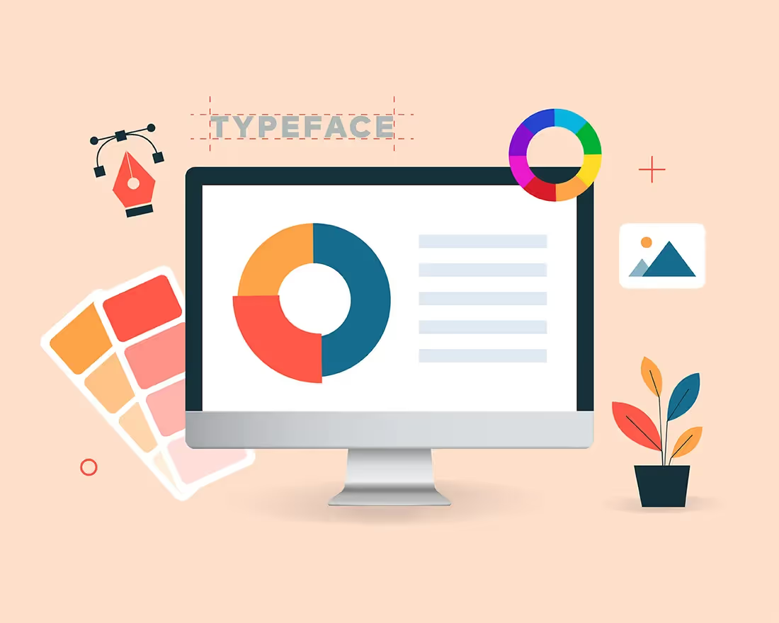
One of the main characteristics of the infamous Frankendeck is inconsistent design. This could present itself in a variety of ways including (but not limited to); using too many fonts in the same deck, contradicting color palettes, and mismatched slides. To avoid the hodgepodge disaster, we recommend creating a custom branded theme. In Beautiful.ai custom themes allow you to upload your own brand colors and fonts to create an aesthetic unique to you and your story. Once you create a theme, you can set it and forget it— it will automatically be applied to each slide in the deck so that everything is visually consistent.
Stick to one idea per slide
Less is more in presentation design. If you try to cram too many ideas onto one slide all you’ll get is a cluttered deck and confused audience. That’s the fastest way to lose them to boredom. The key takeaway on each slide should be clear and obvious to keep your audience engaged. Only include the most important information, and leave the rest for verbal explanation. One way to help narrow down your takeaways is to think of your story first, and design second. What do you need the audience to know? That’s what you should include on each slide, and you can go from there.
Organize your data with digestible infographics
Just because you geek out on data and can make sense of it, doesn’t mean your audience can. Nothing screams Frankendeck more than a overly-comlicated slide, and that includes a discombobulated graph or chart. Instead, use a simple infographic to help make some of those numbers more digestible. Beautiful.ai’s chart and graph Smart Slide templates are easy on the eyes and won’t overwhelm your audience. For an extra umph, play around with animations to bring your data to life and grab your audience’s attention.
Play around with more modern, clean layouts
If you’re still using an outdated PowerPoint slide from 8 years ago that you keep adding to and updating, it’s probably a Frankendeck. You know what we’re talking about: those presentations that look like they belong in the early 2000s. With newer presentation software like Beautiful.ai you can structure your story in new ways. Smart Slide templates provide you with modern, clean layouts so that your deck is always professional and visually stunning.
Stay consistent with visual assets
A Frankendeck will often include a variety of low-quality images, sometimes presented in a sloppy collage. To avoid this, choose icons, logos, and images of the highest quality so that you can ensure they’ll look good on any screen size without becoming pixelated or blurry. It’s also important to pick photos that compliment your story, while maintaining a cohesive theme. For example, you should opt for images that look like the same photographer shot them as opposed to picking images with differing artistic styles.


