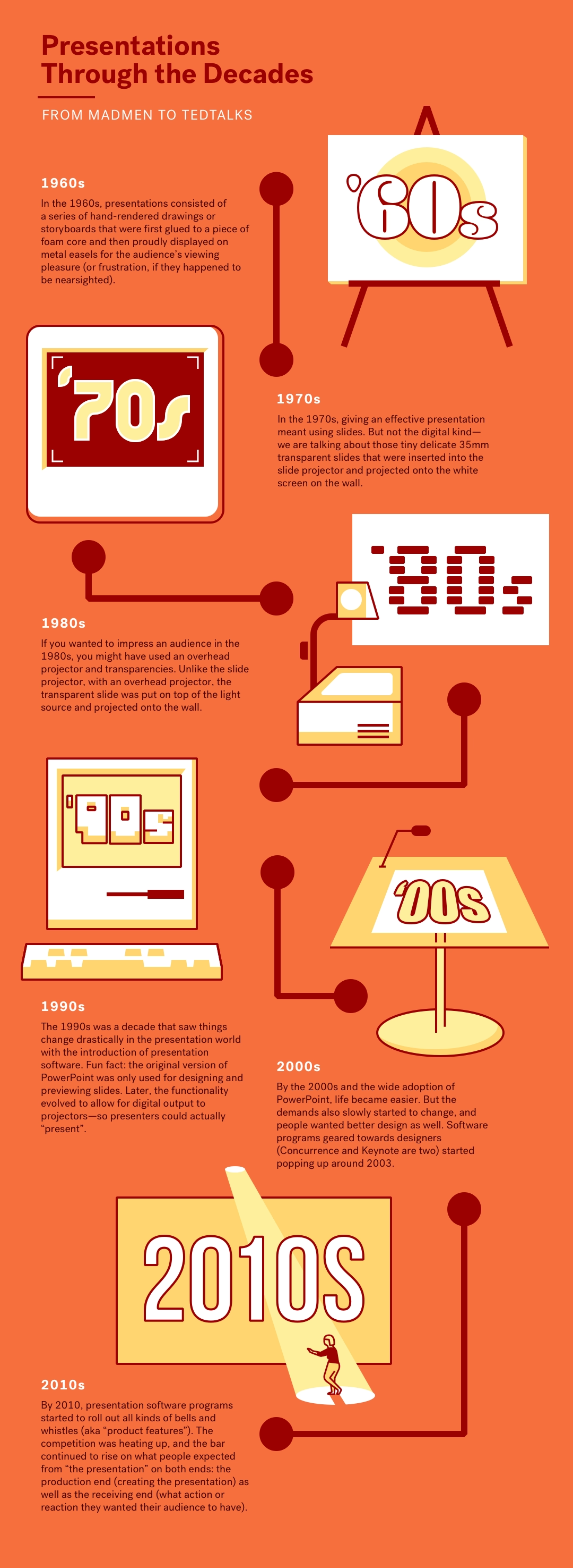
In the Don Draper days of 1960s Manhattan, the concept of a "presentation" was very different than it is today. At that time, presentations consisted of a series of hand-rendered drawings (or storyboards) that were first glued to a piece of foam core and then proudly displayed on metal easels for the audience’s viewing pleasure (or frustration, if they happened to be nearsighted). Or, in less sexy industries, paper memos were typed up on typewriters and distributed for people to read during meetings — usually accompanied verbally by an equally lackluster presenter.
Today, it’s a totally different world.
From the ubiquitous PowerPoint, to the many expensive and free Powerpoint alternatives, there is no shortage of presentation software options out there that help bring stories to life in boardrooms the world over.
With technological advances in sound, projection, high-def screens, animations, and more, everything today is digitalized, zoomable, easily prepared and easily digestible. But have we reached the golden age of presentation software yet?
Let’s see how we got here and what we can still improve.
The 1960s
If you had a brilliant idea to present to your boss or your team in 1960s, you didn’t have the option to open your trusty PowerPoint. No, all you had at your disposal was a large physical easel with built-in oversized pads of paper — where you built your presentation sheet by sheet, praying that it wouldn't get ripped, eaten by your dog, or rained on while on your way to the office.
When presenting, you may have used a "pointer" stick to direct your audience’s attention to the parts of the presentation currently under discussion.
Maybe if you were exceptionally well-organized — or if the presentation was super important — you mounted your hand-written memos to foam boards to display on (often flimsy) easels. Now that was impressive.
The 1970s
In the 1970s, giving an effective presentation meant using slides. But not the digital kind, since the world was still PowerPoint free.
We are talking about those tiny delicate 35mm transparent slides that were inserted into the slide projector and projected onto the white ‘screen’ on the wall. If you’re reading this and are getting nostalgic flutters reminiscing how your aunt came to visit once and gave your family a slide show about her recent Hawaii vacation while you and your toddler sibling were fighting over the last cookie on the floor, then yes, you’re thinking about the right device. (And yes, you’re officially ancient).
Fun Fact: The slide projector was actually around since 1950s and was a descendent of an even earlier device that was used as early as late 19th century. The tiny slides were crafted by professionals and took days in advance to make. Forget about pulling an all nighter at your laptop the day before the conference — you needed weeks, if not months, to pull a presentation off.
The 1980s
If you wanted to impress an audience in the 1980s, you might have used an overhead projector and transparencies (Or you still had the slide projector option, of course. Or the paper pad option. Paper was always free. PowerPoint still wasn’t around though.)
Unlike the slide projector, where the image was put in front of the light source, with an overhead projector, the transparent slide was put on top of the light source. These slides were bigger, too. They were also prepared in advance but the presenter could modify them and add material during the presentation using a marker. These projectors were especially widely used in the classroom, but were also the standard option for sales meetings and conferences.
If you were a diehard fan of the 35mm slide business, you were also in luck. Carousel slide projectors, which were capable of holding 80 to 140 slides and rotating them came into wide use. The slides still had to be made days in advance and, unlike transparencies, were not modifiable. But the device was more portable than the overhead slide projector.
The 1990s
The 1990s are where things changed drastically in the presentation world. PowerPoint, which was created by the startup Forethought in 1987, and almost immediately acquired by Microsoft, releases its first version for Windows in 1990 (the original version was made for Macintosh), and slowly begins to conquer the world.
The original version of PowerPoint was actually used for preparing the presentation slides and previewing them on the computer but not delivering the presentation. By the third version (PowerPoint 3.0, released in 1992 and later renamed PowerPoint 1992), the functionality of the software was extended to enable direct video output to digital projectors, eventually replacing the physical transparencies.
PowerPoint has revolutionized the way people did presentations. Suddenly, you could add text and graphics to slides (and remove them at will), and organize and re-organize the slides through the slide sorter.
PowerPoint 3.0 also introduced some features that made it look similar to the PowerPoint we know today - for instance, TrueType font support, transition effects, and drawing tools. These advances, as well as the eventual integration of PowerPoint with the rest of the Microsoft Office suit (in 1994) have sealed its position as the leading presentation software of the time.
The 2000s
By now, the concept of the "presentation" was improving. People no longer had to drag heavy projectors with them to conference rooms. The introduction of the PowerPoint software made creating presentations exponentially easier.
But the demands also started to change. Now that the process of preparing and presenting was easier than ever, people started expecting something else: better design.
A few powerpoint alternatives started popping up. Concurrence, a presentation software developed by Lighthouse Design, was released in late 1990s (for NeXTSTEP and OpenStep platforms). Concurrence was an integrated outlining and presentation software and was what Steve Jobsused for his first presentations. In 2003, Apple released Keynote, which was originally developed as a software for Steve Jobs to use at Apple keynote events, and soon became the most popular PowerPoint alternative at the time.
The 2010s
By 2010, presentation software programs started to roll out all kinds of bells and whistles (aka “product features”). Keynote (now part of iWork) introduced official HD compatibility, and new features such as group scaling, 3D charts, multi-column text boxes, auto bullets in any text field, image adjustments, free form masking tools, and three-dimensional transitions.
PowerPoint added all kinds of plug-ins, animations and pre-built templates. Prezi launched, complete with a robust set of sophisticated, interactive “zooming” transitions between subtopics and slides. New rival presentation software programs started popping up.
The competition was heating up, and the bar continued to rise on what people expected from “the presentation” on both ends: the production end (what presentation software let them create better presentations, quickly) as well as the receiving end (or what action or reaction they wanted their audience to have).
By 2010, presentations were expected to be “presented” on a white screen or large TV monitor; paper printouts were unacceptable. Secondly, It had to clear and legible. It had to feature inspiring visuals. And more and more attention began to shift towards the design of each slide; how a presentation looked was a direct (positive or negative) reflection of the person presenting.
Presentations Today
We have undoubtedly made some strides since the age of the metal easels. No longer do we have to spend weeks in advance preparing the slides (that may be a good thing or not so good, depending on how you look at it). Whatever presentation software you use, the process is quick and easy.
Today everything is digital - projected onto a screen, sync'd with a large TV monitor, and so on. But we have also made significant advancements in the brain science of how we perceive, learn and retain visual information, which also has to be taken into account. That means it’s not longer enough to make your slide transitions look like you’re turning a physical page (actually, try to avoid that kind of thing if you’re intent on not annoying your audience). Presentations these days have to be beautiful and easily digestible.
Thankfully, PowerPoint is no longer the only presentation software on the block. If you do use it, you’d do better not to overuse its initially much lauded bells and whistles. Seriously, nobody is impressed by your ability to insert clever animations anymore. At best, they’ll be distracting and at worst - highly annoying.
The Future of Presenting
In a world where people are constantly bombarded with tons of visual (as well as textual) information every day — or every single time they open any kind of device — the design bar is steadily rising. Which means visual stories and presentations have to follow suit in order to remain a successful form of professional communication.
Yes, we’ve come a long way, but there is still room for improvement. With "blank slate" authoring tools like PowerPoint, most presenters still have work to do when it comes to creating truly beautiful presentations that engage but don’t overwhelm the viewer. If you want to move away from the "old standbys" completely—into the world of easy-to-use and viewer-friendly presentation software—PowerPoint alternatives today include non-linear, web-based and collaborative presentation programs.
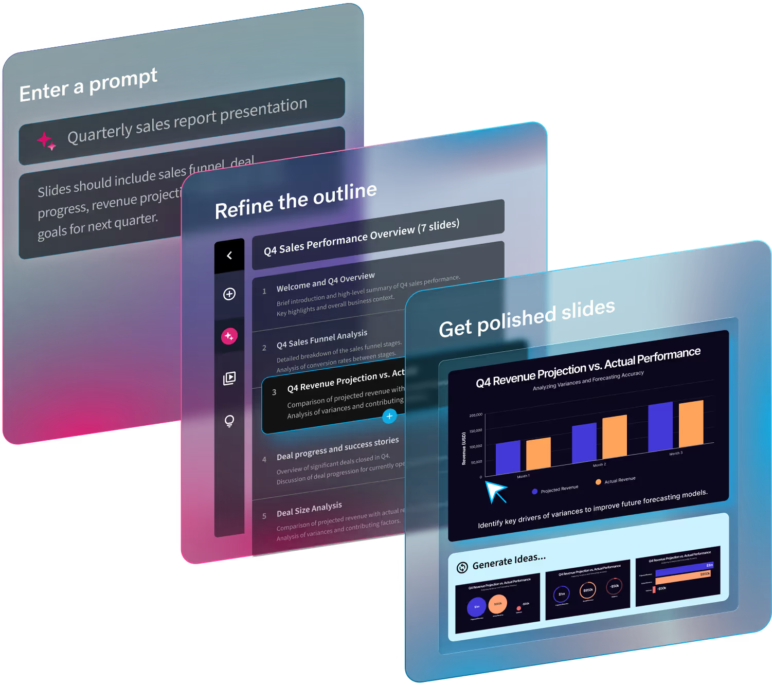
Luckily, creating beautiful presentations today does not have to be hard work, and it can even be fun! After all, that’s why we built Beautiful.ai. With its smart templates and design a.i., Beautiful.ai is taking the work out of the equation and still maintaining the most professional of presentation appearances. Try it for free today.



.gif)
