Time is of the essence, and every moment counts toward nurturing leads, closing deals, and driving revenue.
Amidst the hustle, weekly sales reports serve as an important reminder and benchmark. These documents, or presentations, offer insights into pipeline progress, performance metrics, revenue generation, and general team performance.
Sharing out these weekly metrics can be time-consuming and cumbersome. That’s where the power of our Weekly Report Presentation comes in, streamlining the creation process and empowering your team to focus their energies where it matters most – on sealing the deal.
Understanding the importance of weekly reports
Weekly reports shouldn’t just be a document; but an instrument for monitoring, analyzing, and optimizing sales performance. Instead of a snapshot of a key metric in a spreadsheet, Beautiful.ai can seamlessly integrate your sales data into an animated line graph that shows off your success.
You can also engage your audience with all the information in one place, streamlining their workload as well. With a weekly report deck, you can identify trends, spot potential roadblocks, and make informed decisions to drive performance.
Introducing the Weekly Report Template
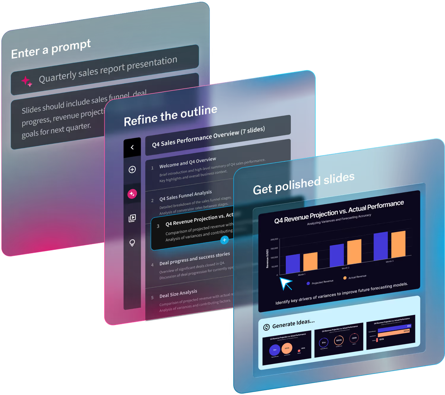
At the heart of effective report creation lies a Beautiful.ai designed template that encapsulates all the essential components of a weekly sales report. This template offers a visually appealing, customizable, and design AI intuitive framework for compiling and presenting data. These slides cover various aspects of sales performance, and are easy to update and share.
Leverage our Weekly Report Template for faster deck creation
Utilizing this template not only ensures brand consistency and coherence in your reports but also significantly expedites the process.
1. Personalize the title slide
Start by personalizing the first slide with your company logo, team name, and date. Switch or edit your theme to correspond with your brand colors and text.
2. Customize your objectives
What are you covering in this week’s report? Some of these should remain the same week after week, like your continual benchmark review.
3. Highlight pipeline progress
Project management, weekly results, and progress-to-goal slides can all help to visualize the status of your sales pipeline. Choose which design best fits the number of leads, where they are in the funnel, opportunities, and average deal size. This provides a snapshot of pipeline health and can identify areas for focus and improvement.
4. Showcase performance metrics in an engaging way
You’ll notice in the presentation view (press the play button) many of our slides are pre-animated to engage the audience, particularly when it comes to metrics. These slides can be used to showcase key performance indicators (KPIs) such as conversion rates over time.
5. Summarize action items
Project dependencies and next week slides help summarize key takeaways and project status, helping easily identify what happens next. Clearly outline actionable insights using these slides.
3 Design tips for more engaging presentations
Great presentation design helps convey information clearly, captures attention, and elevates a boring report. Here are some of our team’s tips for your Beautiful.ai presentation:
1. Keep it clean and consistent
Opt for a clean, professional design aesthetic rather than trying to make every slide intricately beautiful. Editing is your best friend.
2. Utilize visuals wisely
Charts, graphs, icons, photos, and videos capture attention through visual interest. Pairing a relevant image to information helps us retain 65% of the information three days later, compared to the 10% we retain without the help of an image.
3. Simplify text
Break down complex information into digestible chunks and present it in a simplified, concise way. Prioritize bullet point and numbered list slide formats over large blocks of text.


.gif)


.gif)