A stand-out presentation can be the difference between an audience inspired to take action or an audience that forgets everything you said the minute they walk out the door. We’d be willing to bet that most presenters want to avoid the latter. After all, what you have to say is important so it’s important that people listen. Achieving an engaged audience is twofold. First, you’ll need a stellar presentation deck that supports your overarching message. Second, you need the confidence to tell your story to a live (or virtual) audience. While we can’t control your public speaking skills, we can help you create a presentation so good that you’ll feel confident presenting it.
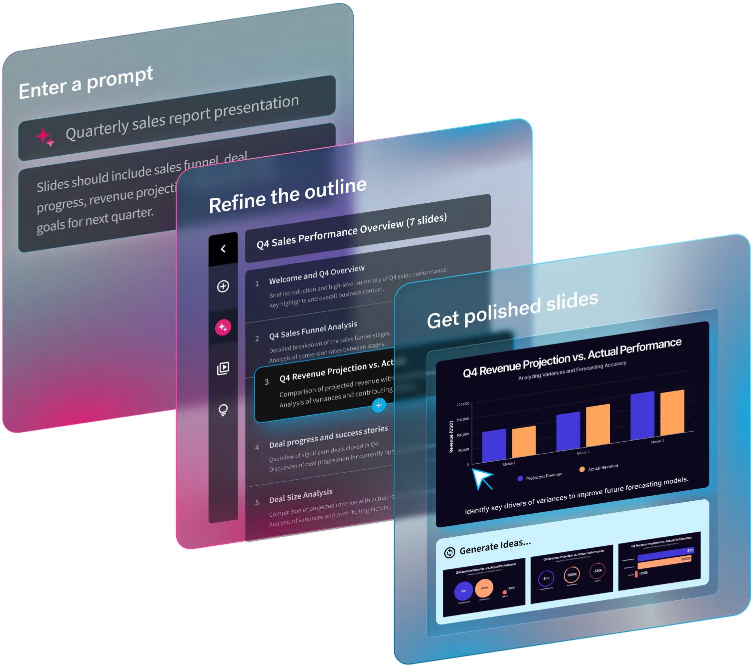
A lot goes into a good presentation, from the image selection down to the font size. You want your deck to be effective and professional, all while looking good. Luckily, with Beautiful.ai even non-designers can create show-stopping presentations. Our product acts as the designer and takes on the burden of aligning images and boxes and resizing fonts so that you can focus on what’s truly important: your message. We understand the importance of your presentation and how much is at the mercy of its success. Whether it be an external pitch or an internal board meeting, we’re here to help.
We share a lot of great presentation tips to help you reach your end goal, but here’s the sparknotes version. Make a stand-out presentation with these three easy steps.
Storytelling
It all starts with a story. The message you’re trying to convey is unique to you, your team, or your company. Regardless of whether you’re telling a story about a company mission, a service or product you offer, a class or course topic, or a new business venture, your story is the anchor for your presentation. You should spend the most amount of time on this part of the process. Before you even think about opening a blank presentation slide, you should decide how you will narrate your story. Everything should be centered around this. Once you’ve nailed the storytelling you can begin building out your presentation.
The product helps you format your story, and organize your thoughts, in different ways. Our Smart Slide templates make it easy for you to toggle between different templates or variations so you can see your message in a new way. Once you’ve committed to a slide template and format, Elements gives you creative license to add some extra text, a call-out or annotation, or another graphic so you can tell your story exactly the way you want (and need). You bring your story, and we’ll help make it come to life on the screen.
Insightful and actionable statistics
You have your core message, now what? You’ll want to back up your story with some statistics. Nothing will convince your audience that what you’re saying is authentic quicker than proof in numbers. That said, you can’t just fill your slides with numeric fluff in the hopes that it will strengthen your presentation. Instead, choose meaningful and insightful data that encourages action. Take some time digging around and only include the most important and relevant sets of data that support your story. You don’t have to stuff every statistic ever reported onto your slide (trust us).
We know that data can be intimidating, especially when you’re trying to make it look good. The last thing you want to do after sifting through data all day is stress about how to present it. But it’s important to include. Don’t worry, we’ve got you covered. Your data tells a story, and we make it beautiful. With our Smart Slide templates you can choose the best type of chart or graph for your content, easily import your numbers, and watch them come to life in minutes, not hours. We take on the heavy lifting of design so that you can choose the right statistics to drive action.
Memorable animations
Everyone knows that good visuals pack a punch. Using graphics in a presentation deck makes your audience a lot more likely to retain the information being presented to them. This is key. It’s an easy way to rein in the audience after hitting them with nitty gritty data or stale (but important) blocks of text. Being intentional with graphics and visuals only help to amplify your message. Especially in a remote environment, using tools like animations, videos, and rich icons will help you better illustrate your story and engage your audience.
Beautiful.ai animations bring your slides to life. We give you the power to decide how they will build on each slide by allowing you to control the speed, the order, and whether they build automatically or advance with a click. Depending on your content, and talking points, you may select a slow, normal, or fast animation speed. You can also choose the style such as overlapping, simultaneous, sequential, or no animation at all. Using animations in Beautiful.ai are a subtle but effective way to make your slides more dynamic.


.avif)
