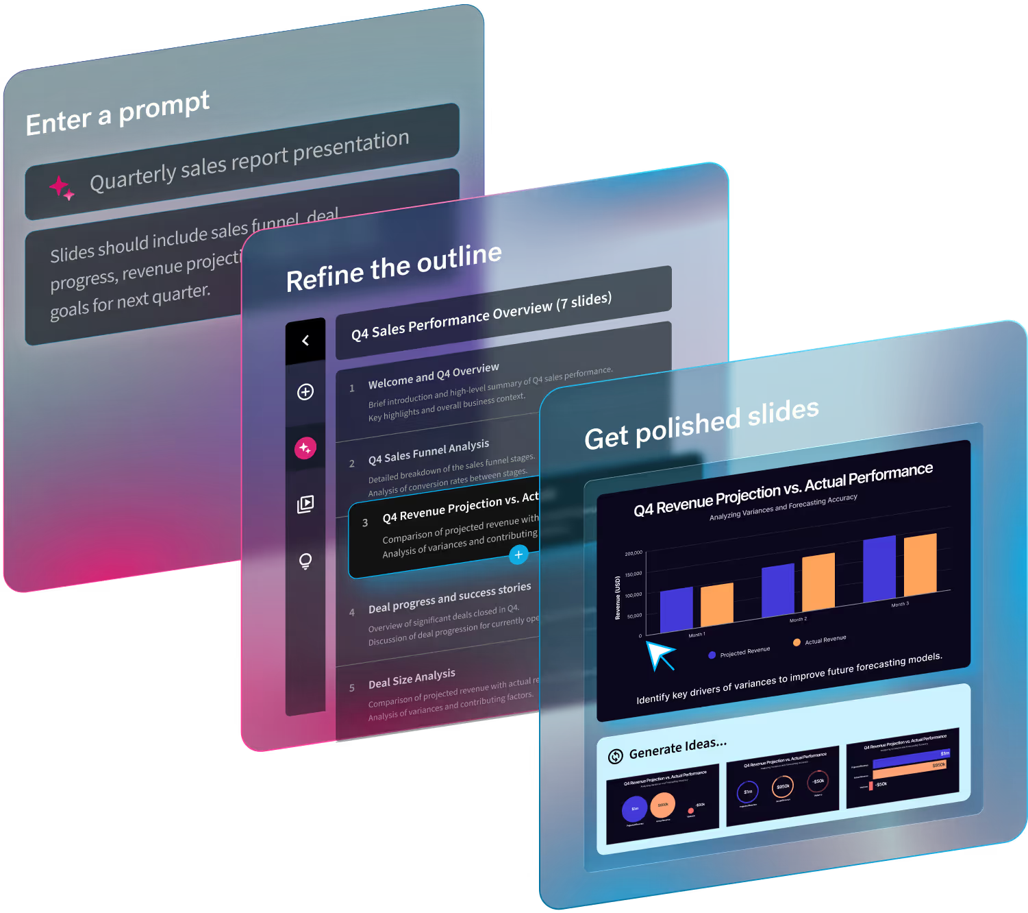
Historically speaking, the biggest nuance in presentations is the design process. If you don’t have the design skills to back it up, creating decks can be a huge time-suck. And as a presentation software, It has always been our goal to make your greatest presentations come easier. In our summer 2022 release we made improvements to our user interface (UI) to make Beautiful.ai more intuitive and your design process more fluid.
This includes things like simplified editing, new shortcuts, and performance enhancements. Because we know time is money, and we want to help you fast-track your creation process without compromising design.
The second blog of our three-part series is all about ease of use. This release brings you the enhancements you’ve been requesting, without losing the Beautiful.ai magic you know and love.
Work smarter (and easier than before)
We made our user interface more intuitive and easier to use so you can work smarter, not harder. Yep, that’s right, everyone’s favorite presentation maker just got better. Which means your greatest presentations now come easier. Learn more about the improvements below.
A more intuitive UI
Everyone has always loved Beautiful.ai because of its ease of use compared to more outdated softwares like PowerPoint. And having a presentation maker that both non-designers and designers could easily navigate has always been a top priority for us. That’s why we’re always looking for new ways to improve the user interface and overall experience.
Just click and go, it’s that simple. Now double-click images to quickly access menu options and editing tools like scaling, and filters, and seamlessly edit text with our simplified and more intuitive text editor. Experience new style options in connectors and elements for certain templates like hub and spoke, cycle, xy plot, and flowchart, that make it easier to use.
Easier & faster
We’ve made creating beautiful slides even better with key features like switching templates (now in Beta!). This removes extra steps like adding a brand new slide and deleting the old one. Instead, you can toggle between different templates and in most cases it'll preserve your content so you don't have to start from scratch. Now you can easily add multiple items in one click, and enjoy a more seamless experience with performance improvements all around.
This means that what you once thought was fast is now faster. And your best presentations are just minutes away.
Classic Slides, upgraded
Our Classic Slides give you unlimited flexibility to design your slides as you see fit with a more familiar authoring canvas. And while many people will still opt for the guardrails provided by Smart Slides, we wanted to give our Classic Slides an upgrade, too.
New shortcuts and right-click menus have been added for easy drag selecting, resizing, copy and repeat transformations. We’ve improved functionality around locking and grouping items, and have built finer control on selecting shapes. We made sure all of our theme-defined frame shapes are available in Classic Slides to help you create visual consistency across both Classic and Smart Slides. This also helps improve fidelity and ease of use when converting a Classic Slide to a Smart Slide.
We’ve made beautiful.ai faster, easier and more powerful with the updates you never knew you needed. Spark your greatest ideas, create unique content and tell your story in a fraction of the time.


.avif)