Sometimes when we’re so excited (or nervous—yes, it happens to the best of us) to present something new in front of an audience, we forget about the little things that make up a great presentation. Like speaking skills, presentation design, making sure your core message is loud and clear, or even just the simple act of, you know, breathing.
It’s a lot to think about, but we have you covered! Here are six presentation tips you might not have thought about that will help you grab the audience’s attention—and hold it—through the entire presentation. You can continue to read, or scroll through the slideshow below.
#1: Get Acquainted
Get the party, er, we mean presentation, started by introducing yourself and your team. This seems super obvious, but people forget to introduce themselves all the time, and it can hinder your authority over the audience. The room wants to know your credentials and a quick 30-second intro gives your audience exactly what they need to know without overdoing it.
We don't just mean saying your name, title and company. Your audience needs context: Who are you and what gives you the right to lecture me right now about this particular thing? Lori Giovannoni’s book, So You Want to Be a Speaker, notes that spending a minute or two introducing yourself can also give you a big boost of energy and confidence at the beginning that will help you capture momentum and the audience’s attention for the entire presentation.
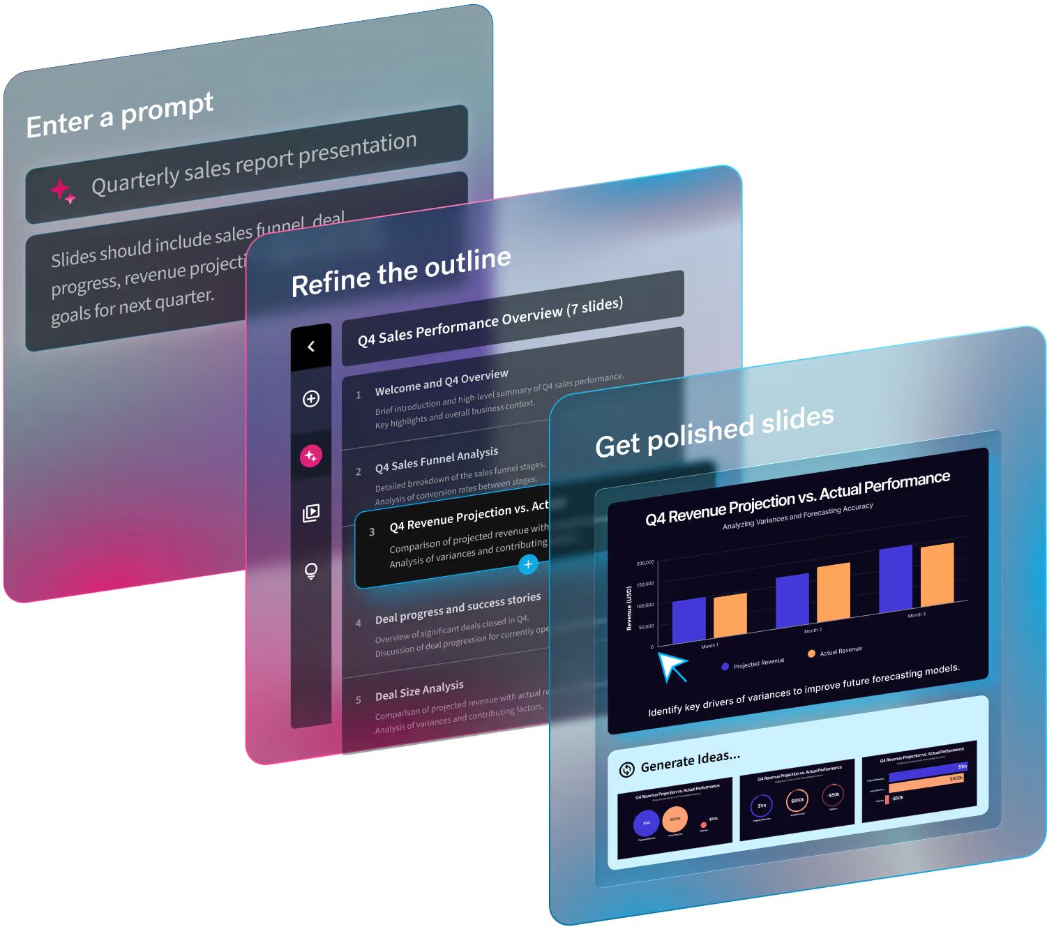
Moreover, if you’re worried about a line of team portraits taking hours to center in a PowerPoint presentation, don’t! Nix the PPT for next-gen software that designs your presentation slides for you in real-time. Be sure to customize your presentation to your personal or company brand as well; this helps hook your audience with a slide that looks like an extension of you and/or your company from the very beginning.

#2: Be a Tease
Your presentation probably isn’t a secret. Unless you just happen to be Steve Jobs at an Apple Keynote in 2004. Make sure you give attendees a roadmap for what you’ll be covering, so they don’t get lost or zone out halfway through your slideshow. We’ve all been in that audience with presentation slides nobody can follow. It’s not fun (or interesting). A great presentation makes it easy to give all your attention to a new idea. Try sparking curiosity by teasing out important points with an Agenda slide at the beginning that will intrigue your audience enough to stay alert. Or, take The Harvard Business Review’s recommendation and frame your subject within a captivating and relevant story. Another great but simple tip? Practice, practice, practice. It makes for a perfect presentation, after all.
#3: Pace Yourself
Getting through an entire presentation in record time is great and all, but have you ever tried breathing?
Stage anxiety is real, but remember this is a public speaking engagement, not a race. Try to retain a normal conversation flow with pauses throughout your talk. It gives your audience the chance to digest what you’re telling and showing them so they can remember and retain that information (Psst: it really does help if you have beautiful presentation slides).
Never underestimate the power of a registered pace. It exudes confidence, allowing you to emphasize a message for an overall better presentation. But you may wonder, what if there isn’t enough time to slow down? Executive speaking coach Patricia Fripp says to think twice about that. She explains that talking too quickly can destroy an entire presentation and any chance for an attentive audience. She also notes that if you’re speaking like an auctioneer in order to meet a presentation time constraint, there’s a good chance you’re including too much information (which most people will never remember).
#4: Design Your Slide-Deck to Engage
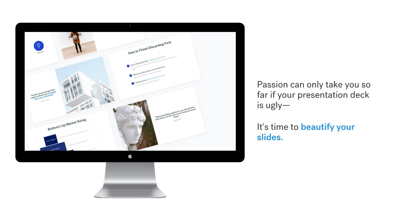
When you’re in front of an audience giving presentations, do you notice anyone looking bored when you try to make eye contact? It might not be you or your subject matter. It might be your presentation slides. Passion can only take your visual aids so far. Outdated slideshow materials can ruin even the best lectures. Hint: People haven’t been thrilled by clip art or the Comic Sans font since 1988.
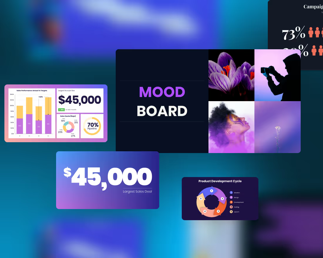
Even if your information is correct, your audience may not want to hear it from someone who hasn’t upgraded their presentation slides in thirty years. Not to brag (okay, we’re bragging), but Beautiful.AI has loads of awesome presentation templates that display your best information in the prettiest way possible so the visual and aural learners can process all your hard work.

#5: Double Check Your Data
Information can change in an instant. Before you tell a full room your big key points, make sure those key points are all correct. It can be a chore to double-check statistics -especially if you’re excited to get to the part where you present your findings- but, as the digital marketer Avinash Kaushik points out, you can’t afford to get sloppy because your data presentation is your brand.
Take a second look at your main points to ensure there are no glaring errors. In a world where smartphones, Google, and social media exist, your audience (and maybe even their audience) will see what’s wrong with your presentation slides almost immediately. It never hurts to go over your data one last time.
#6: Make Your 'Call to Action' Clear
You’ve been knee-deep in this slideshow for seemingly forever, so of course, it should be obvious what you want your audience to do once you’ve wrapped up your takeaways… right?
Unfortunately, it might not be as obvious to them. Remember, your audience members are hearing these main points for the first time. You have to clarify the next steps with a call to action, or CTA for short. International keynote speaker, Michael Aagaard, says the CTA is the “tipping point between bounce and conversion,” and directing your audience towards action is key so they know what to do with the information you’ve shared.
It doesn’t have to be complicated! You can keep it simple with a little task — like asking them to follow you on social media, connect on Linkedin, or visit a specific website to learn more — and hopefully you'll see big results.
Want your key points to shine as boldly as your presentation design? Beautiful.ai can take your ideas to the next level with more than 60 customizable slideshow templates that bring your presentation together in a snap… or rather, a click. Create a gorgeous presentation that captivates and gets your point across way before your 8AM deadline.


.avif)