Not everyone is a designer by trade. And for those non-designers, being tasked with creating a presentation can be equal parts overwhelming and challenging. A blank presentation slide is essentially like a blank canvas, and if you don’t know how to paint the end result will likely be pretty messy. Afterall, we can’t all be Picasso. But imagine if Picasso tried creating a new masterpiece with an old brush. Even the best presentation design tips won’t help if you aren’t using the right tools. Choosing the right colors and fonts, ensuring everything is aligned and sized appropriately, and creating a story on each slide isn’t always instinctive— until now. We have the tips for an effective presentation that you’ve been looking for, and it starts with ditching PowerPoint and using Beautiful.ai instead.
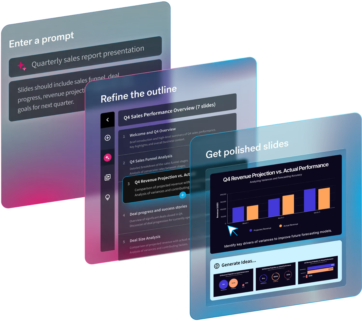
We’re not above faking it until you make it, especially when it comes to presentation design. We have the best presentation maker that makes even the most amateur designers look like they know what they’re doing. Beautiful.ai is the deck designer so that you don’t have to be. It’s like having a professional designer in your back pocket. The ease of use, intuitive controls, and smart slide templates give you the guardrails you need to create something beautiful in a fraction of the time. Think of it as bowling alley bumpers, but for presentations. We’re here to help make you look good and be successful.
These 7 presentation design tips with help even the most amateur designers create something they’re proud to present.
Start with a story
If you’re not sure what your story is, step away from the computer. It’s important to identify your message and structure your thoughts before you even think about opening a slide. Once you know the key points you’re trying to make, we can help you structure them throughout your presentation. Our vast library of smart slide templates help you structure your thoughts in new ways. Toggle between different layouts and format your story more seamlessly.
Get inspired with templates
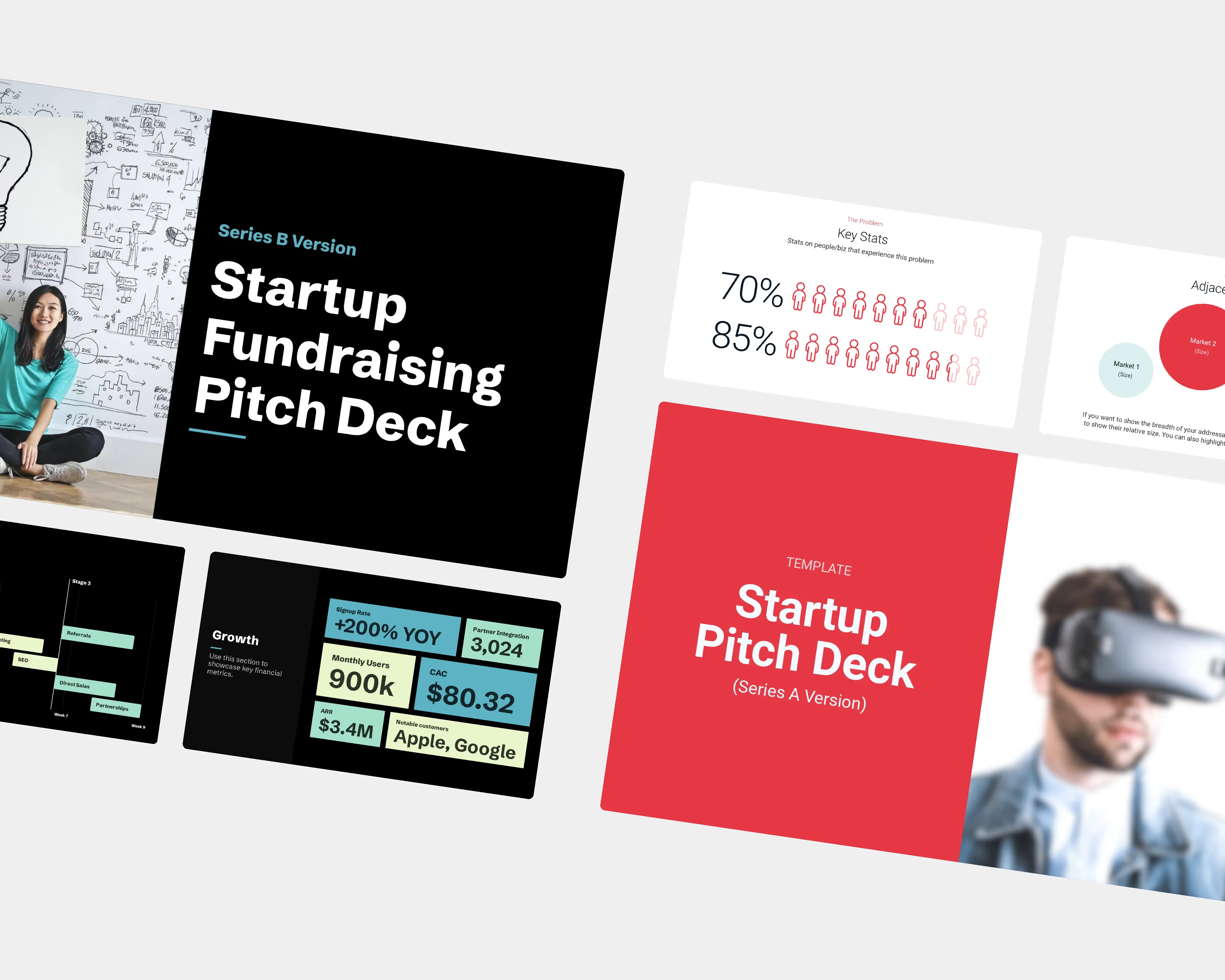
Don’t be a hero. Not everyone can create a beautiful slide from scratch, and that’s okay. Start inspired with our gallery of free, pre-built presentation templates. With presentation templates created and curated by industry experts, there’s a template for every industry, every team, and everyone. Browse through the library and let our templates spark your creativity.
Keep it simple
Only include what’s necessary— especially when it comes to data. Keep it simple. There’s no need to go overboard with numbers and text that won’t be digested well on the receiving end. Instead, only include the most relevant information on each slide and elaborate verbally where necessary. Each slide should feature just one key takeaway. This will keep your slides looking clean and more professional.
Use supporting visuals
A picture is worth a thousand words. What does that mean for presentations? Adding a high-quality image or video can get your message across much more quickly than a bullet point would. Choose an image from our library full of hundreds of thousands of stock photos and icons right from within the product. Make sure the visuals you are using are consistent with one another and on-brand.
Focus on what’s important
There is absolutely no reason that you need to stay up until 3am aligning text boxes and getting the format right on your slides. Read that again. Let us do the heavy lifting so you can focus on what’s important: your story. Our smart slide templates give you the guardrails you need to ensure good design without sleepless nights. We take the best design principles from the experts and apply them to your slide so that your text boxes, fonts, images, and graphs are always sized and aligned properly.
Less is more
In the world of presentations, less is more— trust us. Don’t try to incorporate all of your favorite colors, texts, and assets into your presentation. Pick a couple complimentary colors, a basic font, and clean layouts for a more minimalist look. The less clutter, the better. A clean slide will make it easier for your audience to hone in on your key takeaways.
Find the right chart for your data
Presenting data can be a nightmare (we get it), but it doesn’t have to be. In Beautiful.ai you can easily toggle between different charts and graphs without losing your content, so you can find the format that works best with your data. Proper data visualization can be the difference between a successful call to action, and one that falls short. Learn more about how to choose the right graph for your data here.
Now that you have the best (and easiest) presentation design tips, let’s get started. Log in today and create something beautiful.


