You spend hours crafting your story, building your presentation, and finalizing your speech. Regardless of the contents of your presentation, you likely put a lot of effort into creating it. We get it, you’re passionate about telling your story— and rightfully so. But your hard work is all for naught if your presentation isn’t effective. Of the millions of presentations given everyday, how many are actually successful? And how are teams measuring said success? Understanding the importance of an effective presentation is just as vital as understanding good presentation design. In fact, the two go hand in hand.
When they step down from the stage, most presenters are looking for feedback beyond, “you looked nervous.” They want to know if what they said resonated with the audience. Did their presentation drive their key points home? Were all of those hours spent fine-tuning their presentation worth it? In most cases, the effectiveness of your presentation can be determined by a simple call-to-action. But there are also so many other ways to monitor your success.
How effective are your presentations?
An effective presentation will do one of two things: it will teach your audience something or it will inspire them to take action. But neither of those things will happen if the audience isn’t engaged. In a perfect world, you’d be able to tell if your audience was paying attention by doing a quick scan of the room. However in our current remote climate, the nature of presentations have shifted. Giving a remote presentation makes it harder to gauge the audience’s level of interest until after the fact. It’s likely that you’re giving a remote presentation via video conferencing, and then sending out the deck as a follow-up. That’s not to say they still can’t be effective. Incorporating video can help engage your audience and increase the effectiveness of your message. Choosing on-brand images, using the right charts and graphs for your data, and the number of slides you include may also play a role in how effective your presentation is.
Why is it important?
Your presentation is your story. Whether you’re teaching an online course, hosting a webinar, making a business pitch, onboarding a new hire, or sharing a campaign with your team, what you have to say is important. You need your audience to listen. The effectiveness of a presentation determines how many people you reached with your story. It represents how much of the information they will take with them when they leave. And it can help you understand what you can do better next time.
Understanding the effectiveness of your presentation can help you to figure out if your content is resonating with the audience. Was the presentation too long or too short? Are people making it to the last slide or skipping through? What is the longevity of your content— will your presentation continue to drive traffic a month from now? Is there one slide that people spent more time on than others? These all factor into how powerful and impactful your presentation actually is. You can find the answers to all of these questions through presentation analytics.
Tracking metrics
In any business, tracking metrics is important. Data itself tells a story (for those who are willing to listen). It can help you better understand your audience, and their behaviors. It’s how you learn more about what works and what doesn’t, which will ultimately help you scale your business.
Tracking metrics in a presentation can look a little different for every speaker. Depending on your goal of the presentation, you may want to know how many people made it to the end without skipping ahead. On the same coin, you may care more about the effectiveness of your call to action on the last slide. Regardless of which metrics you’re looking for, having the ability to track presentation analytics is important.
Beautiful.ai analytics
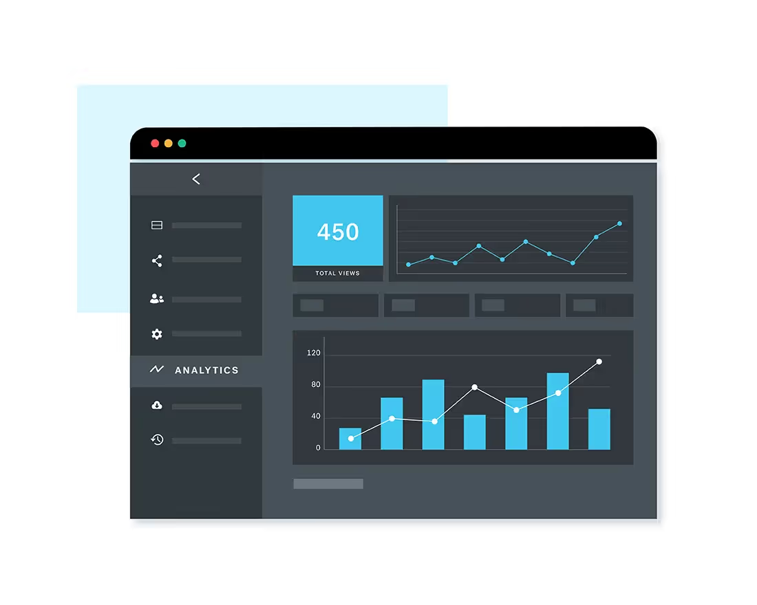
Beautiful.ai gets it. We know that measuring the success of your presentation can be as simple as tracking your metrics— especially in our new remote world. In Beautiful.ai you can see things like total views, unique viewers, total view time, completion rate, average view time per slide, and how many people shared out the link to your deck. With these analytics, you are able to monitor the effectiveness of your presentation days, weeks, and even months after you first present.
Check it out for yourself! To find your presentation analytics in Beautiful.ai, follow these three, simple steps.
- Click in to any presentation from your Pro account
- Select “actions” on the left side bar
- Open the “analytics” tab
Do you want to present like a pro? Check out our Pro plan and unlock all of the features you need to present your best work ever.




.avif)

