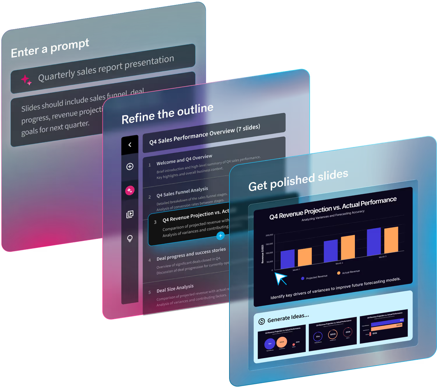
We’re here to help teams work smarter, not harder. And as that relates to presentations, we do the work to automate the design process for you so that you can create something brilliant, and on-brand, in half the time. Taking on the burden of design for things like charts and graphs, aligning text boxes, and sourcing images is what presenters and storytellers have come to know and love about Beautiful.ai.
But there are so many more great features beyond our bread and butter (Smart Slides), that can take your presentations to the next level. One feature in particular: our custom themes. Custom themes ensure that you and your team are using the right colors, font, and logo every time. It keeps every slide consistent—and consistently creative— for a more put-together, professional look.
In this blog we’re going to share theming best practices, and the in-and-outs of the tool, so you can create your best presentation yet.
Introducing theme background images
We’re excited to announce our new, optional theme backgrounds! Now you can choose to upload slide background images to your theme to make your slide pop. As a good rule of thumb, background images shouldn’t be so busy that the content isn’t easily legible. For example, you might choose a background that adds just an accent on the edges, and save more intricate images for a headline slide.
Legibility is key
Background images are a great new addition, but legibility is key to keeping your deck professional and clean. In order to ensure legibility it's important to define how the image should be treated— as a light, dark, or color. To “treat as color" means the image is more colorful and the content on it should be white for contrast. Similarly, “treat as light" means the image is close to white so your color palette pops. Or lastly, “treat as dark" means it's close to black and a lighter color palette will be more readable on it.
Define a default
Just how you can choose a default theme, you can define a default background image. Choose from any color already defined, or one of your pre-selected background images, and this will be the background by default when you add a new slide. Don’t worry, you can choose to change it on a per slide basis as needed!
How to nail your themes
Beyond our new background images, setting themes can really change the whole perception of your presentation. It keeps things consistent, on-brand, and professional so that you can avoid the hodgepodge mess known as frankendecks. Keep these key five tips in mind when you're locking in your next custom theme.
- Upload two logos for both light and dark backgrounds
- Customize your typography by uploading your branded fonts and adjusting them by scale and spacing found in the “three-dot more” menu
- Add your brand colors: the primary palette is for shapes, diagrams and accents like bullets and emphasized text. You don't need to include your background and text colors here.
- If you have a limited color palette, choose a few more colors to use for charts in the custom chart palette. These should be easily distinguishable from each other, and stand out from the rest of the colors in your theme.
- Pick an icon style to suit your brand.
The nice thing about themes is that you can save your customized theme to use again when you create a new presentation. It will automatically apply all of your selections (fonts, colors, logo, etc.) to each slide so that you don’t have to manually tinker with details every time you add to your deck. Themes can be specific to your brand, department, event, or topic so there’s always a personalized touch added to your story.

.gif)
.gif)


.gif)
.avif)

