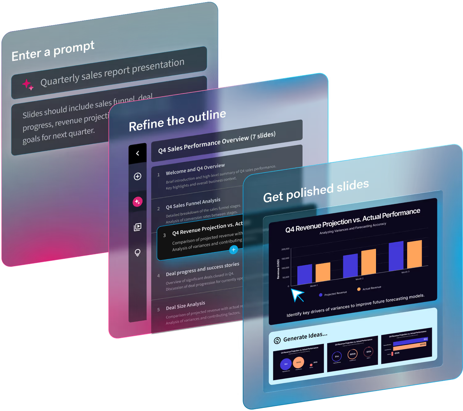
We've partnered with First Round Capital on this free, customizable pitch deck template. Download your copy now.
Let’s face it, advice on crafting th perfect pitch deck is everywhere. A quick Google search bombards you with “The Only 10 Slides You Need in Your Pitch,” “The 11 Slides You Need to Have in Your Pitch,” and, you guessed it, “12 Slides to Have in Your Pitch.” While these templates offer a solid framework, they often fall short on guiding you through visually compelling presentations.
Why? Because there’s no one-size-fits-all design for “the problem” your company is solving. Plus, most templates are stuck in PowerPoint purgatory, making customization a nightmare. It’s no wonder experts prefer generic advice over specific design tips.
This VC pitch deck template stands out
We don’t claim to have all the answers—every pitch is unique and it’s impossible to build a template that works for everyone—but it’s certainly the most comprehensive, useful, and easy-to-use VC pitch presentation template we’ve ever seen. It’s not just a formula; it’s a starting point.
Endorsed by the best
Our venture capital presentation template has the seal of approval from First Round Capital’s Pitch Assist Team. These early investors in Uber, Warby Parker, and Flatiron Health know a thing or two about successful pitches.
Visualize your pitch like never before
Unlike other templates, ours doesn't just tell you what to say on each slide. It shows you how to visualize your content and can help you edit your copy. With multiple layout options for each slide, you can choose the best fit and design for your story.
Built with Beautiful.ai
And, finally, this template is built in Beautiful.ai. This AI-powered presentation tool helps you visualize your ideas instantly and takes care of the design work you typically have to do in programs like PowerPoint or Google Slides. Each slide in the template is effortless to edit, will adapt its design as you add or update content, and will be beautifully animated—all automatically. Your VC pitch deck is a reflection of you as a founder, and this template ensures a polished, professional look.
Dive in
Ready to elevate your VC pitch? Explore our VC pitch deck template for a deeper dive and pro tips to make yours stand out. GET THIS FREE TEMPLATE NOW
Investor Pitch Deck Presentation Example
Here is a detailed guide on our venture capital presentation itself as well as a few design pointers that will help you once you start crafting your deck in Beautiful.ai.
1. Title Slide

First things first: Your audience already knows why you’re there, who they are, and what day it is. So there’s no need to include “Investor Presentation” in the title or take up space with the date or the VC firm’s logo. Just include the name of your company and a brief explanation of what you do.
Don’t get too cute with the tagline on this slide. For many in the room, this will be their first exposure to your company and product, so a straightforward and easy-to-understand product description (“logistics software for trucking companies”) is better than an aspirational marketing message (“moving the world forward’). Don’t worry, you’ll have a chance to show off your marketing language a bit later.
2. Company Purpose
After you’ve briefly introduced both yourself and your company on the title slide, your next job is to explain not just what you do, but why you exist. There are a few ways to achieve this: You can focus on the value you’re providing to your customers, the massive leap in technology you are bringing to market, or the size and scope of the change you are delivering to the world. This gives the investor insight into you as a founder as well as your personal connection to the market you are entering.
The key here is to tune this purpose to your investor, not your customer. Your purpose needs to be both noble and profitable. In other words, it must be incredibly simple to connect the dots from why you exist to the size of the opportunity ahead of you.
3. The Problem
With a firm grounding in what you do and why you do it, this is your opportunity to dive deeper into the problem you are solving. In doing so, you want to establish not just the scope of the problem but the size of it, as well. It may be true that it’s hard for trucking companies to do logistics (and you should make this clear), but it’s even better if you can quantify the cost of this problem: Are they spending a lot of time or resources trying to solve it? Is the lack of a solution costing them money?
There are a number of ways to answer these questions. You can use existing market data, anecdotal evidence, an example/case study, or some combination of the three. However you choose to do it, framing the problem effectively is incredibly important because it is the filter through which your audience will judge the rest of your pitch.
4. The Solution
It makes a lot of sense to follow up your description of the problem with an overview of your solution to that problem. (We never said this was rocket science. That is, unless you’re pitching rocket technology, in which case it very well may be.)
It’s easy to get carried away in this section of the presentation, so it’s important to identify which are most important for your audience to understand: the product, the approach, or the core technology. You want to lead with the most compelling answer to this question so the VC you are pitching clearly understands what you are doing that is truly unique. From there, you can move through the other two, if need be.
5. Traction
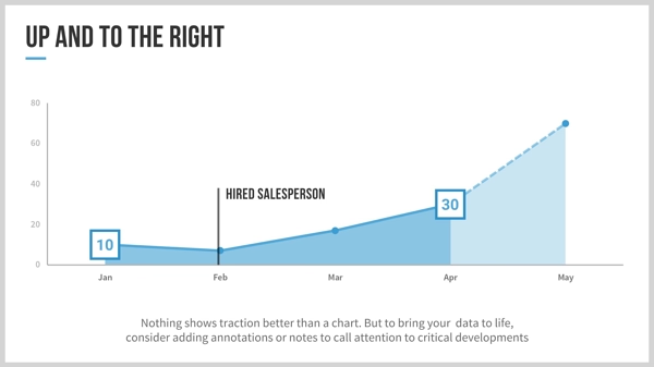
If your company has been around long enough to prove its value, investors expect this to be reflected in your metrics. The key is to identify the metrics that matter for your business—whether that’s growth, revenue, transaction volume, etc.—and then explain to the VC why those metrics are critical and how you’ve been able to achieve the success you have. (For example, if you are growing rapidly, highlight the customer acquisition strategy that accounts for this growth.)
Be careful here. In many cases, especially at the earliest stages of your company, the traction data you have is preliminary, at best, and misleading. Trying to prop up flimsy data is never a good idea—investors can smell it from a mile away—so if you don’t have enough hard data to share, consider finding other ways to communicate your traction. For example, you might feature some of your more impressive customers with a logo slide or a representative case study.
6. Why Now?
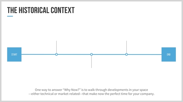
You don’t typically see this topic included in startup pitch deck templates. Still, it addresses a critical question that investors will invariably have about your company, i.e., Why hasn’t someone done this before? Answering this question effectively gives VCs the impression that they are investing ahead of the curve.
In most cases, the answer to “Why Now?” falls roughly into one of three categories: (1) the problem was too expensive to solve before, (2) the technology didn’t exist to solve the problem, or (3) the problem was not as apparent or pervasive as it is now. Generally, the case you’re making will include some combination of the three, so prioritize them and present them systematically.
7. Market Size
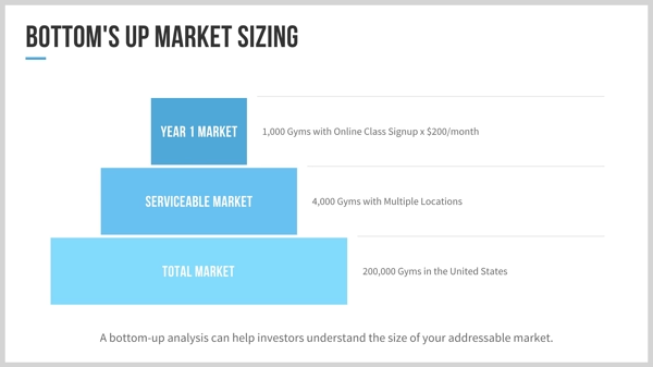
This section of the VC pitch is fraught with pitfalls. The conventional wisdom is that you want to show as big an addressable market as possible, and we’ve seen way too many entrepreneurs try to pitch their company into a $1T market. The truth is that, beyond a certain point, the market size is far less important than the thinking you apply to get there. Whether you’re sizing your market top-down or bottom-up, show your work so that investors clearly understand the opportunity.
It’s also important to think about the “story” you are telling about your market. Market size is just a number, so you’ll need to add context to help investors understand the market dynamics. For example, is this a market growing significantly (or expected to do so)? Is it a collection of adjacent markets that you can attack in sequence? Or is it a whole new market that swallows up a collection of existing markets? Whatever the story, you’ll want to use a compelling visual to communicate it clearly.
8. The Competition
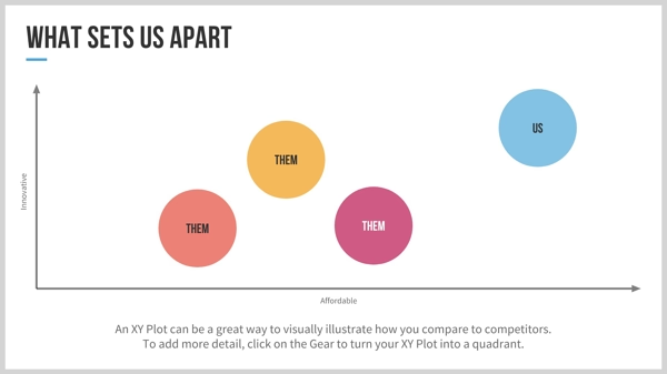
Founders often claim that there is “no competition” for their product, but investors know that this is never truly the case. Your goal is to position yourself as an expert in your space, and this is nearly impossible without a thoughtful discussion of competition.
If your competitive set can be compared to a common set of characteristics, then an XY Plot or Quadrant diagram is a great way to visualize the dynamics of your market. That said, sometimes it isn’t that simple—in these cases, dividing your competition into distinct categories and addressing them individually is often the best course.
9. Business Model
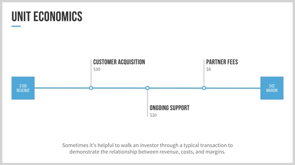
Like traction data, this is another case where the amount of time you’ve spent in the market should dictate how you address this topic. If your revenue model is clearly defined, explain how you arrived at it. A detailed explanation of your unit economics, customer acquisition cost, and lifetime value is also relevant here.
However, if you’re in the earlier stages of your company—either before you’ve gone to market or in a free beta period—this is an exercise in speculation and hypothesis. In this case, educate the investor on how you propose to monetize, why you’ve chosen that course of action, and a projection of how that model translates to revenue over time. It’s important, though, to focus on just one or two ways you intend to make money; while it’s tempting to highlight all the ways you could monetize, investors may perceive this as a lack of focus or conviction.
10. Team Slide
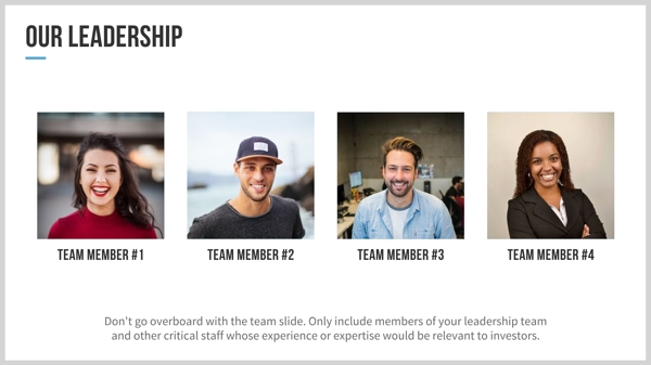
This is a fairly straightforward slide, but there are a few important things worth noting. First, remember that investors are interested in who is on your team, not merely how big it is. Rather than including all 15 of your employees, choose the three or four members of your leadership team who you believe will impress the investor, and spend a sentence or two discussing their expertise and explaining their value to your company. And if you have key positions to fill, identify them and talk through the kind of person you are looking for.
11. Financial Projections

Financial projections are often taken with a grain of salt, in part because everyone in the room knows that they’re, at best, educated guesses. The important thing is to present a realistic picture of the key metrics of your business and how they evolve over time. For example, you might want to illustrate how revenue grows over time, how your headcount scales with that growth, and how your operating costs change as you achieve economies of scale?
It’s OK if this slide looks a bit busy—investors are used to seeing financial models in this format and can quickly scan for the information they’re looking for—but try not to overwhelm them with unnecessary rows of data.
In terms of how far out to project, one rule of thumb is to go as far as you think the next financing round will take you (or, more specifically, when you expect to raise your next round). Start with a monthly projection for the next six months and then a quarterly or annual one afterward.
12. Closing Thought
The natural instinct of most presenters is to close their pitches with a bulleted list of “key takeaways” or reasons to invest. There’s nothing wrong with a synopsis at the end of your presentation, but the goal of your presentation should be to start a conversation, not end one.
To that end, leave your audience with a closing statement or question that gets them brainstorming with you. If the 20-40 minutes after your pitch ends up being a discussion about how to grow your business—rather than a grilling about your business model—then you know you’ve been successful.
Building your VC pitch deck in Beautiful.ai
It’s worth saying again: No pitch deck template on the planet will work for every kind of startup. Your company is unique, so your pitch should be, as well. That said, we believe that this template will help you hone and refine your story. With Beautiful.ai’s AI presentation maker, even non-designers can consistently design beautiful presentations that capture your message and story.


