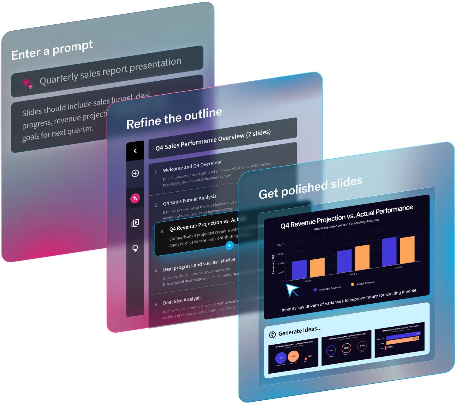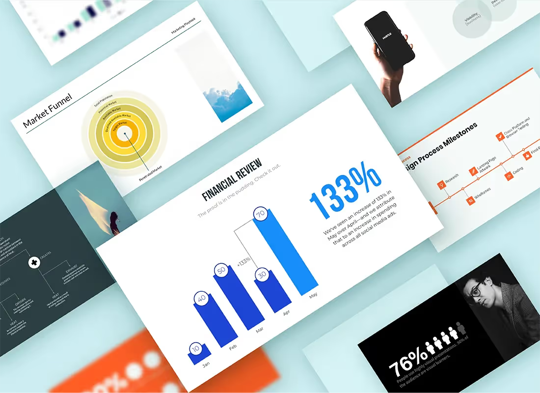
There are some cardinal rules to any presentation: Keep it simple, engage the viewer, know your goals and know your audience. But how do you ensure your presentation tactics are working?
With Beautiful.ai, you can utilize analytics to understand the impact of each of your decks. You can learn how much time a viewer spent on each slide, slides skipped, who opened the presentation, and how many people made it to the end.
Here are a few use cases that showcase the power of our analytics feature, and how to empower your team with it:
Leveraging analytics in Beautiful.ai for better design decisions
You can use analytics and user behavior insights to craft engaging presentations that capture attention on every slide.
While your deck tells a story, so does the data of the presentation itself. The insights that Beautiful.ai’s analytics feature provides tell another story, one that can help you better understand your audience (and what works and what doesn’t).
Consider the time spent on each slide
The more time spent on each slide, the more engaged they are. Minutes on a slide means better retention of the information being presented. To encourage your viewer to stay on a slide longer, make sure to organize the information clearly. Make sure your fonts are easy to read, and the text is organized well with bullet points or text blocks.
What slides are being skipped altogether?
If a prospect is skipping a slide, it could be for a number of reasons. Perhaps the information on the slide wasn't relevant to them, in which case sales reps should better tailor the info to the needs of the client. Maybe there was too much text and the viewer got tired of reading, in which case you can edit the text or use infographics or images to break up larger blocks of text.
How many prospects are making it to the end CTA?
Your CTA will likely be at the end of the deck, where viewers may have already reached a point of fatigue. Presenters can use analytics to see how many people are making it to the pricing or CTA slide at the end, and take that into consideration when choosing a design for the final slide. Keeping your audience engaged, even when you’re wrapping up, is crucial. You can shake things up with a bold quote or a question, or offer a special deal at the end to entice those who clicked all the way through.
Give your sales team informed outreach
A sales rep might send a deck to a prospect, come back a week later to check the analytics, and realize that they never opened the presentation to begin with. Or, perhaps they’ve opened the deck and left on your pricing plan slide.
They can then take that information, powered by Beautiful.ai, and craft a follow-up email that is personalized and value-based.
Another example: If a client skipped a slide, or spent less than 2 seconds there, that might indicate you need a design or copy fix.
With Beautiful.ai’s Team Plan, that sales rep can go in and choose a more engaging layout for the content that is brand-approved and responsive thanks to design AI that helps companies create sales collateral 75% faster.
Present data in more engaging ways
By analyzing slide data, you can optimize design choices and slide layout. If viewers are spending a short amount of time on a particular slide, try adding animations or video.
You could also opt for a different template that better showcases the information you’re trying to get across.
Import Google Sheets, CSVs, and more
With Beautiful.ai’s integrations, you can link or upload a data source directly into your presentation. When the source file is updated, those changes automatically happen in your deck. With the data auto-updating, you can spend more time focusing on making the complex numbers more engaging with different chart variations, or adding visual elements to the slide.
Check the downloads
If your presentation is meant to educate, downloads can show that a user is truly engaged with your content and considers it a valuable resource. With analytics, you can see total downloads and when it was last opened. Whether it’s days, weeks, or months after sending, you can determine how many people have viewed it – which comes in handy when reporting on campaign success.
How to use Beautiful.ai analytics feature
Perfect your presentations with analytics.
Dissect the analytics of your presentation
Our analytics features offer insights such as view history, unique visits, total view time, and presentation completion rate. Analytics help you understand which slides are most engaging, what’s resonating with your audience, and what they’re skipping through.
Get started
Finding the analytics feature in Beautiful.ai is simple:
- Click in to any presentation from your Pro account
- Select “actions” on the left side bar
- Open the “view analytics” tab
- Review what’s working and what has room for improvement within your deck


.avif)
