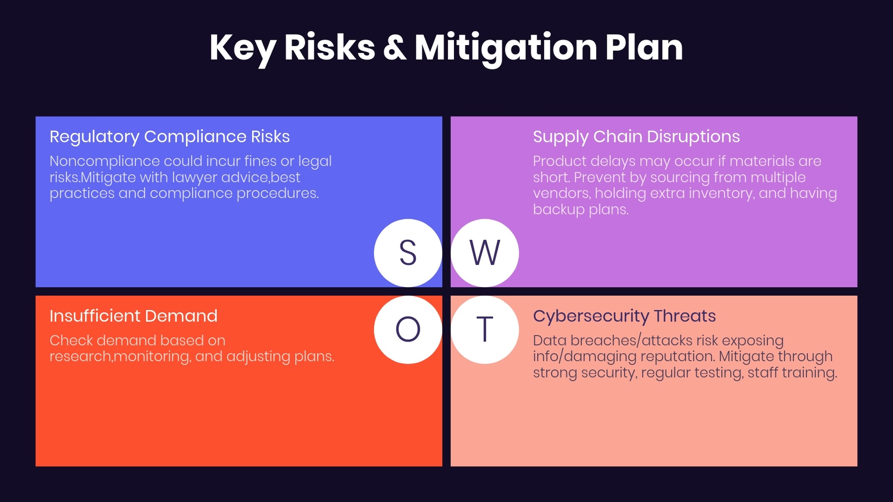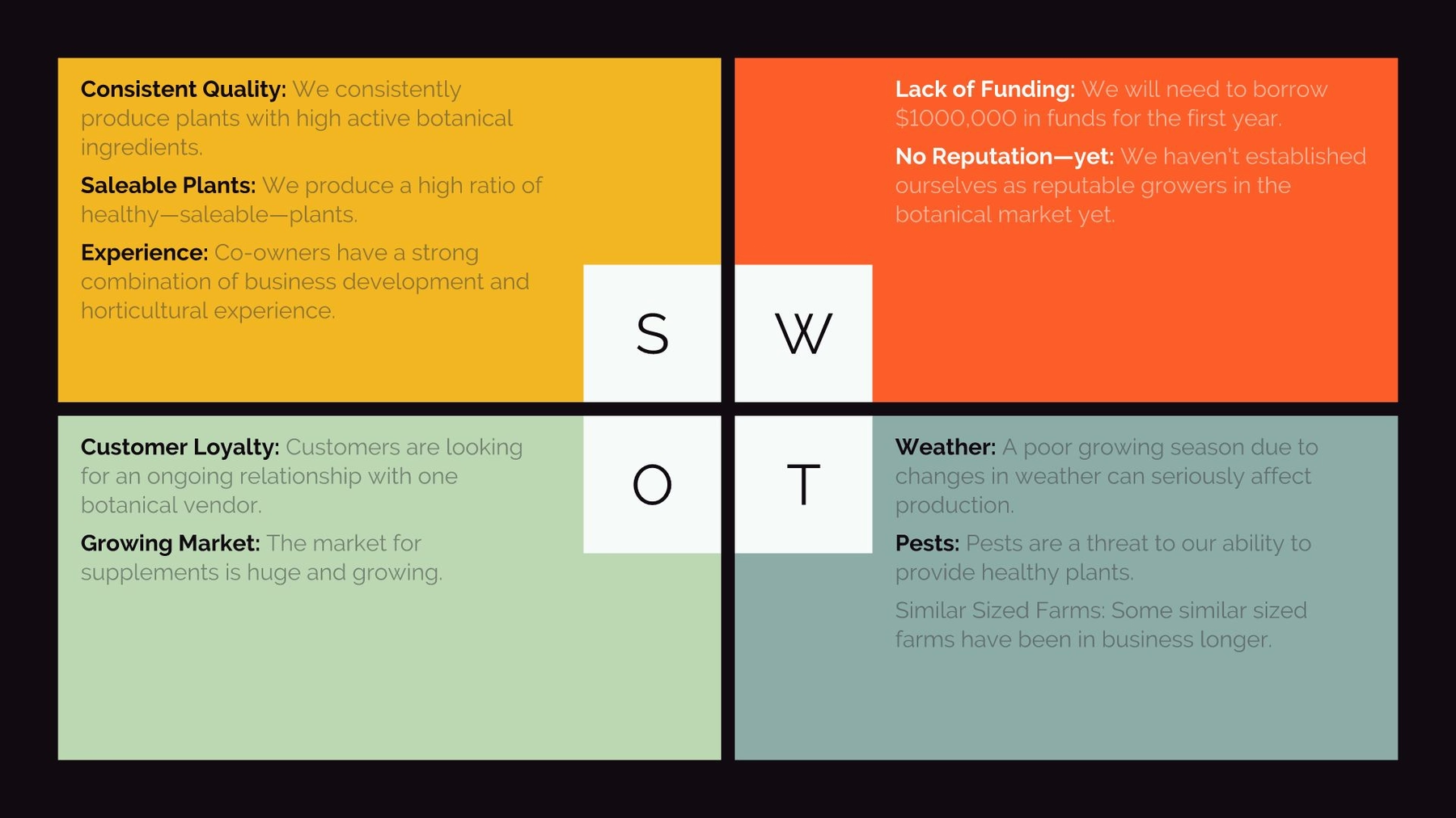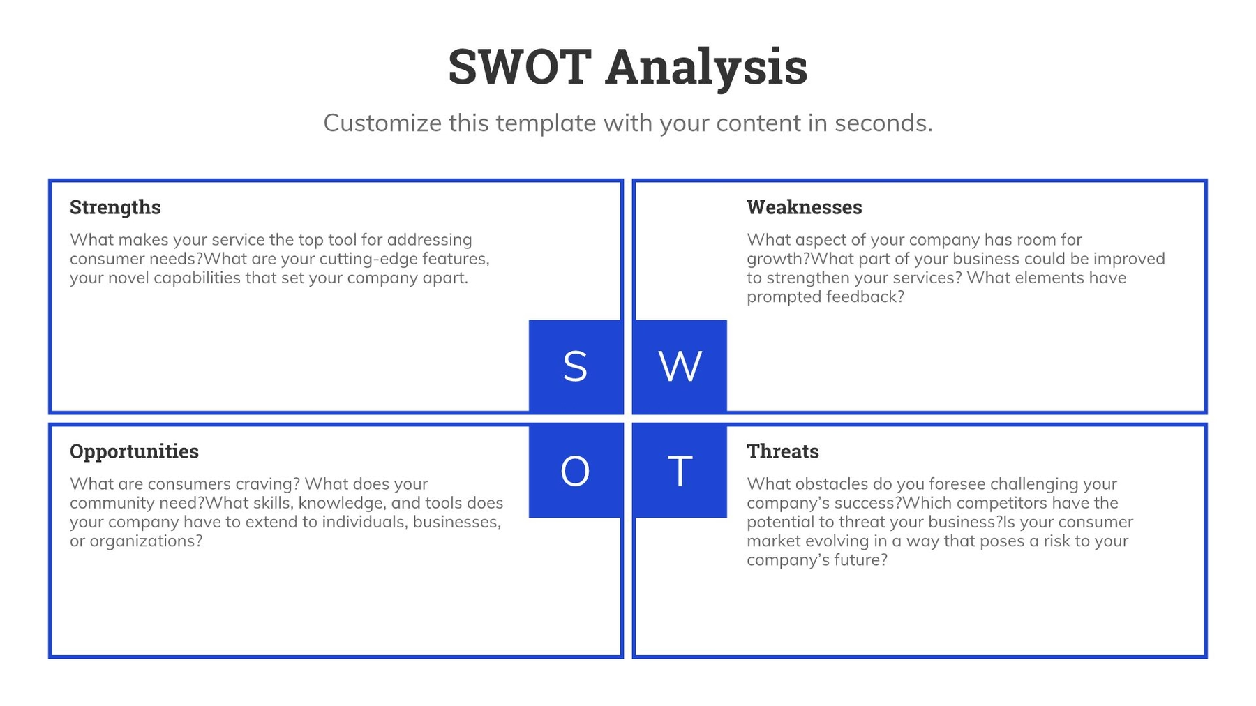
When you don’t know where to take your presentation, Smart Slide templates are a great starting point. The customizable templates use guardrails to protect the design as you add in your content, and can help you reimagine your story. While there are intentional limitations to maintain design integrity, there are so many different ways to customize each layout beyond the default settings.
In this series, we’re highlighting your favorite slide templates, and challenging you to try something new. For each Smart Slide, we’ll showcase different ways to style and format it to help inspire a new way to tell your story.
SWOT
SWOT analysis is an evaluation model used to help identify strengths, weaknesses, opportunities, and threats to a business, project, or opportunity. SWOT itself is an acronym standing for Strengths, Weaknesses, Opportunities, and Threats. A typical SWOT diagram includes both potential internal and external factors and formats them into a single four-quadrant model. An effective SWOT analysis organizes data into four basic categories. These are:
Strengths
Gives insights as to what a company, product, or project does best.
Weaknesses
Describes potential roadblocks or hurdles that will need to be overcome within an organization or project
Opportunities: Project advantages
Highlights external circumstances or situations for a company or organization to put their strengths to good use.
Disadvantages or Threats to the Project
Explains external forces, factors or situations that could be problematic or make it harder to reach a goal.
A SWOT analysis template simplifies the process of designing your own SWOT matrix for a presentation. Here are five creative ways to use the SWOT Smart Slide template.
Thoughtful colors
Contrasting colors can help differentiate each category within your SWOT diagram. You might associate a bolder, warmer color for the strengths and opportunities, and a more muted, cooler tone to signify weaknesses and threats. The use of colors can make it easier to digest at first glance, resulting in better audience engagement.

Font selection
Keep color and font easy to read. A SWOT analysis slide template using pale colors or decorative font might get lost. Remember that there are four categories to display so font size isn’t as large as single category slides.

Headers and titles
You can turn the header on or off based on design preference. There’s no right or wrong answer— a header tells the audience what they can expect on the slide, while a SWOT without a header hits them with the analysis immediately. Regardless of your slide layout, you can keep your audience on track with titles for each of the 4 sections.

Use bullet points to organize each section
Adding a bulleted list to each section of your SWOT can help your audience identify the key takeaways quickly. In an otherwise text-heavy slide, bullet points make the information easier to comprehend and act on.
Try a text box slide instead
To get a similar look with more creative freedom you might opt for a text box Smart Slide instead. With the text box template, you can add 4 boxes and title each box to correspond with the appropriate section— strengths, weaknesses, opportunities, and threats. The benefit to a text box slide is that you have more control over the sidebar where you can add a video or image, big text, or important metrics to complement the analysis.

.gif)
.gif)


.gif)
.avif)

.avif)