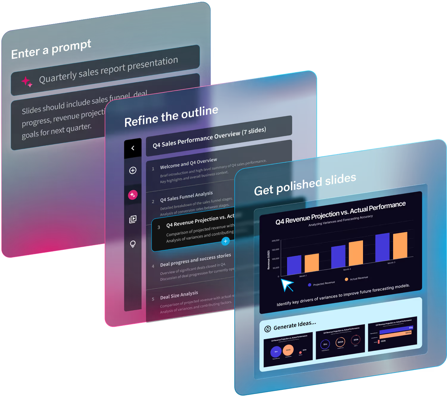
Creativity and technology merge in the world of presentation design. With tools like Beautiful.ai, presentations become collaborative tools that showcase your team's cohesion and innovation.
With the entrance of generative AI and design tools that make things easier, the fundamental structure of presentation design has changed. Thanks to advances that take us beyond conventional limitations, ground-breaking ideas are now possible.
Keeping up with the latest trends in presentation design helps you make a lasting impact. Captivate users by adding these to your presentation templates. Here are some design trends we have our eyes on:
1. Typography and text animation
Gone are the days of static text that simply sits on the slide. In 2024, typography is taking center stage with dynamic text animations.
Give your words a bit of flair and personality. Whether subtle movements or bold entrances, animated text can help emphasize key points and keep your audience engaged. For a deeper dive into this trend, check out our guide on compelling visual stories with animated presentations.
2. Gradients
Not a new trend by any means; the use of gradients in presentation design has been around for a long time. This time, gradients are on the rise, particularly 3d gradients.
Gradients add color and dimension to your slide and can be applied to typography to enhance product shots, photography, and more.
3. Motion graphics
Movement captures attention. Too much will overwhelm your audience and distract from your message. Adding motion graphics like videos, animations, or gifs to your slides illustrates your story and engages your audience.
Beautiful.ai allows you to decide how your animations will build on each slide. You control the speed, the order, and whether they build automatically or advance with a click. Create a custom timeline or a manual control of your animation build. Customize the animation timing and style to choose overlapping, simultaneous, sequential, or no animation.
Depending on your content and talking points, you may select a slow, average, or fast animation speed. For example, if you want to elaborate on each end before the next one appears, consider a slower build so that you have time to narrate as the slide progresses.
4. Bento grids
Inspired by Japanese bento boxes, Bento grids are a design trend that can be seen all over the internet.
Bento grids are handy for presentation design because they allow you to showcase multiple things in a single composition. In this case, it means breaking up your slides into boundary boxes with distinct separations. This helps break down information that doesn’t necessarily go together in one slide.
With this design trend, you can organize information into one layout. Remember–even in your Bento grids, it never hurts to think outside the box.
Our Photo Grid Smart Slide template is extremely versatile and allows you to mix media and information on one engaging slide.
5. Ultra vibrancy
If you’re looking for a way to make your slides stand out, ultra vibrancy is the way to go. The use of vibrant colors is on the rise. This trend injects excitement, individuality, and modernity into brands to help capture attention.
Bright, bold hues can capture attention and make a lasting impression. Don’t be afraid to embrace the rainbow and let your slides shine with personality and flair.
6. Generative AI
Generative AI has no doubt impacted and influenced how we interact with images. In 2024, AI is transforming how we interact with images and creating new possibilities for presentation design. With AI tools, you can generate custom visuals, streamline your design process, and even get real-time suggestions to enhance your slides. AI is no longer just a buzzword; it's an integral part of the design field, making creativity more accessible and collaborative.

.gif)
.gif)


.gif)
