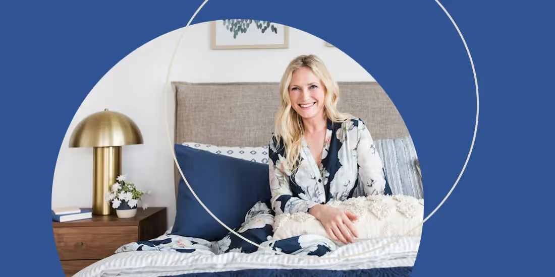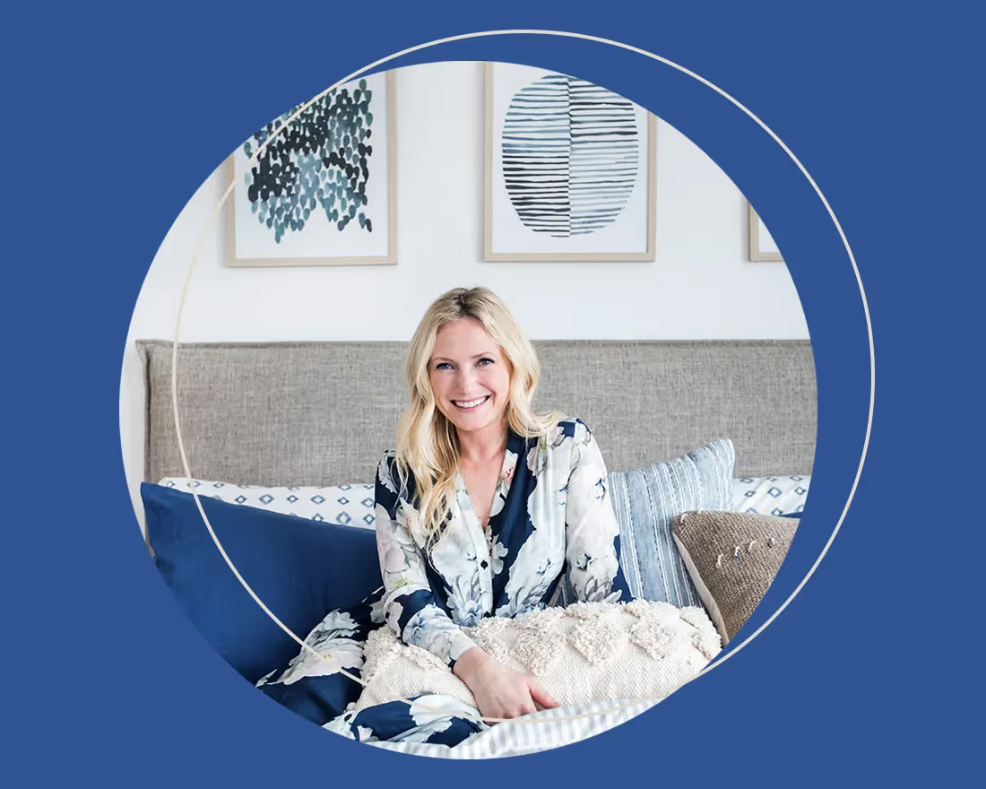
Interior design is a craft that many try to master and few succeed. However, HGTV Design Star winner and host of Secrets From a Stylist, Emily Henderson, has had her hand in success. The popular interior designer known for her mid-century modern style moved to New York City to study industrial design at The Pratt Institute in Brooklyn after graduating from the University of Oregon. She’s been immersed in the design industry since and her career boasts an impressive number of accomplishments including a notable portfolio of clients, a New York Times Best Seller book, a successful blog, and a Style by Emily Henderson collection at Target retailers.
The queen of “weird is good, in small doses,” believes that design— interior and otherwise— should be a reflection of you, your brand, and your personal style. It’s her eclectic eye for design that humanizes her work and makes chic living areas achievable and livable. While her creativity is inspiring, we bet you’re wondering what Emily Henderson’s style has to do with presentations, right?
While interior design is vastly different from presentation design, it’s also similar. Like any principles of good design, interior design best practices can be applied to presentations, too. Take these styling and design lessons from interior-artist, Emily Henderson, and apply them to your next presentation deck.
Push the boundaries of design
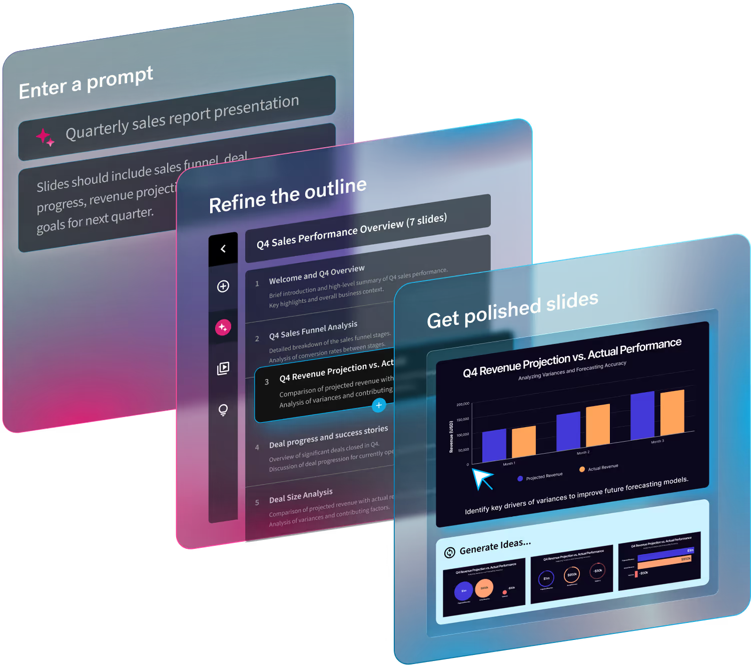
Emily Henderson said in an interview with The Everygirl, “Push the boundaries [of your design] because if you don’t do it for yourself why would your clients let you do it.” We love this advice for presentation design. Emily Henderson’s style is constantly shaking up what’s safe and normal, and pushing the boundaries of design. In Henderson fashion, don’t be afraid to try something new and edgy in your next presentation. Try structuring your story in a new, thoughtful way that you might not have thought of before and force people to see your offering in a new light. Beautiful.ai’s smart slide templates help you start inspired so you can customize your design and try new layouts and formats to take your content to the next level.
Lean in to modern maximalism
Eclectic-meets-modern stylist, Emily Henderson, often explores a “modern maximalism” approach to design. What does this mean? It doesn’t necessarily mean whacky and cluttered. Instead, Henderson has coined her color-play as modern maximalism. This means she isn't afraid to mix bold, loud colors together. In fact, some of her best examples of modern maximalism are dark, moody walls and monochromatic furniture which is a far cry from her traditionally bright, white design style. While we generally like to keep presentations clean and professional, that doesn’t mean you can’t experiment with trendy, modern colors and supporting visual assets. Explore Beautiful.ai’s free image library— full of high-quality, modern, edgy, and professional assets— to find the perfect photos to compliment your presentation without having to open a new browser or tab.
Keep it cohesive
Emily Henderson has been known to mix elements of different interior design styles. Her one rule? Keep things cohesive and consistent. This means that while she may mix mid-century modern and coastal pieces, she sticks to one cohesive color scheme to tie everything together (her favorite hue being shades of blues). You can (and should) apply her rule of consistency to your presentations as well. All of your presentations should be an extension of your brand, and as such they should be consistent with any other marketing or sales collateral. It’s easy to keep your presentations cohesive with Beautiful.ai’s custom themes. Simply create your own theme by selecting your brand colors, fonts, and logos and it will automatically be applied to each slide throughout your presentation.
Adapt and evolve
In a Style by Emily Henderson blog, Emily shares her evolution of design of the last decade. As she breaks down each design style, she shares examples proving that she isn’t afraid of evolving with the times and adopting new trends. In the same blog article she notes that her design style went from corky and bold to more practical and neutral as her lifestyle shifted to motherhood. Being fluid with design trends— while still incorporating her own unique flare— is what sets her apart from other designers. So, what does all of this mean for your presentation? Don’t be afraid to adapt. What worked in the early 2000’s— namely PowerPoint— doesn’t necessarily work now. Trying new presentation software, like Beautiful.ai, and new presentation design styles can help take your deck (and perhaps your career) to the next level.


.avif)

.avif)
.webp)