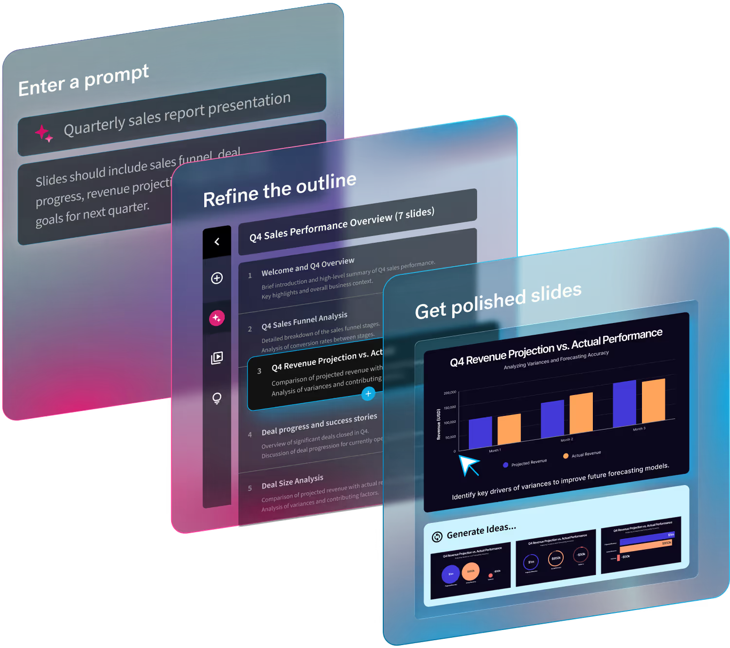
Have you ever seen a presentation and thought it looked like it belonged in the mid-1990s? What about a deck crammed with wordy text blocks, colors that didn’t compliment each other, or overlapping photos? We’re talking about those really outdated, poorly designed presentations that have little-to-no visual appeal and make you wonder who thought they looked good enough to present. That’s what we like to call a frankendeck. A deck so bad it makes your audience cringe. Spoiler alert: frankendecks are a good thing to avoid and Beautiful.ai can help. With best practices in mind, our Smart Slide templates act as the designer and handle the heavy lifting so your presentations always look clean and professional.
If you or someone on your team has created a frankendeck, it 1) was probably made in PowerPoint, and 2) is probably lacking branding. Your presentations are an extension of your business so they should always be professional and on-brand. Branding is important in any business for a magnitude of reasons. It introduces your company before people even know what you offer, it builds trust, and it creates brand awareness. Everything has a purpose from the logo and images you choose, down to the typography and brand colors you use. For example, a lot of thought likely went into your brand’s colors and the emotion you want that color scheme to evoke from your prospective customer. The same goes for your presentations. Your deck should reflect your company brand from the message and tone down to the font choice. It should evoke the same emotion from your audience that your website or marketing materials would.
In this blog we share the importance of branded presentations, and how you can avoid frankendecks in the wild.
Branding tells your story
Presentations are all about sharing your story, and your branding compliments the narrative you’re trying to tell. Having a solid brand presence, and an accompanying presentation deck that reflects that, makes your company more recognizable. It sets you apart from the competition or from other speakers at the conference. Your presentation introduces you before you even have a chance to speak, and sets the tone for how engaged your audience will be. Afterall, a first impression is a lasting impression. A good presentation with the proper branding sends a clear message to potential clients or customers. Using the same style of images, branded colors, or fonts to evoke emotion from your audience only adds to your story, and ultimately contributes to how successful your call-to-action will be at the end of the presentation. People will remember how your presentation looks, and how it made them feel, which may help them retain the information and remember your brand after they leave. At the end of the day your brand and the story you’re telling go hand-in-hand.
If you don’t know where to start, try one of our customizable presentation templates. It helps you structure your thoughts and build the foundation for your presentation so that you can focus on your message. Each template is curated by industry experts, and can be customized with your branding to better tell your story.
Consistency is key
If you’re reading this, it’s likely because you give your fair share of presentations. When you’re presenting to the same, or new, clients multiple times you want to ensure consistency across all presentations. It helps make your presentations look more professional and cohesive, while ensuring a consistent experience across all decks. All of your company assets should represent your business in the same way. This means your brochures, website, advertisements, and presentations should all use similar branding. The consistency and exposure across different verticals and platforms will increase your brand awareness, which will eventually contribute to your end goal.
It’s easy to stay consistent in Beautiful.ai by creating your own branded theme. You can easily customize your theme by importing your brand colors, fonts, and logos and we will immediately apply that throughout your entire deck so that you don’t have to update each individual slide manually. This ensures that each slide matches the last, and that your logo can always be found on the bottom footer. Your personal branded touch will be applied with a simple click.
Quality establishes credibility
Any marketer will tell you that branding builds trust. This is true for presentations, too. When you present a new deck to an audience, and they immediately recognize the quality of your presentation, it helps establish credibility which translates to trust down the road. Having a professional-grade presentation and unified vision of your business lets clients know that you’re reliable. They have confidence in your brand and the product or service you’re offering. You want the quality of your presentation to be a representation of what the audience can expect from your business. You should avoid grainy photos, low-quality logos, or outdated fonts. Instead choose modern icons, a style of images that reflect your brand, and appropriate logos.
With our free image library you can find quality, on-brand images, icons, or logos without ever leaving the Beautiful.ai platform. We make it easy to search through hundreds of thousands of free visual assets to help compliment your content right from within the slide. Using the right visuals will help keep your presentation on-brand and better narrate your story.


.avif)
.gif)

