When great ideas come together in harmony to tell a story, magic happens. A good story can inspire, motivate, and make you (or your audience) want to take action. Ah, the psychological power of storytelling.
When it comes to presentations, the same rules apply. We’ve all spent enough time in conference rooms to know that the best presentation slides are not only gorgeous, but they engage both the left and right sides of the brain. That means connecting the hard facts that left brains love with compelling visual storytelling that right brains crave, in order to create a professional presentation that packs an optical punch. Isn’t it nice when things are pretty and practical? We think so. Let’s update your pitch deck with a presentation design that truly wows. We have seven tips that will take your slides from meh to high-quality ocular masterpieces. Scroll through the presentation below, or keep reading.
Step #1: Say "Ohm"
Feel the ying and the yang; your best presentation is a balanced and symmetrical presentation. Apple, a company known for the gorgeous high-end tech products we all know, use, and love, tends to set the bar for visual design. Their experts, like CEO Tim Cook, think design should be ‘balanced…neat and organized.’ We happen to agree. In our presentation example, the calming blue color scheme fades in our main points with ease, so you can float effortlessly through the presentation instead of being whacked over the head with an idea. Try this soft opening to make a big impact for your next presentation.

Step #2: Become a Minimalist
Leonardo Da Vinci once said, “Simplicity is the ultimate sophistication,” and we agree. We’ve all been audience members of a Microsoft Powerpoint presentation that was too complex, unrefined, and left you wondering what you were even supposed to be learning... So give your peepers a break. Skip cramming your deck and instead, keep things simple and digestible with eye-catching graphics in your color scheme like we did in our presentation example. When you keep slide design clean, you can jump-start talking points in style without overwhelming the audience.
Step #3: Stock Up on Pro Photos
If you’re looking for sharp, slick slide design, dropping the ball on imagery can be your biggest downfall. Outdated or overused stock images can be off-putting (Hello, we’ve all felt like this when a presentation falls flat), so set the bar high when it comes to your visual presentation’s stock photos. Online libraries like UnSplash or Stocksy offer high-quality visuals that speak to your topic, instead of distracting. Because we mean it when we say we have all seen enough of that poor woman ‘laughing and eating salad’ for a lifetime.

Step #4: Commit, Already
Lynn Gaertner-Johnston, the writer behind The Business Writing Blog, says it’s imperative to remember the “power of one idea.” If you want your audience members to catch important points, commit to focusing on just one main message or topic per slide. It’s easy to do once you ditch extraneous text for straight to the point visual storytelling. In our presentation example, we took one main idea and broke it up into three fun graphic subtopics that would bolster our talking points. That’s not cheating! Just make sure all the subtopics truly relate back to your one main focus.
Step #5: Don’t Let Data be a Drag
Dr. Stephanie Evergreen, the author of Presenting Data Effectively: Communicating Your Findings for Maximum Impact, knows ‘the burden of knowledge,’ is real. She explains in her book that when our brains are overwhelmed with too many facts, they will simply ignore them (kind of like when we put off doing laundry because there’s so much of it). Left brain people might adore data, but they’d probably agree it can look boring even if the information is important. The swooping line graph in our Beautiful.ai presentation example is visually stimulating, but it also tells the data’s story in a way that hooks the audience so information isn’t lost in a haze. You can do this, too. Liven up your next presentation by effectively displaying your data with thoughtful, eye-catching visualizations that complement both the slide design and your statistics.

Step #6: Hue Can’t Lose with Good Color
If you’re looking to make a splash with your presentation design (and let’s face it, you are!) take a quick peek into the psychology of color and pick out a color scheme that resonates with your audience and your content. Science backs up the notion that our brains interpret meaning behind colors, even subconsciously. In a 2001 Kawasaki and Yamaguchi study, people were exposed to an array of pigments—as their brains were observed through an EEG—and a definite correlation was found between brain activity and favorite colors. The bottom line seems pretty black and white; color captures our attention. Need a color palette cheat sheet for best presentation practices? Colors like red, orange, and yellow set us into action with passion, while shades of green and blue promote harmony, security, and reliability.
Step #7: Keep Consistent
Let your audience focus on the important facts by keeping your deck visually consistent. It might be tempting to use every serif font on your computer, but by keeping to one or two fonts (we actually recommend san serif for better readability), one congruent color scheme, and one type of graphic style throughout your presentation, you can create a stunning professional lecture that people actually pay attention to from beginning to end.
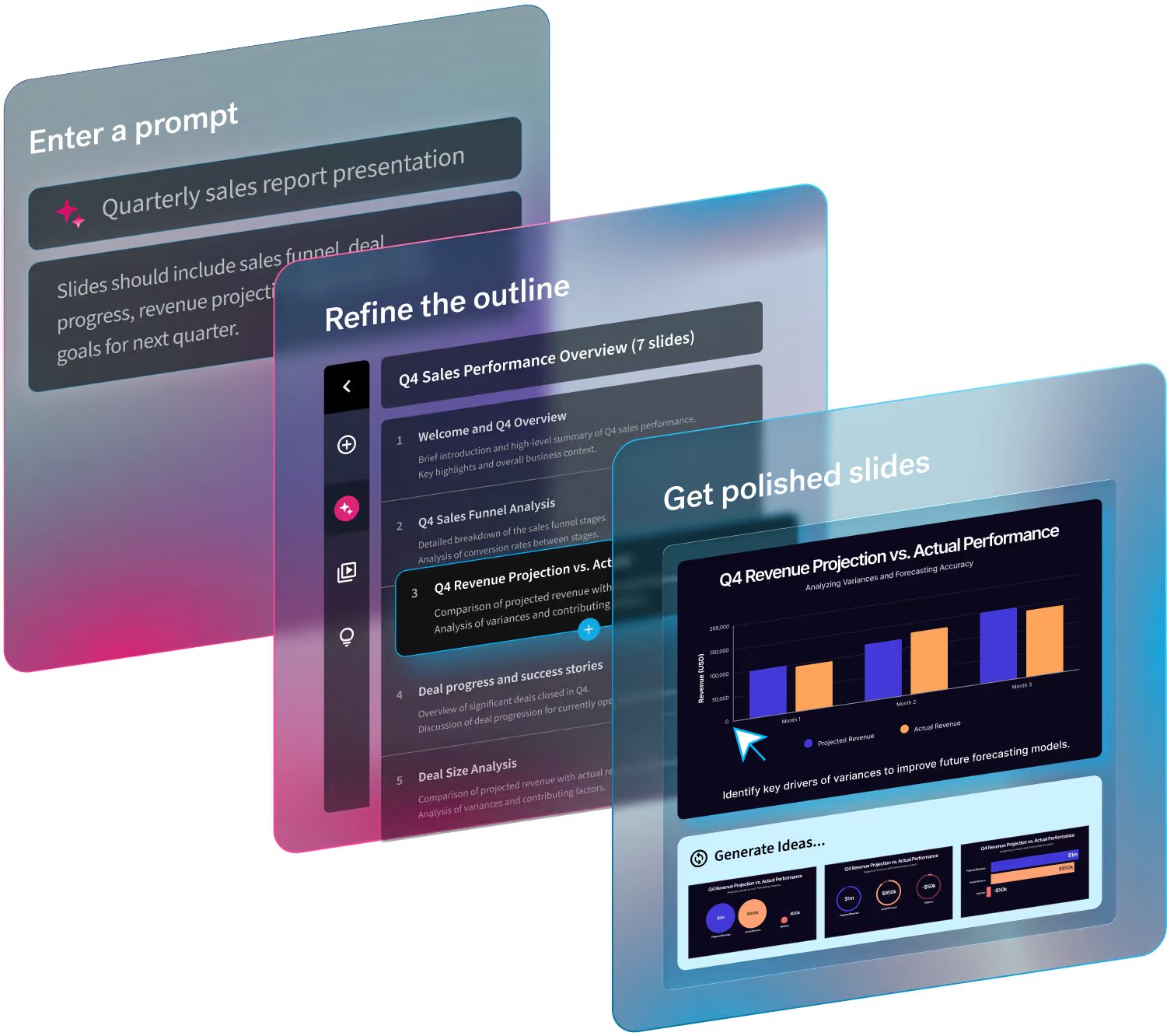
If you don’t know how to start creating a polished presentation, let us help. Beautiful.ai is designed to be intuitive, easy, and well, beautiful... while saving you time and effort. We have hundreds of smart slide and presentation templates that turn your ideas into standout visuals, so every slide you produce looks sleek, professional, and tailored to your brand. Try for free today so you can be proud of what you present.

