A good webinar is like a movie for your brand— informative, inspiring, and educational. When done properly, it can generate new business leads, allows you to leverage audiences, and it can influence sales. In fact, research shows that up to 40% of webinar attendees eventually convert to qualified leads. We’ll chalk that up as an effective tool for marketers to keep in their arsenal. However, a bad webinar can turn someone off to the topic completely. For example, if someone is trying to learn how to use your product, and tunes into a poorly executed introductory webinar, they may dismiss their interest in your brand altogether. The best webinars teach and sell in one overarching effort, but to do so you need to know how to create a showstopping webinar presentation.
A presentation is the backbone of the webinar. Think of it as the vessel in which you’re delivering information to your audience. Here are some tips and tricks to create slide decks that will supercharge your next webinar presentation.
How to create a webinar presentation with a wow-factor
In any presentation, design matters. The worst thing that can happen to your webinar— free or not— is releasing a frankendeck in the wild with your logo attached. Your webinar presentation should be professional, on-brand, and engaging to keep your audience focused and eager to learn. We’re here to help (thank us later).
Here’s how to make a webinar presentation that will wow your audience.
Make it easy to follow
Your webinar should tell a story, much like any other marketing collateral. By making said story easy to follow, you’re ensuring that your audience will be able to comprehend and retain the information— encouraging a more positive experience for everyone involved. In fact, 90% of people believe that a strong narrative in a presentation is critical for engagement— so why is a webinar presentation any different? Hint: it’s not. We suggest borrowing from the structure of a narrative arch— including a beginning, middle, and end— and keeping it concise and to the point.
Visuals are your best asset
A report revealed that webinars that feature video in the presentation rated a 7.8/10, much higher than those without video or other supporting assets. It’s no surprise, considering that 65% of humans are visual learners. Try this in your next webinar: instead of telling them about a topic, show them. Using videos, high-quality images, or icons in your next webinar could help you produce a more engaging presentation and favorable outcome.
Bring it to life with animations
The million dollar question: how do you engage your audience from behind a screen? The key is to bring your story to life through animations. Subtle animations on your slides can help direct any wandering eyes back to the presentation in front of them— and the same goes for webinar presentations, too. When you sit down to create your next deck, opt for animated infographics and dynamic slides that will force your audience to pay attention to the information you’re presenting.
Incorporate a demonstration
In any webinar presentation, you should inform first, and sell second— but extra points if you can kill two birds with one stone. Webinars position you as the expert in your field, so incorporating a demonstration of your product or service within the presentation can be powerful and beneficial for your viewers (and your final call to action, too). Your demonstration should provide value to your audience, educate them on your topic, while showing them the problem you’re solving. They should leave the webinar feeling confident in what they learned, and how they’d like to proceed with adopting your product, service, or idea following the presentation.
Create an on-brand experience
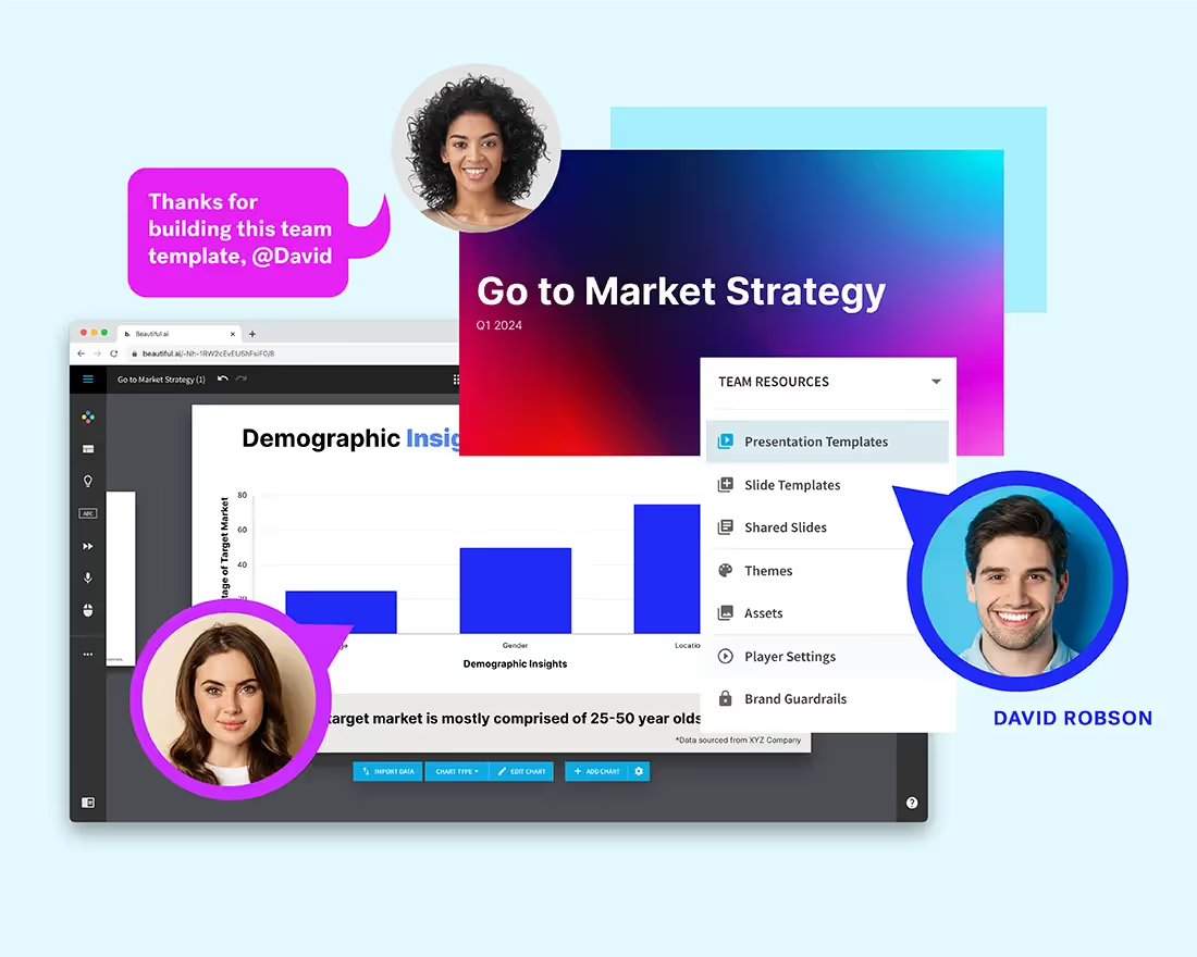
Like any marketing tool, webinars are an extension of your brand. Your webinar presentation should be branded and inline with your company’s creative standards. With Beautiful.ai you can create custom themes to reflect your brand’s color and fonts, and include a company logo on the footer of every slide. Once a theme is created, it is automatically applied to each slide within the deck, so you don’t have to worry about manually selecting or changing things as you go. This helps keep your presentation on-brand and consistent from slide to slide, ultimately making it more professional and visually appealing.
How to make a webinar presentation for free
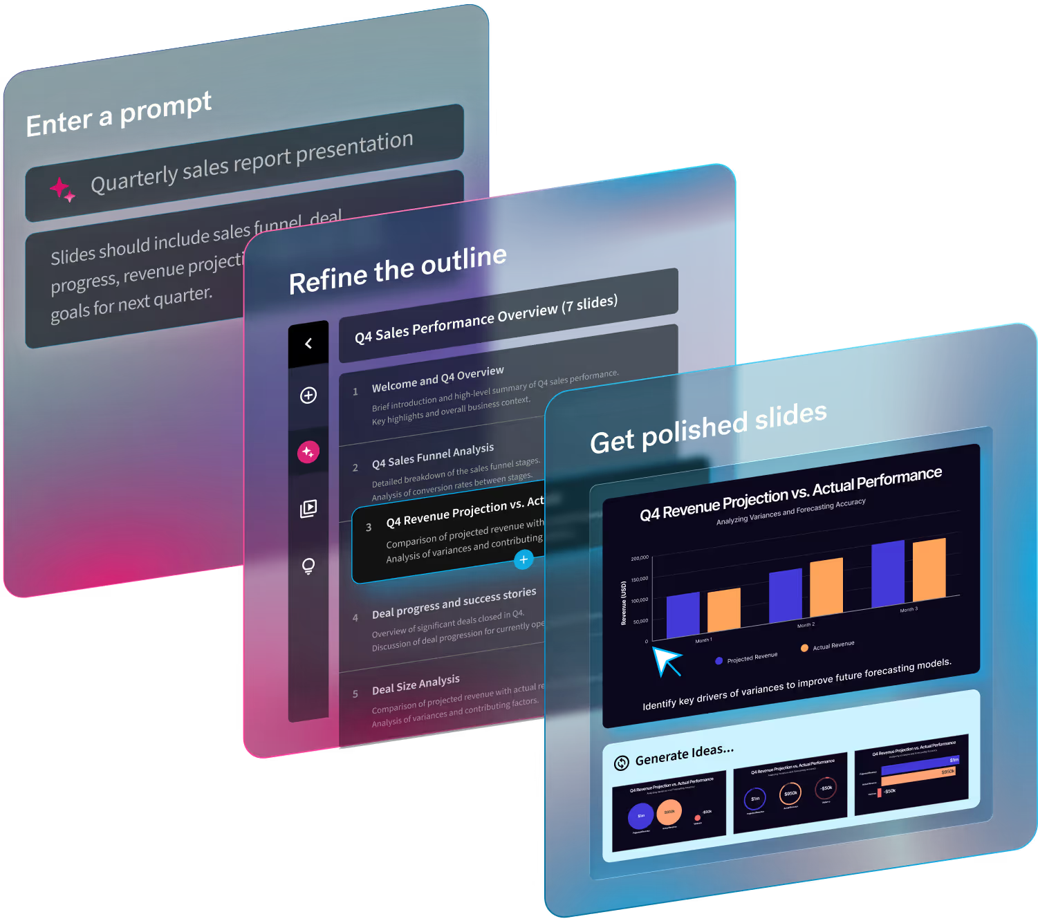
Making a webinar presentation is easy with a free PowerPoint alternative, and Beautiful.ai makes presentation design a snap with our AI-powered software. Simply choose from one of our free presentation templates curated by industry experts, browse the gallery of fully built templates, and start inspired. Once you’ve selected your deck, our slides take on the burden of design and adjust as you add in your content. The ease of use, and principles of good design borrowed from the professionals, helps you make a webinar presentation in half the time with double the impact.
By using a free presentation maker, like Beautiful.ai, it’s easy to send out the deck following the live webinar. Your webinar presentation serves as an additional asset for the audience to take with them and reference again later. If they were especially interested or impressed with your presentation, they might also share it with their family, peers, or colleagues giving your company extra exposure and residual buzz. Beautiful.ai saves everything to the cloud, so it’s a piece of cake to share the latest, most up-to-date, version of your deck. Simply send your webinar audience a follow up email thanking them for attending, and include a sharable link to the presentation which they can open in their browser. With Beautiful.ai’s advanced analytic tools, you can monitor deck views and whether or not people made it to the final slide, which can help you gauge the effectiveness of your slides, and revise your approach and design for future webinars.
Start today and create a deck that will supercharge your next presentation for free.


.gif)

.gif)