It is said that strong presentation skills can define whether or not you are good at communicating. And when doing business, there is nothing more important than getting your ideas across.
Today visual communication takes a major part of the work environment. As a result, design itself became as valuable as ever. But not everyone has what it takes to be a creator. Even some professionals see it as quite a hurdle.
For this reason, Cybernews had a chat with Jason Lapp, CEO of Beautiful.ai to discuss what are the main design mistakes and how to achieve better presentation skills.
How did the idea of Beautiful.ai come to life? What has your journey been like?
Beautiful.ai’s Founder, Mitch Grasso, has been immersed in the presentation business for nearly two decades, starting with his time at SlideRocket. After selling the business to VMware, he was fortunate to be able to spend some downtime exploring new ideas. In 2014 he started building the software that would later become Beautiful.ai, but didn’t start talking to investors until 2016. He hired a team shortly after and the product has evolved from there.
Visual communication is a big part of today’s work environment, which makes design more valuable than ever. Many people want to be creators, but not everybody has the design skills to back it up. Beautiful.ai unlocks the ability to design by giving everyone the tools necessary to create beautiful presentations using automated smart content that obeys the rules of good design. It allows people to make professional-grade presentations spending far less time than they would by using traditional design software.
But visual communication and design are no small feat. It’s not just an obstacle that individuals face, and many of today’s companies struggle to keep their teams on brand and on message - especially when it comes to presentations. Beautiful.ai provides teams with presentation-specific collaborative tools for internal and external sharing, controlled themes to keep every department on brand, easy access to existing content, and insights into presentation performance.
Can you introduce us to your presentation maker? How is AI incorporated into your product?
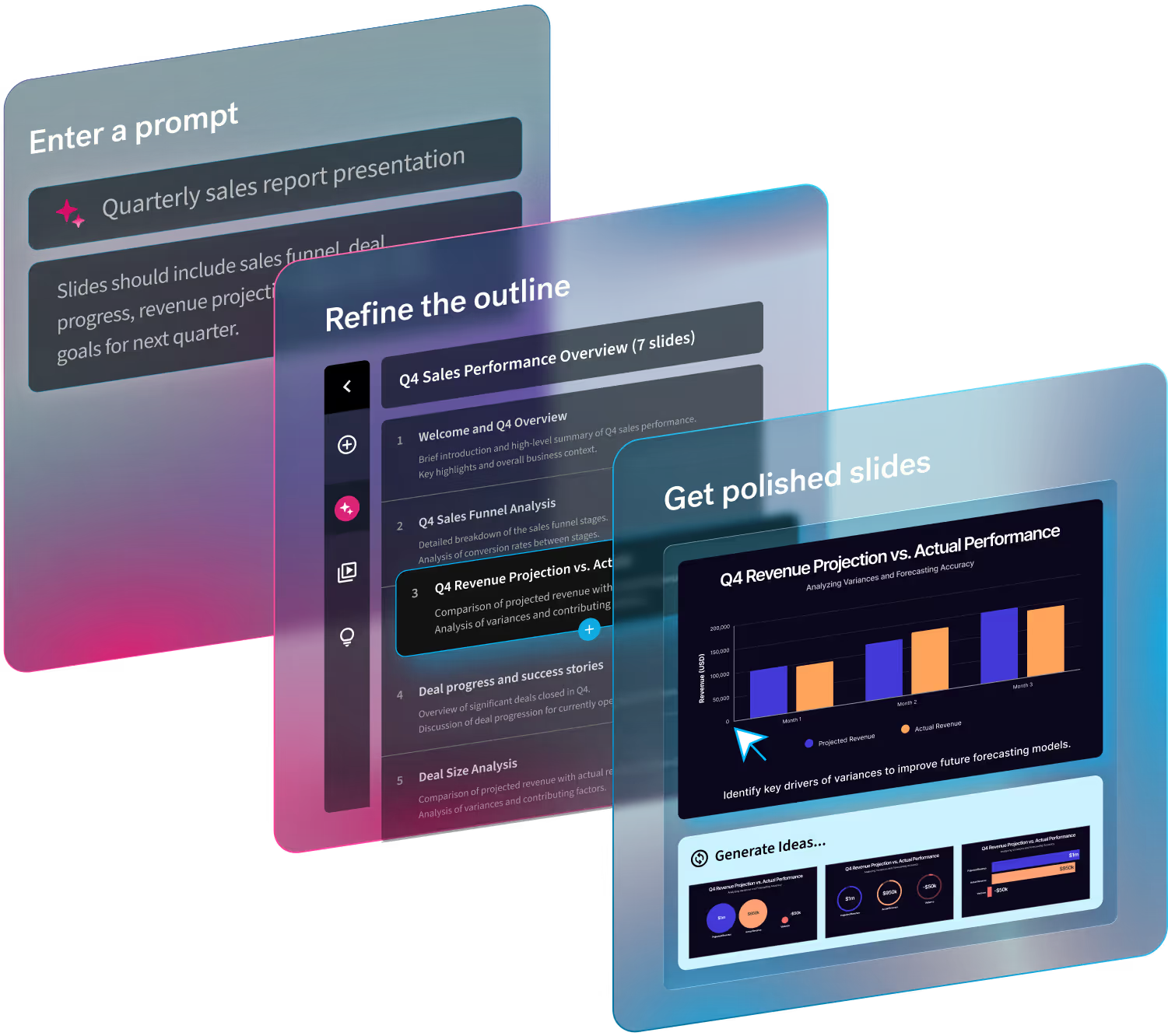
Beautiful.ai’s Smart Slide templates take on the burden of design for presentations to help teams of professionals avoid missteps in the creation process. The AI automatically applies principles of good design to each slide so that teams can focus their attention on the actual story or content, rather than the granular details of the design.
What would you consider the main challenges people run into when designing a presentation?
Information overload: Presentations that include everything but the kitchen sink are hard to follow. Too much information makes it hard to read the slides – let alone comprehend them – because they’re cluttered and overwhelming. The audience won’t know where to focus or what the takeaway is with lengthy blocks of text or jam-packed slides.
Inconsistent slides: A big component of a professional presentation is consistency. And whether that be consistent branding or the flow of the content, a lot of amateur deck designers will miss the mark. Many marketers will notice different versions of the same logo, colors that clash, and a mix of competing font styles and sizes when they do their final pass of the presentation.
Jumbled assets and elements: A Frankendeck at its core consists of jumbled brand assets and design elements. Teams can easily create a mess of assets and elements without a designer’s eye or the right presentation software to guide them. Strong presentations will have a combination of good, proportionate design and strong visuals.
How did the recent global events affect your field of work?
As a tool that facilitates remote collaboration and communication, new users adopted Beautiful.ai early on in the pandemic as they transitioned to new remote or hybrid work environments.
We noticed a shift from individual contributors creating their own presentations to teams working together and collaborating on decks simultaneously. Multiple users were weighing in on presentation content, and teams were able to create content under one roof more seamlessly.
Recently, maintaining creativity has been a serious struggle for some organizations. How can companies foster creativity and innovation when the majority of employees are working remotely?
Professionals in nearly every field are expected to create visually strong content to express their ideas through presentations, documents, data visualizations, web pages, marketing assets, etc. Yet most knowledge workers— CEOs, salespeople, engineers, accountants— are not designers by trade, nor do they want to be. They can appreciate good design, but find less value in learning how to actually create it.
Having design AI allows people of all design backgrounds to create high quality content in a fraction of the time. This allows them to focus on the core of their story versus learning how to become a graphic designer overnight, and it might even inspire them to tell their story in a new, unexpected way.
If someone is feeling especially stuck in a creative rut, we have an inspiration gallery full of customizable, pre-built slide and presentation templates. They were curated by an in-house expert to help get people's creative juices flowing to inspire their own work.
What are some of the key principles that should be followed when creating a presentation?
In my opinion, a great presentation requires you to:
- Use your data to tell a story. Make the data relatable and digestible so your audience can understand your message.
- Choosing the right chart can make or break your slide.
- Less is more, and designers should resist the urge to pile multiple takeaways on every slide.
- Highlight differences between data sets with contrasting colors. Use bold colors to call out important information and tell the audience exactly what you want them to pay attention to.
- Paint a picture and provide additional context with strong visuals. The thoughtful use of images, icons, or shapes can make your slides more memorable.
- Only include the most important takeaways. Be intentional with your text and use it with restraint.
- Utilize dynamic animations to bring data to life and better engage your audience.
Would you like to share what’s next for Beautiful.ai?
Our vision is to democratize design for non-designers and make the presentation process as a whole less of a chore. We want everyone to be able to tell their story, whether that be through presentations, documents, websites, etc.
In order to do so, we're doing the work to integrate Beautiful.ai with your existing workflows so that you can continue to build and manage the best presentations alongside your other documents and software.


.avif)
.avif)
