
It’s true that some of the greatest business ideas of all time were so obvious and simple that we all wonder why we didn’t think of them first. After all, the creator of the iconic yellow smiley face that has become one of the world’s most well-known symbols was paid $45 for his drawing—it went on to generate more than $50 million in licensing fees.
Or how about the Snuggie? It’s a combination of a blanket and a robe… nothing too technical, right? More than 20 million were sold in the brand’s first year alone.
Need we even mention the pet rock? That guy definitely laughed all the way to the bank.
The most profitable ideas often are just so obvious they are ingenious—so useful they leave consumers wondering, "Why didn’t I think of that?”
Customize this pitch deck template for free
Conceiving Buffer
Buffer was born from just such an ingenious idea. Co-founder Joel Gasciogne noticed his Twitter following responded particularly well to his sharing of inspirational blog posts or quotations. But he soon realized the effort required to regularly tweet quality content.
Wouldn’t it be easier to schedule several tweets at a time to sporadically post throughout the day? And of course, the natural hypothetical answer to that question is the epitomal, “Duh!”
While Gasciogne wasn’t the first person to devise a way to preschedule tweets and other social media posts, he noticed the Twitter clients available at the time required specific scheduling by choosing the exact date and time for every tweet.
The native Brit thought it would be so much simpler—and organic—to simply choose and tweet “five times per day,” for example. That way, he could choose all content he wants to share for the day at one time, but not exhaust his followers with 20 posts all at once.
Why was this option not available? In answer to the question, Buffer was born in late 2010.
Still, how do you get from an idea to a marketable product? Most people need investors to transition the product within their minds to the product on the shelves. And how does one attract investors? With a winning pitch presentation, of course—and Buffer was no exception.
Customize this pitch deck template for free
The Pitch
After the successful soft launch of a bare-bones app, Gascoigne and fellow co-founder Leo Wildrich needed capital to establish their brand. Buffer’s impending doom received a last-minute reprieve thanks to an investment from San Francisco based AngelPad, which allowed the small team to continue expanding Buffer for the next six months. Then, in December 2011, the Buffer team managed to raise $450,000 in seed money thanks to 18 essential investors.
But even that investment wasn’t a slam dunk. The co-founders took about 150 meetings with investors who turned them down almost 90 percent of the time. With a then-unestablished brand, they needed one heck of a presentation to raise the kind of backing needed to ultimately hit 1 million users by 2013.
The social media management platform now allows users to schedule posts for Twitter, Facebook, Instagram and LinkedIn through web or mobile applications. It even provides engagement analysis for improved content management. And it’s possible none of it would have happened without their original 13-slide pitch deck presentation.
The original Buffer presentation might have been effective in 2011—obviously the pitch deck helped them raise capital—but it lacked style and charisma. The slides were what would typically be created by an amateur using PowerPoint or a PowerPoint alternative—they lacked a cohesive visual design. The information might have been a sell, but the design certainly wasn’t.
Just imagine how much seed money Buffer might have raised had it used a professionally designed pitch deck. What if Gascoigne and Widrich could have relied on smart templates incorporating all the best principles of professional design like those available from Beautiful.ai?
To answer that question, we’ve redesigned Buffer’s original pitch deck using our special brand of artificial intelligence. Our version is definitely prettier, plus we set up a common theme for the full slide deck, so each slide automatically shares common fonts, color schemes and page design.
Is the presentation more effective when it’s “beautiful?” Let’s take a look and find out:
1. Title
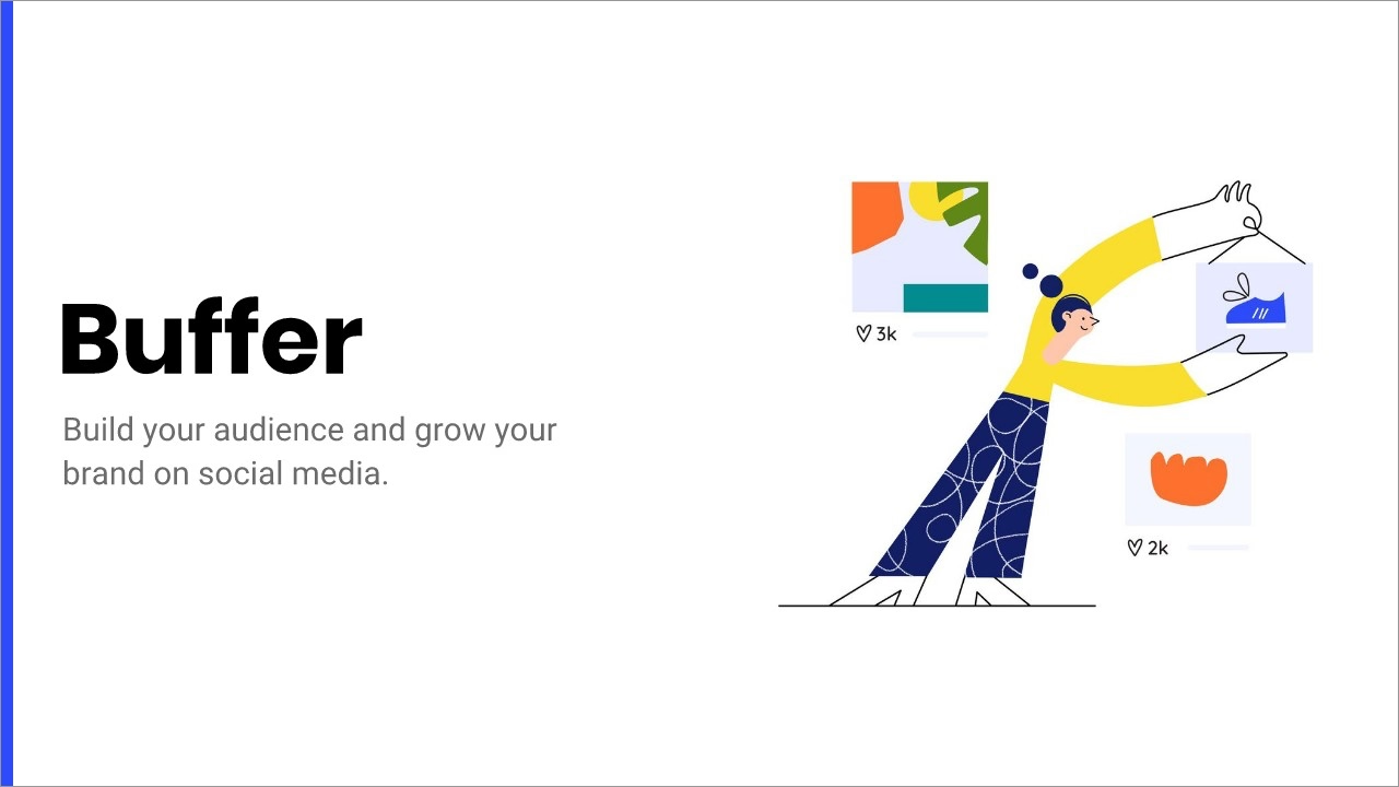
Would you buy a book without a cover? Think of the title page like a book cover—it’s vital for a professional presentation. The Buffer team knew this and included a title page as the first slide in the presentation.
While we found no reason to overcomplicate Buffer’s simplistic first slide (their logo on a black background), we were able to breathe some life into it using Beautiful.ai’s free stock library of images, icons and logos. Just search for a brand or company name, and insert its logo or one of it's brand illustrations in the smart templates.
2-3. Introduction
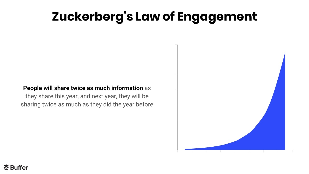
Before bombarding potential investors with data, our redesigned pitch deck takes a second opportunity to engage investors with a brand’s story or personality. One way of grabbing their attention is by relating the brand to a popular or inspirational quotation.
In Buffer’s original pitch deck, the second slide features two related quotes. Neither is too long to share the slide with the other, but combining them tends to dilute the efficacy of both. When we redesigned Buffer’s pitch deck, we placed the quote from Donanza on one slide, followed by Zuckerberg’s Law on the next.
Beautiful.ai’s smart templates make it simple to add pizzazz to an ordinary quotation or short statement. We searched for and chose a free stock image from our library, then overwrite text atop the photo. Beautiful.ai’s presentation software automatically aligns the text and adjusts fonts based on established design principles.

4-6. Problem and Solution
The next slide in Buffer’s pitch deck cuts to the matter at hand. How do you drive traffic with social media? A basic slide with the primary problem solved by the product gives the speaker ample opportunity to interest potential investors by detailing Buffer's competitive advantages.
While we again chose to retain the same content as Buffer’s original pitch deck, we again upped the visual interest of an otherwise boring slide using Beautiful.ai’s customizable color palette. The perfectly aligned text pops with the new bold hue.
If our fourth slide presented the problem Buffer solves, the fifth focuses on how Buffer does it. Buffer’s original pitch deck included a similar slide, but we again added personality to the presentation by adding a colorful, on-brand illo. There’s no reason to save images, format them or resize them. Instead, use Beautiful.ai's built-in image formatting and let our ai-powered smart templates optimize each image to look its best.
7. Traction
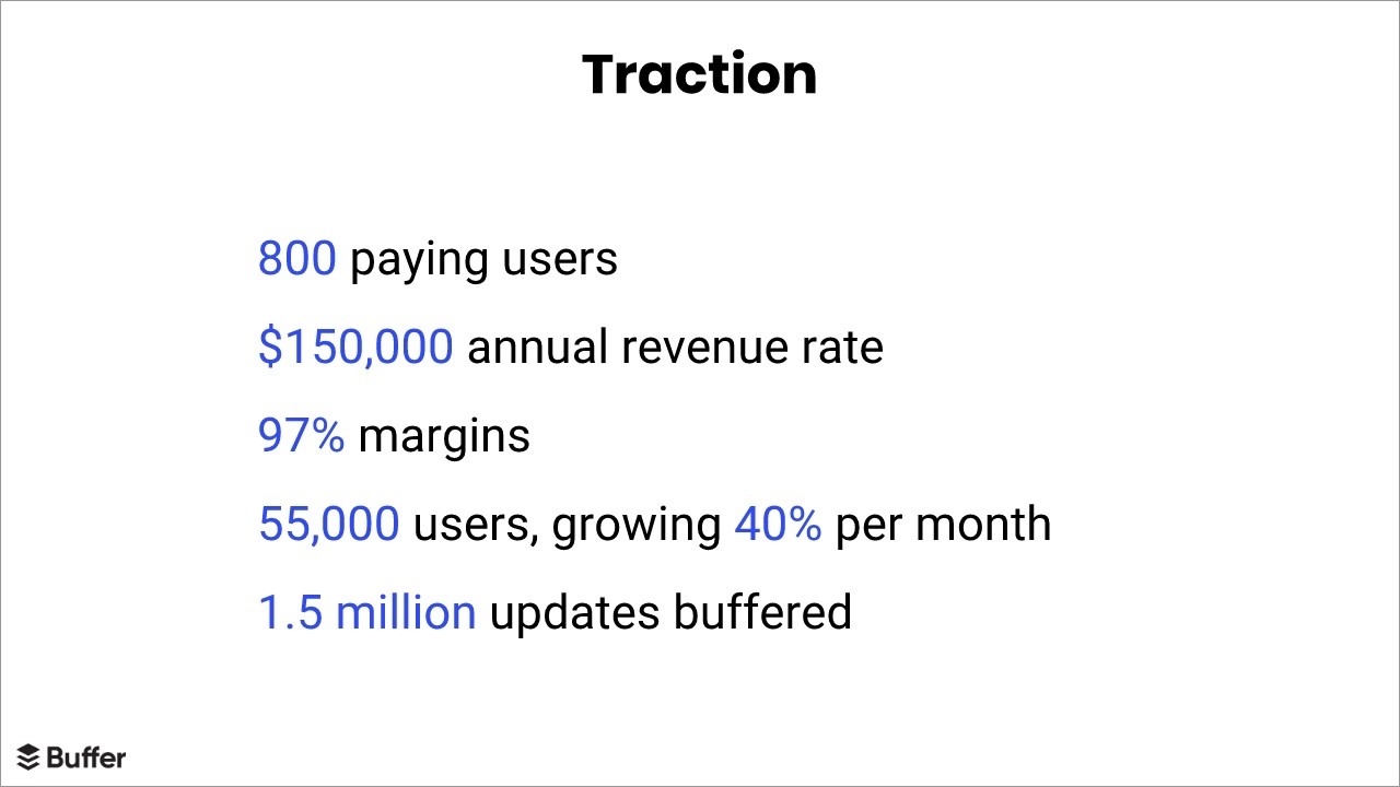
Buffer’s founders placed great emphasis on what they called the traction slide. They felt potential investors would not be interested enough to support their brand unless they could establish traction in the startup pitch deck.
“My advice for first time founders who want to raise funding is almost always to put that thought aside until you have good traction,” Gascoigne wrote on his blog. “Focus on product/market fit. When you have good traction, it becomes much easier to raise funding.”
Still, Buffer’s original traction slide was rather dull. We livened it up by animating the bulleted list. By delaying the appearance of bullet points or list items, each can be emphasized in turn. Plus, our smart templates make it simple to highlight important terms or key metrics, while automatically aligning the text, adjusting all fonts, lines and margins.
8. Milestones
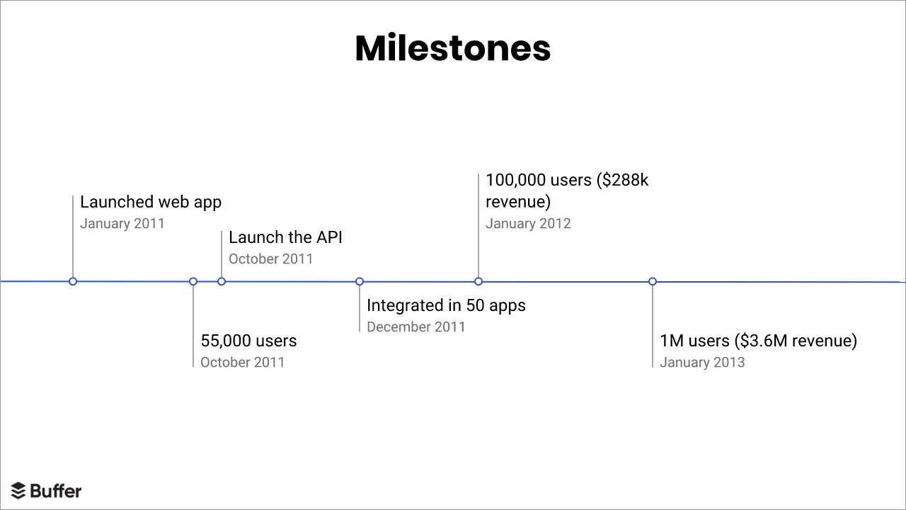
Buffer continued its traction demonstration by highlighting milestones achieved in the company’s short existence. We recreated this slide using Beautiful.ai’s smart timeline template.
It’s simple to create informational graphics using our smart templates—just enter in the figures and our presentation design software transforms it into timelines, bar graphs, scatter charts and more. The infographic not only keeps audiences engaged with the presentation with animations, but the data is more digestible when visually presented compared with strictly text.

9-10. Business Model and Landscape
We again recreated two more slides from Buffer’s original pitch deck by animating bulleted lists and adding pops of brand colors.
Our smart templates make creating and structuring lists fail-proof, and the animation grabs audience attention and keeps viewers engaged with the content. And since we already set up a common theme for the full pitch deck, every slide automatically shares common fonts, colors and page design.
11. The Effects
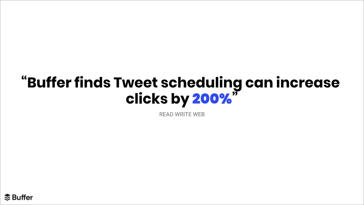
The original Buffer pitch deck again utilized a simple quotation to emphasize its point. It’s one thing to say Buffer increases clicks, and it’s entirely more effective to use a quotation from an authoritative source to demonstrate the “Buffering effect.”
We liked the cleanliness of Buffer’s original slide, but updated it with a more modern font. Since we already set the Design Theme for our slides using the color palette icon, all the fonts and page design elements were automatically adjusted based on principles of good design.
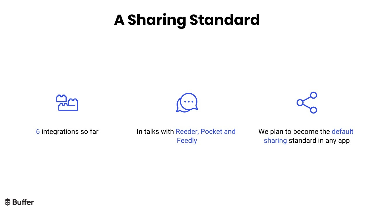
12. A Sharing Standard
Beautiful.ai’s free presentation design software made it simple to improve upon the next slide, as well. We chose appropriate (and free!) icons from the built-in icon library to bring each message to life; creating and formatting the perfect slide in under a minute.
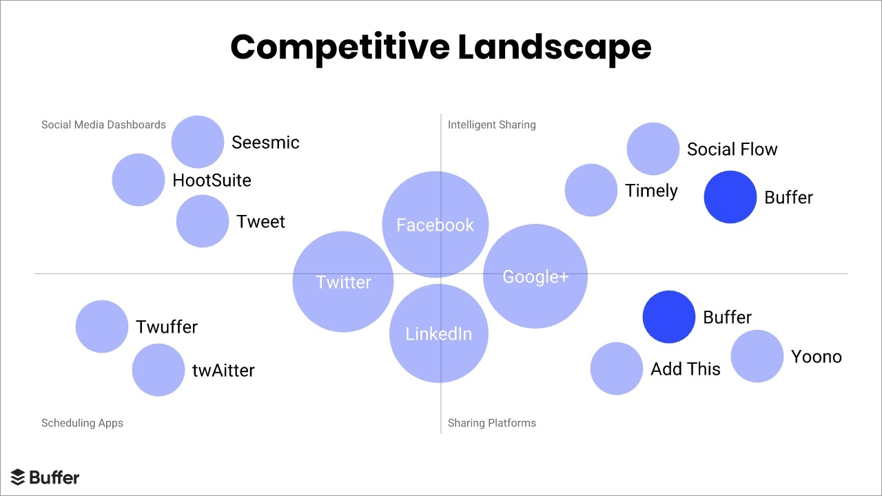
13. Competition
Competitive analysis is a vital element of any successful pitch deck, and Beautiful.ai’s smart templates make it simple to convert the data into an engaging infographic. Buffer’s original pitch deck featured a host of competitor brands littered across the screen – not a very cohesive design.
We recreated the slide using a smart slide template that plots the competitor "bubbles" equally across the grid automatically, so the slide design looks balanced. The XY Plot presentation template serves as a clear visual description of Buffer’s competitive landscape. It's even simple to add animations, attracting more attention to each element as it appears. And again - adding in color for visual interest.
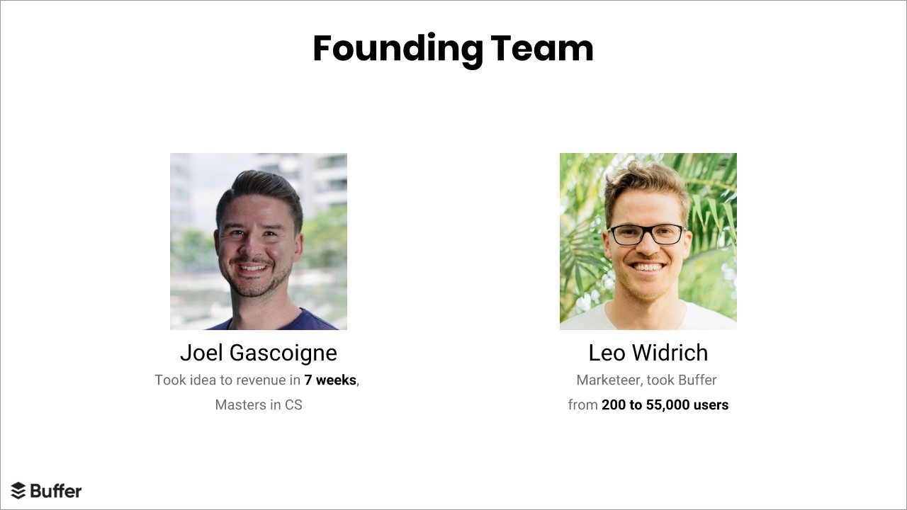
14. Team Members
We consider a “Meet the Team” slide a necessity to any successful pitch deck. Buffer’s co-founders included it in their original pitch deck from 2011, but it’s just as dry and overloaded as the rest of their slides.
Rather than overwhelm potential investors with too many team members' names, we personified Buffer by featuring the co-founders’ smiling faces. Beautiful.ai’s "Team" smart slide template highlights each member of the team equally, with room for headshots.
15. Contact Info
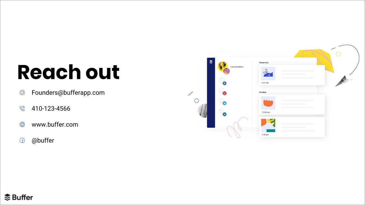
Every good investor pitch deck should tell audiences where to find the company’s home base—or at least how to contact key figures within the brand. This important information usually is presented at the end of a presentation.
Buffer’s original pitch deck included a final slide that couldn’t be more short and sweet: the company email address. We spiced up the slide using Beautiful.ai’s smart template by again inserting Buffer’s logo along with an animated list of primary contact information.
How do you think we did on our pitch deck redesign? Isn’t it pretty now… or even beautiful? You can use our design for pitch deck examples, as a pitch deck template, or you can check out our step-by-step Business Plan guide and presentation template.








.gif)