
The love affair between consumers and subscription boxes has proven itself resilient to the global pandemic, and people can choose to periodically receive practically any product under the sun. From snacks to cosmetics, razors to dog toys, subscription boxes cater to everyone.
Who would have predicted 20 years ago that people could subscribe to receive underwear?
Manpacks was just such a subscription service. Established in 2009, the company offered quarterly shipments of men’s underwear, socks, t-shirts and other personal items— products that all men use but for which few enjoy shopping. Musicians and entrepreneurs Ken Johnson and Andrew Draper founded the company as a side project. It soon struck a chord with consumers, however, and soon Manpacks became their full-time jobs.
Johnson and Draper needed capital to take Manpacks to the next level, and they found it in 2011 through a single round of funding and 11 angel investors. The Manpacks team raised $500,000, and they used it to expand their catalog and boost the company into several years of success.
Alas, Manpacks dismantled about 2018, leaving its subscribers with old underwear and unwanted trips to the department store. The company had a good run, however, and it was made possible by successfully pitching those 11 pivotal investors.
We took a look at Manpacks’ 2011 pitch deck, and we can see why it worked. The presentation did a great job grabbing audience members’ attention by pulling them into a simple yet entertaining story. At the same time, the slide deck wasn’t very cohesive, and even though there were only 12 slides, they as easily could have belonged to three separate presentations.
We can’t help but wonder how much more funding the Manpacks team might have raised with a professionally-designed presentation. How might the company’s fate have differed if the pitch deck had been designed using a consistent and organized theme? What if it had been created using the best design principles relied upon by the pros?
We tried our hand at redesigning the Manpacks pitch deck using Beautiful.ai’s presentation design software, and we started off by customizing a theme common for each slide. Selecting a color palette and specific typography for the entire presentation saves time and ensures a cohesive slide deck— unlike the original Manpacks pitch deck that incorporated multiple incongruent shades of blue. The color scheme complements the Manpacks brand, and we were even able to add the company logo as an automatic footer on the slides.
Might Manpacks be around still to this day with a pitch deck designed using Beautiful.ai’s free PowerPoint alternative presentation software? Take a look at our pitch deck makeover and judge for yourself.
Download the free, customizable template here.
Slide 1: Manpacks Title Page
Just like every book needs a cover, no visual presentation is complete without a title slide. We chose Beautiful.ai’s Headline slide template to fit the bill, and we filled the slide with a high-quality photo found using Beautiful.ai’s free image and icon library.
We then filled in the smart slide with a title and subtitle, and the layout automatically adjusted using design best practices as content was added. That way, even non-designers can create their best work. Designing the entire slide was a cinch thanks to the preset theme.

Slide 2: Meet Dave
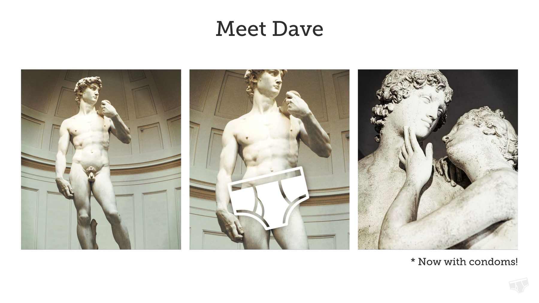
The original Manpacks pitch deck featured a cute story of Dave, whose worn-out underpants served as a girl repellant— that is until met up with a pair of shorts from Manpacks and suddenly became a chick magnet. We loved the concept, but we also think Manpacks’ use of five slides to tell Dave’s story was definitely excessive.
In our pitch deck makeover, we consolidated Dave and his story into a single slide. We used Beautiful.ai’s Photos with Text slide template, and visually told Dave’s story in a series of three photos and a cleverly-placed Manpacks logo.
Slide 3: Why Manpacks?
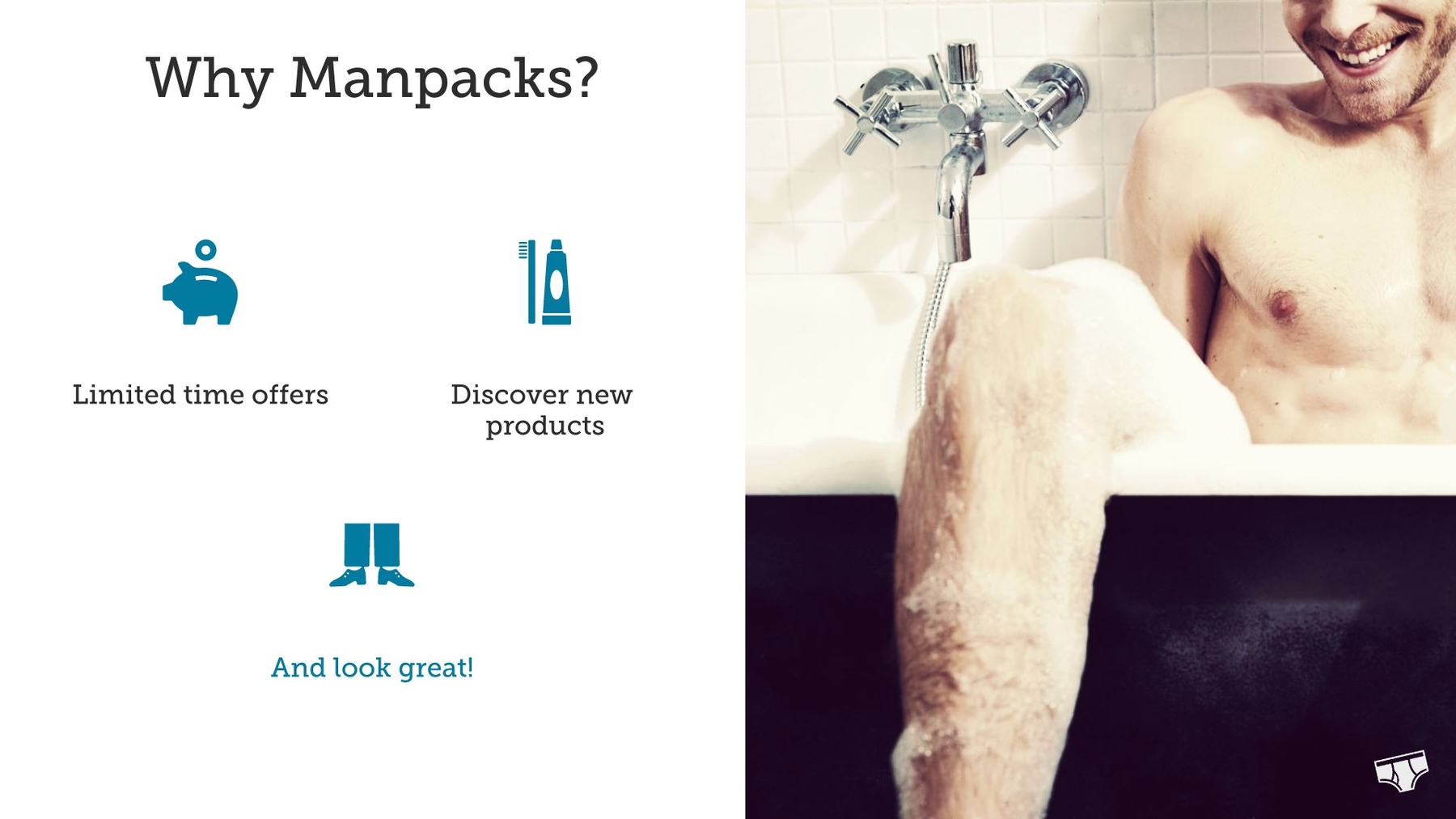
The original Manpacks pitch deck followed up Dave’s story with a slide detailing why customers choose a Manpacks subscription. The simple slide consisted of text against a solid blue background. Boring!
We created a slide with the same content in a far more interesting format. Using Beautiful.ai’s Icons with Text slide template, we added an eye-catching photo to half the slide, while listing the reasons people choose Manpacks with corresponding icons found using our free icon library.
Slide 4: More Time to Be Awesome
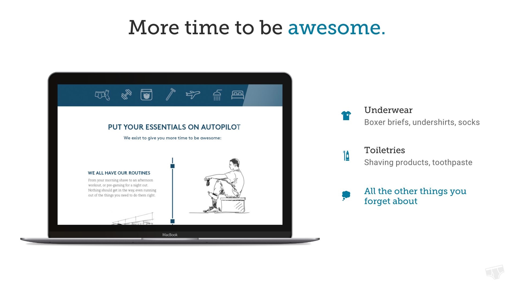
Manpacks’ original pitch deck included a slide featuring a screenshot from the platform… no information, just a screen shot— not exactly an exciting addition to the presentation. The slide just didn’t offer any value to the pitch.
We replaced the slide with our own creation using our Laptop Screenshot slide template. We took a more useful screenshot and placed the image inside the outline of a laptop screen, and we added useful text alongside the image. The slide was simple to create thanks to our customized color and font settings.
Slides 5-6: People Love Manpacks
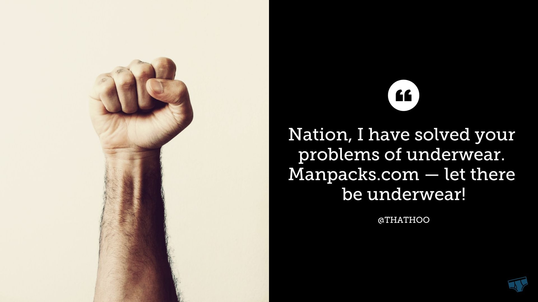
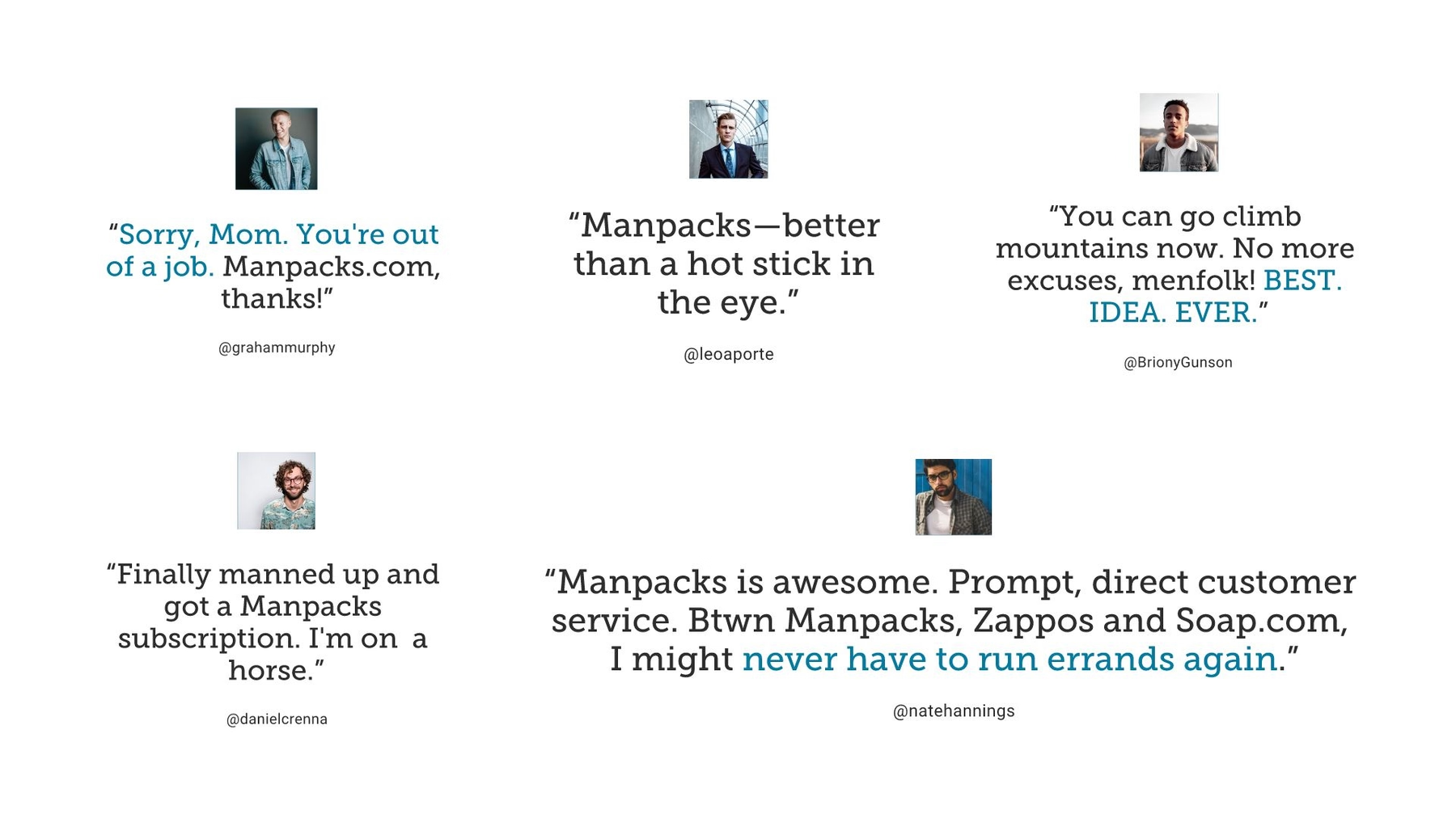
When pitching a company, it certainly can be beneficial to incorporate positive reviews, and the Manpacks team took advantage of its popularity among Twitter users, while also mentioning press it received from major media publications.
We recreated this information across two slides. Using our Image slide template, we made an emphasis with a bold image that pops from the screen and a single impactful quotation. Then, we added the tweets from the original pitch deck using Beautiful.ai’s Photo Grid slide template. The slide automatically adjusted using best design practices as we added additional content, and the photos were easy to find in our vast image library.
Slide 7: Founding Team
Any proper pitch deck should identify the company’s principal players. Beautiful.ai’s Team Members slide template perfectly filled this role. The template— along with our preset presentation theme— is designed so adding photos, names and titles is quick and easy.

Slide 8: Call to Action
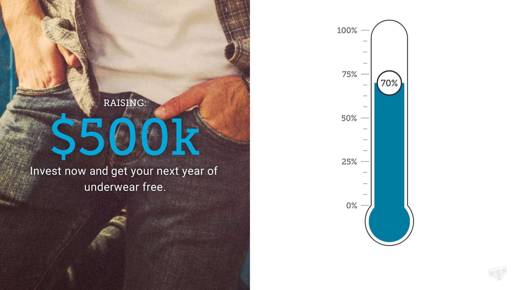
The next slide in Manpacks’ original pitch deck from 2011 summarized its goals and issued the company’s call to action: Invest now. At the time of presentation, Manpacks had achieved 70 percent of its goal, and the slide conveys that information… while putting audiences to sleep.
We redesigned this slide using Beautiful.ai’s Thermometer slide template. On the left half of the slide, we set the financial goal against another high-quality photo pulled from our free image library. The right half of the slide features a thermometer infographic depicting the fundraising progress. Since it’s a smart template, the image automatically adjusts based on the numerical data entered.
Slide 9: Business Card
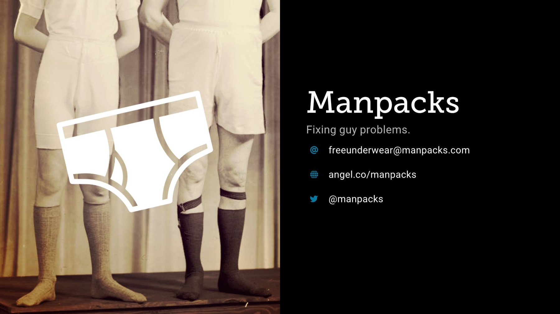
Any effective pitch deck should include the company’s contact information. The original Manpacks pitch deck concluded the presentation with this key data, even if the overall slide was rather dull. We included the same information using Beautiful.ai’s Business Card slide template. We closed out our slide presentation with another image and superimposed the Manpacks logo atop it, then the company details alongside the image.
What do you think of our PowerPoint makeover? Is the redesigned Manpacks pitch deck more cohesive and persuasive? Do you think our version would be more effective? Is it “beautiful?”







.png)

.gif)
