
Can you remember a time when there was no Reddit? It’s hard to imagine in 2021… it would have been hard to imagine in 2011. When Reddit hit the scene as the front page of the internet in 2005, who could have known it would grow to become a zeitgeist of our time?
Founded by college buddies Steve Huffman and Alexis Ohanian, Reddit was part of the now-legendary Y-Combinator program’s first class of startups. The pair of University of Virginia students envisioned an online bulletin board where users could post videos, text and links to other websites… sound familiar?
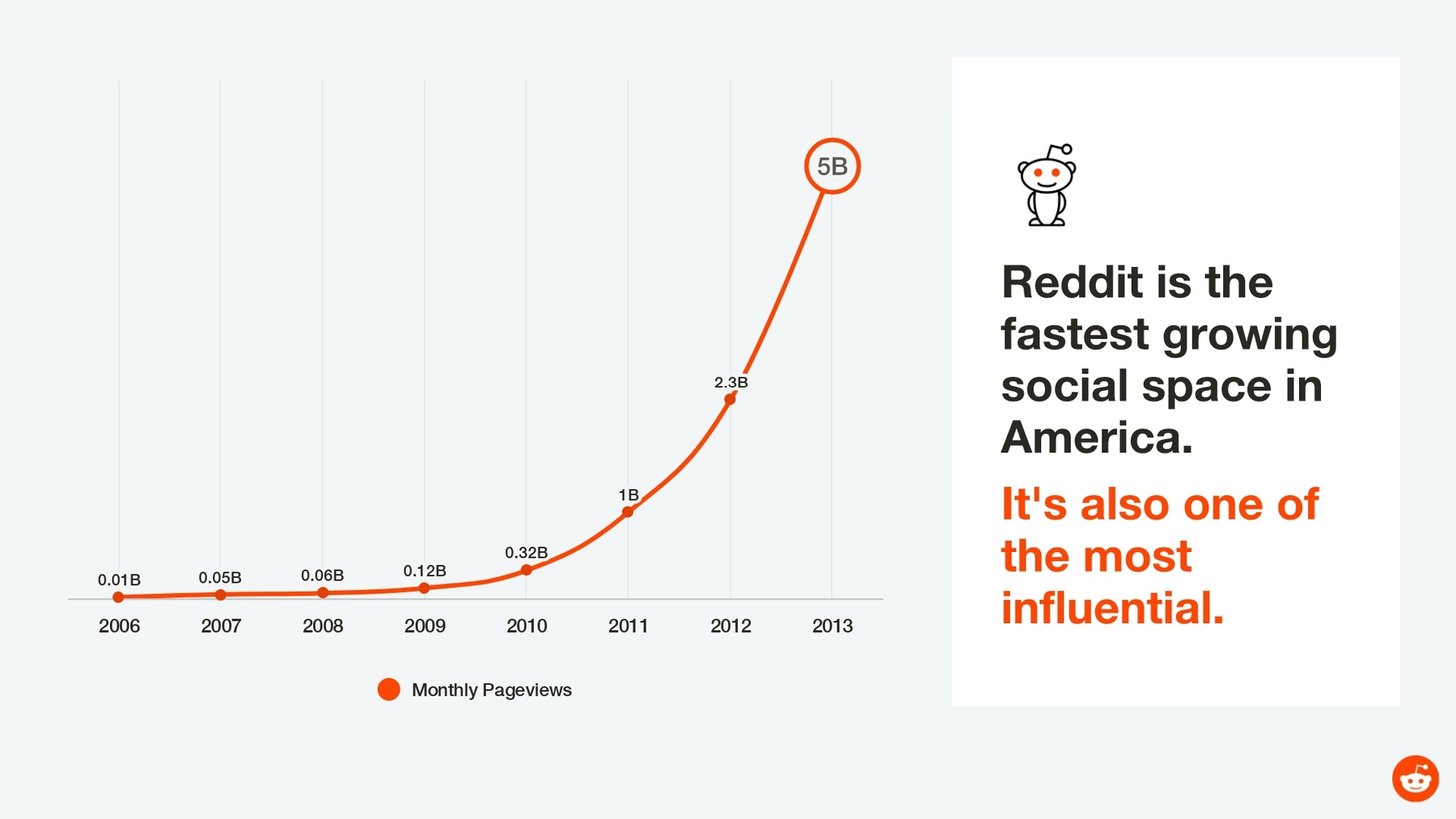
Thanks to that all-important Y Combinator seed funding, Reddit launched with a blast and within just about a year, the growing website was purchased by Conde Nast, publisher of major brands such as Vogue, GQ and Wired. Growth steadily continued, and Reddit reached 1 billion page views per month by early 2011, which it doubled by the next year. From there, the popularity only continued to increase exponentially.
Of course, no company rides the wave of incredible growth without funding, and Reddit – operating independently from Conde Nast since 2011 – was no exception. In 2014, Reddit raised a pivotal $50 million in funding thanks to a round led by former Y Combinator president Sam Altman. Other key players in the funding round, however, included names such as Jared Leto, Joshua Kushner and Snoop Dogg.
More than 52 million Redditors now have access to over 100,000 communities at their fingertips, including popular topics ranging from “gadgets” and “television” to the practical “build a PC” and “personal finance.” In August 2021, Reddit was valued at $9.6 billion. To get there, however, Reddit’s founders started with a pitch.
We took a look at the pitch deck Reddit used for that all-important 2014 funding round, and we have to say it reminds us a lot of the company itself: quirky, fun and memorable. You can’t argue that kittens and unicorns make a strong impression… but was it the most professional impression? If you’re Reddit, you can probably get away with extra quirkiness, but not every company is looking to attract investors like Snoop Dogg.
So, we decided to redesign the pitch deck and give it the Beautiful.ai treatment. We think our version is just as fun, but our design is more cohesive, and it includes better branding. We let our AI take care of the structure, making sure every slide was constructed using professional-level principles of good design any time content is added.
What do you think? Do you like our PowerPoint makeover? Is our redesigned Reddit pitch deck, “beautiful?”

Theme:
It’s easy to spend hours tweaking every design detail in a traditional PowerPoint presentation. Are the margins all the same? Are elements consistent? Is the color scheme cohesive? Instead, save tons of time using Beautiful.ai by preselecting a custom theme and automatically applying style options like typography and color palettes to each slide.
We set the theme of our Reddit pitch deck makeover by selecting the brand’s colors, and we polished off our deck by adding the company’s logo to the footer of every slide. To customize our pitch deck template, just change the colors and logo to match your own.
Slide 1: Reddit Title
Don’t get us wrong. Reddit’s original 2014 pitch deck opened with an eye-catching and memorable image of a kitten riding a unicorn. How can you top that? We gave the title slide a more professional and branded twist with our Headline slide template, complete with the company logo pulled from our vast, searchable library of photos, icons and logos.
Slides 2-4: Reddit by the Numbers
Reddit’s 2014 pitch deck featured a few slides that highlighted Reddit’s achievements to date. While we admire a line chart superimposed over a curious kitty cat staring into space, we decided to stick with a more simple, branded approach. We selected our Line Chart Smart Slide template, and simply input the same data from Reddit’s original graph. Voila! Artificial intelligence transformed the figures into a vivid infographic in the pre-set color scheme. We brought the slide to life by animating it with just a couple of clicks.
Reddit’s pitch deck featured other slides featuring a hodgepodge of statistics, such as the company’s total monthly visitors and pageviews. Plenty of solid information, but the slides were… busy. We took a less cluttered and more organized approach and chose two of the facts to feature on their own Headline slide templates. The simple presentation will grab attention and create emphasis. Once you have your audience’s attention, you can verbally highlight the other statistics.


Slide 5: AdAge Quote
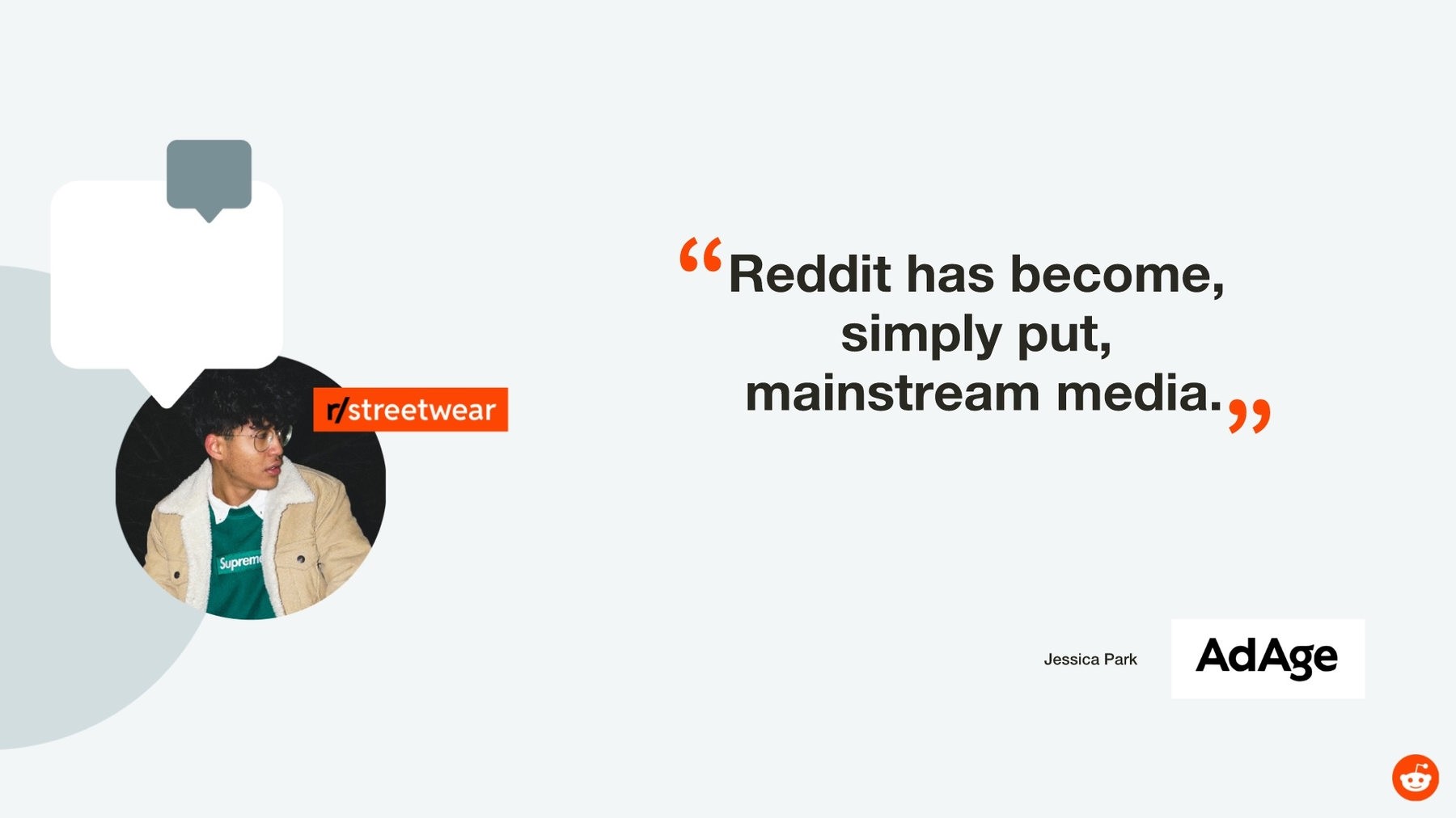
We love a good quote. Reddit’s 2014 pitch deck featured a brag-worthy statement from AdAge, marveling that the website had become, “mainstream media.” The quote was obviously important to Reddit – and effective – so we kept it in our redesigned slide deck using our Quotes Smart Slide template. Our custom color palette and typography were automatically applied to the slide, and we added a free stock photo from our image library for some extra pizzazz.
Slides 6-7: Engagement
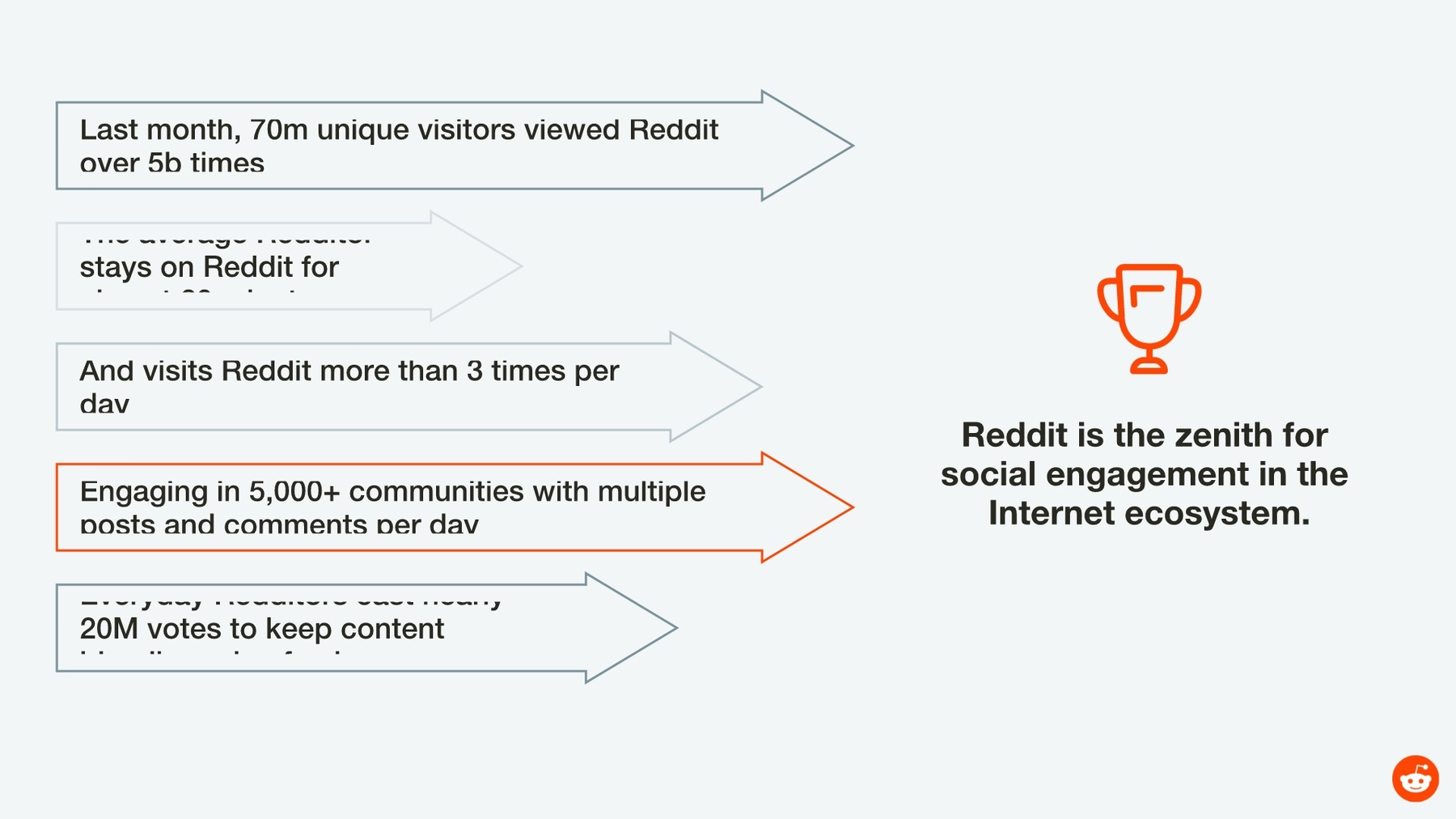
We wanted to include some more newsworthy facts from Reddit’s pitch deck, but we decided to present them in a more engaging and organized format. We chose our Arrow Bars Smart Slide template to present five facts, and we animated the infographic to keep our audience engaged.
We added additional Reddit statistics to our Team Members Smart Slide template. Normally used to introduce people, the format was perfect for describing details of three popular subreddits.

Slide 8-9: Ad Opportunities
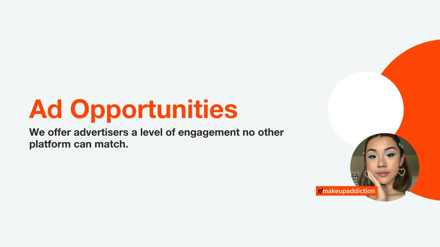
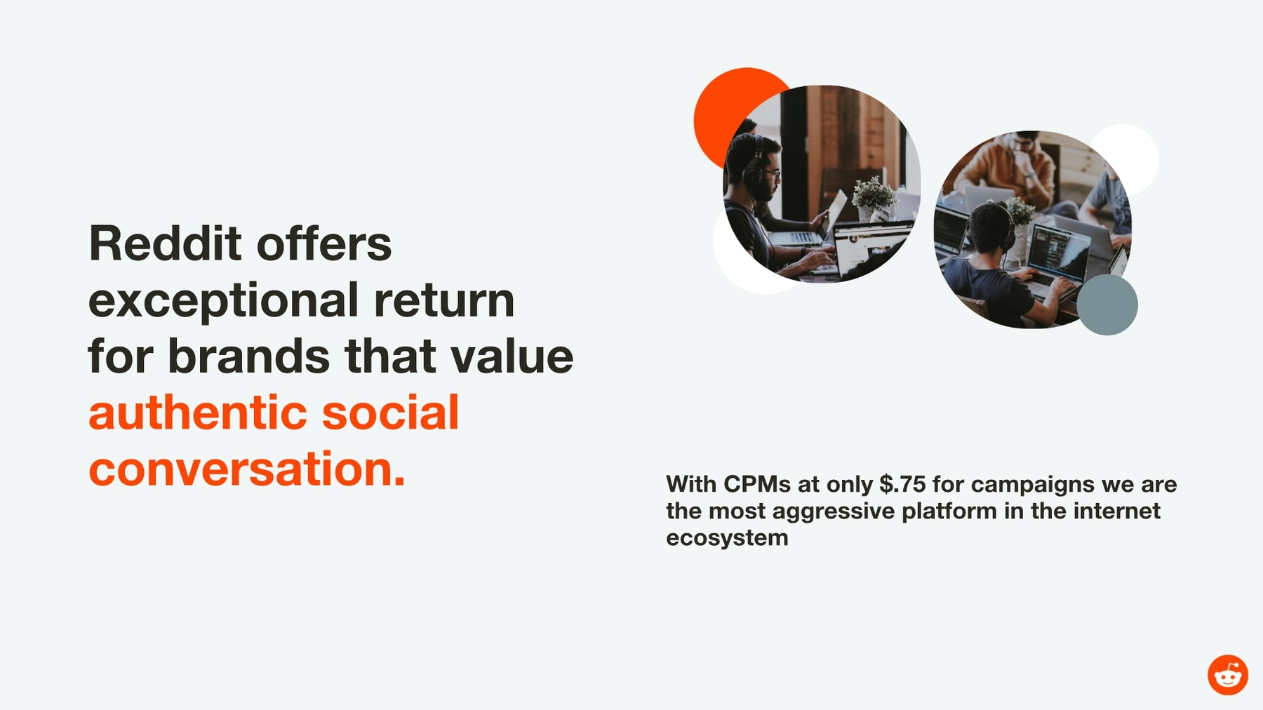
The next slides in Reddit’s 2014 pitch deck were more cluttered examples. We presented the company’s all-important advertising opportunities using our Headline slide template: short, sweet and to the point. We easily sourced an engaging stock photo from our free image library, and, of course, the colors automatically adjusted to match Reddit’s brand. We further recounted Reddit’s stated engagement opportunities for brands using our Photo Grid Smart Slide templates.

Slide 11: Relevant, Reliable, Real
Reddit closed its 2014 pitch deck with a powerful statement. Reddit wanted potential investors to know it was relevant, reliable and real. While we compliment the company again on its creative use of kittens, we chose to highlight the statement using our Headline slide template along with a colorful community of Redditors. The slide was a breeze to create thanks to our preselected theme.

Slide 12: Contact Us
Any good pitch is going to leave potential investors with the company’s contact details, and we had just the slide template to do the job. We recreated Reddit’s final slide using our Contact Us Smart Slide template. The Beautiful.ai template provides fields to input information like name, address, phone number and email address, then our AI perfectly positions the information using the principles of great design.

So, what did you think of our PowerPoint makeover? Did we improve upon the Reddit pitch deck, or did you miss the kittens? Either way, was our design, “beautiful?”







.gif)
.png)