Company culture is so hot right now. And for good reason—new research shows that companies that succeed in creating a healthy work culture are more successful than those that don't. But what makes a good work culture? Employees have cited work-life balance, a welcoming environment, team camaraderie, top-down connectivity and feeling valued as the most important things to them (more important than compensation, even).
But when did the conversation around “company culture” begin? It’s a bit hard to pin down, but many (including Sheryl Sandberg) look to a little company called Netflix as the spark that started the fire in 2009 with the release of their culture deck. The now-famous 125-slide presentation was created by Patty McCord, Netflix’s Chief Talent Officer at that time, in collaboration with Reed Hastings, Co-Founder and CEO.
Download the Netflix Culture Deck
This presentation was created using Beautiful.ai
The original presentation, simply titled “Netflix Culture: Freedom and Responsibility,” spelled out for potential and current employees what it means to be a part of the culture at Netflix. If you made it all the way to the end, you know that the 5 main subtopics (aka key takeaways) are as follows:
- Hire, reward and tolerate only fully formed adults
- Tell the truth about performance
- Managers own the job of creating great teams
- Leaders own the job of creating the company culture
- Good talent managers think like businesspeople and innovators first; HR people last
Even now, the concepts in the Netflix presentation are pretty progressive. The idea of “no tolerance” for immature behavior; the transparency around job performance; the accountability of managers; and so on. But as great as the content in the Netflix presentation is, we can all agree that the design of the presentation leaves a lot to be desired.
Which is why we’ve taken it upon ourselves to beautify it for you—and offer it as a free customizable template so you can craft your own Company Culture presentation in minutes. And because 125 slides is way more than we'd suggest, our version is condensed and only includes the most important topics and subtopics.
As we all know, a strong presentation starts with a strong Title slide. It's the first impression; the outfit your presentation wears; the "tone setter" for the entire talk...aka a very important part of the equation. Let's see how Netflix did.
Netflix Culture Presentation Title Slide: Before
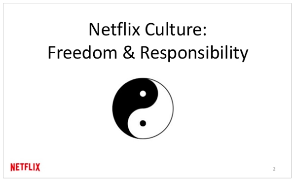
Netflix Culture Presentation Title Slide: After
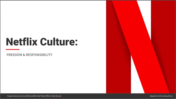
Perhaps you prefer the generic font, microscopic logo and random ying-yang symbol of the original Netflix version—you've got every right to, after all. But we'd like to think that the new Beautiful.ai version communicates something more sophisticated, more mature, more professional. A little more "let's raise the brand bar," if you will.
We do this by having a more prominent logo displayed, using a bold but modern color palette (we used the exact hex codes for Netflix's primary and secondary reds and grays), a clean, sans serif font, balanced, congruent layout of elements on the slide, and a professional presentation byline at the bottom. All these little things come together to say "this is a professional document." And what's more important to company culture than a strong brand?
Let's look at another slide in the "Company Values" section of the Netflix: Culture preso:
Netflix Culture Presentation 'Growth Problem' Slide: Before
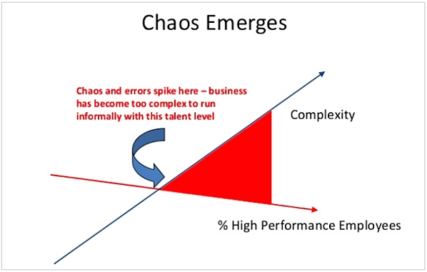
Netflix Culture Presentation 'Growth Problem' Slide: After
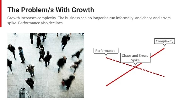
Since the original Netflix version of this slide was text-heavy, with uninspiring graphics (did our stress levels just spike with this slide?), unclear title and outdated font, we felt it too screamed for a makeover. Still, the concept of the slide is brilliant and one most companies can deeply relate to— #growingpains.
So we moved things around a bit; renamed the slide; added imagery for visual contrast; and used a clean font and clearer graph tags to communicate the point: Growth is tricky.
Netflix Culture Presentation 'Growth Solution' Slide: Before
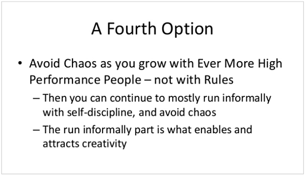
Netflix Culture Presentation 'Growth Solution' Slide: After
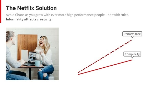
The original Netflix presentation then used the next 12 slides (yes, 12!) to communicate their solution to the problems that arise from rapid company growth, with each slide featuring line after line of text. Not one image or attractive graph or anything, just text. Aka the cardinal SIN of great presentations. (You'll also notice lots of random lines going up and to the right in the original version, but let's ignore those for now before we have an aneurysm).
We'll give Netflix a pass this time—it was 2009 after all—but we think we've said it all (12 slides worth of words) much better with one simple summary slide and some happy smiling faces of staff members below. Check it out:
Netflix Culture Presentation 'Inspiration Quote' Slide: Before
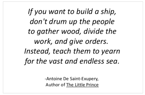
Netflix Culture Presentation 'Inspiration Quote' Slide: After
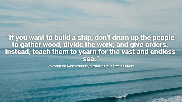
What's more inspiring: a bunch of san serif text on a white background, or a gorgeous ocean scene that illustrates the sentiment of the inspirational quote and gets you excited about contributing to the team? Yeah, we thought so. This one's pretty obvious, so let's move on.
Netflix Culture Presentation 'Teamwork' Slide: Before
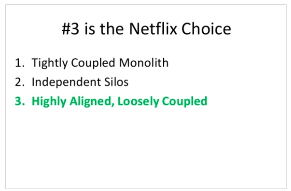
Netflix Culture Presentation 'Teamwork' Slide: After
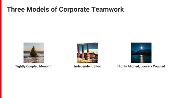
So we have to give Netflix a little credit here. They actually used some color on this slide. Nice! But they could have taken things one step further and chosen supporting imagery to paint a vivid picture of the differences between these three models of corporate teamwork. Our version of slide 90 (yes, it's a long document) offers what none of Netflix's 125 slides do not: context. And because 65% of the population are visual learners, you gotta give 'em visuals if you want them to retain the information you're presenting.

Thus concludes our first "PowerPoint Makeover," and we must admit we're proud of our work here. The best part of all this makeover business? It took us minutes to do. And no professional graphic designer— just Beautiful.ai. For the rest of the presentation, we implemented our tried-and-true "best practices of presentations," including but not limited to:
- Less text on each slide
- Inspirational imagery
- Simple, interesting graphs
- Clean font and typography
- Clear organization (agenda)
- Minimal pops of color
- One idea per slide
- List main takeaway as headline
And voila! The Netflix: Culture presentation just went from Blah to Beautiful, in minutes. Check out the finished product below, and download a customizable version to use as inspiration for your own company culture presentation or start from scratch.





.avif)
.avif)
