Flashback to 2009. Early Facebook employees Adam D’Angelo and Charlie Cheever began discussing the concepts of information and learning during their lunch breaks. The pair pondered a world where anyone could access any sort of information at any given time.
Existing resources such as Reddit and Yahoo Answers just didn’t cut it. Being the bright minds that they were, D’Angelo and Cheever decided to create their own platform to serve as a source of endless information. Quora was introduced in June of that year.
Quora was designed as a social network for questions and answers. Following a beta testing period, the website officially launched in 2010, and by 2011 it boasted more than 500,000 registered users.
Users can utilize Quora in multiple ways. They can ask a new question by directly addressing prolific Quora users who boast expertise on the relative topic, then wait for replies. Answers then can be denoted as useful or not, offering questioners crowd-sourced insight on the accuracy of the responses.
Users can also search Quora for similar questions already asked and answered, and they can follow those whose answers they find useful and interesting. Quora users can follow a topic or specific questions, receiving notifications when new content is added. Possibly the most used features are the related answers that appear toward the top of Google’s search results when a question is typed in the search bar.
By 2020, 300 million users visited Quora’s website every month. Then, in August 2021, Quora launched a premium subscription membership, and it began allowing its contributors to monetize their content.
Since its inception, Quora has raised more than $225 million from investors in four funding rounds, and the company currently is funded by 15 investors, including Matrix Partners, Collaborative Fund and Y Combinator.
Of course, before any of that could happen, Quora’s founders had to score that first investment to launch the brand— and to do that, they needed a stellar pitch deck. The slide deck Quora used for that first pitch was plenty informative, and it included engaging infographics to help tell the company’s story in data.
Still, it could have featured a more cohesive color palette, and many of the slides were cluttered with too much information. It wasn’t exactly the epitome of how to structure a presentation deck, but Quora still found success with it. Because we love trying our hands at redesigning some of the most famous pitch decks, we present another PowerPoint makeover: the Quora pitch deck.
Theme
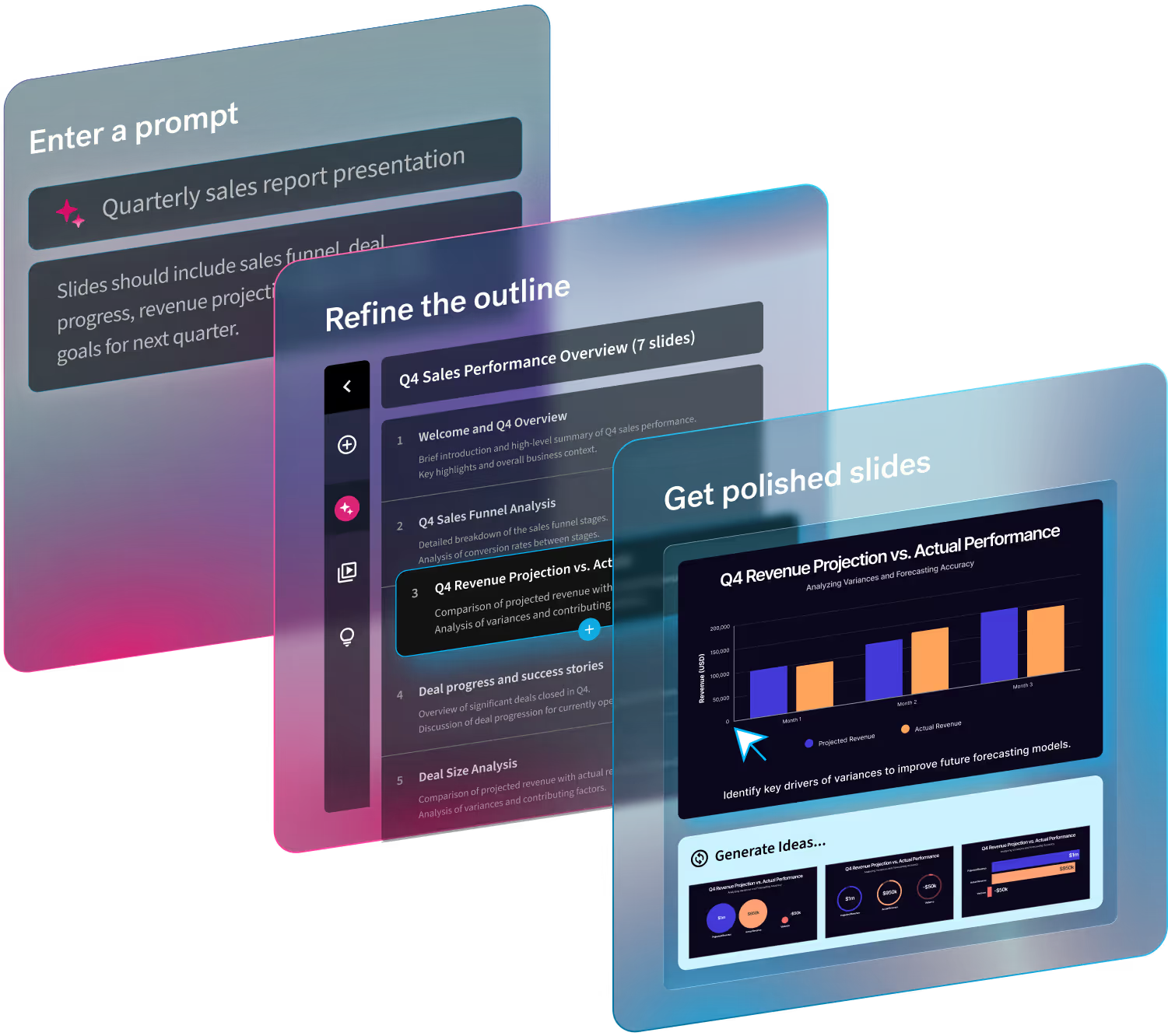
Slide deck designers can spend hours tweaking the design details of each slide in a traditional PowerPoint presentation. We saved tons of time and designed a professional-quality pitch deck by customizing a common theme, which automatically applies style options like typography and color palette to each slide.
The theme ties together the design from every slide into a presentation that is unified and cohesive. Beautiful.ai users can choose from a variety of themes curated by our design team, adjust the settings of each one or start a new theme from scratch that coincides with a brand’s style guide. We also customized a footer for each slide, selecting Quora’s logo found in our free image library.
Slide 1: Quora Title
The original Quora pitch deck started out with a teaser slide, an opening graphic that catches the audience’s interest and offers a clue to the following content. Because this is a pitch deck, and audiences are already prepared for the topic, we omitted that slide in our redesigned pitch deck and instead started our deck with a bold title slide using Beautiful.ai’s Headline Smart Slide template.
We think the bright background and colorful image from our vast library of free stock photos, icons and logos will grab potential investors’ attention and generate interest in whatever content might follow.

Slide 2: Knowledge Meets Search
We included the rest of the content from the Quora pitch deck’s introduction on a second slide. The simple statement clearly communicates Quora’s purpose to potential investors still unfamiliar with the then-fledgling company. We again chose the Headline Smart Slide template, but this time added an eye-catching image to the bottom portion of the slide. We animated the appearance of the slide’s content to add some extra pizzazz.

Slide 3: The Problem
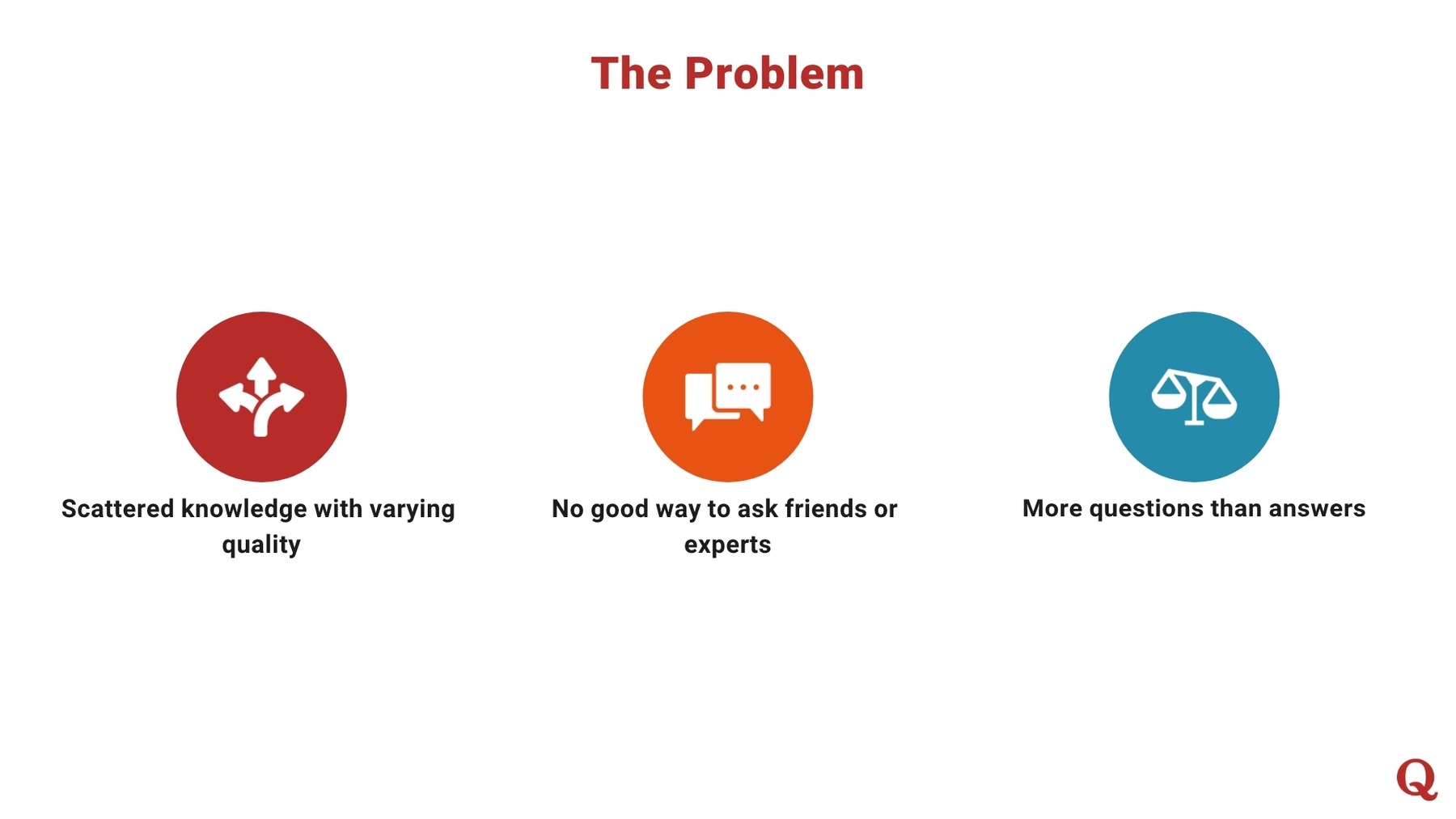
Quora’s original pitch deck next showcased its team, providing details on the company’s principal players, but we decided to omit that slide in our PowerPoint makeover. Instead, we chose Beautiful.ai’s Icons with Text Smart Slide template to illustrate the problems that Quora would solve.
We kept it interesting by again animating the slide so each icon appears in order from left to right. Each icon was found in our expansive library of free images, and the colors of the slide automatically adjusted to match our present theme.
Slide 4: Enter Quora
We felt it appropriate to follow up the problem Quora solves with a slide illustrating the solution the website offers, so we moved that slide from Quora’s original pitch deck to our No. 4 spot. Instead of another PowerPoint-esque bulleted list, we transformed the slide by choosing Beautiful.ai’s Product Screenshot Smart Slide template.
We added a Quora screenshot to the image of a mobile phone, and we illustrated the bulleted points with icons found from our free image library. We animated the appearance of the bullet points so they appear one at a time.

Slides 5-6: Why Now?
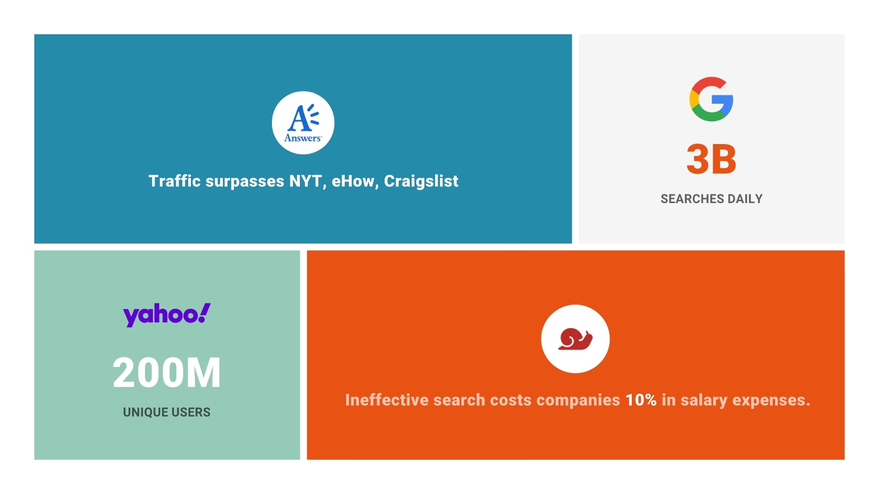
Quora’s original pitch deck featured a slide describing the various reasons why 2009 was the perfect time to launch Quora. We presented the same information in two slides. First, we selected the Headline Smart Slide template with the bold statement, “Why Now?”

We followed up that slide with Beautiful.ai’s Image Grid Smart Slide template. We included five cells, each detailing a 2009 fact supporting the market’s readiness for an extensive question and answer platform. In each text box, we also added various company logos found in our free image library.
Slide 7: Online Activities Data
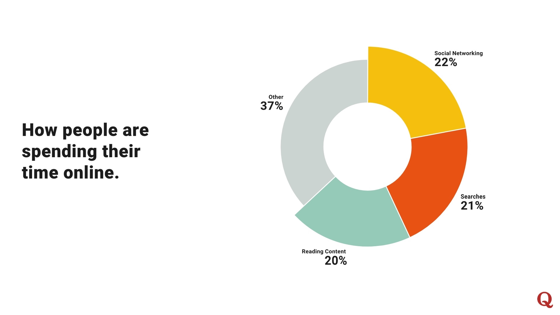
How were people spending their time online in 2009? The next slide in the Quora presentation featured an infographic that illustrated what portion of all time online people spent conducting activities such as online shopping, social networking and search.
We recreated this infographic using Beautiful.ai’s Donut infographic as our Smart Slide template. Like with any Beautiful.ai infographic template, we simply entered our data and watched as artificial intelligence transformed it into an eye-catching and informative data visualization.
Slide 8: Marketplace Data
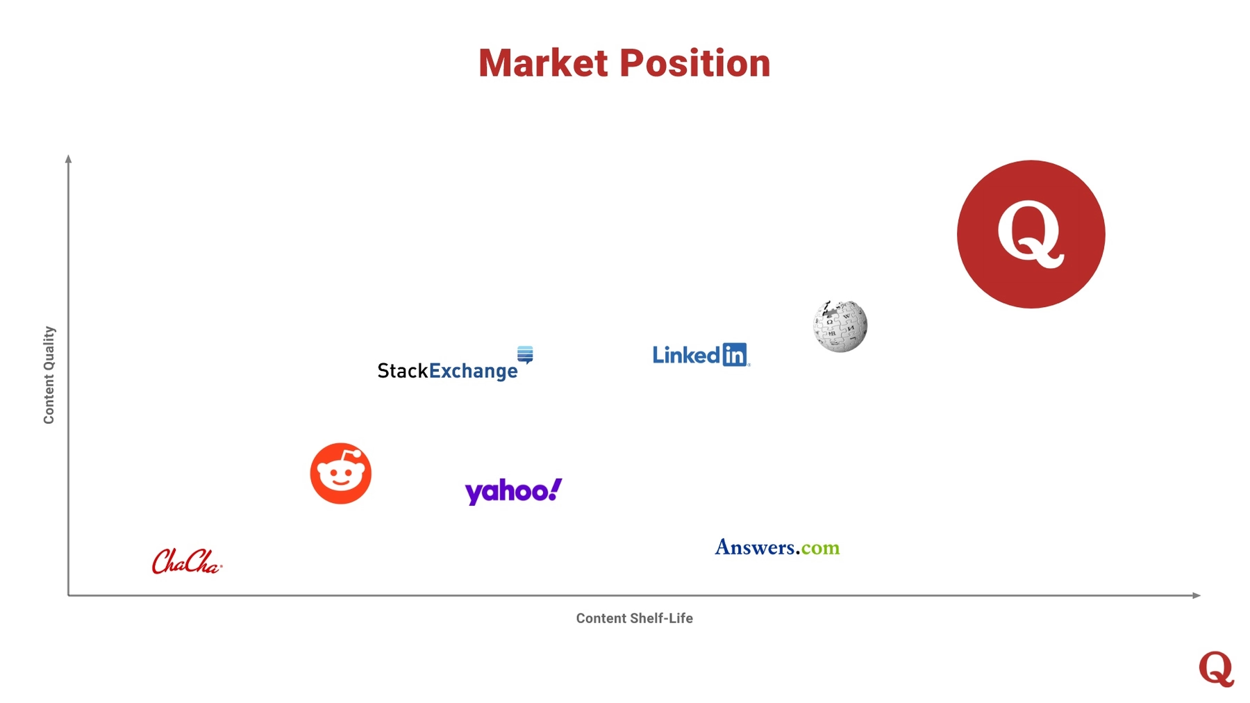
We chose to redesign another of the original Quora pitch deck’s later slides in our No. 8 position. The original slide illustrated other platforms in the 2009 market, plotted on a chart with a quadrant XY plot.
Beautiful.ai also features a scattergraph plotted on an XY axis, and the Smart Slide template automatically adjusted the infographic’s design each time we added new data. Instead of colored dots, we plotted each company in the marketplace using its logo pulled from our vast image library.
Slide 9: Quora Vitals Data
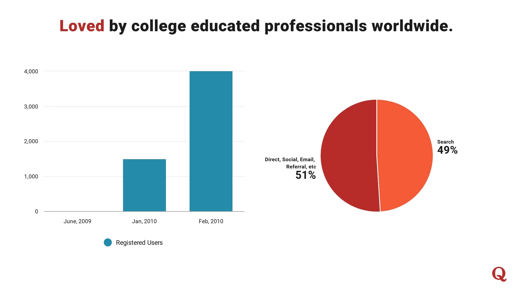
The original Quora presentation also illustrated the growth of its customer base using two infographics: the classic bar graph and pie chart. Our PowerPoint makeover features the same two infographics, recreated using the appropriate infographic among our smart slide templates.
Slide 10: Quora Timeline
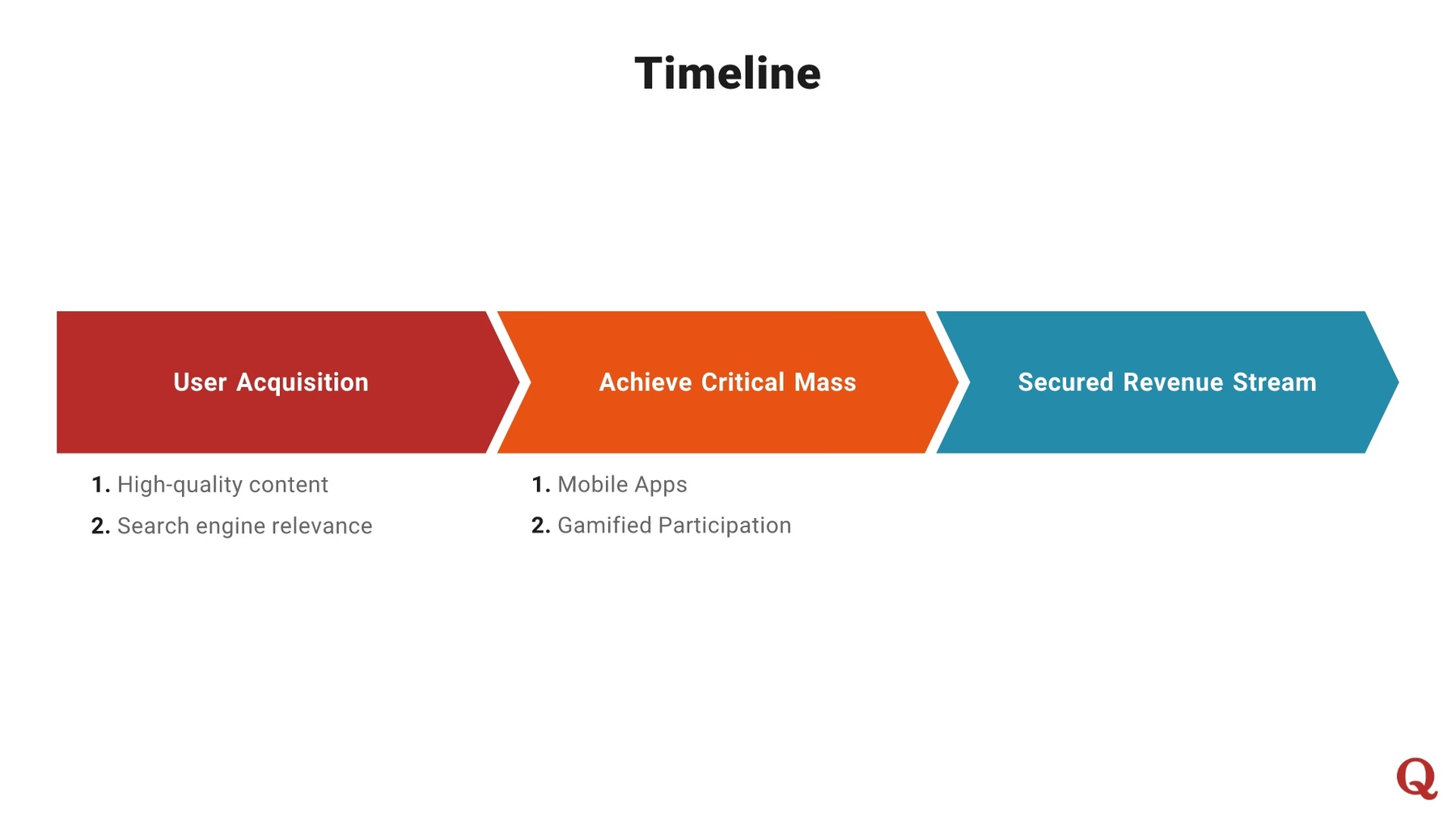
Quora’s original pitch deck also included a timeline of the company’s revenue stages, illustrating the chronology with some basic text boxes… quite the bore. Fortunately, Beautiful.ai features its own timeline Smart Slide template, as well as our choice: the process diagram. We included three steps in our diagram, and simply labeled each section and modified the color using contrasting hues.
Slide 11: Financial Data
To redesign the original Quora slide detailing some basic financial information, we created a simple slide, taking advantage of ample white space to make the single illustrated figure— $10 million— stand out.
While the slide grabs an audience’s attention, the presenter can discuss other financial details without overwhelming audiences by including all the data on the slide. We again chose Beautiful.ai’s Photo Grid Smart Slide template, but stuck to just a single item, while adding bulleted details as a sidebar.

Slide 12: Quora Closing Slide
Every strong presentation concludes with an equally strong closing slide. We redesigned Quora’s original slide using Beautiful.ai’s Product Screenshot Smart Slide template, only this time we selected an image of a desktop computer monitor. We then added another bold and colorful image from our image library to the unit’s screen, and we included a strong closing question, as well as the company’s contact details.

What did you think of our redesigned pitch deck? Did we improve on Quora’s original presentation? Was our design, “beautiful?”
