
Discord, a company founded by Jason Citron and Stan Vishnevskiy in 2015, was built on the idea of creating a space for everyone to find their community. The online platform is a voice, video, and text communication service used by hundreds of millions of people around the world looking to connect with each other. The company has undoubtedly grown since creation with 150M monthly active users, 19M active servers each week, and 4B server conversation minutes daily.
Company growth, like Discord’s, often warrants a rebrand to reflect the evolution of the business. And Discord felt like their brand needed a refresh to better represent the welcoming nature of their platform. To celebrate the company’s 6th birthday in 2021, they opted for a complete overhaul of their brand. The rebrand included freeing “Clyde"— the Discord logo— from his chat bubble, a more saturated “blurple” (blue-purple) brand color, and an updated font.
Discord’s rebrand was meant to better encompass the core values of the company, something that many businesses can relate to. Their rebrand journey was the muse for our own rebrand presentation template that other businesses can use to refresh their company presence.
The Discord Rebrand Presentation Template
Discord’s rebrand was designed to exhibit a more welcoming experience from start to finish, but first they had to do an overhaul of their existing branding. A rebrand like that requires organization so that teams can align on important brand developments and guidelines.
This presentation is using Discord's 2021 rebrand as inspiration to showcase the type of slides that can help marketers present the new face of their brand to employees, partners, and investors in a more impactful way. You can see more details of their rebrand here.
Title
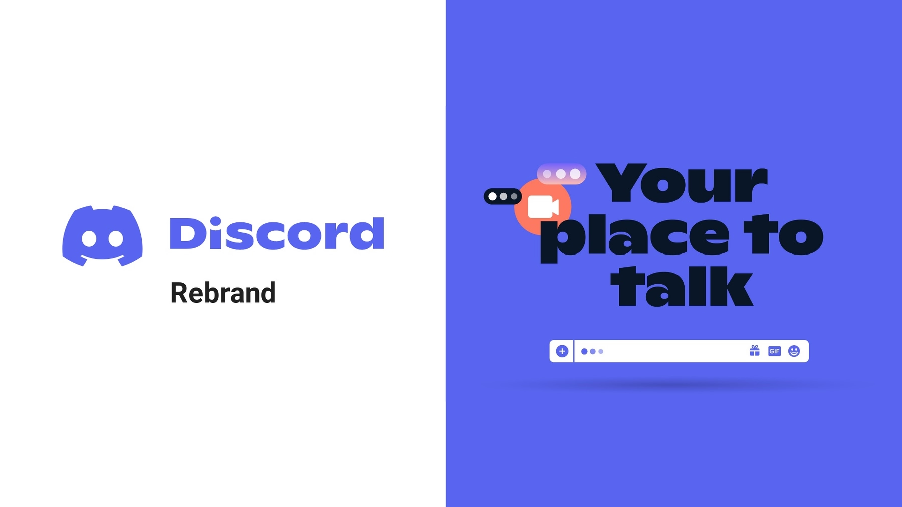
Like any title slide, the title of your rebranding deck should be eye-catching and bold. A Title slide can either make or break your presentation by hooking the audience early on or losing them to boredom. Because this is a rebrand presentation, your title slide is the first introduction to what the new company identity will look like. It should include an on-brand background, your new logo, and incorporate pops of your new brand colors— in Discord’s case their "blurple" and "Clyde".
The Pitch
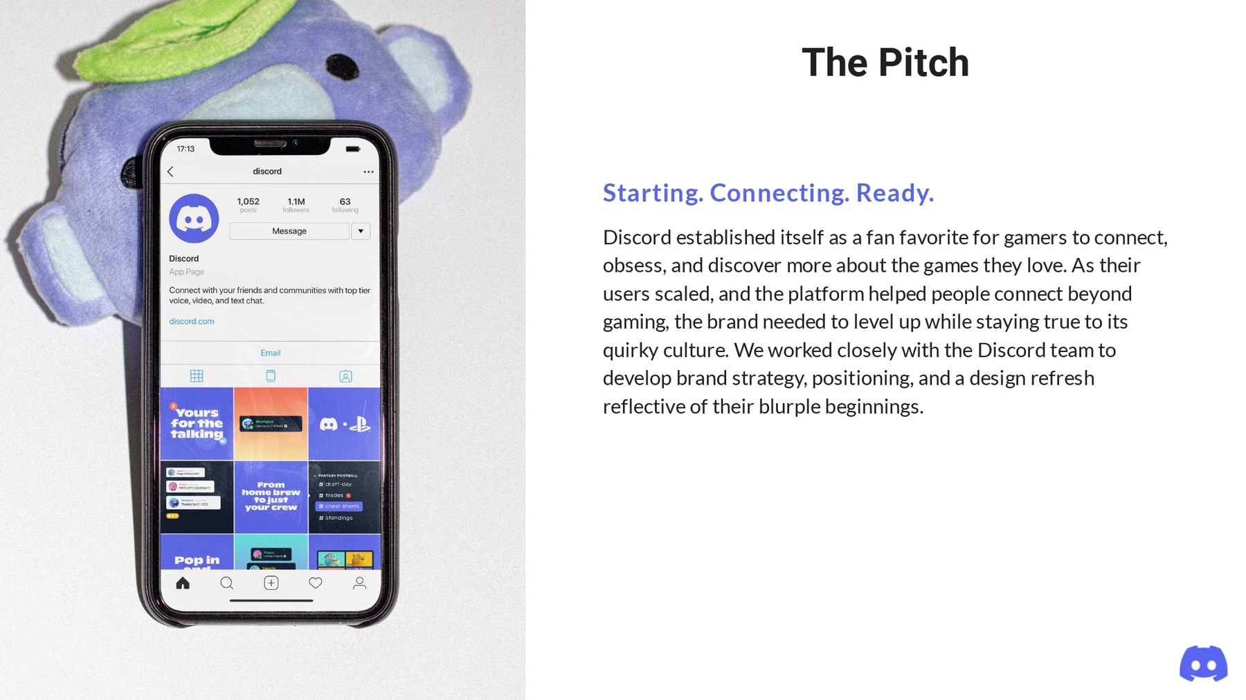
Including a pitch slide is sharing your “why” for the project. When presenting your rebranding to key stakeholders— like investors or partners— the pitch should outline why your team chose to do a rebrand and what you intend for it to do for the business. Use a bullet point slide early on in the presentation so your audience understands how you landed on certain design choices.
Introduction
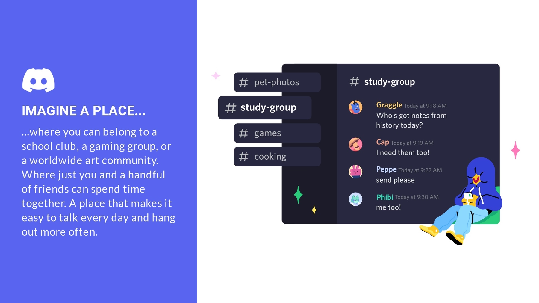
Set the tone for your rebrand presentation with an introduction about the company. In the Discord rebrand, we included a slide that paints a picture of the brand and the value it provides to its customers.
A quote
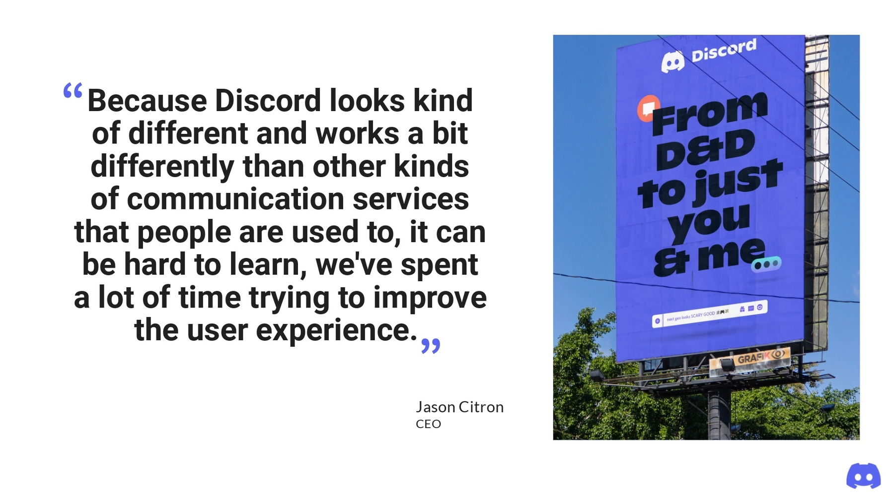
To provide more context, you might include a quote in your rebrand presentation. In Discord’s rebrand presentation we added a quote from their CEO, Jason Citron. Whatever quote you decide to run with, we recommend using our Headline or Quote slide with contrasting colors so the text pops.
Design Team
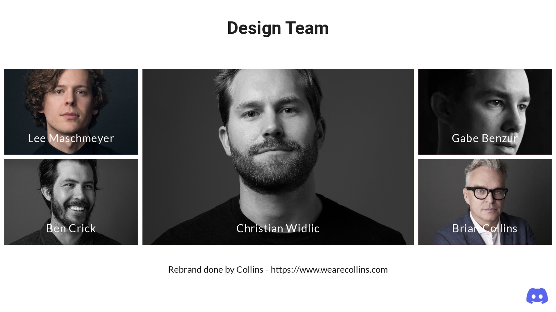
Most rebrand presentations will include a slide of the design team who owned the project to give credit where it’s due. Collins is the transformation agency that led Discord’s rebrand, so we included their team on this slide. Our Team Members slide is great for introducing the design team and how they each contributed to the new brand identity.
Brand Attribute
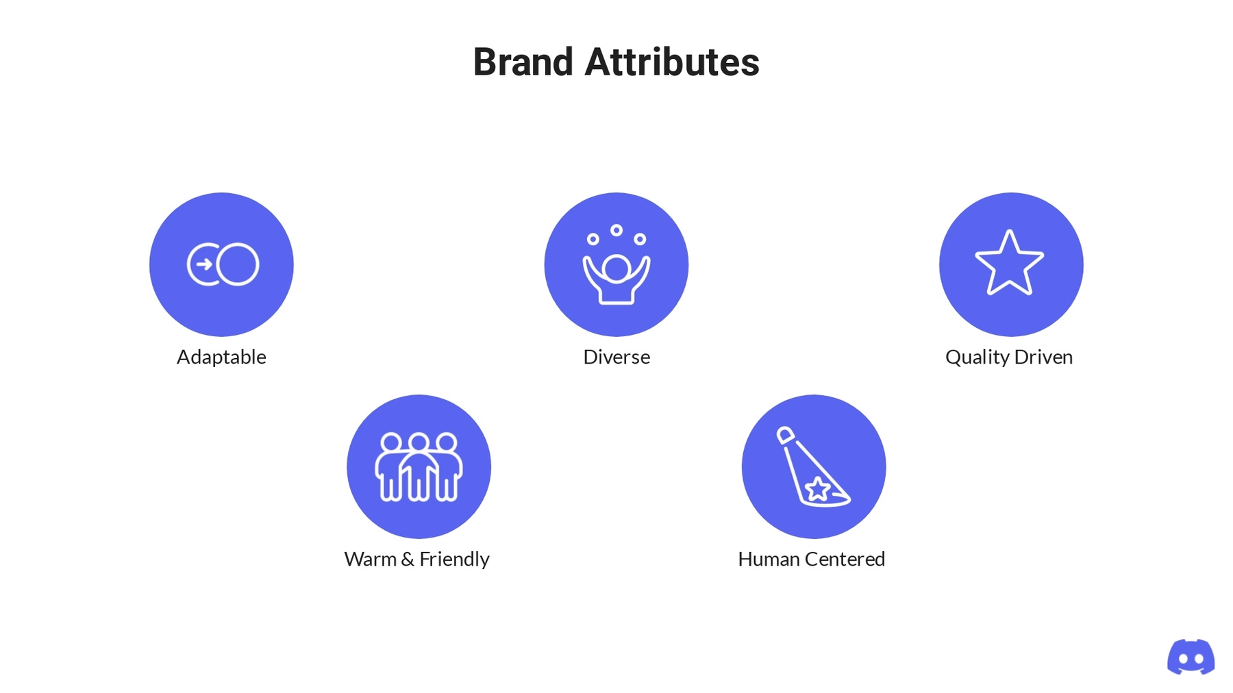
What are the key attributes of your brand? These are the characteristics and core values that make up your brand as a whole. In Discord’s case, we included things like adaptable, diverse, quality driven, human centered, and warm and friendly. Use our Icons with Text slide to list out your brand attributes so that your team can understand how you landed on certain branding decisions.
Logo
A brand overhaul will almost always include a new logo. In a rebrand presentation you can include a Photo Grid slide to showcase the new logo on both a dark and light background. Like we mentioned above, Discord’s new logo removed the chat bubble that previously surrounded “Clyde”.

Logo evolution
If you want to take it a step further, you might include the evolution of the logo. This helps stakeholders understand key differences between the old and new logos, and the rationale behind the changes. We used a Photo Grid slide again to share an animation of the creative process.

New colors
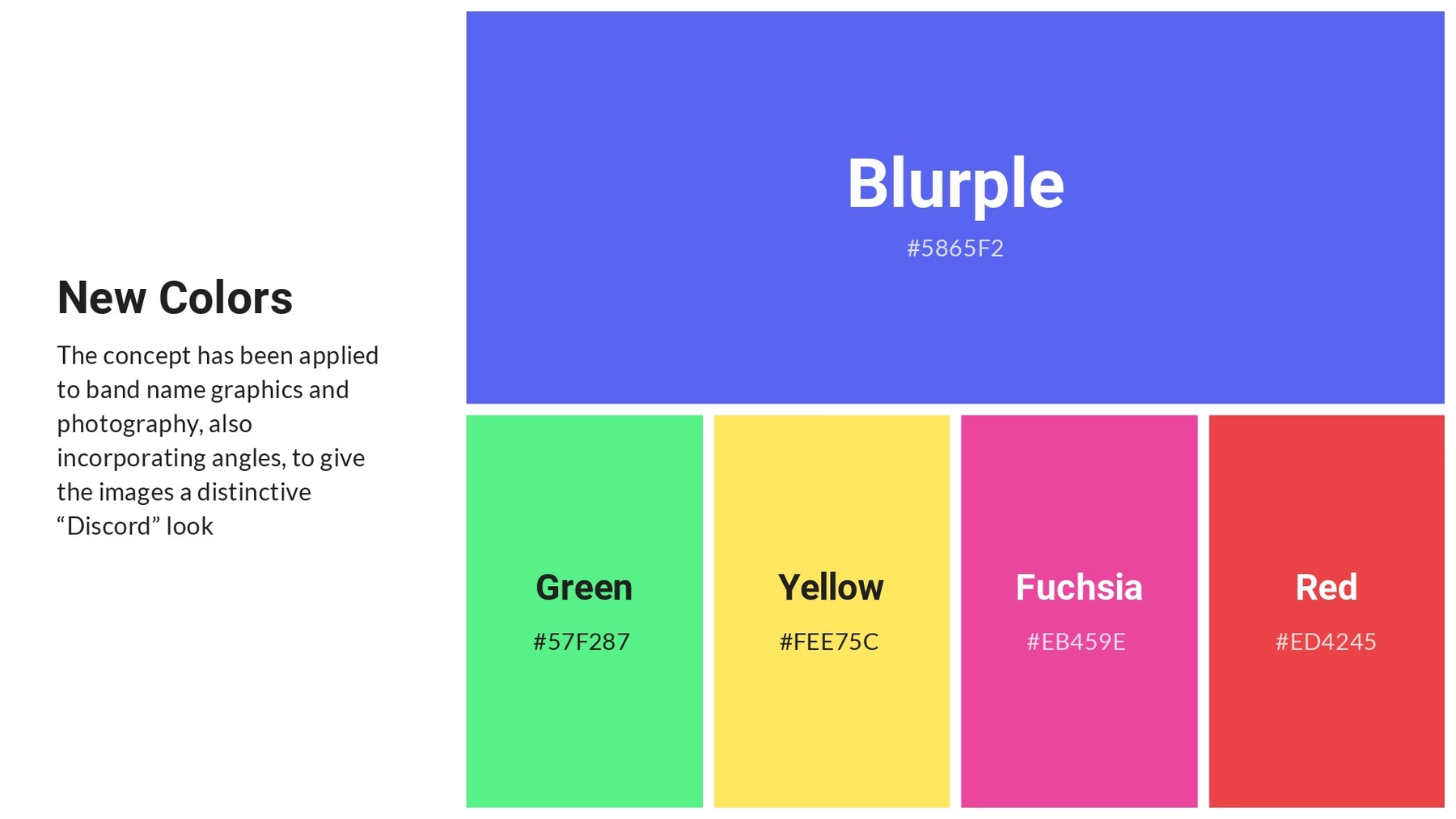
Including a colors slide ensures that the team is aligned on brand-approved colors moving forward to use in sales collateral, marketing materials, and designs. We used an Icons with Text slide to include a display of Discord’s new colors in each icon bubble. Your team can use this slide as a resource to find color HEX codes down the line. This is especially helpful if your new color(s)— like Discord’s blurple— are unique and specific.
Typography
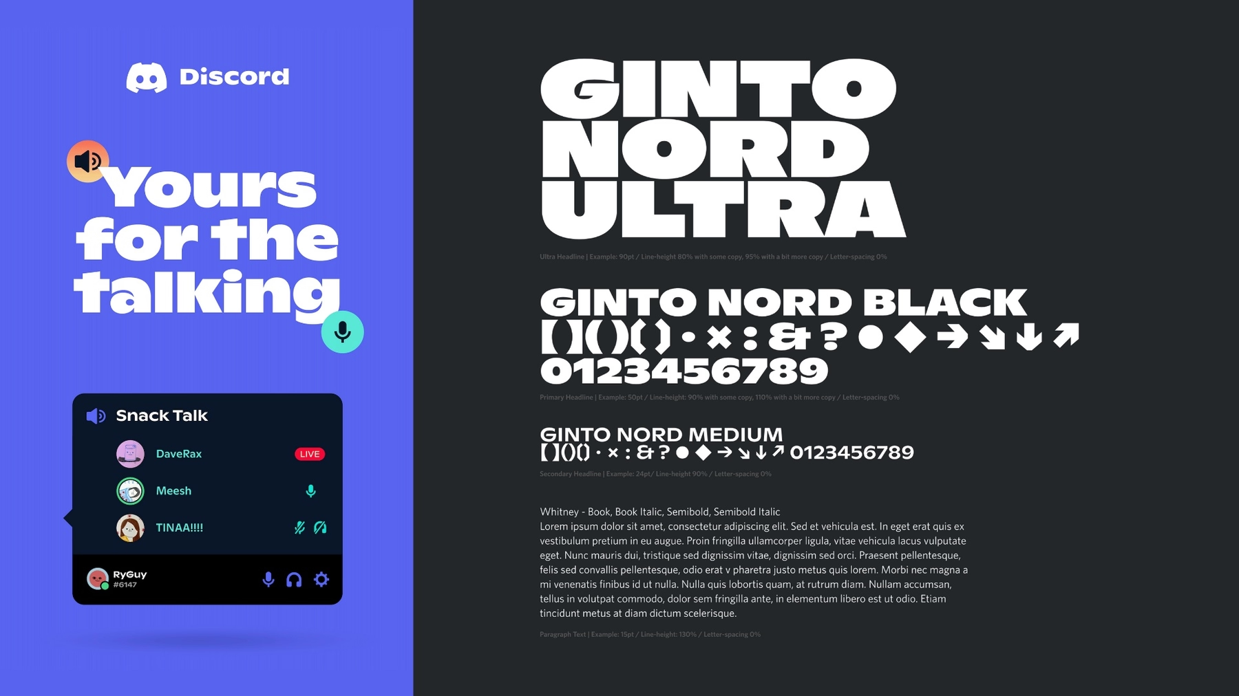
This slide acts as a good reference point for the team members who need to be reminded which typography that they can use in any branded assets. It should include an example of the text, the name of the text, and different variations of the text (i.e. header and body copy). Discord’s rebrand shared examples of their new branded font: Ginto Nord Ultra, Black, and Medium. With a Text slide you can also include a brief description of the font and why you chose it.
Branded material
Including examples of branded material with the new aesthetic can help stakeholders and team members really understand the new look. We used a Photo Grid slide to showcase a collection of branded material. This can be new graphics, custom imagery, or sales materials that reflect the new company branding.

Website example
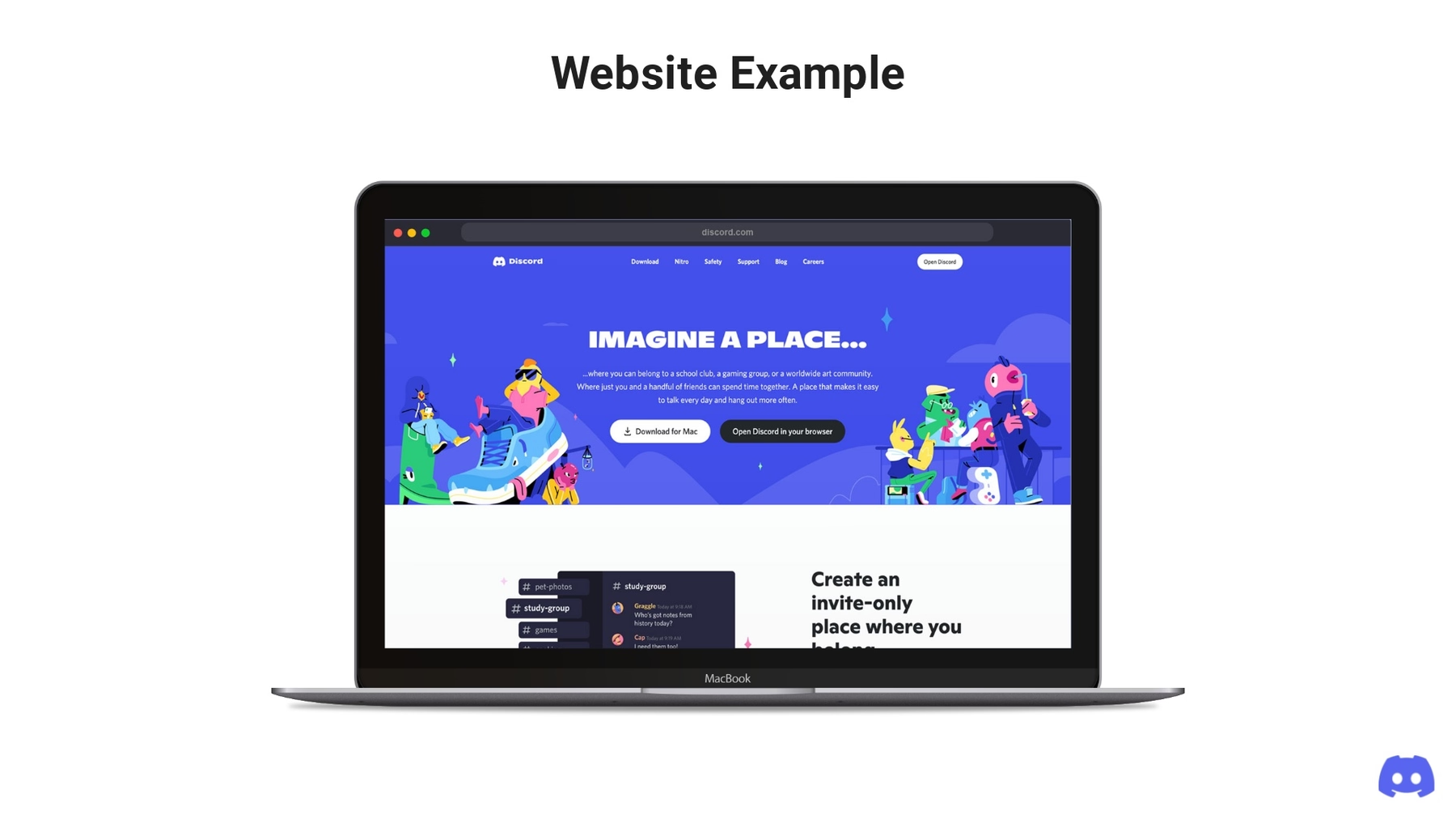
How did the rebrand come to life? Here you can use the Product Screenshot slide, or the Webview slide, to showcase the new and improved website which reflects the branding refresh. This can be simple screen grabs, or an interactive view, to give your team a chance to see the new site design before it goes live.
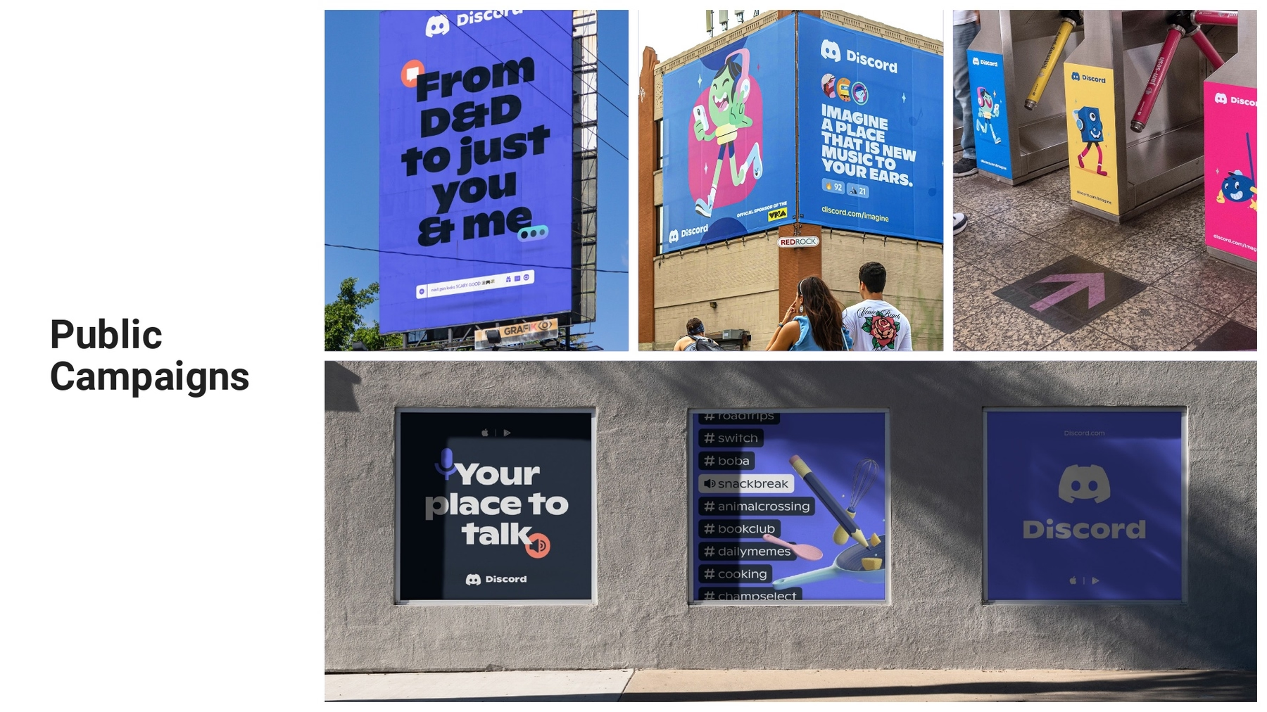
Public campaigns
To really bring the rebrand home, share out some of the public-facing campaigns that will go out on the day of the launch. We used the Photo Grid slide template to be able to include a variety of Discord assets all on one slide. This helps those who weren’t involved in the rebranding process envision how it will look in the wild.
Closing slide
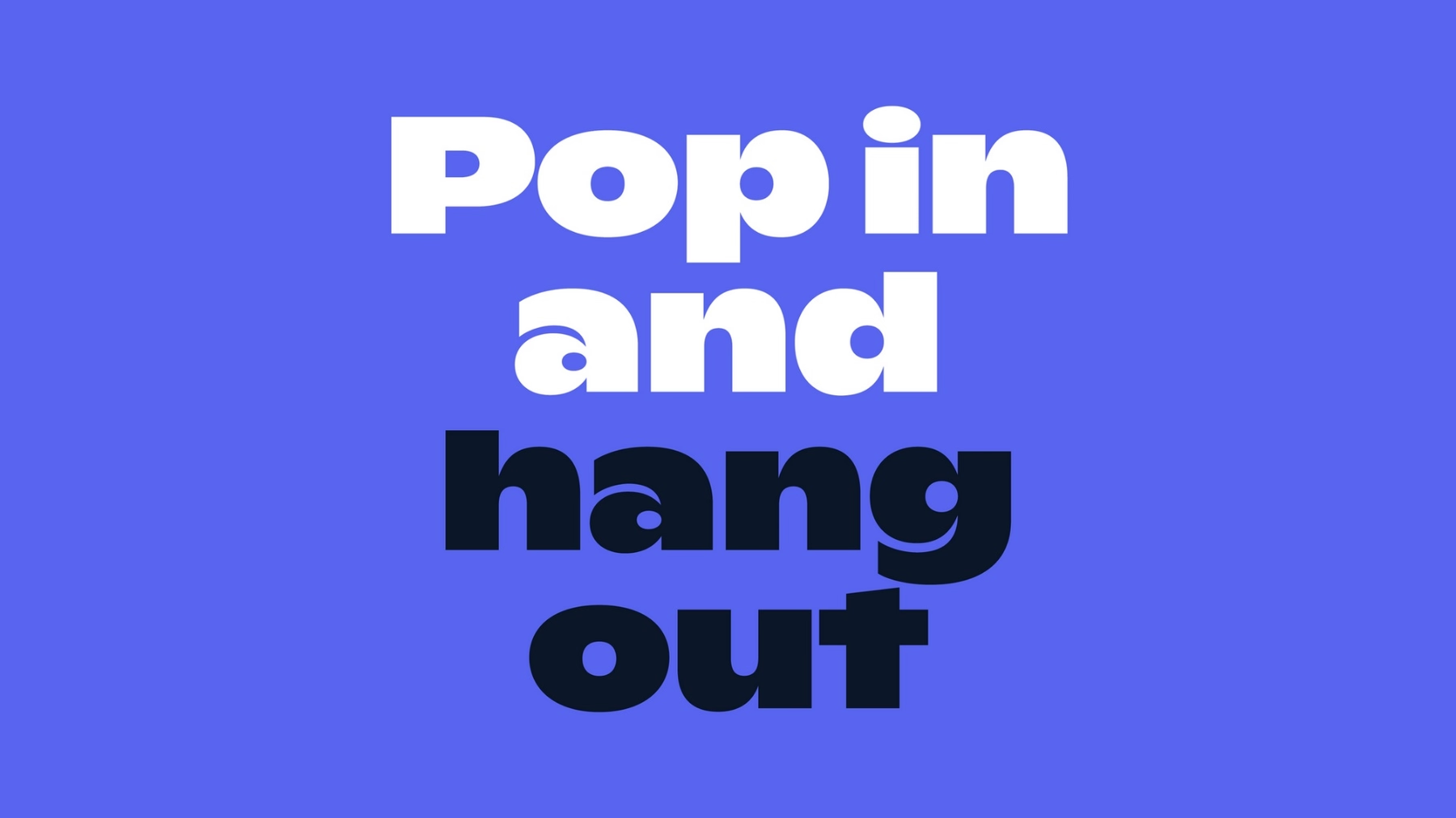
How do you want to close your presentation to really make a big impact? We chose to end the Discord rebrand with two slides; 1) a powerful quote “pop in and hang out” on a Title slide, and 2) an animation of the new logo coming to life on an Image slide. It brings the entire rebrand full-circle, while ending on a statement.


.gif)



.gif)
.gif)
