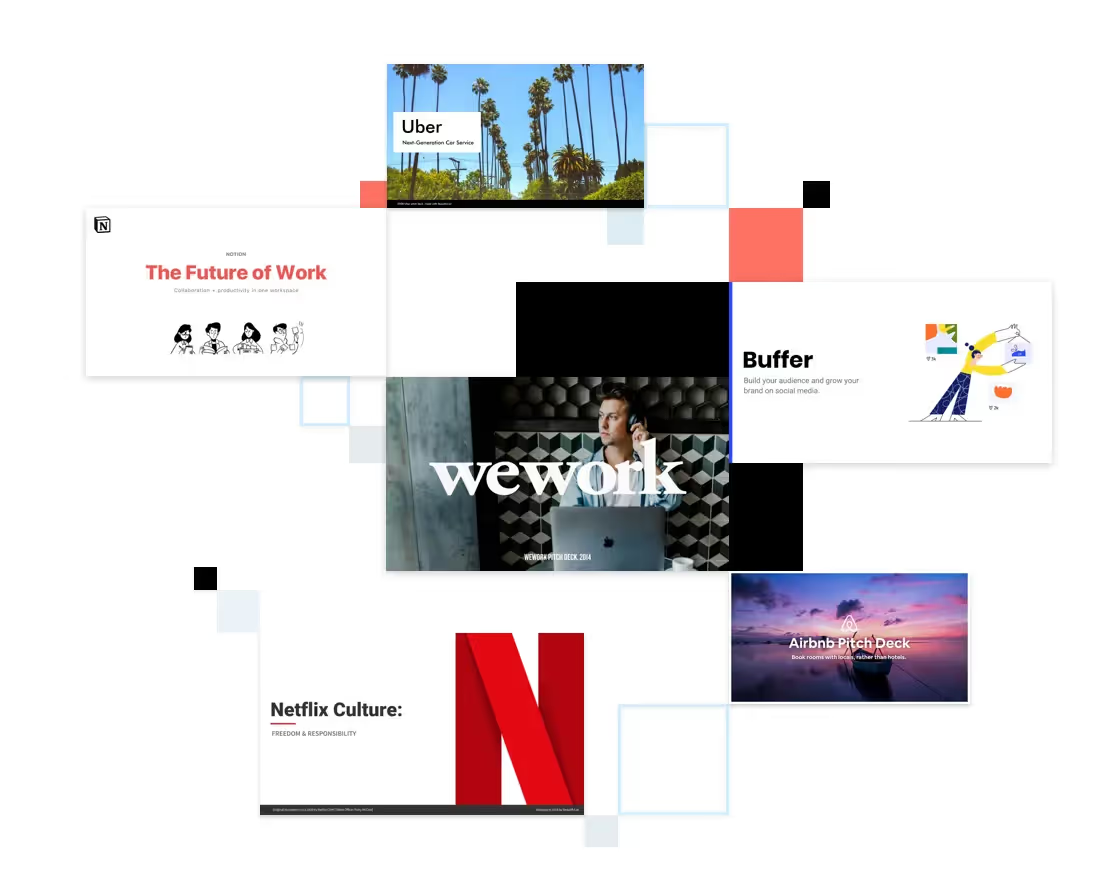
Anyone who has seen our PowerPoint makeovers can recognize that so many of today’s successful companies started with an idea and a pitch deck. But in the case of Snapchat, the company found success without relying on investors. In fact, the visual presentation we’ve redesigned wasn’t used for a pitch at all. Instead the Snapchat deck was designed to introduce potential advertisers to the company’s 2014 monetization plans.
Snapchat was born in 2011 as a solution to the problem of online permanency. Social media users—particularly millennials just starting their professional lives— were frequently caught with past content that didn’t always display them in the best light. Stanford students Evan Spiegel, Reggie Brown and Bobby Murphy devised a social media app that allowed users to post photos and videos that disappeared after a matter of seconds. Initially named, “Picaboo,” the app was relaunched under its present brand when Brown left the company later the same year.
“After hearing hilarious stories about emergency detagging of Facebook photos before job interviews and photoshopping blemishes out of candid shots before they hit the Internet (because your world would crumble if anyone found out you had a pimple on the 38th day of 9th grade), there had to be a better solution,” Spiegel wrote in the company’s first-ever blog post. “Snapchat isn’t about capturing the traditional Kodak moment. It’s about communicating with the full range of human emotion — not just what appears to be pretty or perfect.”
There’s no denying a good idea, and satisfying an untapped need in an ever-evolving market set Snapchat on the path to success. The company boasted a daily user base including 40 percent of U.S. adults by mid-2014, and it managed the feat without relying on a slew of outside investors. In fact, when Mark Zuckerberg tried to buy Snapchat in 2013 for $3 billion, Spiegel, Murphy and team refused his offer.
Eventually, however, any company needs to turn a profit, and the Snapchat team created a plan to monetize the app by marketing additional features and selling advertising space within the app. But the company needed to reach potential advertisers, and it accomplished that goal with a slide deck.
The 2014 Snapchat for Business slide deck obviously was a success, since 99 percent of parent company Snap, Inc.’s total revenue came from advertising by 2018. The 14 slides were certainly informative… possibly too informative. Most of the slides in the original Snapchat for Business deck were so packed full of text they left audiences with information overload. It all makes us wonder what Snapchat might have accomplished with a visual presentation that incorporates principles of good design recommended by the pros.
We redesigned the 2014 Snapchat for Business slide deck with Beautiful.ai’s PowerPoint alternative presentation software. Thanks to our special brand of AI technology, each slide automatically adjusts using those best design principles as content is added. Our resulting Snapchat slide deck template features a customized theme, as well as attention-grabbing infographics and animations.
What do you think of our redesigned presentation? Would it make you want to advertise on Snapchat?
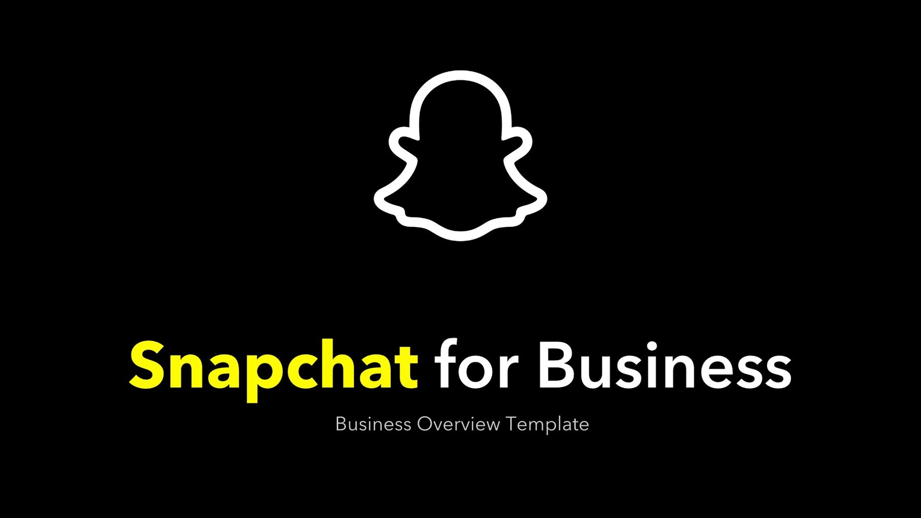
Slide 1: Snapchat for Business Title
Just like the most successful pitch decks, Snapchat’s visual presentation starts with a title that grabs hold of audiences’ attention and lets the presenter set the tone of what’s to come. The original slide boldly displayed Snapchat’s brand with a giant logo.
We added some pizzazz in our redesigned Snapchat title. The slide immediately pops off the screen with its black background and highlighted brand. Creating the slide was simple thanks to our Headline smart slide template and the customized theme we’d already set for the presentation, including colors, fonts and alignments.
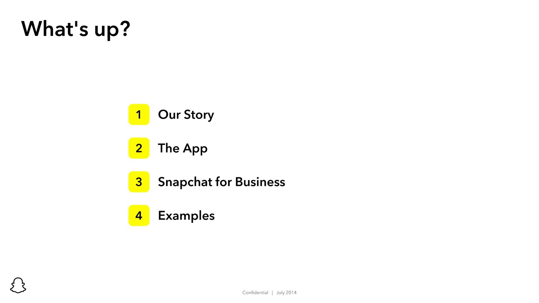
Slide 2: What’s up?
Snapchat’s second slide jumps straight into the company’s story, but we took a more gradual approach as we moved into the presentation. Our second slide highlights the contents of the presentation. This slide was simple to design using Beautiful.ai’s Agenda smart slide template and relying on the fonts and colors we’d pre-selected as part of the custom theme.
Slide 3: Get to Know Us
While we totally agree that a successful pitch deck should include the company’s story, the original Snapchat for Business slide deck offered far too much detail for a visual presentation. Half of the total slide is a wall of text. Beautiful.ai’s presentation software features an About Us smart slide template that was perfect for telling Snapchat’s story, but we did it with an eye-catching image of Spiegel and Murphy accompanied by a brief company summary.

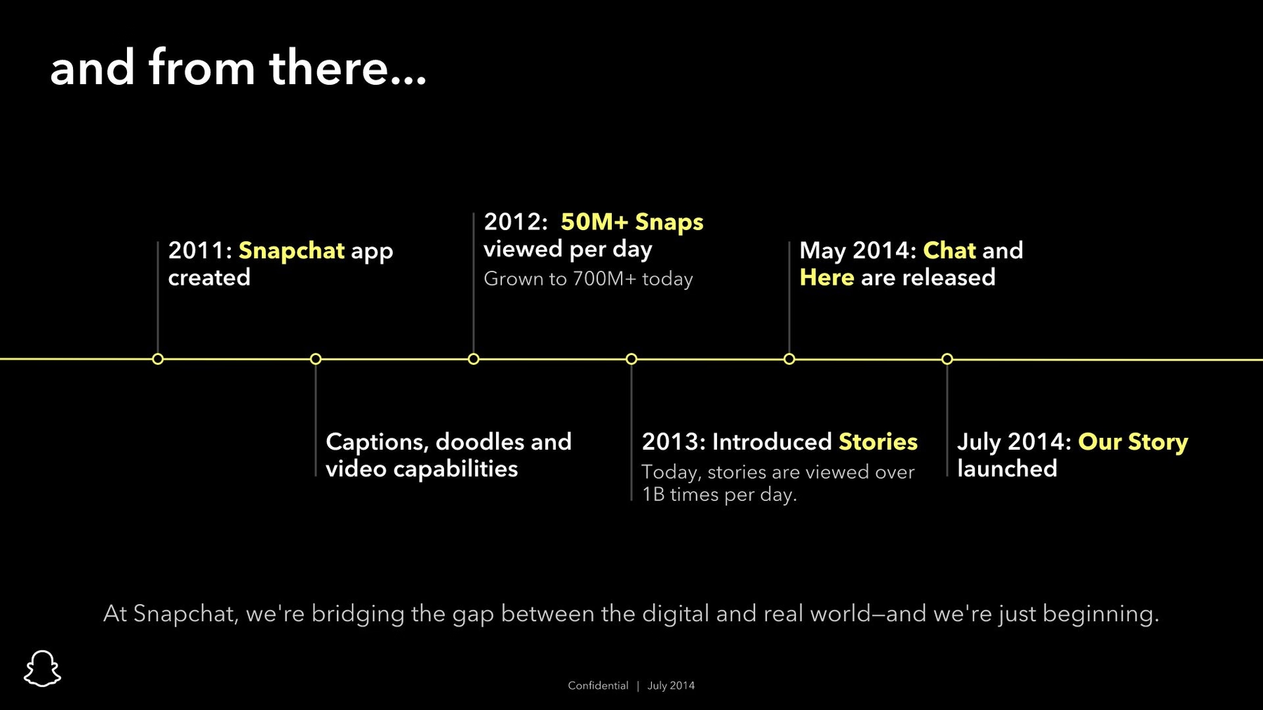
Slide 4: Snapchat Timeline
A company’s story occurs over a series of events, and what better way to summarize that history than with a timeline? Beautiful.ai features a Timeline smart template that transforms a lifeless history into an engaging infographic. The custom theme we already selected made the timeline’s creation a quick and easy task.
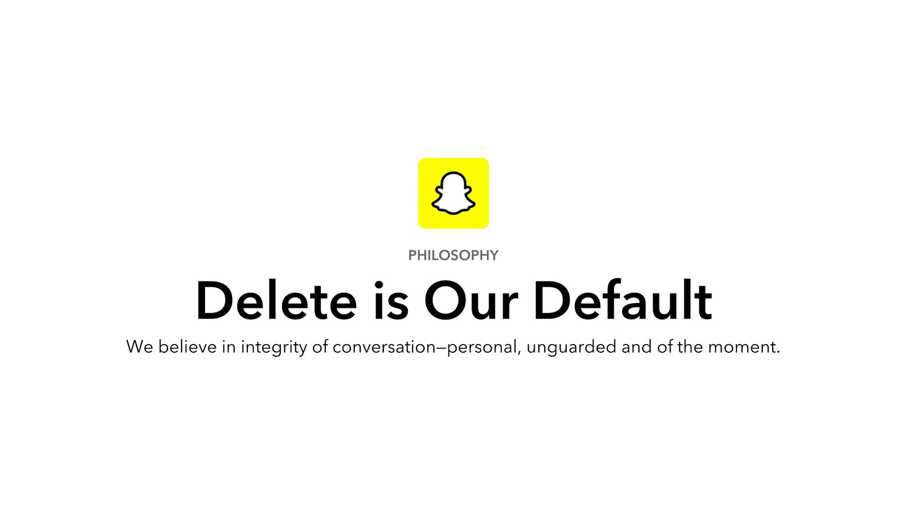
Slide 5: Philosophy
Snapchat also included a slide in its business presentation that described the company’s philosophy. The original slide, however, includes too much small type for an effective visual presentation. We recreated the philosophy slide using our Headline smart template. Thanks to the preselected theme, we just added the text, and the smart template automatically incorporated the perfect alignment, fonts and color scheme. Adding the Snapchat logo was simple using Beautiful.ai’s free image library.
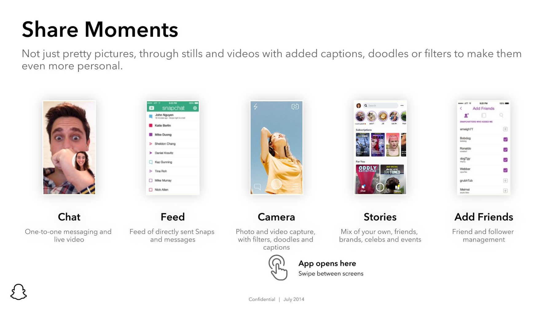
Slide 6: Share Moments
The next slide in our redesigned Snapchat for Business presentation continues to describe the company, but instead of long paragraphs, we’ve included a series of photos accompanied by short textual summaries. With Beautiful.ai’s Photos with Text smart slide template, we were able to design a dynamic slide that continues to draw audiences into the presentation. Each photo was selected from our library that includes millions of free stock images.
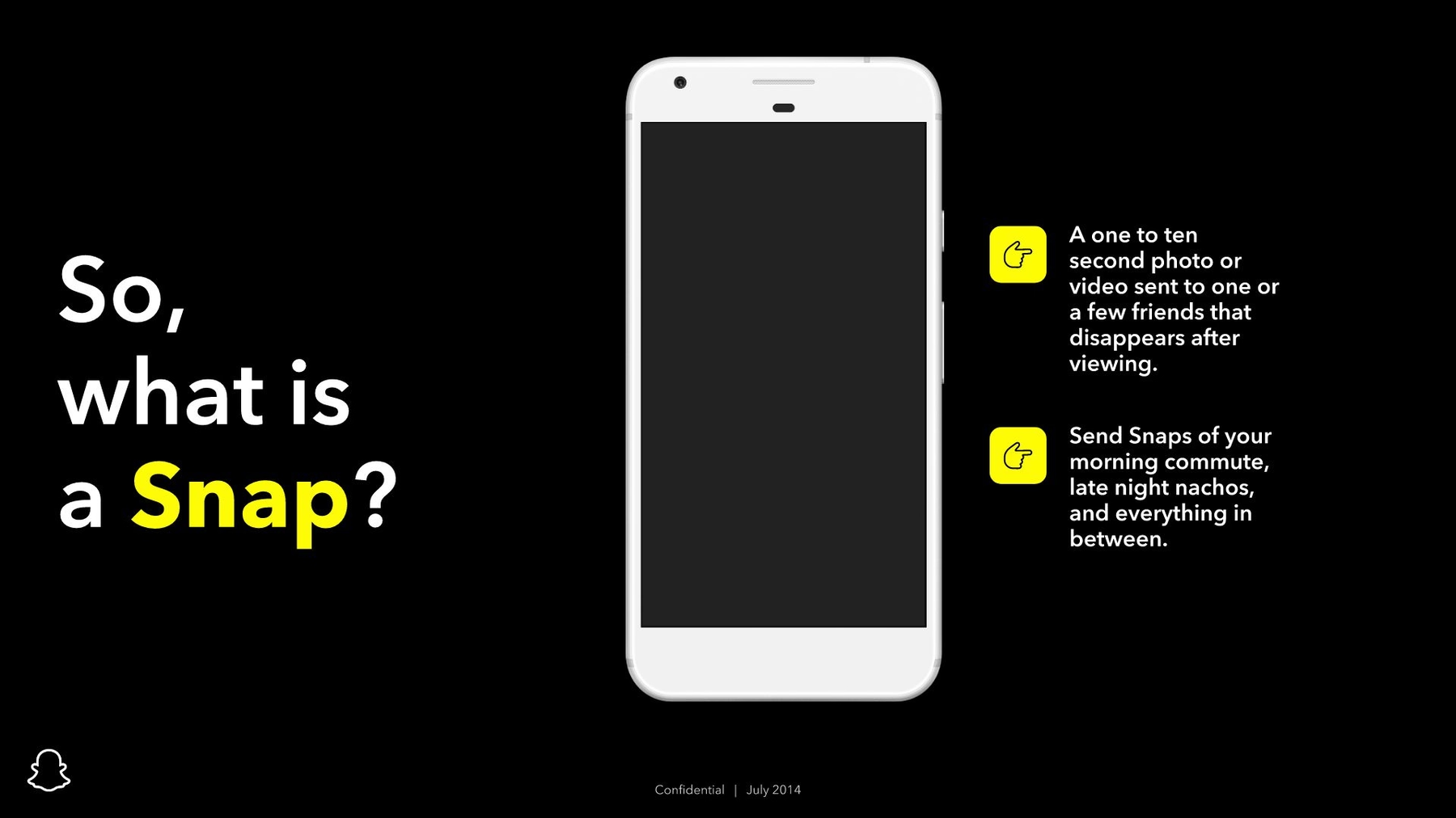
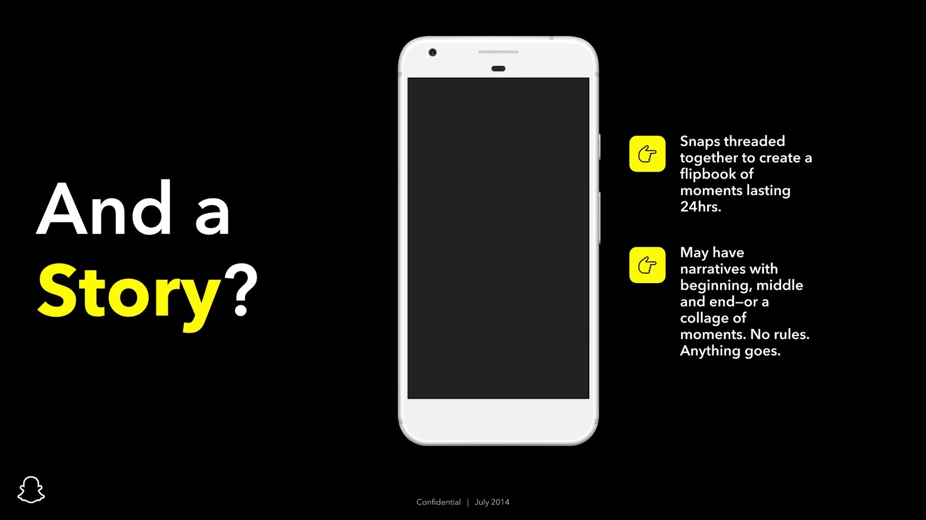
Slide 7-9: Snaps and Stories
Today we can probably safely assume almost everyone who knows anything of the tech sphere knows about Snapchat. But in 2014, the company still needed to explain its concept to prospective business partners. We made sure this important information popped off the screen by again using a black background and adding animated graphics to the next three slides.
With our Mobile Screenshot smart slide template, we were able to add a series of snap images to an image of a smartphone. Not only do the slides clearly illustrate what people can expect from snaps and stories, but the animations recapture any attention that might have begun to drift away by mid-presentation.

Slide 10: Your Turn
Snapchat might not have been pitching the company to potential investors, but it did want other businesses to buy advertisements. The next slide in the Snapchat for Business slide presentation tells audiences what’s in it for them with a whole lot of tiny text. Again, updating Beautiful.ai’s Headline smart template and relying on our custom theme, we redesigned the slide, so it briefly gets to the heart of the matter in a clear and concise way.
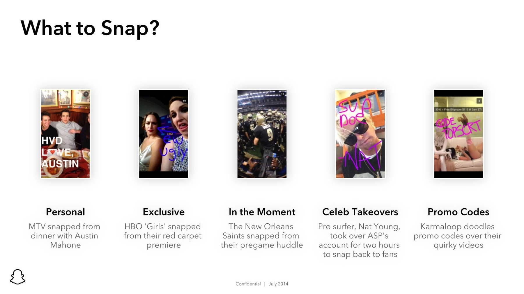
Slide 11: What to Snap?
In case potential business partners were still wondering how they could use snaps to market their brands, the Snapchat team added a slide with examples of snaps used by successful companies. We were able to recreate this slide using Beautiful.ai’s Photos with Text smart template. Our AI-based technology allowed us to insert the same images used in the original slide deck along with text automatically set in the custom fonts selected in our presentation’s theme.
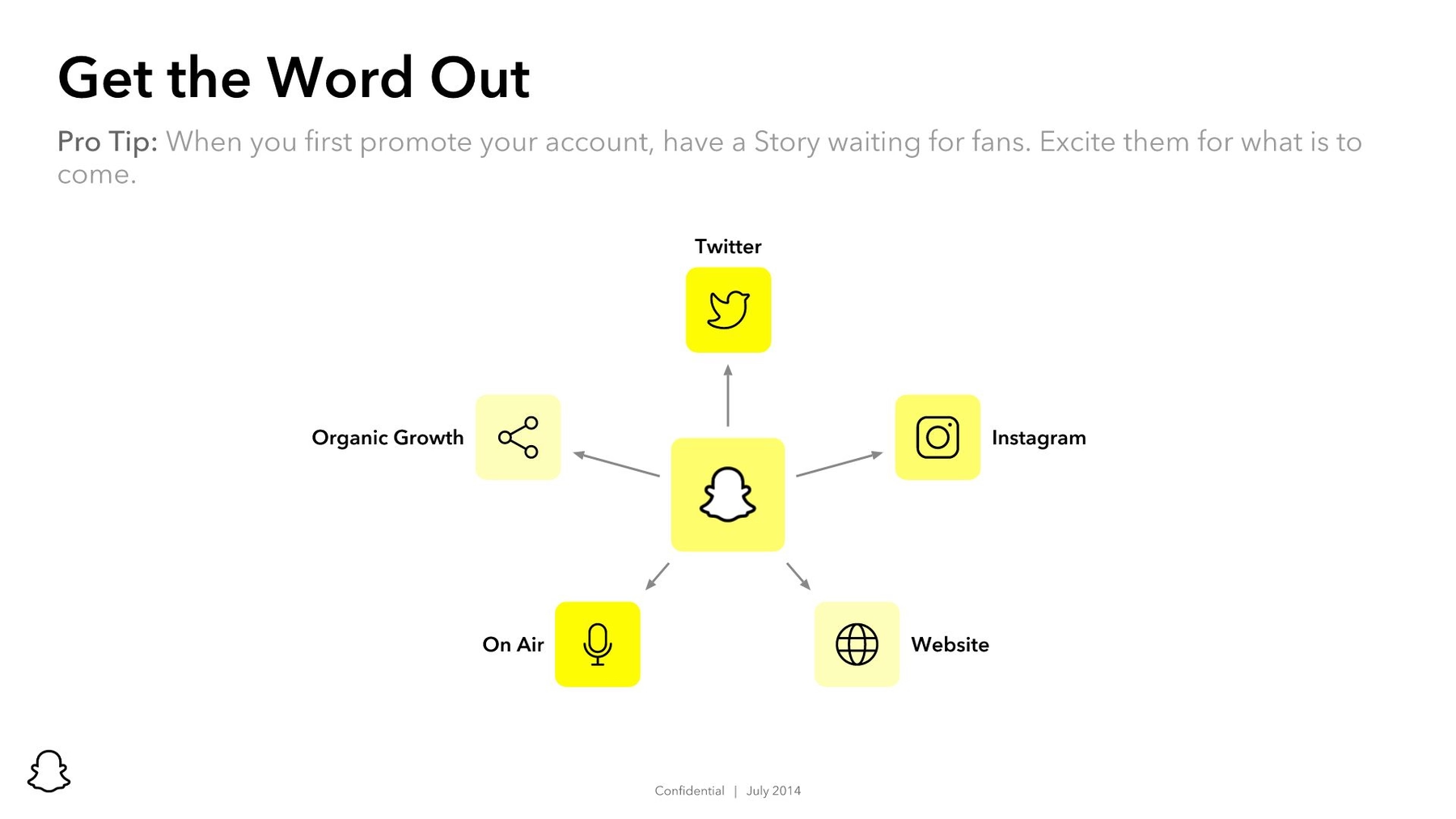
Slide 12: Get the Word Out
Snapchat’s next slide featured a series of images illustrating ways that Snapchat for Business advertisements could be promoted using other online avenues. Instead of a generic format featuring more text and images, we transformed the slide into an infographic. Beautiful.ai’s PowerPoint alternative presentation software features a Hub and Spoke smart template that allowed us to insert logos found using our free image library.
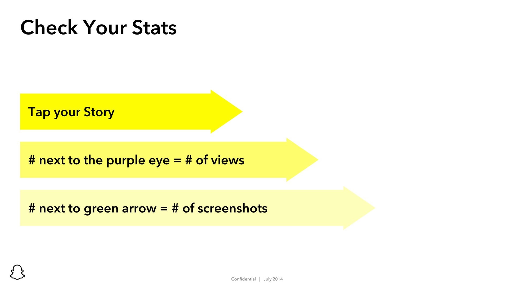
Slide 13: Check Your Stats
Snapchat for Business offered advertisers the ability to check their advertisements’ statistics in the app. We redesigned another complex slide using our Arrow Bars smart template. It was so simple to design based on our custom theme; plus, it’s short, sweet and to the point (literally).
Slides 14-16: Early Adopters
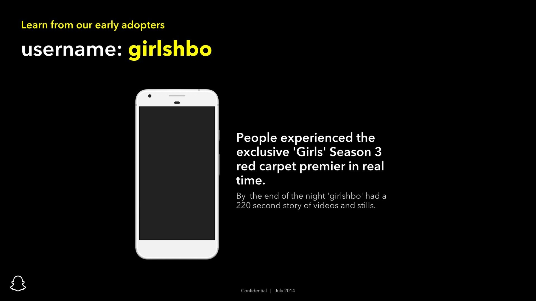
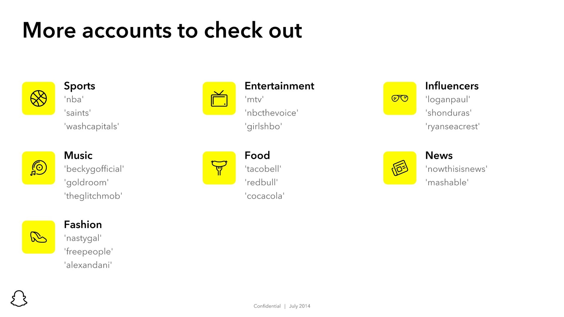
The original Snapchat for Business slide presentation ended by featuring accounts worthy of notice. The slide featured three screenshots and a list of accounts from sports, music, fashion and more. We mirrored the format of some previous redesigned slides, and we chose Beautiful.ai’s Mobile Screenshot slide template against a black background.
We animated a series of Snapchat images within the smartphone graphic to give the appearance of motion and video. Then, we included a list similar to Snapchat’s original highlighting other noteworthy accounts. Our Icons with Text smart template was perfect for the list, and we were able to add corresponding icons found in Beautiful.ai’s free library.

Slide 17: Snapchat Close
Rather than abruptly ending the slide show, we prefer to add a simple closing slide that gives the speaker an opportunity to wrap up the presentation, summarize the information and leave a lasting impact on audiences. Therefore, we added a closing slide to our Snapchat slide deck redesign.
Our Image slide template offered the perfect opportunity to make a bold conclusion using the company’s bright yellow logo. The basic slide gives the presenter opportunity to properly conclude the visual presentation, while the slide remains simple enough for flexibility and personality.

So, what did you think of our Snapchat for Business slide deck redesign? Would you have taken out an ad based on our presentation?








.avif)
