
I’m sure you’ve heard the terms “big data” and “data visualization” by now (most likely in the same sentence, case and point), but why are these two terms inextricably tied to one another as if they were some kind of dream team like Beyoncé and Jay-Z, Batman and Robin, or Bacardi and Coke?
Boiled down to the gristle, it’s because data on its own is tough to digest. Visualizing your data with the aid of tables, bar graphs, and scatter charts (among others) helps your audience take in your data in a way that makes sense to their brains.
Data visualization in these forms (charts, graphs, etc.) helps you see trends, outliers, patterns, and all the important things that help you and your team make important decisions—faster and more efficiently.
Bottom line? We are visual creatures, and aren’t really made to process spreadsheets of data.
Take these two examples below:
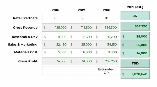
DATA VISUALIZATION EXAMPLE ONE - NUMERICAL TABLE
Source: Beautiful.ai Presentation Software
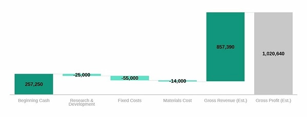
DATA VISUALIZATION EXAMPLE TWO - WATERFALL CHART
Source: Beautiful.ai Presentation Software
These two examples show the exact same information: a report detailing financial projections for the year ahead. The first example, the numerical table, is a straight-up snoozefest. (That’s all we have to say about that.)
However, the second example, the Waterfall bar graph, allows us to comprehend the data’s story almost immediately—“we're gonna have banner year!”—and leverages our human ability to recognize visual patterns and trends. Thus, we can spend more of our precious brain effort thinking critically about the results and asking smart questions like, “do we really need to spend that much on R&D?”
Using a line chart over a spreadsheet may also prevent you from pulling your hair out almost 100% of the time, which is great for your Facebook photos and dating profile pics (wink).
Now, we turn to a study performed by Steve Harzoz and David Whitney in 2012, which looked at the way certain types of information was grouped together and displayed. Their findings prove that we humans have a strict cap on how much information our brain can process and understand. They found that the way data is presented is key for our comprehension.
Take a look at the images below. How long does it take you to decipher how many colors there are in each image?

Source: Medium
Trying to analyze the first two squares takes a heck of a lot more brain power and effort. In fact, if you were a stressed employee—short on time and low on patience, facing a day stacked with meetings—you might not even take the time to really dig into those first two. We’ve all been there.
The last square is pretty darn easy to understand, and this visualization method would save your company time and money—especially if it involved data that impacted important business decisions.
Here are two more examples to compare and contrast:
DATA VISUALIZATION EXAMPLE ONE - SPREADSHEET

Source: Interaction Design
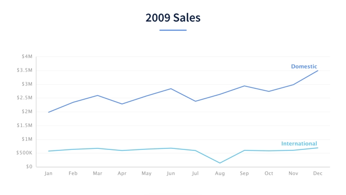
DATA VISUALIZATION EXAMPLE TWO - LINE CHART
Source: Beautiful.ai Presentation Software
Both the spreadsheet and the line chart contain the exact same data, but your brain grasps the story of the chart much faster—allowing you to digest the trends, see the difference between the two data points, and clearly understand that you need to increase international sales. The chart may also prevent you from pulling your hair out almost 100% of the time, which is great for your Facebook photos and dating profile pics (wink).
We’re certain that seeing these kinds of examples will leave you singing the praises of data visualization from the rooftops and evangelizing its use to everyone you know at the office. So with that, we challenge you to use data visualization in your next presentation. Try one of our favorite methods below!
TABLES

Knowing when to use a table and when to use a graph can make or break your presentation. No pressure. Which is why we go deep on the subject in this blog post. To avoid a TL:DR situation ("Too Long Didn't Read"), data that has a wide range of numerical values or stats that don't clearly correspond to each other is prime pickins for the Table template.
VENN DIAGRAMS

One of the most under-used and over-abused slides in any presentation template, the Venn diagram mostly shows up in presentations to show the intersection of two ideas. This isn’t wrong, but it isn’t exactly the most effective way to use a Venn diagram, either. *Pushes up glasses*
We go further into when and how to use Venn diagrams in this post,but as a general rule of thumb, a Venn Diagram is clutch when you’re trying to show the specific relationship between sets: “Some of X is Y and some of Y is X.”
XY PLOTS
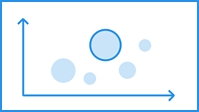
XY plots are kinda like that trusty BFF that helps you through the competitive analysis of your latest blind date. Except in this case we’re analyzing data, not your level of emotional connection. However, now that we think about it, data can be used to elicit emotion—especially in an XY plot. This type of graph is perfect for comparing and contrasting the features, benefits, and markets of different products, services, or business models.
We’re sure there’s an XY plot of someone’s dating history out there. If you find one, please send our way so we can give you a shoutout on social media. Oh, and if you want to get started visualizing your data for free today, try out our Beautiful.ai presentation design tool, or customize the data examples featured that we mocked up just for you.
Start Visualizing My Data





.avif)

.gif)