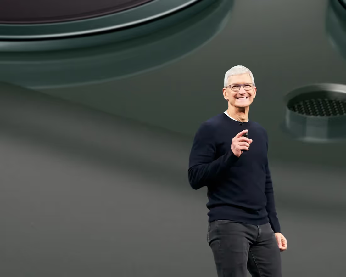
When it comes to giving presentations, we can all agree that Steve Jobs was up there as one of the best storytellers of our time. And while it may seem impossible to get to Jobs’ level of presenting finesse, it’s easy to pick up on presentation best practices simply by watching old Apple keynotes. When the torch was passed to Tim Cook in 2011, the expectations were high — and Cook did not disappoint. Sure, he’s no Steve Jobs, but his comfort on stage, ability to stress key points, and confident body language is everything we’d expect from an Apple exec.
To start, the best presenters utilize solid storytelling techniques to support the core message — and Apple does just that. Apple has been hosting the WWDC for over 20 years, but the keynote is never just about the release of a new product, it’s about storytelling. They paint a picture of the company’s journey to the new announcement(s) and take the audience along for the ride.
For those history nerds out there, here are some fun facts: The first Apple WWDC dates back to 1983, but the first noteworthy presentation wasn’t until 1997, when Steve Jobs returned to the company. From then on, Steve Jobs began most presentations with a company update and ended them by introducing the newest technology, much like what we see in today’s famous keynote presentations. In 2011, following Jobs’ health decline, Tim Cook gave his first WWDC speech which was a live demonstration of Siri in the iPhone 4S.
The most recent Apple Keynote on September 10th, 2019 announced the new iPhone 11, iPhone 11 Pro and iPhone 11 Pro Max, and the world tuned in to watch Tim Cook inform us of Apple's "latest and greatest" technologies during his captivating speech. Still, no presentation — even Tim Cook’s — is perfect. But instead of just passing judgement, how can we learn from his successes and failures? What can we leave, and what can we take away?
Presentation Tips Inspired by Tim Cook
#1. Speak slowly (7:35)
Speaking slowly is actually one of the most underrated speaking skills. When presenters take their time while speaking, it allows the audience to absorb what they’re saying. Tim Cook talked at a steady speed through the entire keynote, making it easier to digest each statement.
#2. Emphasize main points (10:55)
If you tuned in to this month’s Apple WWDC, you’ll notice that all of the main points appeared on the screen behind Cook, while he emphasized them in his speech ("We're going under the sea!"). These visuals help the audience focus more closely on what the presenter is explaining, and makes more of an impact (which helps with information retention).
#3. Move around on the stage (3:08)
Tim Cook did a really great job at moving around on the stage, engaging with all corners of the audience. Seasoned presenters will be able to do this seamlessly and with ease, so that no section feels neglected.
Biggest Mistakes Tim Cook Made in his 2019 Apple Keynote
#1. Pausing after each sentence for applause (8:47)
Tim Cook would often pause after each point, waiting for an applause (Awkward!). Great presenters can deliver their speech and still pay attention to the audience's reactions in real time. Don't worry, this takes practice.
#2. Not engaging with the audience members and making eye contact (11:54)
Sure, Tim Cook did a great job scanning the audience, and roaming the stage, but he didn’t really engage directly with those in the auditorium. Instead, he kept his eyes focused ahead of where he was walking or at the screen. Making eye contact, and engaging with the crowd, is crucial when delivering a message. You want your guests to feel like you’re talking to them directly, instead of preaching to an audience of hundreds of thousands of strangers.
#3. Not allowing time for Q&A (2:14:33)
As Tim Cook closes, he takes a moment to thank the Apple employees for their hard work and dedication, but doesn't allow time for questions. While a Q&A at an event like this Apple keynote could easily take hours, it’s important to allow your audience time to process the information and ask questions in real time. If they leave confused, or unsure of something, it could affect your call to action (which, in this case, is probably "Buy more Apple products please!")
How to Apply These Tips to Your Next Presentation
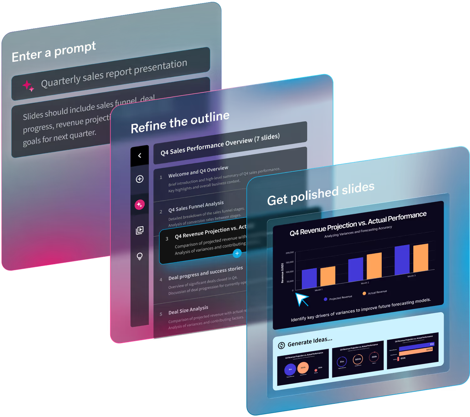
All that to say, the "public speaking" part is only about half of the presentation equation. Just as important (and time consuming) is the design of your presentation, especially when it’s up to you to design it yourself. It goes without saying that most of us don’t have a team the size of Apple to professionally design our presentations, but good news! New design-a.i. tools can actually do the design work for you.
After all, visual aids help to capture and maintain your audience’s attention. Statistics show that if you have your audience’s attention and it’s focused on what you’re presenting (a win in itself), they have a much better chance of retaining the information you are trying to convey. Presentation design can play a big part in this.
If you Google good presentation design, you’ll find a lot of opposing opinions on best practices. For example, Guy Kawasaki believes in the 10/20/30 rule. He says, “[a] presentation should have ten slides, last no more than twenty minutes, and contain no font [size] smaller than thirty points.” Similarly, some presenters will tend to go heavy on images while others prefer more text. Here at Beautiful.ai we like to think that less is more, and prefer a more modern, minimalistic approach. Luckily, our smart slides adapt when content is added, which makes presentation creation much easier for those who lack design skills.
But as we said, good design alone doesn’t make a good presentation.
And even big name presenters like Tim Cook can get it wrong. But now you know what missteps to avoid, so, the next time you find yourself in front of an audience you can apply all the “Dos” we learned from Tim Cook, like using your visual aids to your advantage, engaging with the crowd, emphasizing your main points, and keeping it simple. Public speaking doesn’t have to be a cringe-worthy chore, it can actually be fun once you get comfortable enough.


.gif)

