Figma Rebrand Presentation Template

Overview
Figma understands the importance of branding. The idea of figma— the cloud based design tool— was born in 2011 by co-founders Evan Wallace and Dylan Field. The duo was looking for a solution to bring creative tools for designers to a web browser for accessibility. Just four years later in 2015, the software that claims to be “the first design tool that combined the accessibility of the web with the functionality of a native app” was founded.
There’s no doubt that designers see the benefit in Figma as the company has seen great success since their launch in 2015. In fact, the company was acquired by Adobe in fall 2022 in a $20B deal— Adobe’s biggest acquisition deal to date. But a lot has happened between 2015 and now, including a major rebrand.
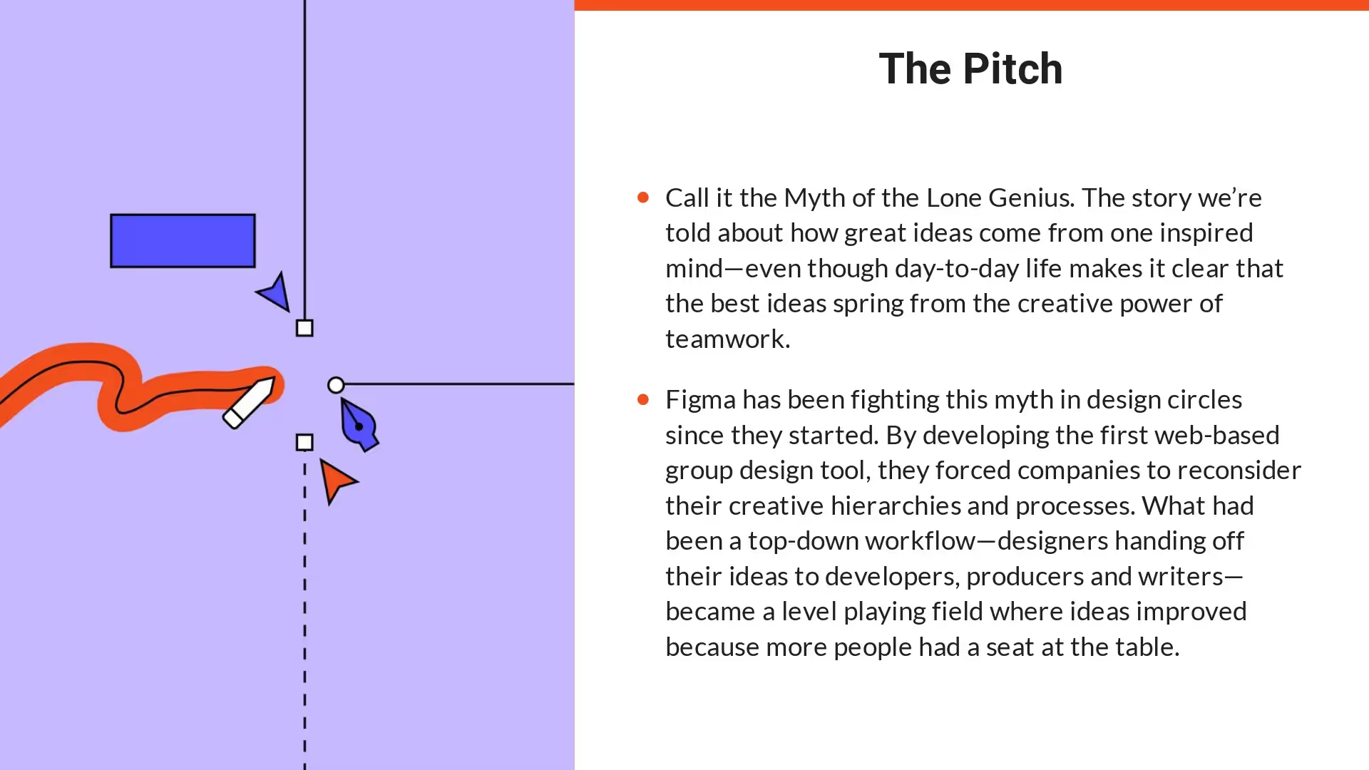
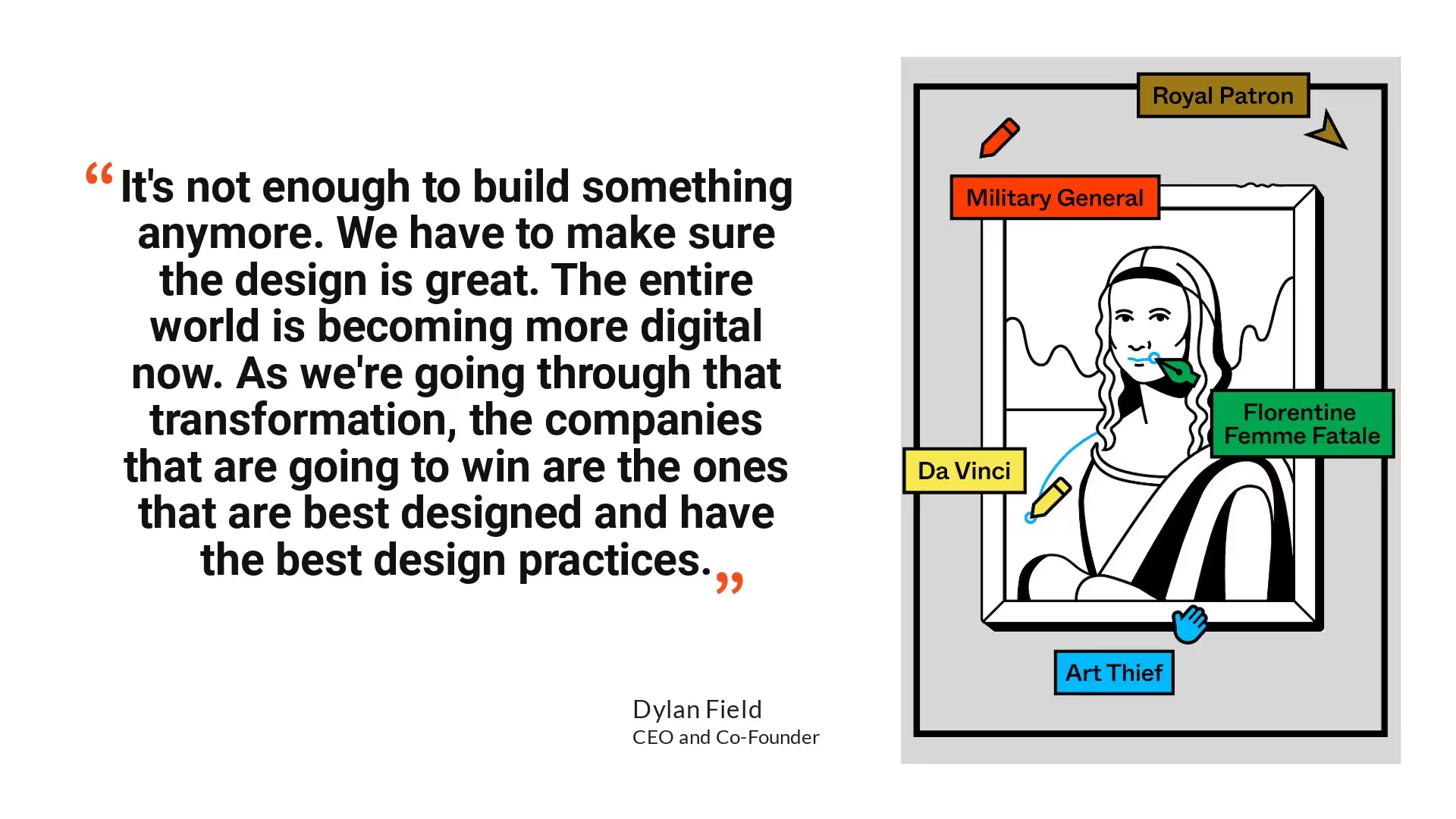
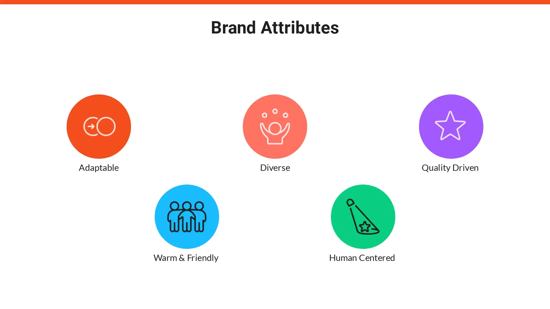
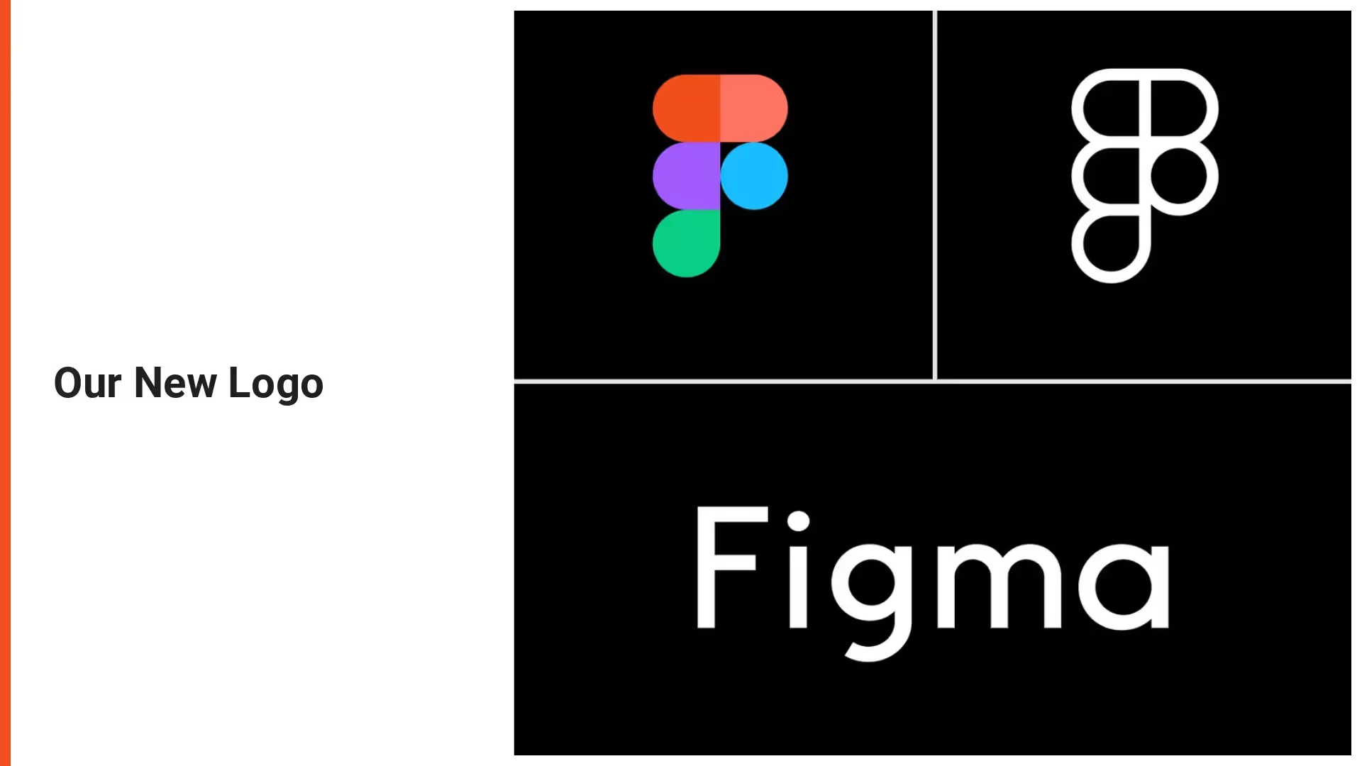
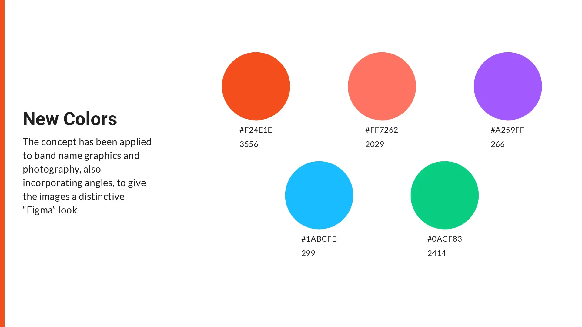
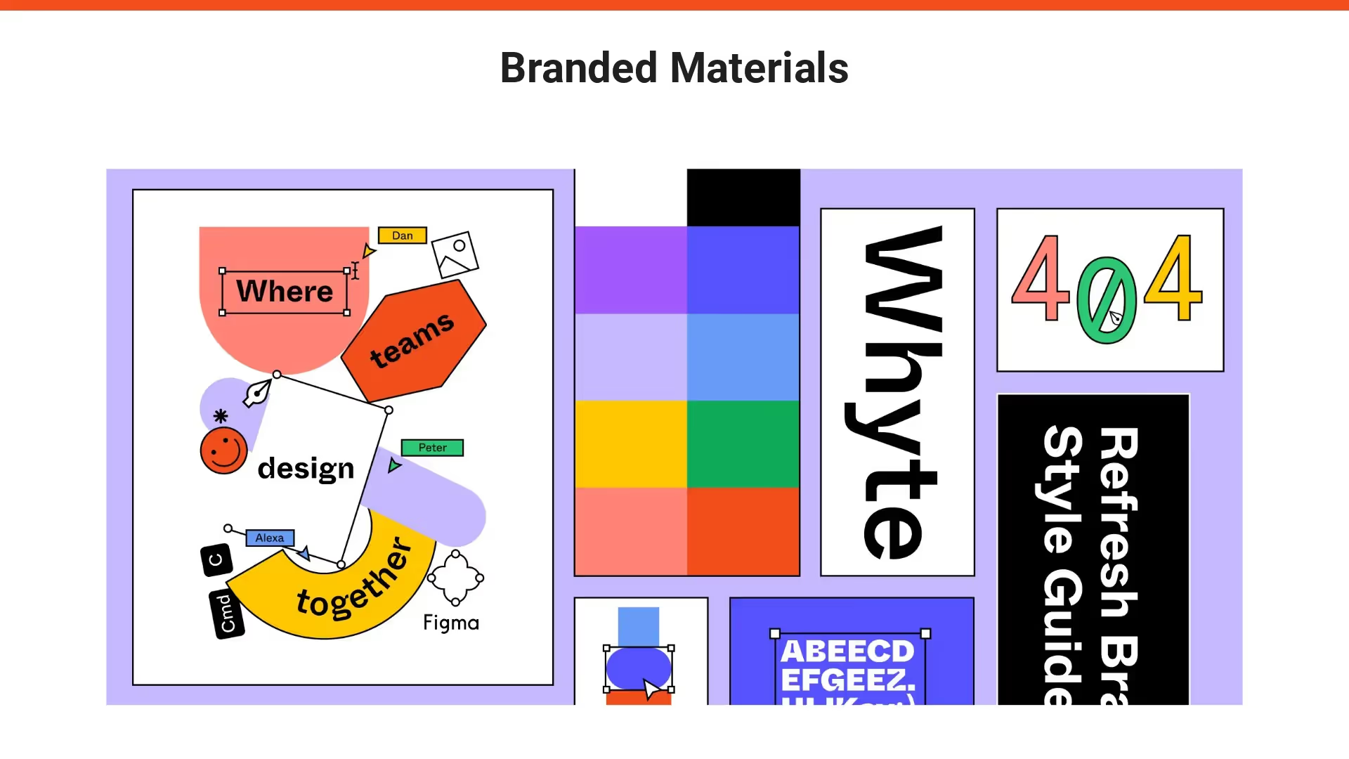
This presentation is using Figma's 2019 rebrand as inspiration to showcase the type of slides that can help marketers present the new face of their brand to employees, partners, and investors in a more impactful way. You can see more details of their rebrand here.
Our Figma rebrand presentation can also help you:
- Explain what lead your team to a rebrand
- Showcase the journey from old to new branding for future reference
- Share any new branded assets, like typography and logos, with key stakeholders
Use our template to create an effective rebrand presentation



Tips to create your own rebrand presentation
Create a theme
Introduce the team
Include examples
Keep it concise
Related templates

Spotify Rebrand Presentation Template

Press Kit Presentation Template

Media Kit Presentation Template
The AI presentation maker for faster impact
With AI that kickstarts your deck and Smart Slides that handle the formatting, you can focus on your story, not the alignment. Go from create, edit, to present with designer-level polish and in a fraction of the time.
Features to ideate, edit, collaborate, and present.
We’re a complete presentation platform. Everything you need is in one place.
Smart Slides
Smart Slides auto-align, resize, and animate your content as you edit, so you focus on the message, not formatting.
Create with AI
Kickstart your ideas with AI. Just enter a prompt, add extra context, and get a beautiful presentation in seconds.
Themes & brand control
Define colors, fonts, logos, icons, and footers once. Save and reuse brand themes across decks and teams.
Data visualization
Instantly create animated charts and graphs. Link any spreadsheet for fast edits and live updates.
Image libraries
Get direct access to an expansive library of free, real-life stock images and videos, no need to leave your slide.
Presentation templates
Discover our gallery of professionally designed presentation templates, multi–slide decks built to give you a head start.
Presentation workflows
Shared slide libraries, real-time collaboration, user permissions, locked themes, and more.
Viewer analytics
Control access, and track engagement so you know what resonates, and when to follow up.
Animation & narration
Add embedded voice or video context to any slide - so your message lands clearly even when async.


Related blog posts
.gif)
The Art of Simplifying Information in a Presentation Without Losing Meaning
.png)
How Do I Give My Presentation a Polished Look?
.gif)
The Ultimate Guide to AI Presentation Prompts: How To Get Better Slides From an AI Presentation Maker

Try it free for 14 days
Start building Beautiful presentations.


