Tinder Pitch Deck

Overview
Tinder is one of the most used apps today, but they had to start somewhere. In 2012, they used mobile app builder and incubator Hatch Labs to create the now-popular Tinder dating app. Since then, they’ve facilitated nearly 20 billion matches and are reportedly valued at $10 billion. The original Tinder pitch deck was less than desirable, so we gave it a more “swipe right” worthy makeover.
Check Out the Tinder Pitch Deck Makeover in Beautiful.ai


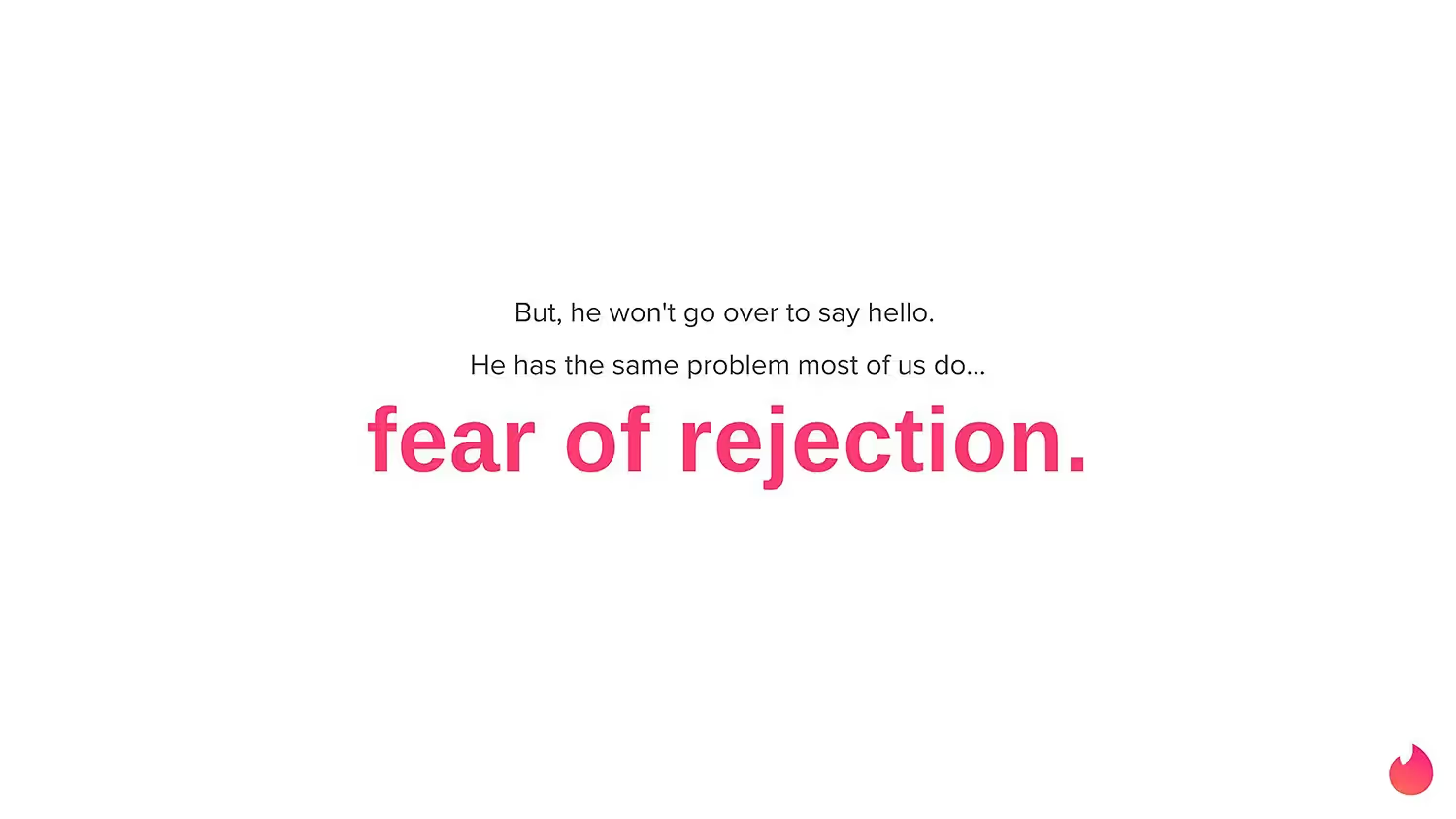
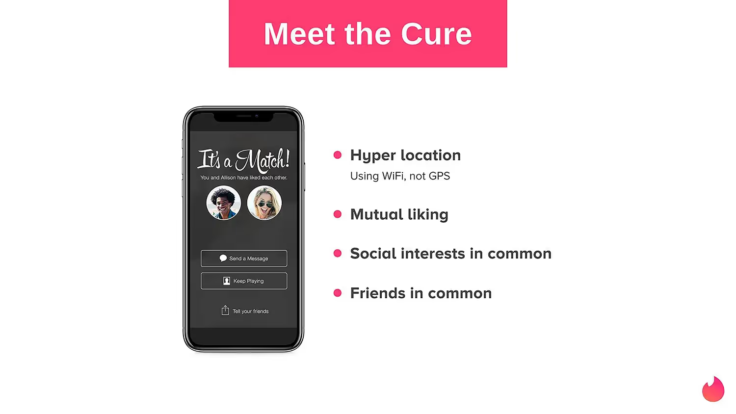
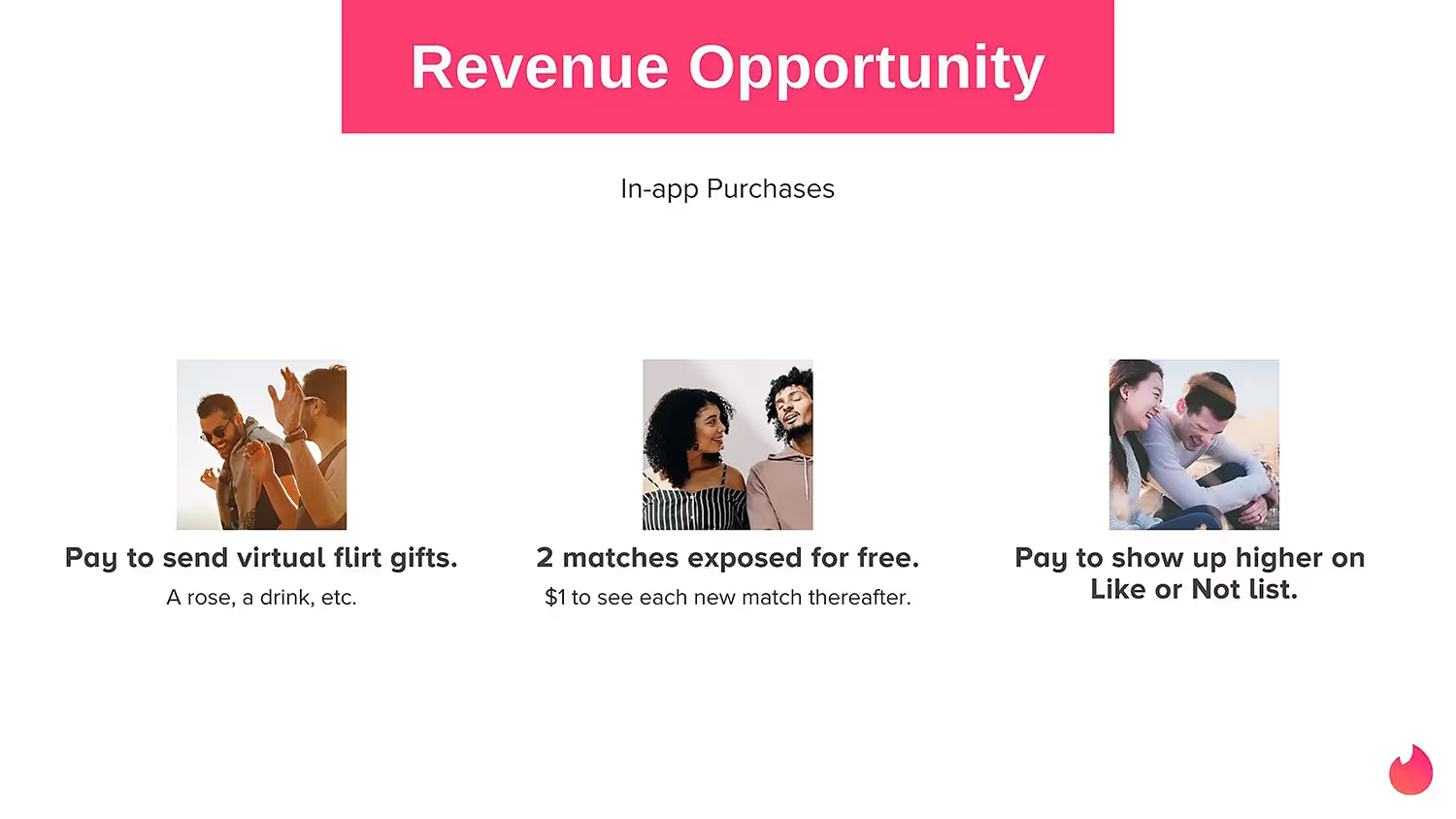
Pro Tips to Customize the Tinder Pitch Deck
Consider the order of slides
Make an impact with every slide
Develop a cohesive color scheme
Include visual aids
Related templates

Business Pitch Presentation Template

Total Addressable Market (TAM) Presentation Template

Construction Industry Business Pitch Presentation Template
The AI presentation maker for faster impact
With AI that kickstarts your deck and Smart Slides that handle the formatting, you can focus on your story, not the alignment. Go from create, edit, to present with designer-level polish and in a fraction of the time.
Features to ideate, edit, collaborate, and present.
We’re a complete presentation platform. Everything you need is in one place.
Smart Slides
Smart Slides auto-align, resize, and animate your content as you edit, so you focus on the message, not formatting.
Create with AI
Kickstart your ideas with AI. Just enter a prompt, add extra context, and get a beautiful presentation in seconds.
Themes & brand control
Define colors, fonts, logos, icons, and footers once. Save and reuse brand themes across decks and teams.
Data visualization
Instantly create animated charts and graphs. Link any spreadsheet for fast edits and live updates.
Image libraries
Get direct access to an expansive library of free, real-life stock images and videos, no need to leave your slide.
Presentation templates
Discover our gallery of professionally designed presentation templates, multi–slide decks built to give you a head start.
Presentation workflows
Shared slide libraries, real-time collaboration, user permissions, locked themes, and more.
Viewer analytics
Control access, and track engagement so you know what resonates, and when to follow up.
Animation & narration
Add embedded voice or video context to any slide - so your message lands clearly even when async.



Related blog posts
.gif)
The Art of Simplifying Information in a Presentation Without Losing Meaning
.png)
How Do I Give My Presentation a Polished Look?
.gif)
The Ultimate Guide to AI Presentation Prompts: How To Get Better Slides From an AI Presentation Maker

Try it free for 14 days
Start building Beautiful presentations.


