Linkedin Pitch Deck
.avif)
.avif)
Overview
LinkedIn is the world's largest professional network with over 800 million members in more than 200 countries and territories worldwide.
Millions of professionals of all ages and backgrounds use LinkedIn to connect and network with businesses, colleagues, and peers. Their entire premise was built around the idea of creating economic equality in co-founder Reid Hoffman's living room in 2002. The company was officially launched in May 2003 and has grown substantially since, ultimately leading to their acquisition by Microsoft in December 2016.
LinkedIn has become one of the top social networking platforms to date, but they had to start somewhere. In 2003, LinkedIn landed a $4.7 million Series A funding deal from Sequoia Capital, and received a Series B round of $10 million from Greylock the following year.
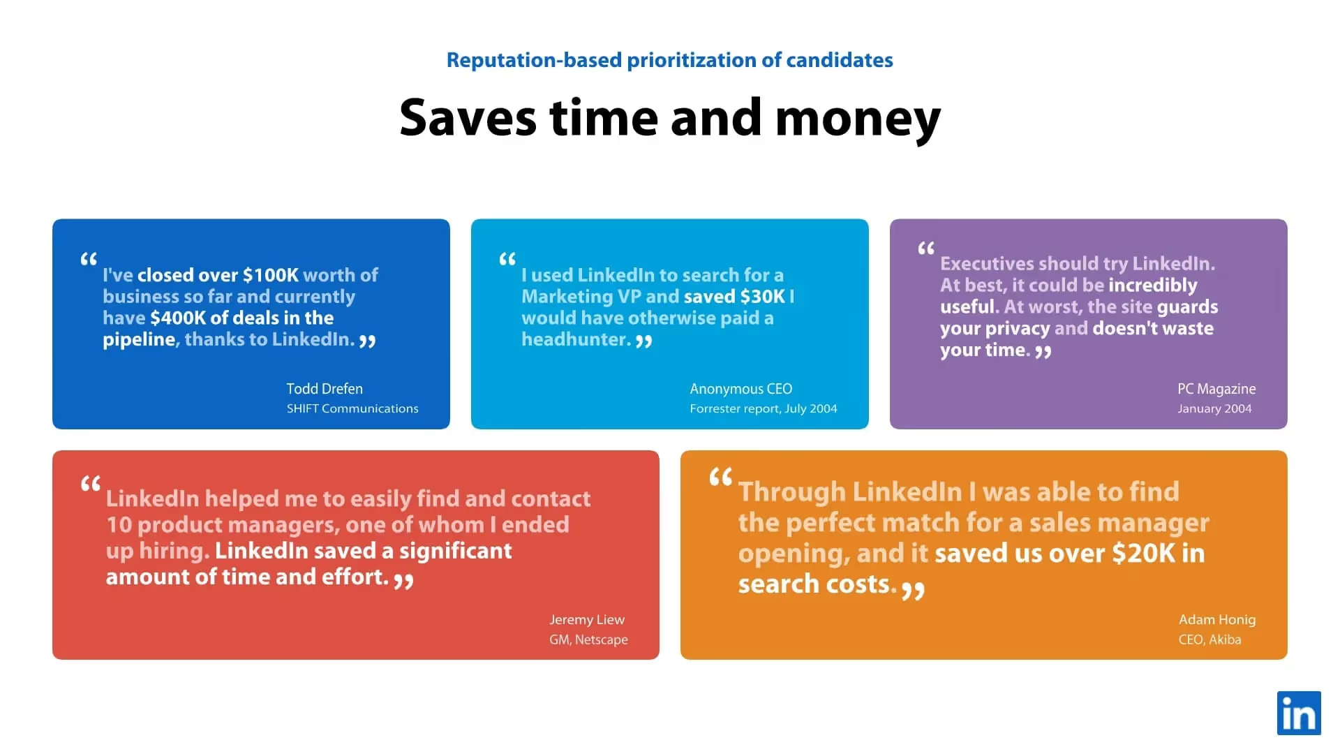
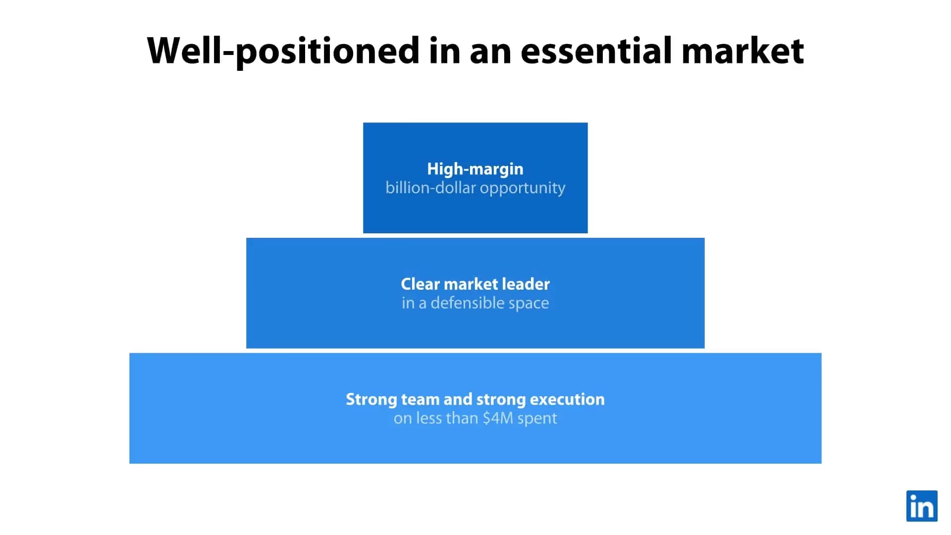
We’re taking LinkedIn’s original pitch deck and giving it a Beautiful.ai spin.
Check Out the LinkedIn Pitch Deck Makeover in Beautiful.ai

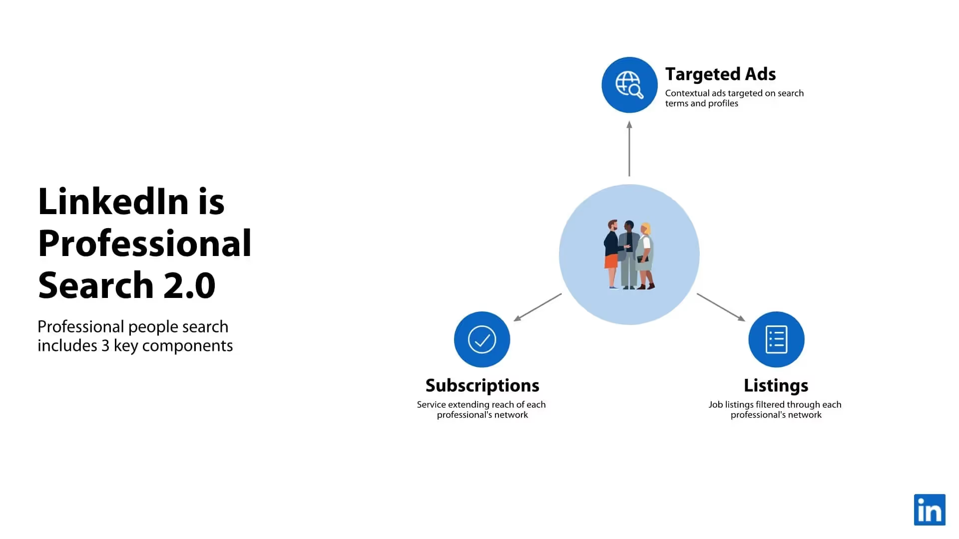
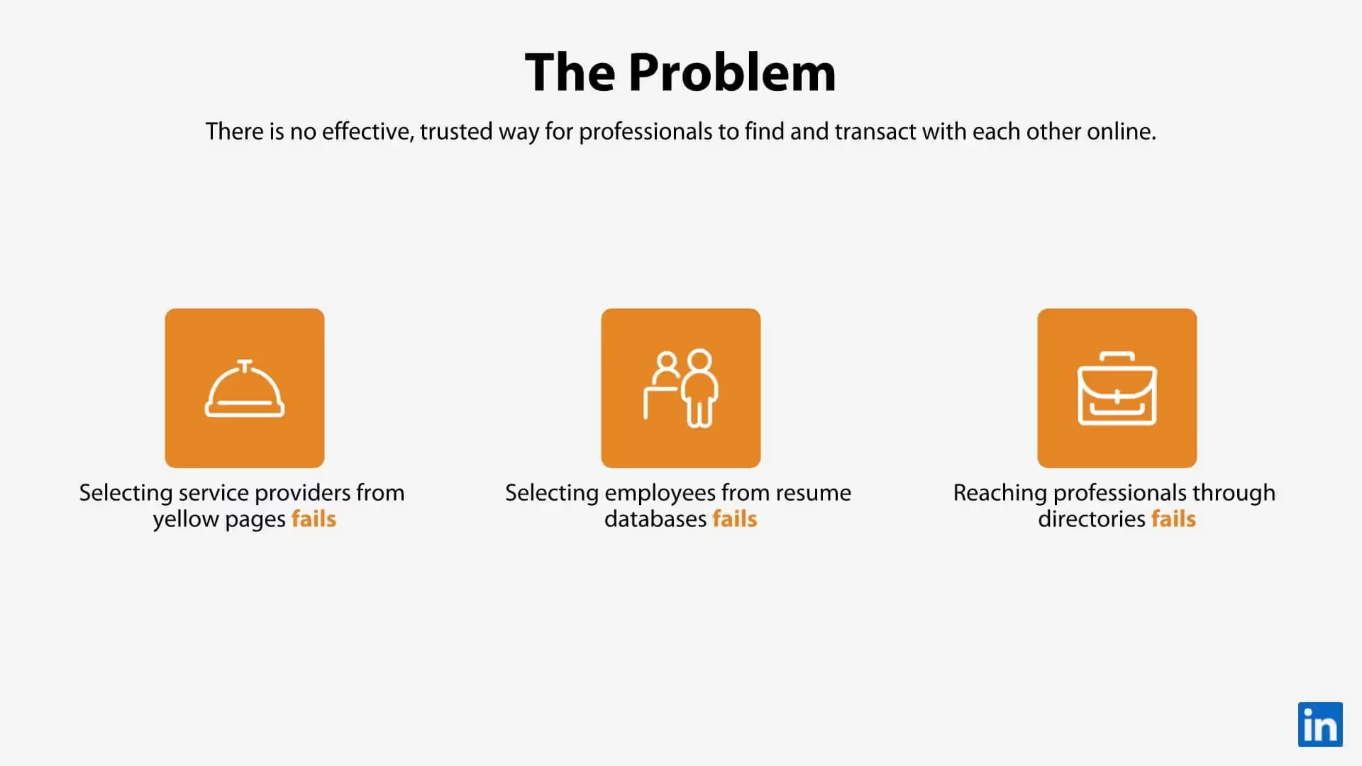
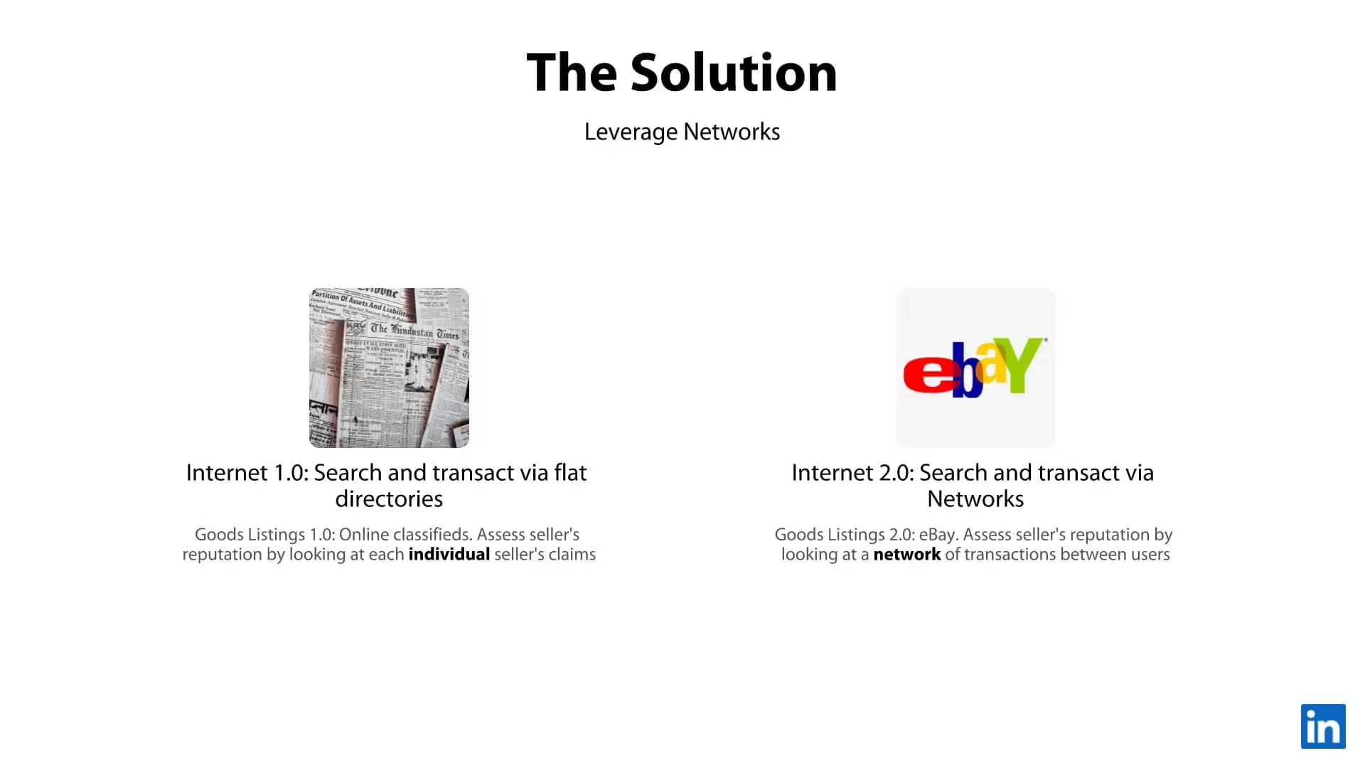

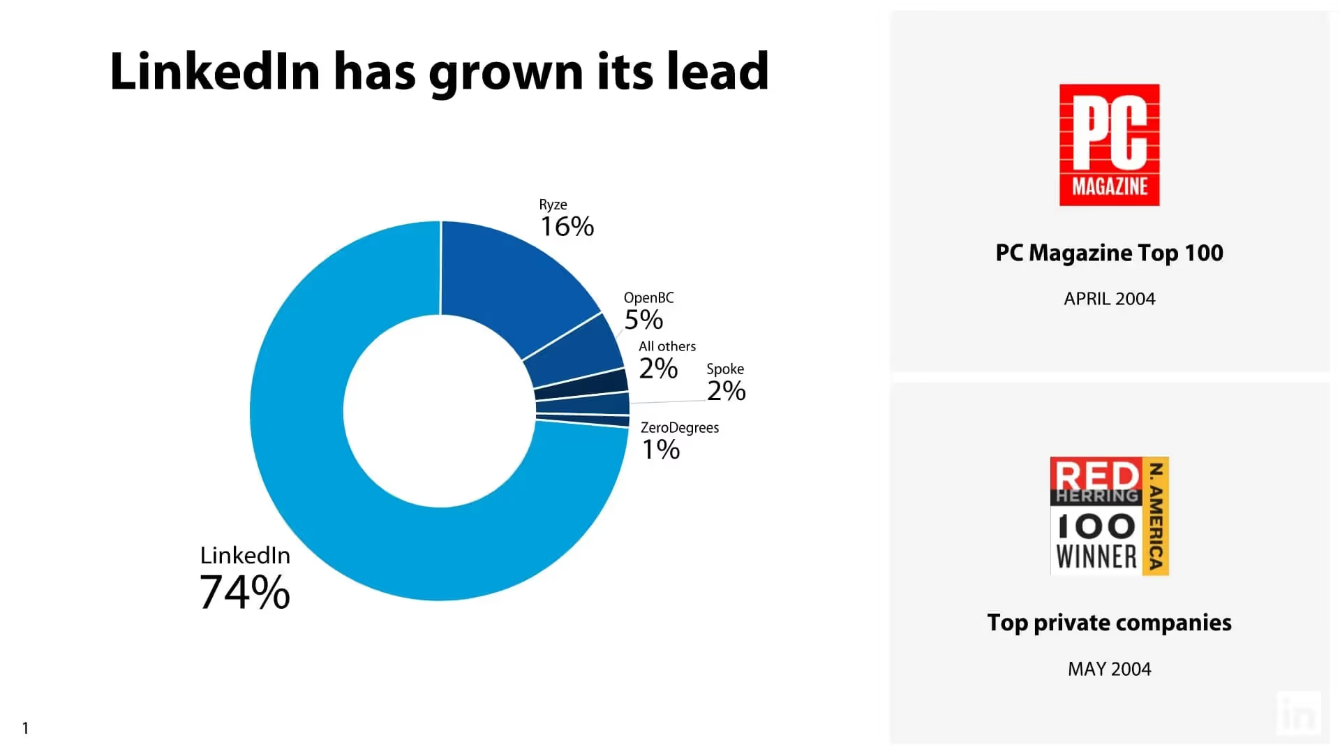


Quick tips for creating a successful pitch deck
Be brief and concise
Each slide makes an impact
Keep it simple
Use visual aids
Related templates

Total Addressable Market (TAM) Presentation Template

Construction Industry Business Pitch Presentation Template

Fundraising Presentation Template
The AI presentation maker for faster impact
With AI that kickstarts your deck and Smart Slides that handle the formatting, you can focus on your story, not the alignment. Go from create, edit, to present with designer-level polish and in a fraction of the time.
Features to ideate, edit, collaborate, and present.
We’re a complete presentation platform. Everything you need is in one place.
Smart Slides
Smart Slides auto-align, resize, and animate your content as you edit, so you focus on the message, not formatting.
Create with AI
Kickstart your ideas with AI. Just enter a prompt, add extra context, and get a beautiful presentation in seconds.
Themes & brand control
Define colors, fonts, logos, icons, and footers once. Save and reuse brand themes across decks and teams.
Data visualization
Instantly create animated charts and graphs. Link any spreadsheet for fast edits and live updates.
Image libraries
Get direct access to an expansive library of free, real-life stock images and videos, no need to leave your slide.
Presentation templates
Discover our gallery of professionally designed presentation templates, multi–slide decks built to give you a head start.
Presentation workflows
Shared slide libraries, real-time collaboration, user permissions, locked themes, and more.
Viewer analytics
Control access, and track engagement so you know what resonates, and when to follow up.
Animation & narration
Add embedded voice or video context to any slide - so your message lands clearly even when async.


Related blog posts
.png)
How Do I Give My Presentation a Polished Look?
.gif)
The Ultimate Guide to AI Presentation Prompts: How To Get Better Slides From an AI Presentation Maker
.gif)
Best Practices for AI Presentations in Global Teams

Try it free for 14 days
Start building Beautiful presentations.


