Spotify Rebrand Presentation Template


Overview
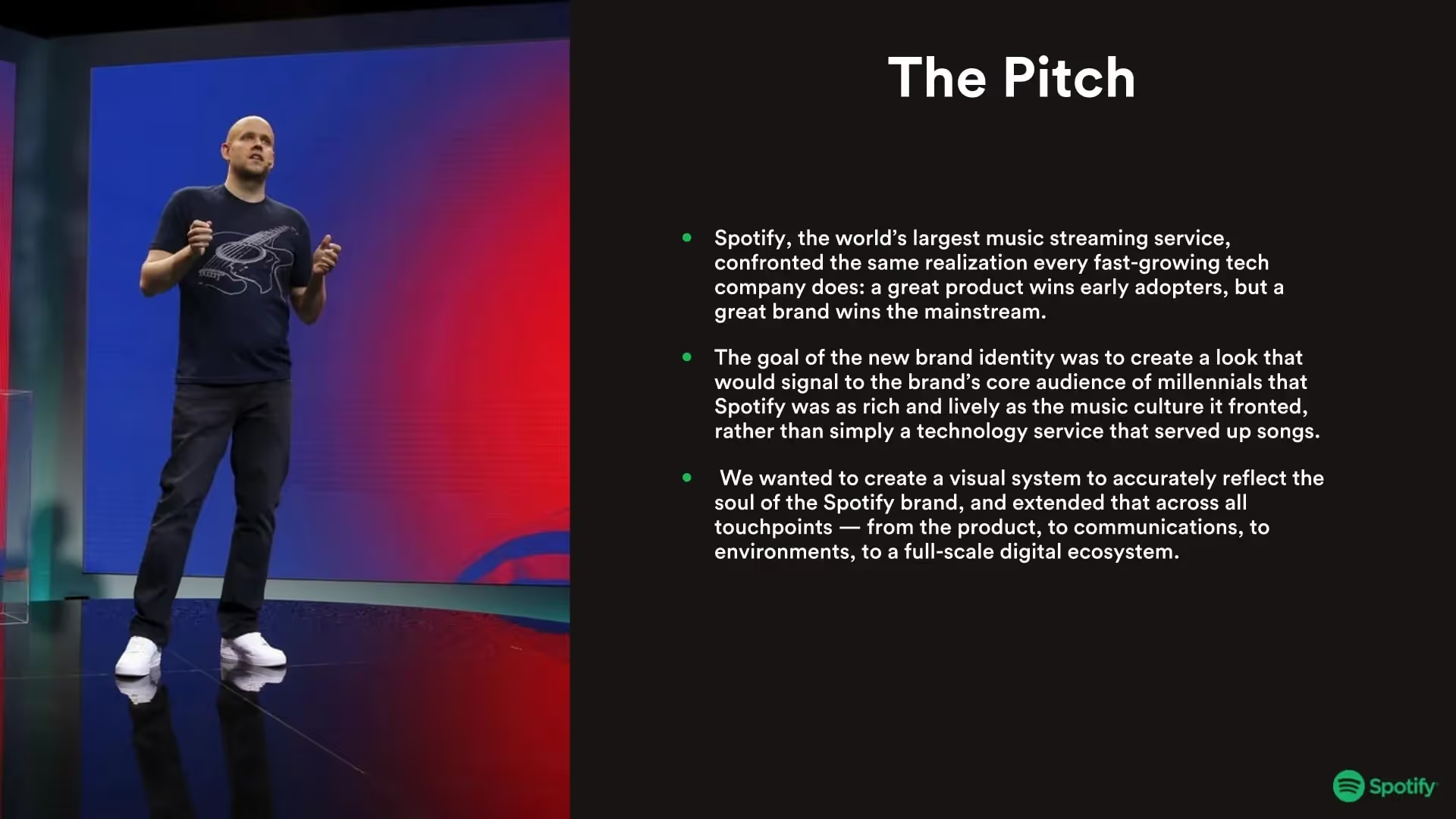
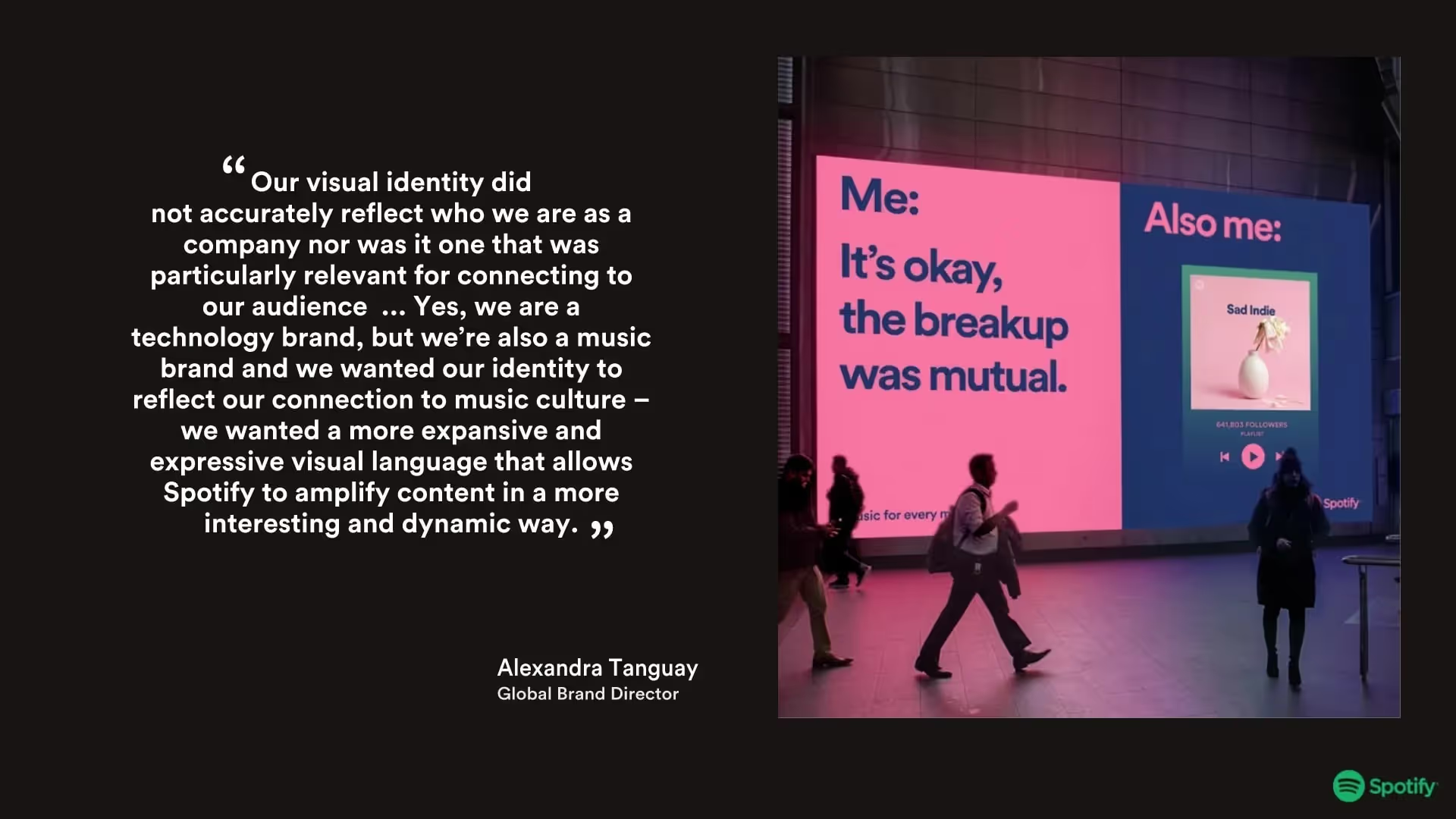
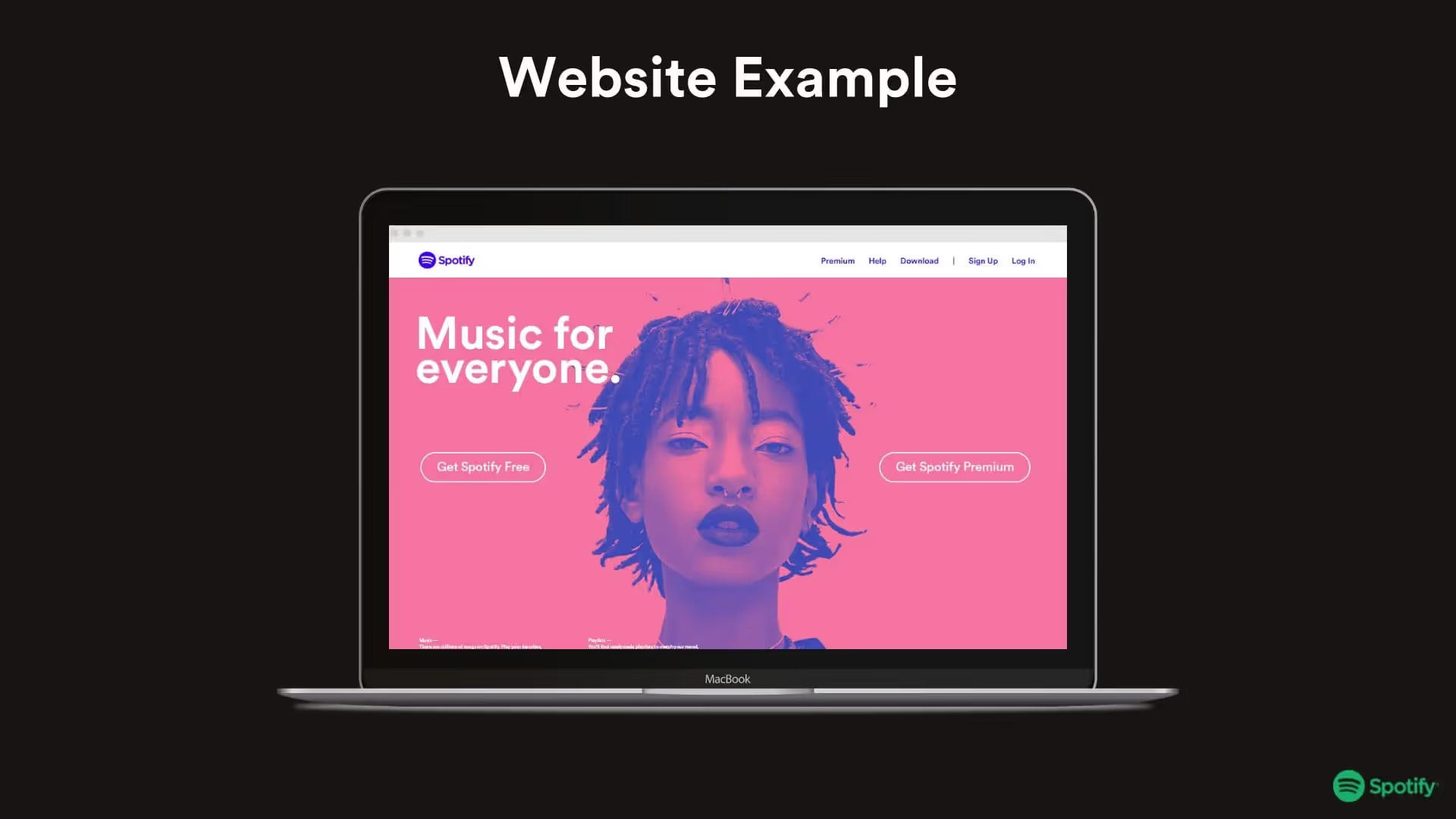
A rebrand is an internal overhaul of an organization’s identity and image to better reflect the business’s goals and mission. A rebrand presentation is necessary to introduce the new branding to your team and key stakeholders. This presentation is using Spotify's 2016 rebrand as inspiration to showcase the type of slides which can help marketers present the new face of the brand to employees, partners, and investors in an organized way. You can see more details of their rebrand here.
The customizable template has everything you need to get everyone aligned and up to speed on the new rebrand. A successful rebrand presentation can help you pitch new branding ideas, showcase the creative process, and introduce new brand guidelines.
Our rebrand presentation can also help you:
- Explain the reason for the rebranding
- Organize the evolution of old and new branding for future reference
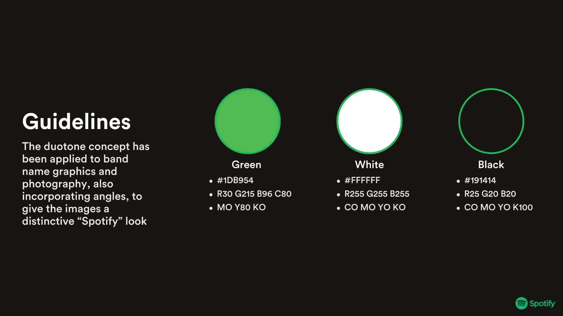
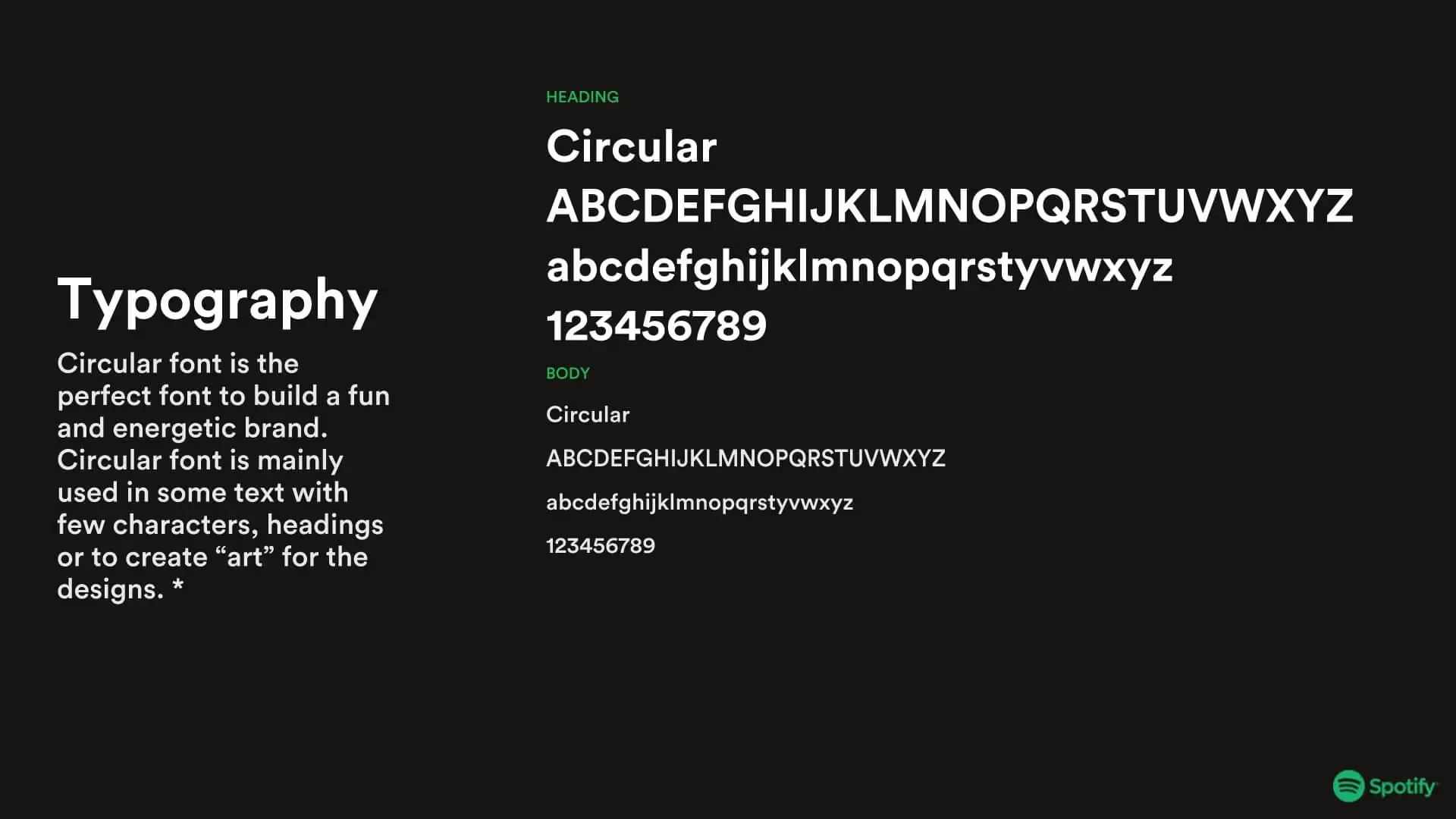
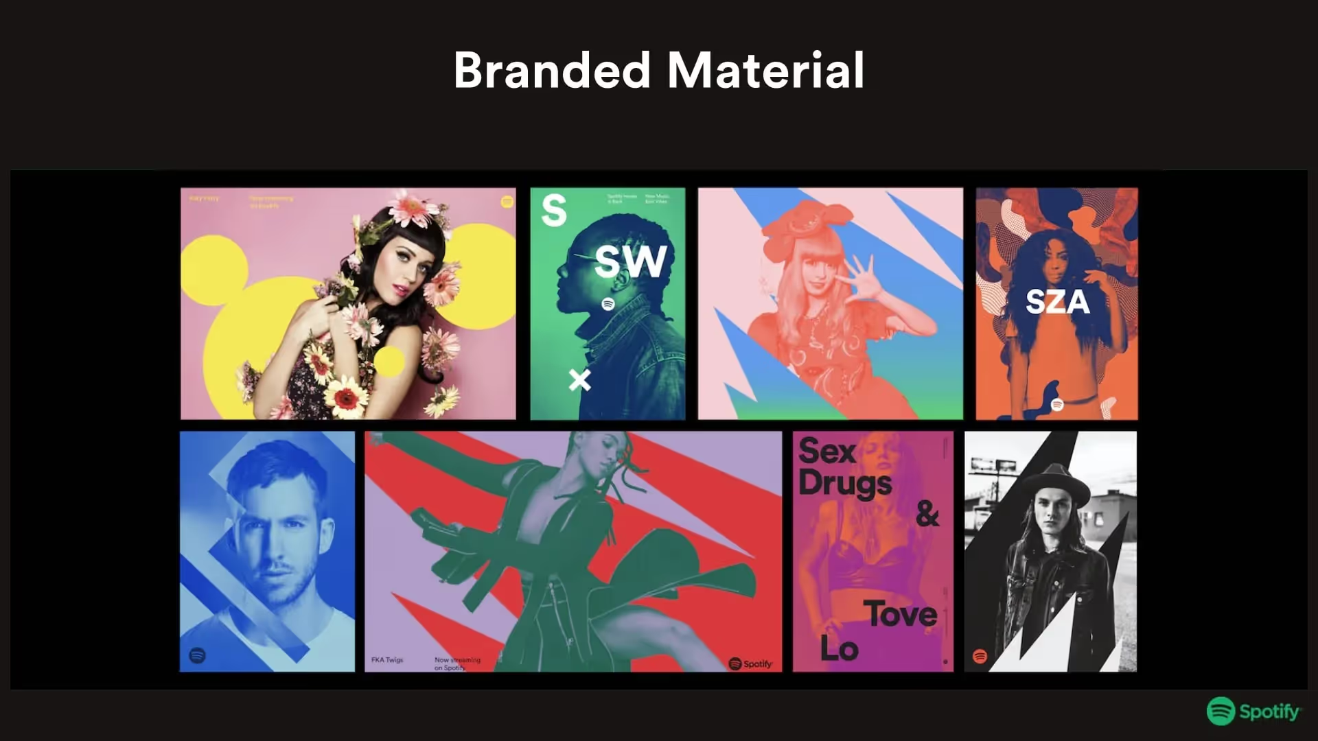
- Share new branded assets, like typography and logos, with the team
Use our template to create an effective rebrand presentation

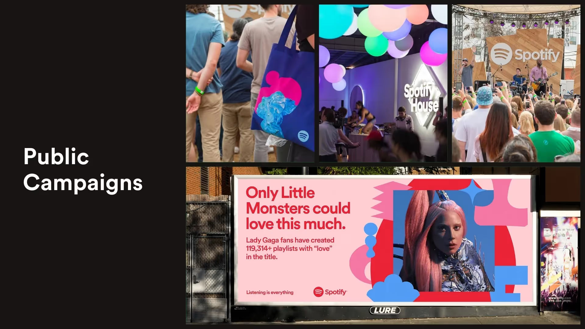
Tips to create your own rebrand presentation
Create a theme
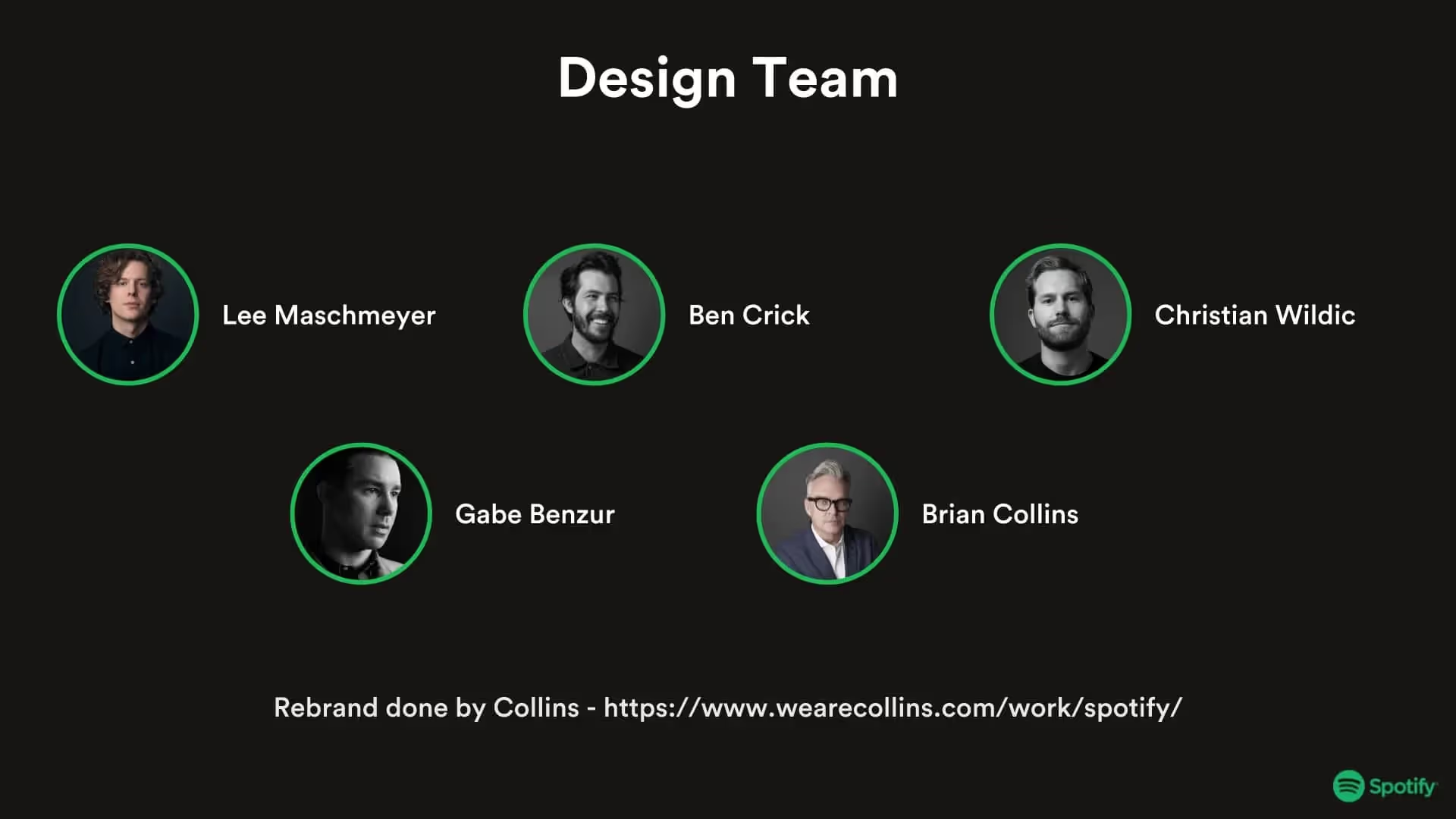
Introduce the team
Include examples
Keep it concise
Related templates
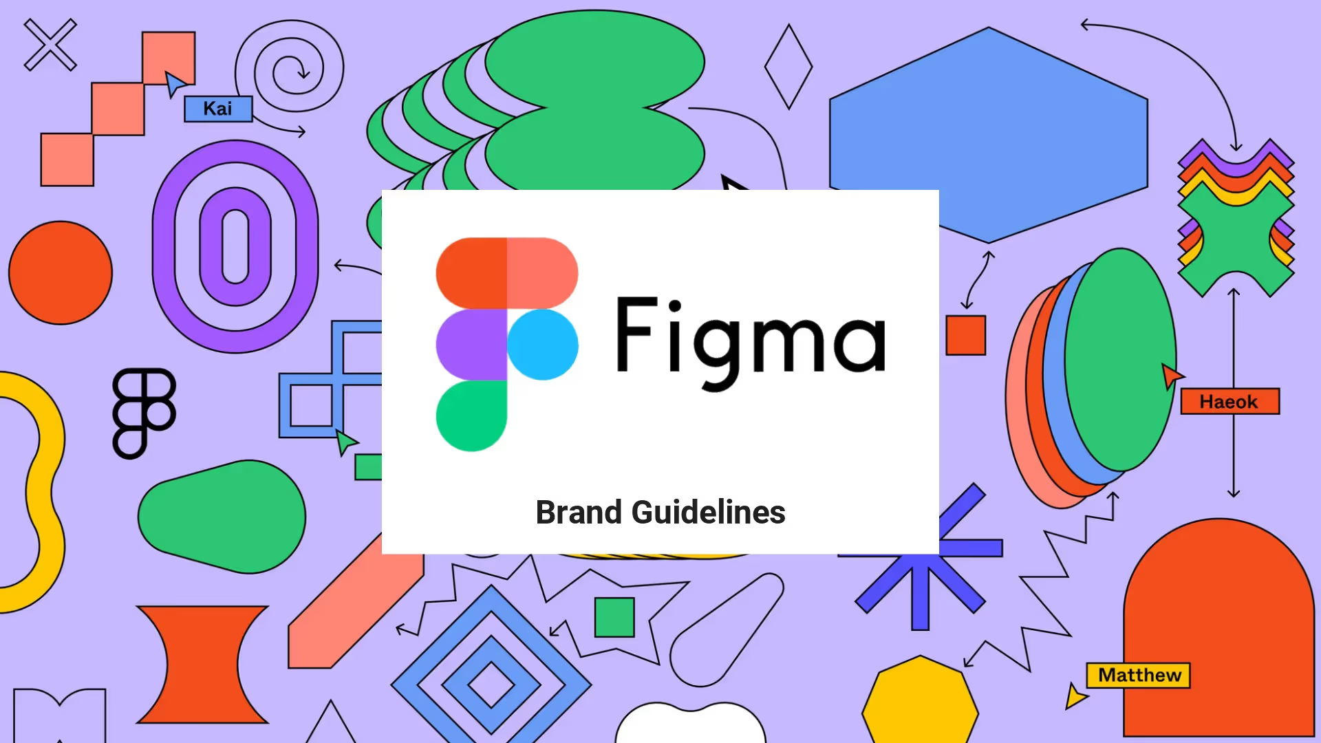
Figma Rebrand Presentation Template
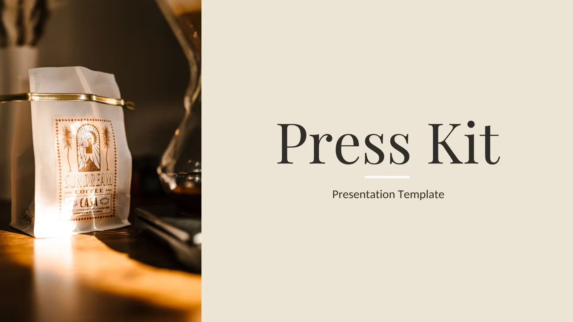
Press Kit Presentation Template

Media Kit Presentation Template
The AI presentation maker for faster impact
With AI that kickstarts your deck and Smart Slides that handle the formatting, you can focus on your story, not the alignment. Go from create, edit, to present with designer-level polish and in a fraction of the time.
Features to ideate, edit, collaborate, and present.
We’re a complete presentation platform. Everything you need is in one place.
Smart Slides
Smart Slides auto-align, resize, and animate your content as you edit, so you focus on the message, not formatting.
Create with AI
Kickstart your ideas with AI. Just enter a prompt, add extra context, and get a beautiful presentation in seconds.
Themes & brand control
Define colors, fonts, logos, icons, and footers once. Save and reuse brand themes across decks and teams.
Data visualization
Instantly create animated charts and graphs. Link any spreadsheet for fast edits and live updates.
Image libraries
Get direct access to an expansive library of free, real-life stock images and videos, no need to leave your slide.
Presentation templates
Discover our gallery of professionally designed presentation templates, multi–slide decks built to give you a head start.
Presentation workflows
Shared slide libraries, real-time collaboration, user permissions, locked themes, and more.
Viewer analytics
Control access, and track engagement so you know what resonates, and when to follow up.
Animation & narration
Add embedded voice or video context to any slide - so your message lands clearly even when async.


Related blog posts
.png)
How Do I Give My Presentation a Polished Look?
.gif)
The Ultimate Guide to AI Presentation Prompts: How To Get Better Slides From an AI Presentation Maker
.gif)
Best Practices for AI Presentations in Global Teams

Try it free for 14 days
Start building Beautiful presentations.


