Presentations have come a long way people: Gone are the days of special effects, gifs, and bullet list fatigue. We’ve also waved goodbye to ClipArt; said Sayonara! to bad stock photography... Heck, we’ve even stopped using charts and graphs that don’t make sense (just for the sake of including them).
But if your current slide deck design reflects any of the “don'ts” mentioned above, or you've somehow lost yourself in the land of bad presentations (no judgement, we swear), then do we have a treat for you: A first class, one-way ticket on the Hot N’ Fresh Presentation Express. It departs now so get your things—we’re leaving!
Besides presenting yourself and your story in a powerful way, the key to clear communication is visual design. And in case you haven’t noticed, design has changed a lot over the last decade or two. Which is a good thing for you, because now things are a lot simpler.
In fact, communicating fewer ideas, better, is the name of the game. No more crowded slides, competing messages, or complicated narratives. Did we mention that ClipArt is dead? Ok, good.
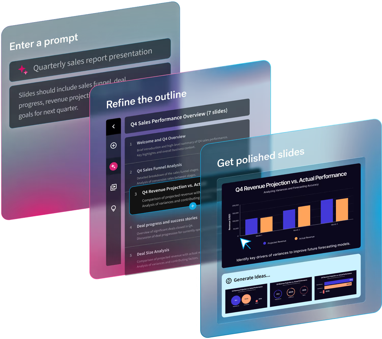
Design plays a big hand in how you communicate your ideas to your audience, and with these hot design trends on the come-up in 2019 (not to mention some insanely progressive "a.i.-powered" presentation tools), creating decks will be easier—and dare we say, more enjoyable—than ever before.
TREND ONE: MINIMALISM

Less is more when it comes to your slides, so consider Marie Kondo-ing your deck to achieve a minimalist vibe before you present it. Use only "what sparks joy," to put it in Kondo terms, and leave the rest out.
A clean white background with black text creates a bold statement that’s easy to read. Turning down the volume on the “noise” (think: graphics, gifs, or photos) on each page keeps your audience’s focus where it needs to be—on your message. That message should be conveyed in as few words as possible too, since minimalism and less text on the page go hand-in-hand.
TREND 2: BETTER PHOTOGRAPHY
"Less stock, more life" is what we always say. You’ll notice our free Beautiful.ai photo library comes packed with non-stock photos that read more "lifestyle"... Anti-stock if you will. Because here’s the thing: stock photos aren’t real life. They don’t reflect what the boardroom (or home, or anywhere else for that matter) really looks like. So if you have the option, choose real over fake every time (when it comes to presentations).
And real people? They like to see themselves in whatever you’re presenting. Diverse, slice-of-life photos are more engaging, because we can picture ourselves in those scenarios—making us more open to messages and concepts that are being conveyed.
When choosing photos to feature in your presentations, keep in mind the minimalist trend and use them sparingly. We’d recommend using photos for transition slides, and using up the whole space to make a big impact. Remember your audience when selecting a photo, too: choose something as diverse and “real” as they are.
TREND 3: STORIES, NOT BULLETS

We know this is going to be a hard habit to break, but hear us out.
The whole point of a bulleted list is to convey more than one idea on a slide at a time. This is in direct opposition to the minimalist trend. Do less, better. You’re also more likely to read directly from your slides when you have bullet points, making your deck more of a crutch than a communication tool. Finally, bullets don’t really offer an opportunity for discussion, because they’re typically a collection of fragmented sentences that represent thoughts that may (or may not) relate to one another.
As someone who knows the deep, tumultuous history of meetings and slide decks, you can imagine the confusion of your fellow corporate comrades when Jeff Bezos banned Powerpoints from executive meetings at Amazon. While this may seem like a pipe dream for most of you (free at last!), Bezos’ underlying reasoning is scientifically sound and brings us to hot trend number three: narrative storytelling.
Stories, not bullet points, are the best way to communicate ideasbecause of how our brains are wired. The most powerful parts of our brain are triggered by emotional reactions, and what gets you more emotional and invested than a story well told? Bulleted lists don’t offer this kind of chemical reaction and, in fact, are the least effective way to communicate ideas. So swipe left.
The next time you get the itch to slap a bulleted list in your deck (we get it—it’s so much easier), we urge you to fight against the status quo and instead, choose one idea per slide and tell a story about what it means.
TREND 4: CONVERSATIONS
Speaking of stories: What’s even more impactful than stories alone? Having a conversation around one. This is why conversational slides are so hot right now—not only are you accessing the parts of the brain that control emotion, and therefore the decision-making functions, but you’re also engaging someone else in a sharing of ideas, which makes it more impactful.
Bonus: great questions and thoughtful communication are both signs of great leadership and send subconscious signals to others that you can be trusted and worthy of following.
How can you use this trend in your next presentation? Engage. Ask questions of your audience throughout your presentation. Don’t be afraid to stop and ask pointed or specific questions, coach to your concepts, and encourage your audience members to talk to each other as well.
TREND 5: FEWER SLIDES
Taking a queue from minimalism, the push to lower your slide count is trending up. After spending countless hours listening to lame, 60-slide presentations on repeat, venture capitalist and Silicon Valley thought leader Guy Kawasaki spearheaded the 10/20/30 rule which says that no presentation should have more than 10 slides, last longer than 20 minutes, or have less than 30 point font.
Plainly put, the 10/20/30 rule is a gift to all those starving, under-caffeinated masses that find themselves in a 90-minute Monday morning meeting full of stats, data, and charts with nowhere to run. However, this idea also reinforces the fact that we humans can’t process too many concepts at once.
Take it from a “Guy” who listens to hundreds upon hundreds of pitches per year and keep it simple, keep it short, and use big fonts.
By the way, we can definitely help you with that.


.avif)
.avif)

.gif)