Historically speaking, presentations have a reputation for being dull, boring, and outdated. We can chalk that up to poor presentation design in older softwares like PowerPoint. Think lengthy text blocks, stuffy stock photos, and cluttered slides. Another pitfall of presentations is that people get complacent with recycled designs, and they all start to look the same.
Luckily, new presentation software like Beautiful.ai allows presenters to reimagine their content and tell their story in new ways. But how do you make your presentation stand out from the rest without losing branding and professionalism?
Here are 7 creative ways to spice up your presentation without losing branding.
Try a background image
Instead of defaulting to a solid color background, try using a background image instead. Upload slide background images to your theme. Choose whether it is treated as light or dark to ensure legibility, and opt to select one as a default background. This can be a simple image like a color gradient, or a background with subtle decorations on the sides.
Add video
Sure, photos in your presentation look nice but are they groundbreaking? No. Instead, try animated gifs or videos to bring your slides to life. Choose from over 80K videos— or upload your own— to draw the attention to your slides. Stock videos can be added as the background on headline slides— or anywhere else you use icons and images!
Generate an AI image
Finding the right image to complement your story can be an endless search. Sometimes stock photography just doesn’t cut it. To add a unique flair to your presentation, try using DesignerBot to generate an AI image that fits your needs. Be specific and detailed in your prompt—including subject, setting, and mood. Here is an example of a prompt to spark your imagination: “photo of busy street in London, people walking to work, morning light.”
Play around with unexpected color combinations
By default, presenters are more likely to stick to a simple color palette in their deck. But colors can make all the difference. Instead of settling for your brand’s primary colors, try using muted or bold colors in the same family. Tweaking the colors— even slightly— can take your presentation from corporate to cool.
Personalize the slide with a video bubble
With video narration, you can now pre record your perfect pitch to humanize the deck! Add a video bubble, record your presentation and position it on your slide. Send a link to your presentation for your audience to view in their own time, or shake up your presentation with a mix of prerecorded and live narration. A message from the founder? Team updates? Let your audience hear from different voices and subject experts to hold their attention.
Switch up the typography
We always recommend companies put their branding at the forefront of their presentation, but sometimes a deck has room for more creative freedom. Uploading custom typography is the easiest way to create a unique deck. Simply upload your custom font in your theme and set it and forget it. It will automatically be applied to each slide in the deck. Don’t be afraid to take a chance on a bolder, more modern font to make a bigger impact.
Write a more impactful message
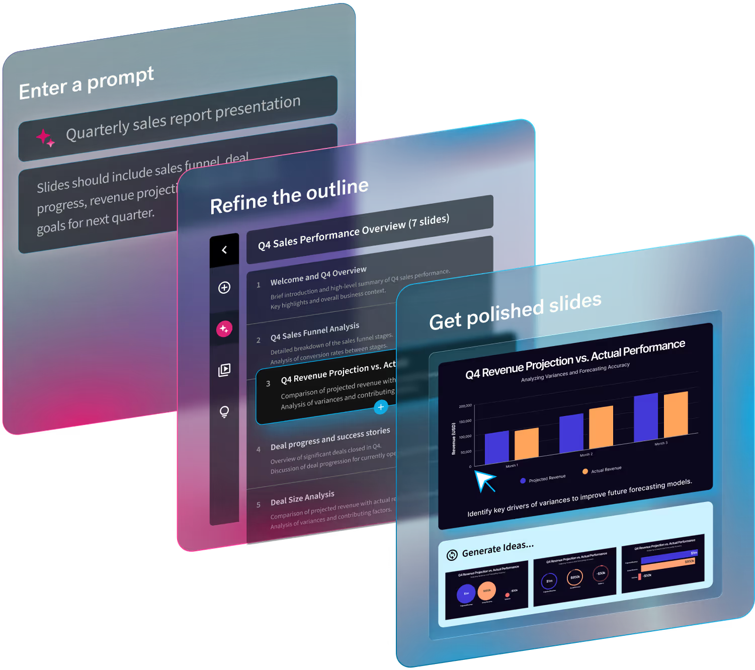
Let AI rewrite your copy to craft a message that packs a punch. Want to sound like yourself, but better? Ask the smart technology to change your tone or use a custom prompt to get the content you need. No really, DesignerBot is here for all your unique needs. Translate text into another language or ask it to generate new content. Try "summarize the benefits of using AI to generate content in a conversational tone" or "rewrite in the voice of William Shakespeare".


.gif)
.gif)

.avif)