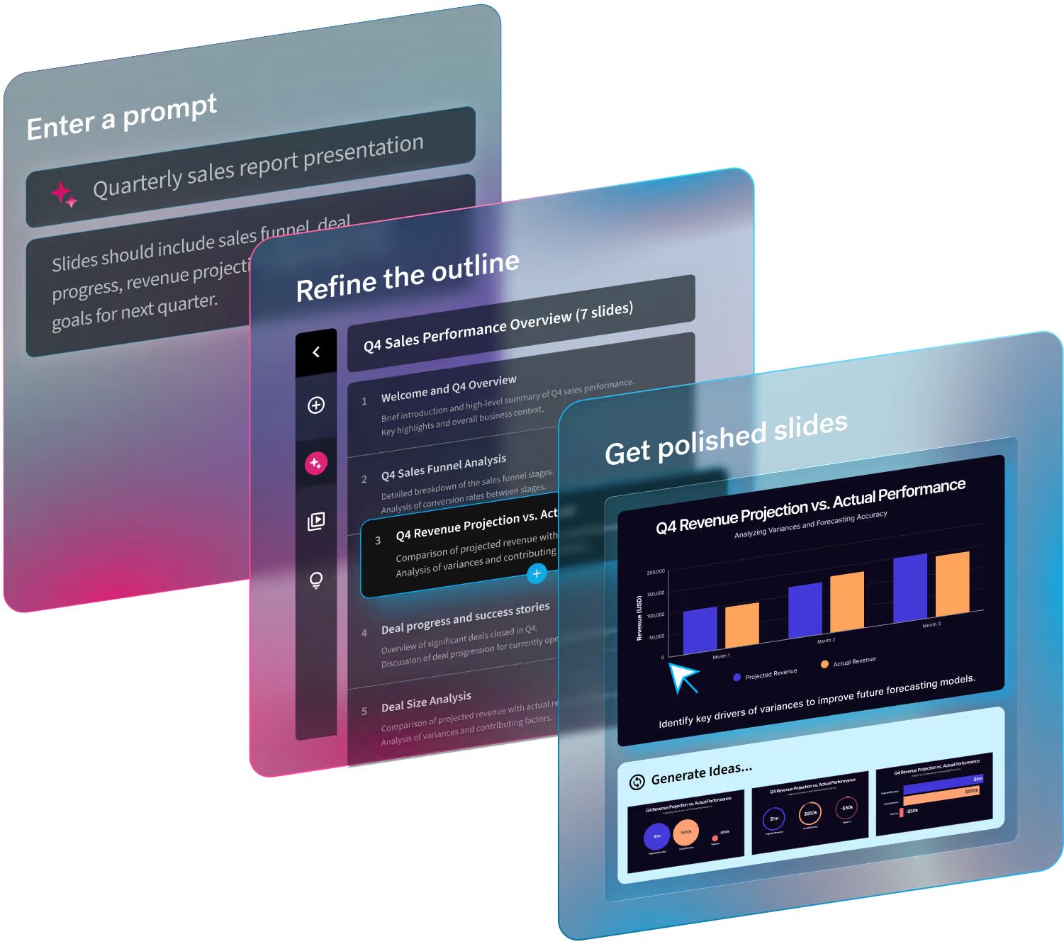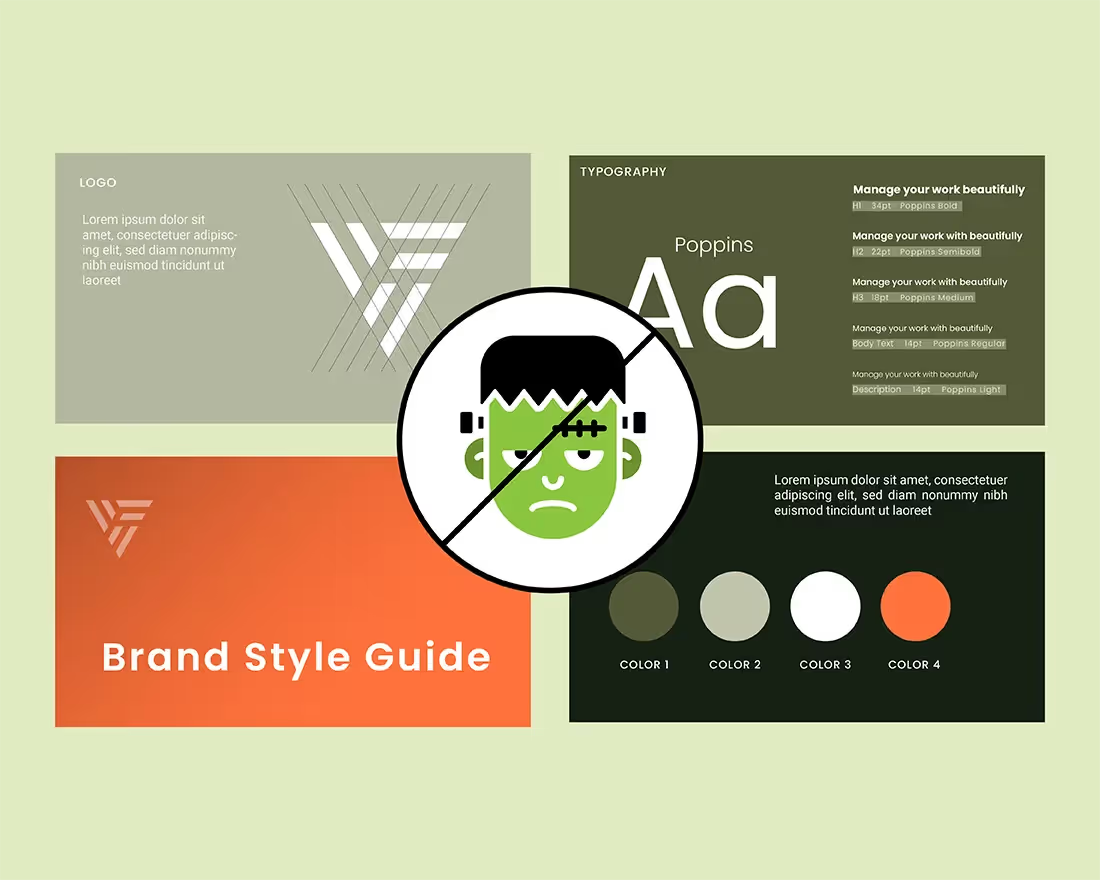
Our goal at Beautiful.ai has always been to take on the burden of presentation design for you so that you could focus on what’s important: your message. This forced us to take a strong opinion on how we thought the slides should look, from the image positioning down to the font size. But we realize that sometimes those options limit your flexibility. Last year we launched Elements, which opened up a more flexible version of Beautiful.ai and released some of the preexisting design restraints.
Our Smart Slides are still there to help guide you, but Elements allow you to take it to the next level and run with your creativity. With Elements you can position different types of text, shapes and graphics anywhere on a slide, which gives you flexibility to craft your message exactly the way you want. We recognize that no one story is the same, and consequently no two presentations should be identical. The ability to customize your presentation design beyond what we could anticipate is what makes it unique to you and your brand. Elements help get you that last mile to make your presentation 100% custom to your specific product, pitch, team, or story.
We think Elements are great (obviously). Of course, with great power comes great responsibility. If you use them right, it will look like a professional designer created your slides. They allow you to add personality and branding to your deck when and where you see fit. But on the flip side, if you don’t know what you’re doing they could make a total mess of your presentation— which is the opposite of what you (and we) are going for. In other words, layering 15 Elements on one slide likely won’t look good, so it’s important to use them with design best practices in mind.
So, now that you’re up to speed on what Elements are, how do you use them? Here are the top use cases for Elements in your presentation that will help up-level any slide.
Call out a feature
It’s nearly impossible for us to anticipate what call-outs you will want to emphasize on your slide— whether that be a product feature, service, or statistic—but Elements allow you to make those decisions for yourself based on your own narrative. The freedom to add context to your slide is key. For example, on our desktop screenshot template you could add an Element to call out a feature on the screen.
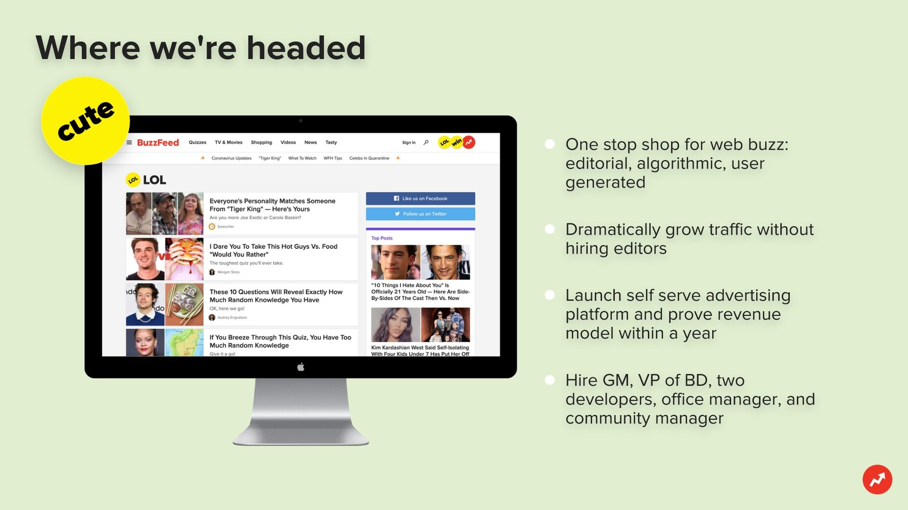
Customize an image
Our image template looks great, but you may want to customize it beyond a standalone picture. With elements you can add text and numbers, or images and icons, to enhance your main photo. This is great if you want to show one image to represent a statistic or product, but need to add an annotation to really drive the message home.

Drop a pin on a map
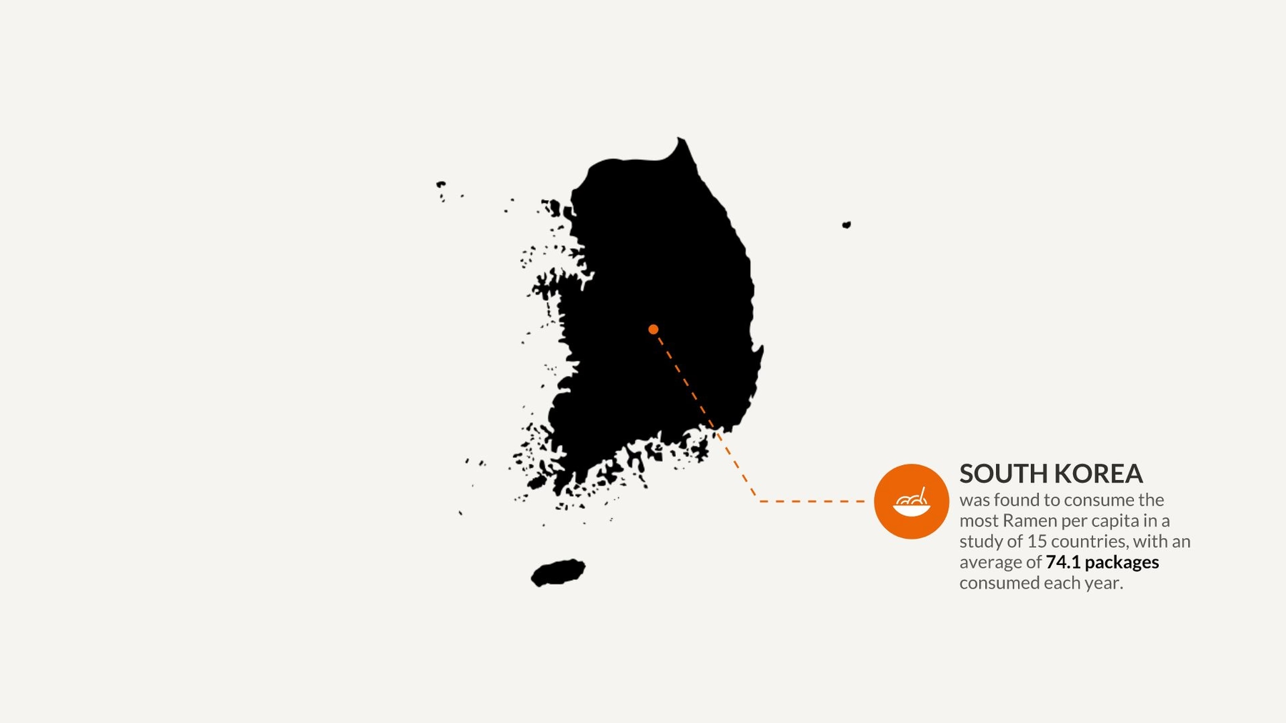
While our world map template is still in the works, Elements allow you to create a workaround if you need to represent a location within your presentation. Get creative! This could be used for a stylized map like the one of South Korea pictured below; a map of your office campus, the element pointing out a specific building; an aerial photo of a coastline, the element pointing out where your property is; or a map showcasing your company’s target demographic. Try using Elements to connect a pin on the map to an icon with text below it explaining the significance.
Explain data on a chart
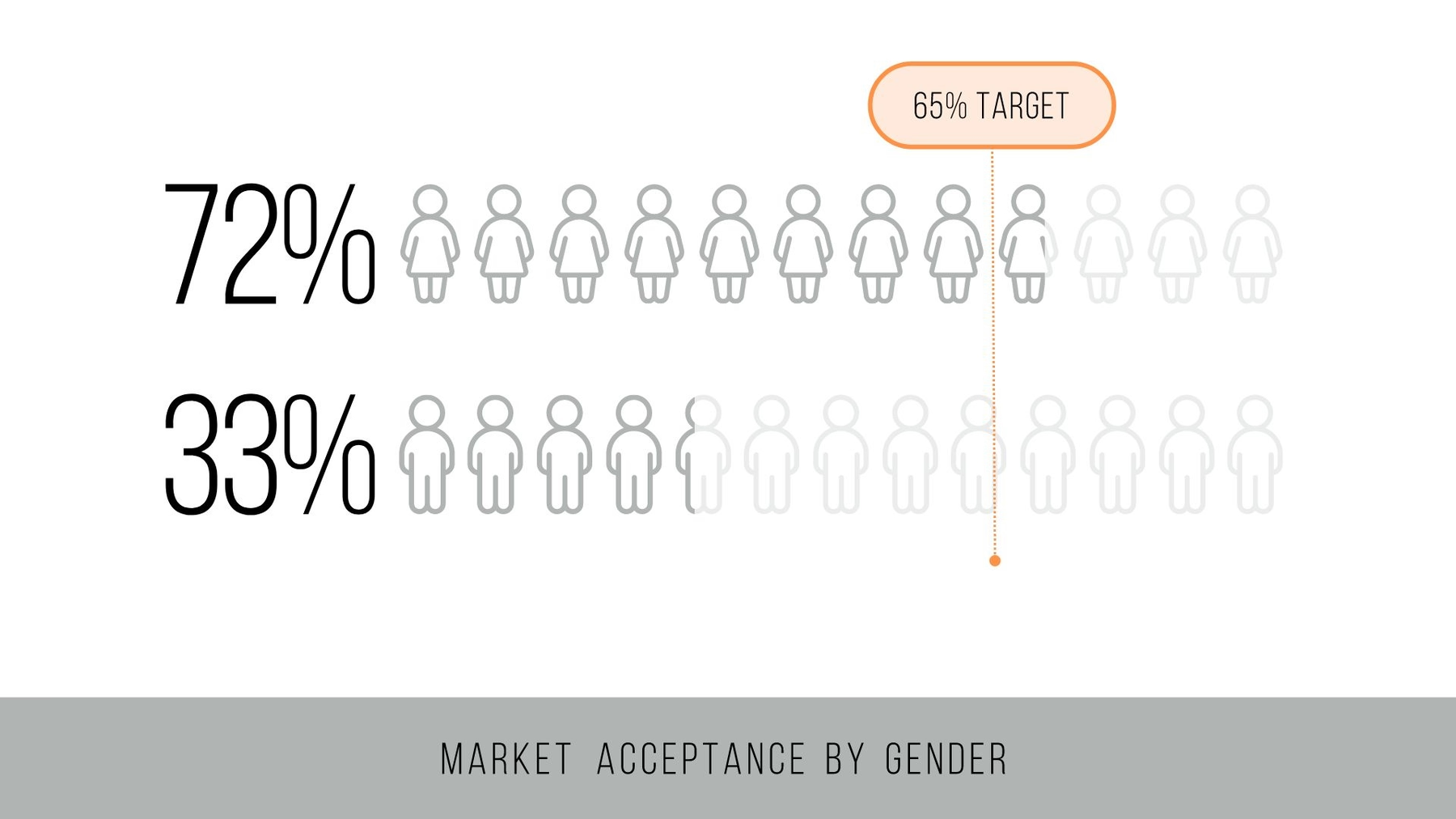
One of the most common uses for Elements is to explain data on a chart. This allows you to add color to a graph or diagram without the need for extra bullet points or lengthy text blocks. The great thing about Elements is that you can move them anywhere on the slide so it acts as an authoring tool to highlight your key takeaways. By using Elements you can call out performance targets, explain keywords, or elaborate on statistics in a clean and stylized way.

.avif)


