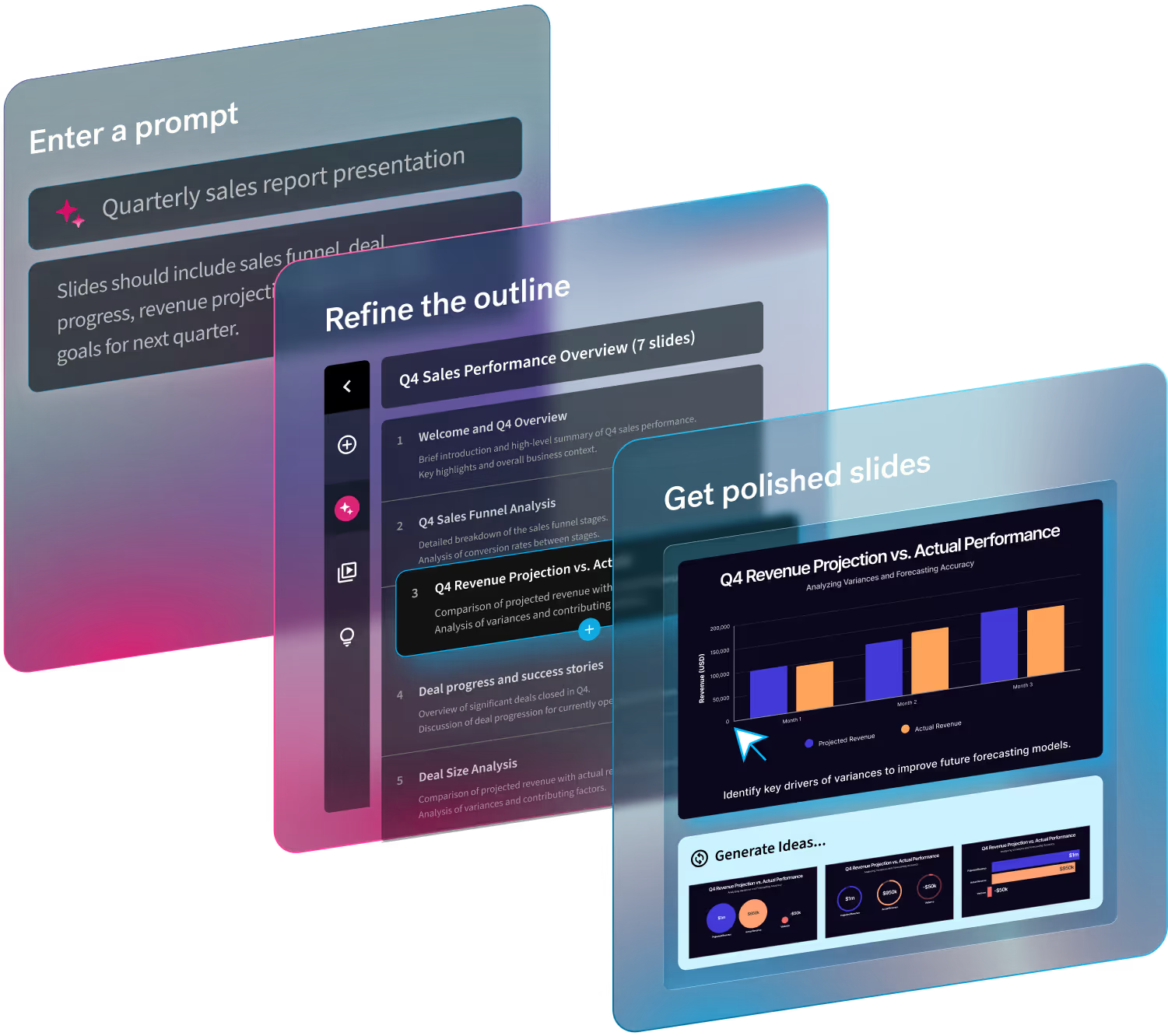
AI-generated presentations are having a moment, and rightfully so. In just a few prompts, tools can spin up complete slide decks, with titles, bullet points, charts, and even visuals, in minutes instead of hours.
That speed is real. And it’s extremely valuable for professionals.
But while AI has dramatically reduced the time it takes to create presentations, it hasn’t magically guaranteed quality. Anyone who’s sat through a cluttered, confusing, or visually inconsistent deck knows the truth: great presentations still rely on design fundamentals.
AI can be a powerful collaborative partner, but only when it’s guided by clear design principles.
In this article, we’ll break down why AI alone isn’t enough, which presentation design rules matter most, how to spot common AI slide mistakes, and how tools like Beautiful.ai apply these principles automatically to raise the quality bar.
Why AI alone doesn’t guarantee a great presentation
AI excels at generation. It’s fast, tireless, and great at synthesizing information. But it doesn’t inherently understand how humans consume information, especially in a visual, time-bound format like presentations.
Without structure and constraints, AI tends to overload slides with content and optimize for completeness instead of clarity.
Design principles act as guardrails. They help AI make decisions that align with how audiences read, scan, and understand slides in real time.
1. Hierarchy still comes first
If everything looks important, nothing is.
Visual hierarchy is the backbone of effective presentation design. It tells the audience where to look first, what matters most, and how to move through information quickly.
Why AI needs clear visual priorities
AI-generated slides often flatten hierarchy—similar font sizes, similar weights, similar spacing. The result? Slides that feel noisy and hard to scan.
Strong hierarchy relies on:
- Clear, dominant titles
- Subheads or callouts that guide attention
- Visual contrast to signal importance
Humans don’t read slides line by line. They scan. If the hierarchy isn’t obvious within a few seconds, the message gets lost—no matter how accurate the content is.
Design rule to remember: One main idea per slide, clearly signposted.
2. Less content, more meaning
AI loves to be thorough, but your slides shouldn’t be.
One of the most common AI presentation mistakes is overfilling slides with text, bullets, and data points. AI is trained to include everything, but presentations work best when they leave space—both visually and cognitively.
Why restraint improves comprehension
Audiences can only process so much information at once. Dense slides force them to read instead of listen, breaking the flow of the presentation.
Great slides:
- Support what the presenter is saying
- Highlight key takeaways, not full explanations
- Use whitespace to create focus
Reducing content doesn’t weaken your message, it sharpens it.
Design rule to remember: Slides should reinforce your story, not replace it.
3. Consistency builds trust
Consistency isn’t just about aesthetics, it’s about building credibility with your audience.
When fonts change randomly, spacing shifts from slide to slide, or colors feel unstructured, audiences subconsciously associate that inconsistency with lower quality and lower trust.
Where AI often goes wrong
Without enforced systems, AI may:
- Mix font styles and sizes
- Apply inconsistent spacing
- Use colors without a clear hierarchy or purpose
Even if the content is strong, visual inconsistency signals that the presentation wasn’t thoughtfully made.
Why This Matters
Consistency helps audiences focus on the message instead of the formatting. It creates a sense of polish, intention, and professionalism.
4. Visuals should clarify, not decorate
AI can generate visuals instantly, but not all visuals add value to the slides.
Generic stock photos, decorative icons, or auto-generated charts can sometimes dilute the message if they aren’t intentional. Visuals should earn their place on the slide.
Purpose-driven visuals win
Effective visuals:
- Explain relationships or trends
- Reinforce the message of the slide
- Reduce cognitive load
Before adding any visual, ask:
- Does this help explain the idea faster than text alone?
- Does it reinforce the takeaway—or distract from it?
Design rule to remember: Every visual should have a job—whether that’s to inspire action, provide additional context, or reinforce the message in an engaging way.
5. Flow beats individual slides
A great presentation isn’t just a collection of good slides, it’s a coherent story.
AI is excellent at generating individual slides, but without narrative awareness, decks can feel disjointed. Each slide might make sense on its own, yet the overall flow falls flat with the human touch.
Presentations are narratives
Strong decks have:
- A clear beginning, middle, and end
- Logical progression between ideas
- Visual pacing that mirrors the story arc
AI works best when it supports story structure—helping organize content, reinforce transitions, and maintain momentum across the deck.
How Beautiful.ai applies design rules automatically
This is where design-aware presentation tools make the difference.
Beautiful.ai doesn’t just generate slides, we apply design rules by default. Instead of asking users to make hundreds of micro-design decisions, the platform enforces principles in our Smart Slide layouts. Once you generate your presentation with AI, our Smart Slide technology automatically handles:
- Built-in visual hierarchy
- Automatic spacing and alignment
- Consistent typography and color systems
- Smart layouts that adapt as content changes
The result: AI-powered speed without sacrificing clarity, consistency, or professionalism.
Beautiful.ai treats design rules as non-negotiable—so every slide improves as you build, not as an afterthought.
The future of presentations isn’t AI instead of design—it’s AI powered by design.

.avif)
.avif)


.gif)
.gif)
.gif)
