We live in a world of Big Data— data about everything under the sun, from buying behaviors to trusted news sources to what we eat for breakfast. The business world is possibly the most impacted by the collection and analysis of data and for good reason. Businesses can make important decisions in seconds rather than days when relying on data analysis. In fact, more than 33% of large businesses will utilize data intelligence by 2023, and the global business intelligence market is forecast to grow to $33.3 billion by 2025— a $10 billion increase from 2020.
So, what exactly do organizations do with all that data? Pages and pages of numbers don’t mean much to the average observer, and there is often far too much information for any human brain to process. Through business intelligence (BI), software transforms the data into meaningful insights that provide clear guidance. BI tools not only gather and report the data, but the programs also often analyze the information, and many display results through easily-digestible data visualizations.
Data visualizations are vital to the success of a BI strategy. After all, lengthy reports are not just dull, they really don’t provide a lot of useful information without thorough analysis… and there is just too much information for a person to evaluate. What does it all mean?
Enter artificial intelligence. Tools like Tableau and Microsoft Power BI mean the difference between pages of names and numbers or valuable insights illustrated with colorful infographics. Simply put, business intelligence visualizations tell the data’s story.
Choosing the Right Data Visualizations for BI
Of course, not all infographics are created equally. A pie chart or a bar graph will not tell the same story as a Venn diagram or a flow chart. Certain data visualizations, however, are more useful to illustrate certain BI concepts than others, including:
- Marketing and sales departments often report information such as buying trends and market demographics. Pie charts and bar graphs are great for breaking down a larger data set into its parts. Meanwhile, an infographic like a line graph can illustrate how something changes over time or even according to monetary values.
- Human resources reps rely on data such as salaries and demographics, hiring trends or onboarding costs. The classic bar graph is perfect for breaking down categories, such as recruiting sources, salaries and tenure. They are also ideal for comparing different amounts of just about any categories. When the BI report is too complex to illustrate with a simple two-axis infographic, HR departments can turn to data visualizations like a scattergraph or a radar chart that allow for any number of variables.
- Any number of data visualizations are effective ways for accounting teams to present their data. Bar graphs, pie charts and line graphs are all effective ways to categorize both spending and profits, but the latter can also illustrate changes across time or another linear scale. Whereas the line graph tells the story of trends, the BI report alone is just a list of numbers.
- Management uses BI for a plethora of purposes both internal and external, and data visualizations allow them to communicate and publish the business intelligence reports in a way that practically anyone can understand. Other types of infographics used in BI include Gantt charts for scheduling and tracking progress and a flowchart to show a process or relationships. Even maps and timelines can be employed to illustrate BI insights.
Choosing the Right Tools for BI Visualization
Hoping to add pizzazz to an otherwise dull business intelligence report? Check out the following tools for creating engaging and effective data visualizations to illustrate your BI reports:
1. Tableau
Tableau is a popular BI platform among data experts that is known for its user-friendliness— user-friendly to data scientists, that is. But the program is often too advanced for the average user. The software features interactive dashboards and real-time data analysis. Tableau also offers engaging data visualizations to paint a picture of the BI reports, to boot. It even features mobile apps for iOS and Android.
Tableau users are particularly fond of the BI software because they can easily drag and drop images to create their data visualizations, not to mention its speed. It doesn’t hurt that Tableau can also be integrated with external data sources including Oracle, Google Cloud, SQL, Excel and several others.
2. Microsoft Power BI
Microsoft’s cloud-based business intelligence solution Power BI offers users the ability to both prepare their BI data reports and illustrate them with ease.
Power BI features plenty of custom visualization options, so users can design infographics with assistance from Cortana. Plus, the program’s dashboard makes sharing insights simple, including publishing data reports to the Web. Power BI also can connect to data reporting and analysis resources like Salesforce, SQL, Oracle, Zendesk and Excel.
3. Google Data Studio
It should be no surprise that Google includes its own free business intelligence visualization tool in its suite of cloud-based software products. The Google Data Studio can be integrated with the entire line of Google productivity tools, including Google Analytics and Google Sheets.
While the program is also popular for its sizable library of reporting templates, it doesn’t offer as much deep data functionality as some other software choices, and it doesn’t integrate with most third-party products. Still, as a Google product, the Data Studio is simple for anyone to access anywhere with an internet connection from almost any device— all they need is their Google account to get started.
4. Beautiful.ai
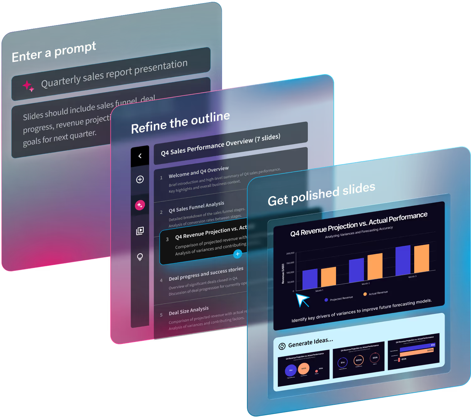
While the cloud-based PowerPoint-alternative presentation software won’t analyze data, it can help even an amateur present their BI report like a boss. The software features a large variety of smart slide templates, including plenty of infographics. Just enter the data into the fields provided and watch as artificial intelligence transforms the information into effective and engaging data visualizations, including everything from a pie chart to a customer journey map.
Users don’t even need to know precisely how to design a pro-level slide deck. Beautiful.ai’s many presentation templates, including choices like a business plan presentation, a weekly report and a competitive analysis report are perfectly curated by professional designers, and users can easily customize the template to best fit their BI reporting needs.


