
.avif)
.avif)

Numbers matter, but stories stick. You can pack a marketing report with metrics and charts, but without context, those numbers are forgettable. Storytelling turns data into insight. It connects the dots between effort and outcome, showing stakeholders not just what happened, but why it matters.
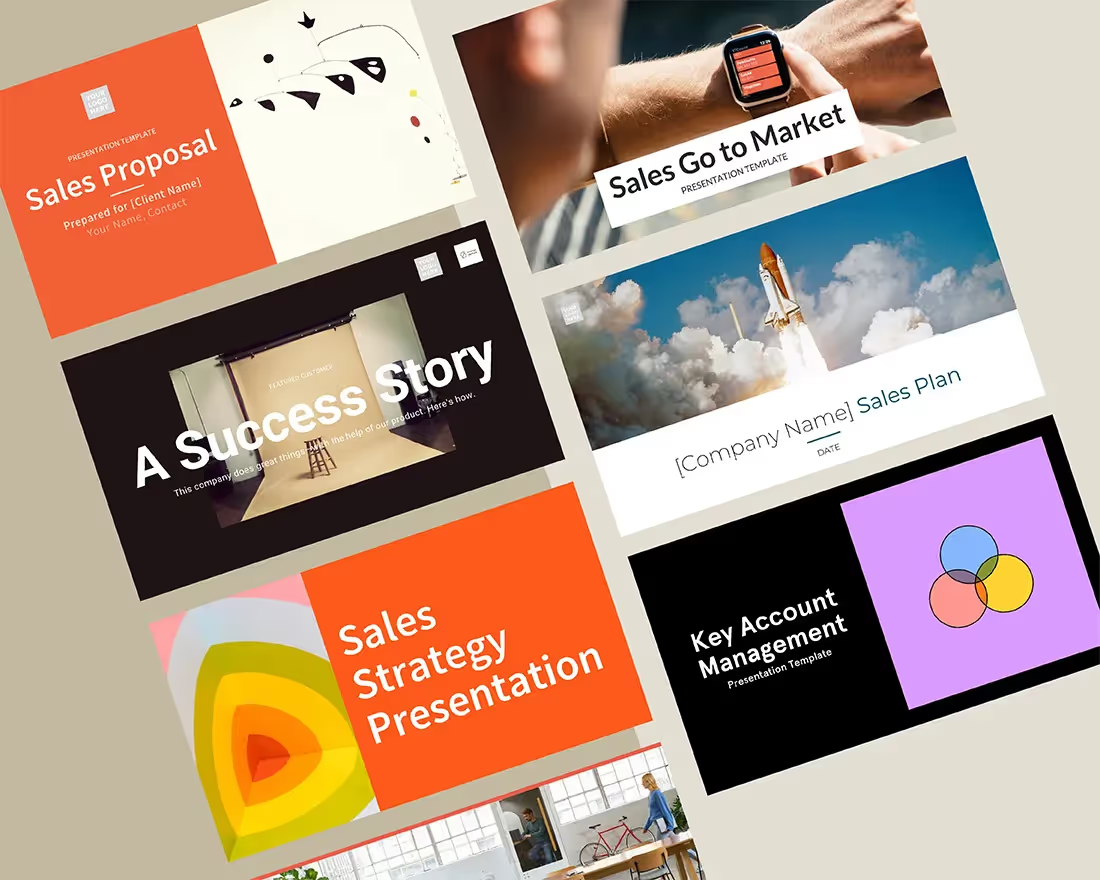
When you frame your report as a story, your audience doesn’t just see the numbers—they understand the narrative behind them. Tools like Beautiful.ai’s presentation templates make that easier than ever, helping you shape raw data into a compelling, visually consistent report with a clear narrative and flow.
Turning data into meaning
Data alone doesn’t drive decisions—understanding does. A spike in engagement or a drop in cost-per-click only resonates when you explain the why behind it. Storytelling gives context to your performance, helping your team and stakeholders see the strategy behind the stats.
Instead of “conversions increased by 20%,” try “our new paid strategy drove a 20% lift in conversions—proof that our refined targeting worked.” It’s simple, but it transforms numbers into impact.
Structure it like a story
The best reports follow the same rhythm as great storytelling: beginning, middle, and end.
Start with context. Revisit your goals, campaigns, and expectations for the quarter. Set the stage for what success was meant to look like.
Then move to the middle—your results. Show what worked, what didn’t, and why. Don’t just show metrics; interpret them. Explain what drove change and where opportunities emerged.
Finally, end with action. Summarize takeaways and next steps. Turn insights into forward momentum.
A presentation template helps you visualize that story clearly, giving you a starting point for how you should structure your deck. Templates like Beautiful.ai’s quarterly business review presentation can be easily customized and tailored to fit your marketing report. Each slide becomes part of a larger narrative that moves from goals to results to what’s next.
Focus on the right data
Not every number deserves the spotlight. Focus on the metrics that matter most to your goals. What shows progress toward your strategic objectives? What will actually drive decisions?
Once you’ve identified those key metrics, make them clear and visual. Beautiful.ai’s smart charts and data slides do the heavy lifting for you, translating complex data into simple, branded visuals that are easy to digest.
You’re not just reporting numbers—you’re highlighting the story of your team’s progress.
Bring your data to life
Behind every chart is a human story. Add color with campaign highlights, creative wins, and customer feedback that give your numbers personality.
Celebrate the moments that mattered like the launch that outperformed expectations, the message that resonated with your audience. And be honest about the challenges too. Transparency builds trust and shows your team’s commitment to growth.
Beautiful.ai makes this easy with flexible Smart Slide layouts for visuals, quotes, and examples that bring your data off the page and into context in a more engaging way.
Design that supports your story
Design is about more than just aesthetics. A clear, consistent layout keeps your audience focused on your message. Visual balance and brand alignment make your quarterly marketing report look polished and professional.
A good rule of thumb is to keep things clean (less is more). When designing your deck, prioritize consistency with fonts, colors, and imagery. Use space strategically so slides feel light and scannable, not cluttered. With Beautiful.ai’s built-in design guardrails, every report stays on-brand automatically—no extra effort required.
How to unlock better quarterly marketing reports with Beautiful.ai
Building a quarterly report shouldn’t take days of designing and formatting. The Quarterly Business Review template from Beautiful.ai gives you a head start with smart, structured layouts for metrics, insights, and next steps. While a business review may have slightly different content than your quarterly report, it’s a good starting point to get your ideas down in a deck.
Each template is totally customizable, and the Smart Slide layouts adapt as you add and edit content, ensuring visuals look sharp and messaging stays clear. Brand guardrails maintain consistency across your team, while collaboration features make it easy to gather input and iterate together.
The result? Reports that look professional, tell a clear story, and are ready to share—without a single design headache.
Once your report is in a good place, sharing is easy in Beautiful.ai. Create a secure, shareable link and share the most up-to-date version of the deck with internal or external partners. Marketing teams can even use the analytics functionality to see who viewed their deck, and which slides they spend the most time on or skipped altogether. This helps marketers understand which parts of the report are resonating with stakeholders.
A marketing report isn’t just a collection of charts—it’s the story of your team’s impact. Storytelling turns data into something people remember. It transforms performance metrics into a clear narrative of growth, learning, and next steps. With Beautiful.ai it’s easier than ever to take insights and turn them into real, measurable impact.


.avif)

.png)
