
Presumé, Portfolio, Creative Resumé… whatever you want to call it, we can help you present your work in the best light. After all, how you package your work experience as a creative is an important part of the equation. It’s the first “taste” either a potential client (if you’re a freelancer or consultant) or employer will have of you, so it should accurately and flatteringly portray your talents.
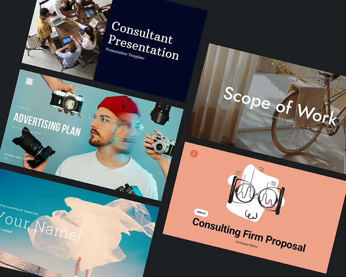
If you are starting from scratch, you can use this free sample presentation template—designed to showcase the scope of your creative work and experience in an interesting way. Or, if you need some help getting organized and understanding what goes into each page of your presumé, read on for additional information.
Prep work
An important part of any creative role—as you know—is the ability to clearly communicate your vision before a project starts. These types of outlines usually detail the conceptual direction you want to take, the resources you’ll need in order to start production, a clear timeline, and how you will gauge “success” when it’s time to wrap. It may be easy to organize a list of ideas to sell a new concept to your boss, but what happens when you need to sell yourself?
The way you choose to “self-brand” in the context of your professional experience can be your biggest asset when applying for a new job. Many creatives find it challenging to communicate how their skills and contributions can add meaningful value to an organization. Some questions to help you find clarity could be:
- What type of clients or jobs am I hoping to land in the future?
- What are my true passions and “unfair advantage” over other creatives?
- What would I consider my best work to date?
The presumé template here was crafted especially for creatives, to simplify the prep work involved and present your qualifications in a clear framework. We will examine each page of your creative portfolio (aka “presumé”) and outline best practices to land you that killer creative gig you’ve always dreamed of.
Start With a Splash (Title Slide)
Go ahead, don’t be shy! Introduce yourself with an eye-catching title page that hints at your style: vibrant and graphic; subtle and sophisticated; sleek and modern. There are a number of studies surrounding the psychology of color, so it’s important to consider the look and feel of your portfolio and how it will be received by your audience.
Once you have decided on an image that best represents your work, add some basic background info: Your name, field of work, highest degree level, etc. But keep it short and sweet. The title page should provide a tiny bit of context, while the voice and visuals set the tone for the entire presentation.
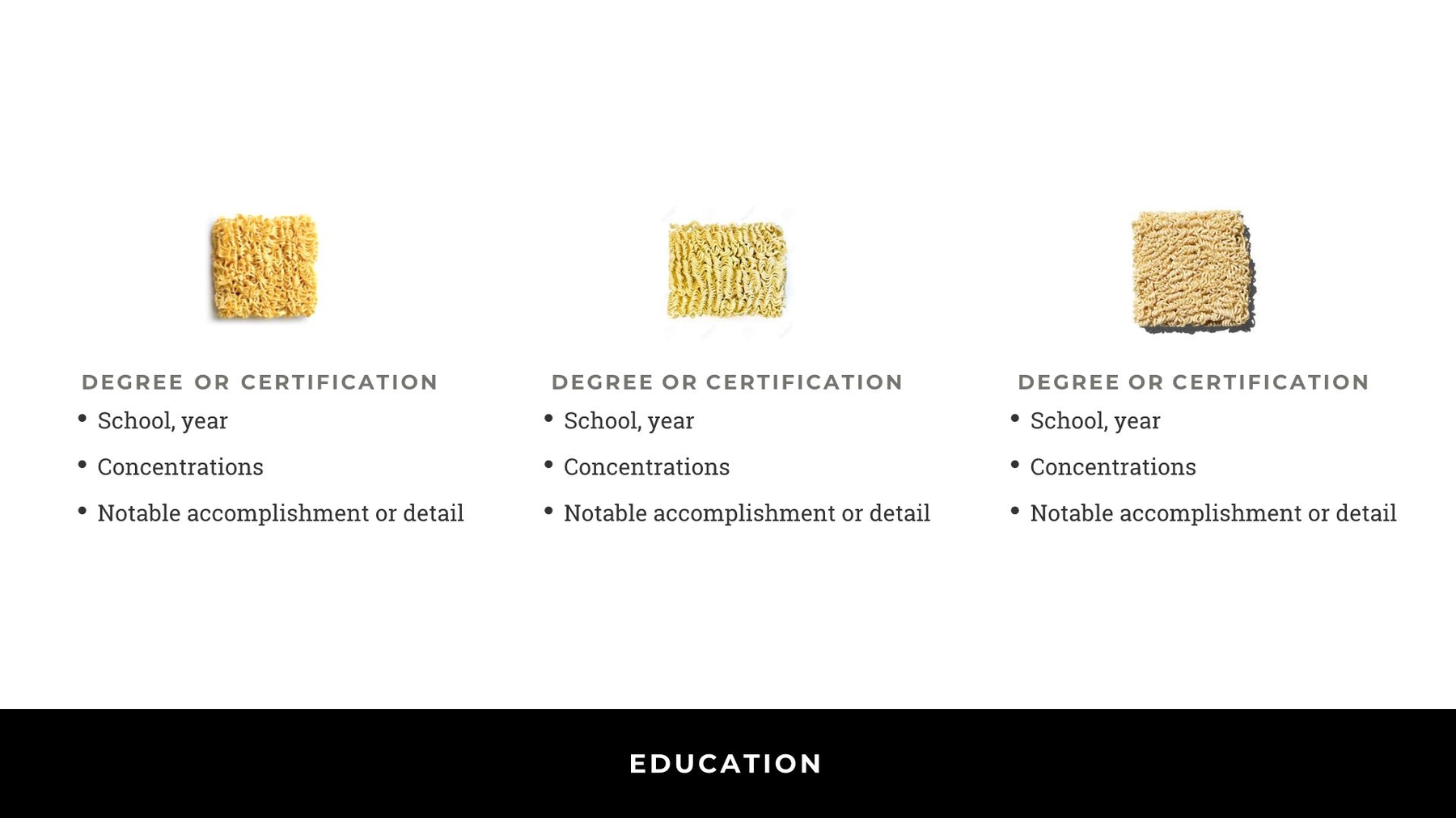
Show Your Smarts (Education Slide)
You’ve shelled out enough cash getting that education, so let’s make sure that’s first and foremost in your presentation. To start, include a brief breakdown of the degrees and certifications you have earned on this page. This could also mean additional “concentrations,” awards, or honors that show your aptitude for the position at hand and play to your strengths. This is a good place to mention any applicable skills you learned from particular classes and degrees.
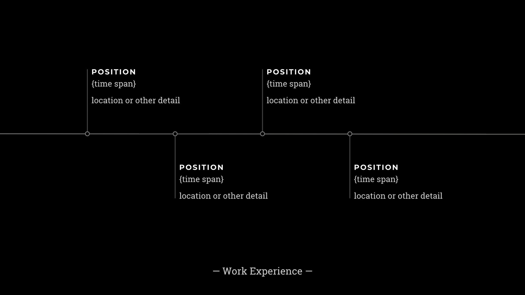
Plot Your Professional Journey (Timeline Slide)
Perhaps you are an established creative with 10-plus years of experience, or maybe you’re just starting your career. Either way, you can use the “Timeline” page template to walk your audience through relevant positions you’ve held, and the time frame you spent in each role. The “Timeline” here adds a visual representation of the career path our Creative, has taken to date, as well as gradual increases in roles and responsibilities (way to go!).
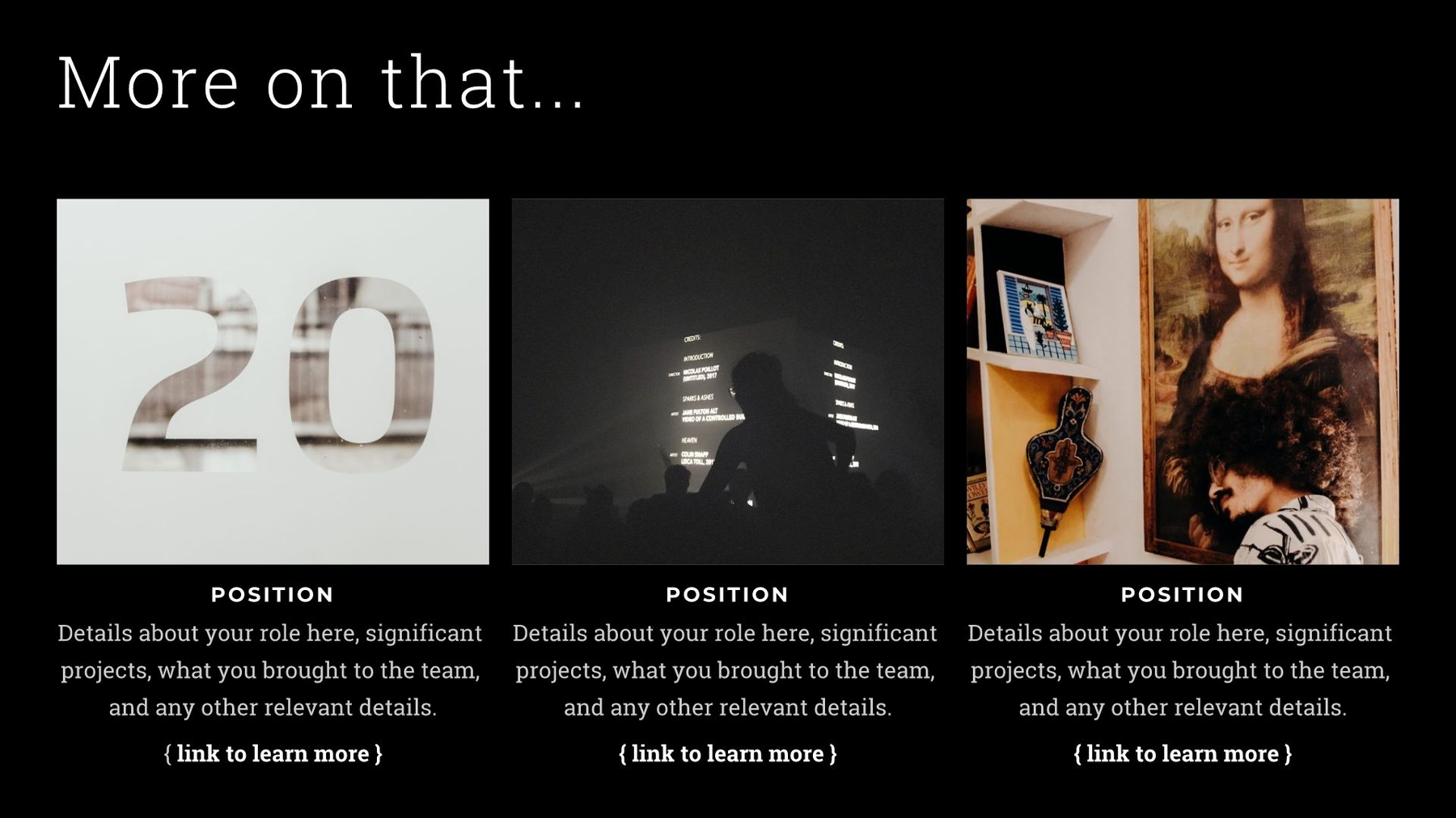
Details, Please (Recent Roles)
Now, let’s dive deeper into the details of each professional role you’ve held. You may choose our “Images with Text” slide template to highlight your most significant and impressive positions; this could mean recognizable brand names or boutique firms where you made an impact. Use each text box to give your audience insight into how these skills will help them (and the company) get ahead.
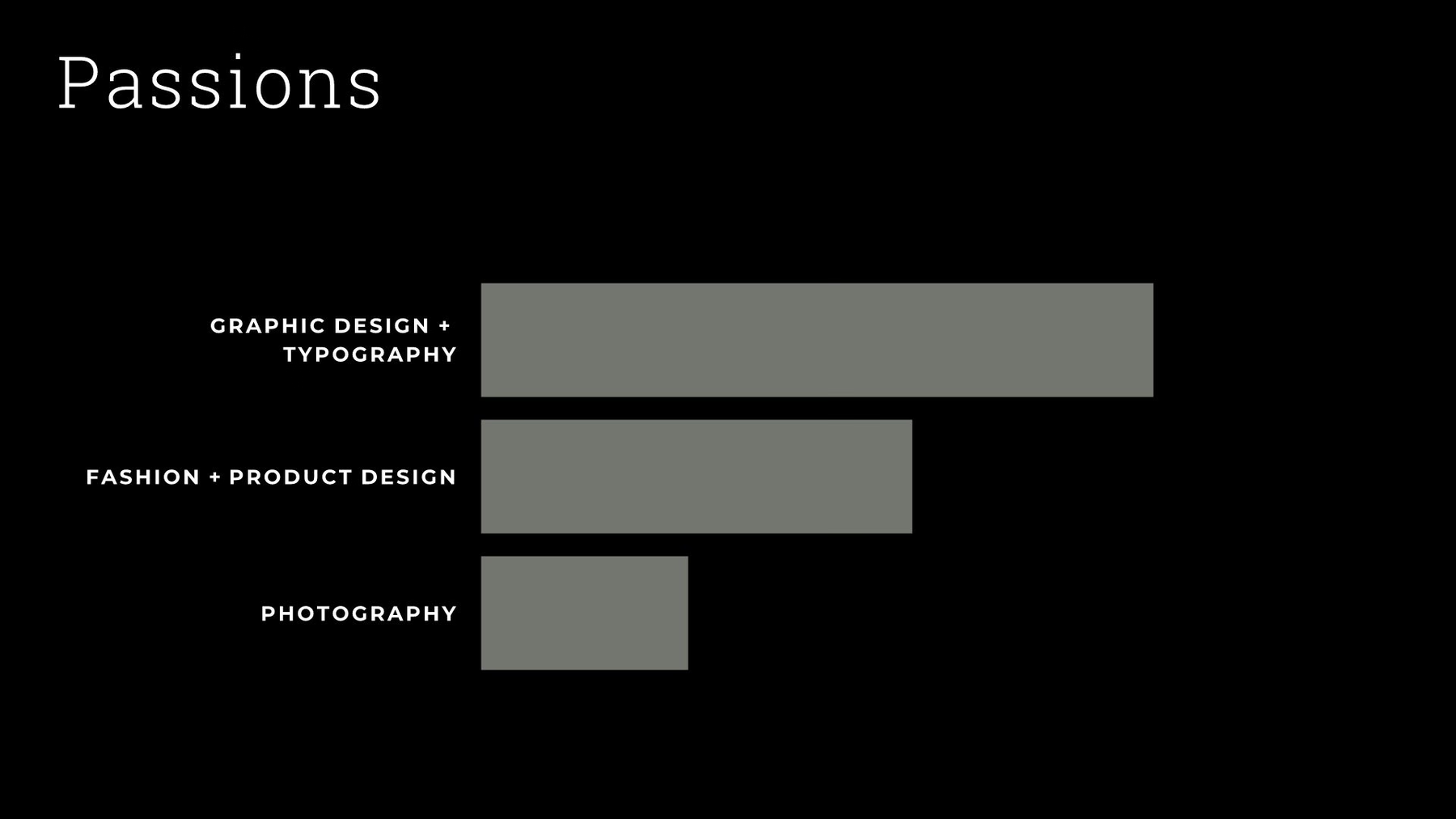
Passions With Payoff (Areas of Expertise)
This page allows you to highlight specific areas of expertise, including any self-taught skills that may not have earned you an actual academic degree. Feel free to include hobbies or side projects that you are proud of and have spent time on. Most creatives are constantly experimenting with new methods, techniques, and technologies, so it’s great to make formal note of them here.
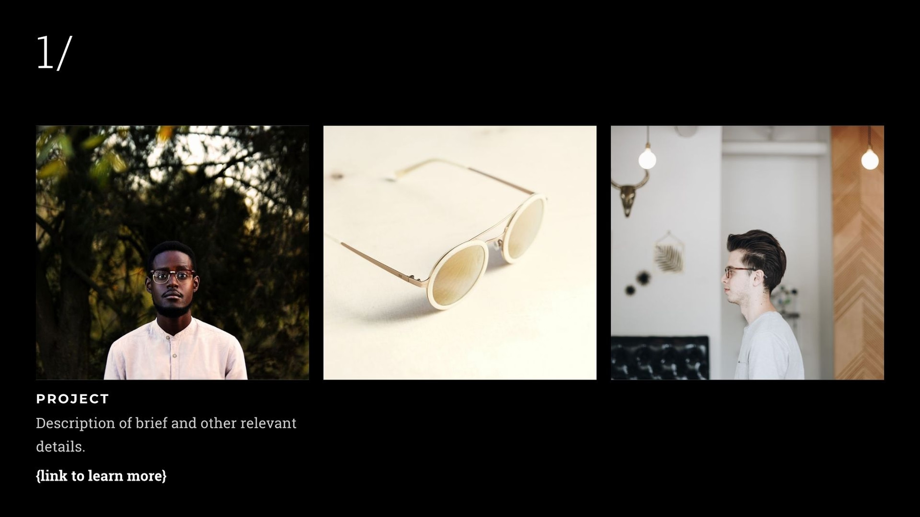
Bragging Rights (Notable Project #1)
Think about one, two maybe three projects that were clearly a “success.” Whether it paid off with a great ROI for the company (say, a marketing campaign you art-directed) or you are just proud of the outcome of the work, take a full page to show off any concept sketches, illustrations, photos, or media formats you created that clearly explain why it was important and/or helped contribute to a successful outcome.

High Quantities (Metrics for Success)
Now it’s time for numbers: gather some basic data from the aforementioned “Notable Project.” Choosing three different data sets (here, we used percentages) not only looks best for symmetry, but offers a quick overview of what actions you took that had a direct, meaningful impact. Using the “Percentage Comparison” page template, you can list new growth numbers your company hit, increased impressions, budget savings, and user acquisition rates, among other things.

New Dimensions (Notable Project #2)
The second project you mention should show a new dimension of your experience and an evolution of your work. The specific example we included deals with a mobile app design. If there aren’t enough numerical data points or results to show off, describe the role you had in detail, as well as your specific contributions that illustrate new skills that haven’t yet been mentioned in the presentation.
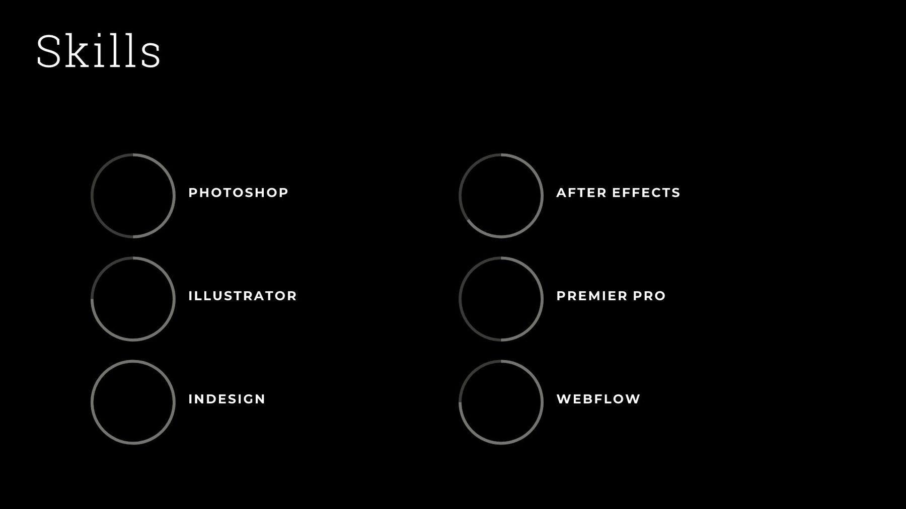
You've Got Skillz (Tech Proficiencies)
This page should give an overview of any special applications, technologies, or design programs you know how to use. Use our "Compare Radial Bars" slide to illustrate your proficiencies in each area.
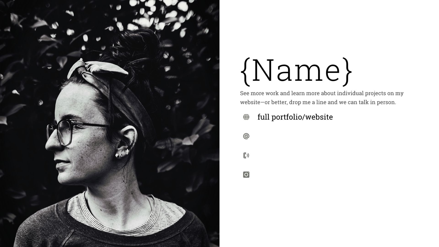
Keep in Touch (Contact Information)
Let your audience know how to reach you. Any relevant contact information, social media handles, and websites can be added to this page as a finale. Make sure any pages you link to here are up-to-date and accurate representations of your level of work. If you have a professional-quality headshot or portrait photo handy, it’s a nice way to add personalization and approachability. If not, no worries—a personal “signature” or other visual element can round out your presentation as well. And... you’re done!
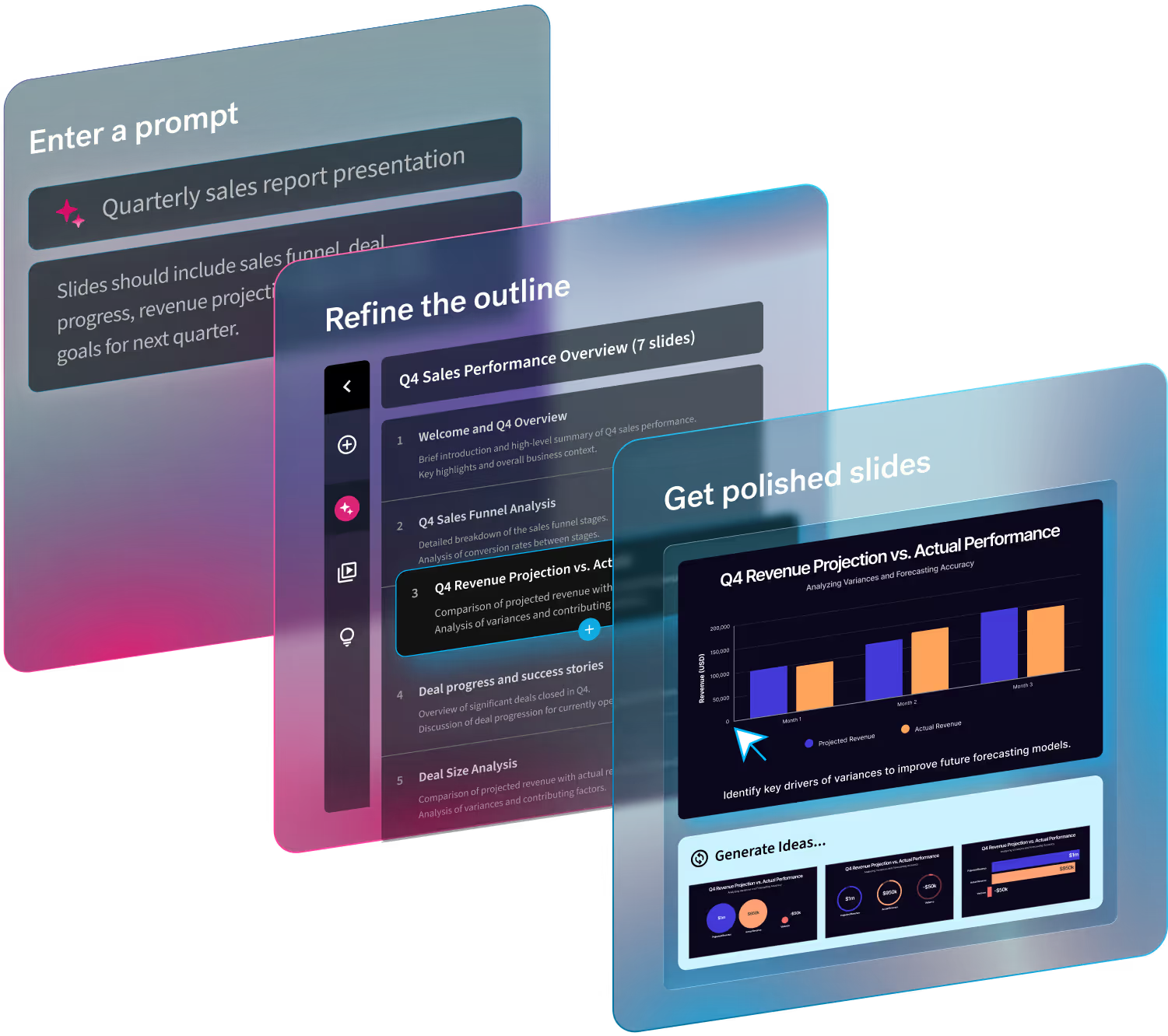
This post is a one in a series of presentation templates we will be creating that you can customize here. Beautiful.ai automatically adjusts the design to suit your content. We’re excited to share more templates with you. What kind of sample presentation templates would you like us to cover? Let us know by sending an email to info@beautiful.ai.



.gif)

.gif)