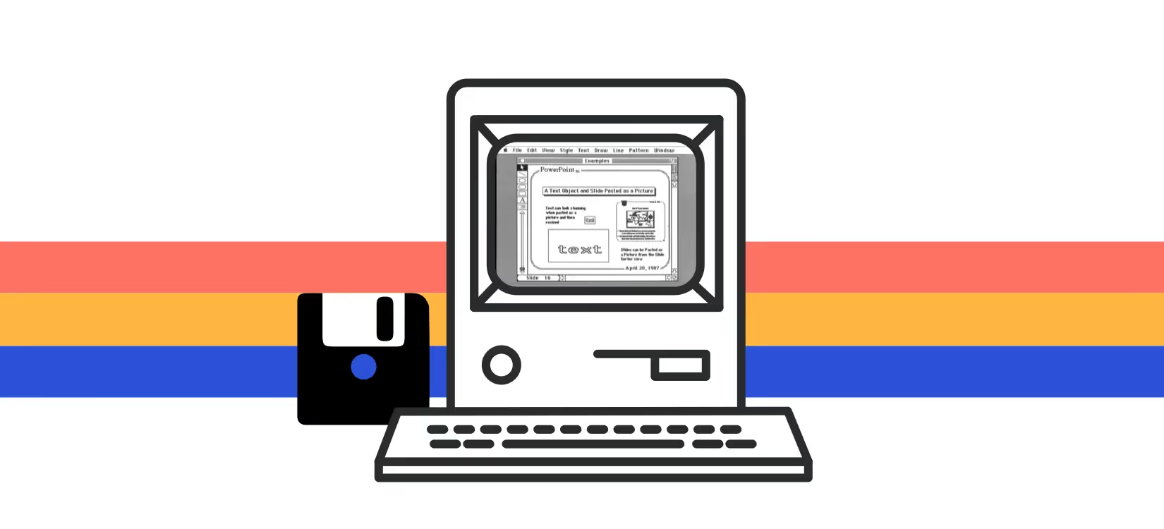
It’s been nearly a week since we rung in the new decade. That means what was relevant in the early 2000s and beyond is now old news in 2020. This is especially true for presentations. A lot has changed since PowerPoint hit floppy disks in the 1980s. Losing your audience to an outdated PowerPoint presentation is so 2010. Technology has evolved. Presentation styles should, too.
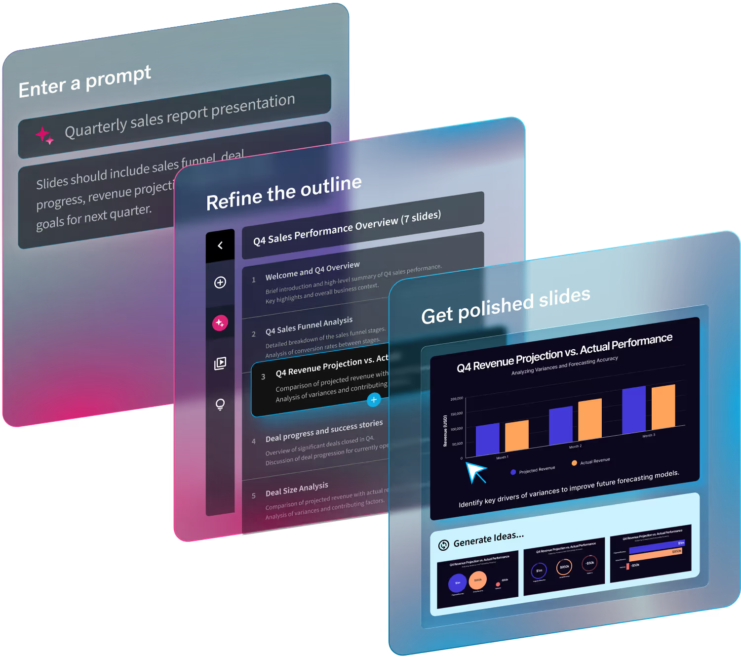
Presentations—both creating and presenting them— tend to get a bad rap. But as presentation software continues to improve, creating an engaging deck has become more painless. Instead of leaving you with a daunting blank canvas, Beautiful.ai has Smart Slides that use design best practices so that your presentation always looks professional even if you’re not a professional designer. Yet even with the automated design, it’s still important to learn how to organize your presentation to be more efficient and effective.
Here are a few totally simple ways to level up this decade.
#1 Start with a story
Become a visual storyteller in 2020. Devote the most amount of time to creating your story. Even visual storytelling should include a narrative arc: a beginning, middle, and end. Create your presentation only after you've nailed the narrative. Hint: You'll save up to 75% presentation design time with Beautiful.ai.
#2 Create a theme
Gone are the days of contradicting colors and mismatched slides. In Beautiful.ai you can create a custom theme complete with branded fonts, colors, and logos so that your presentations are always cohesive and professional. Tip: create a custom theme one time, save it, and quickly apply it to each new presentation moving forward.
#3 Keep it simple
Cut the fluff. Less is more when it comes to your presentation. Keep it simple, clean, and create space for breathing room. What does that mean? Avoid lengthy text blocks and don’t try to fill each slide to the brim with wordy bullet points. What you can’t communicate visually, you can communicate verbally.
#4 Communicate visually
Remember, you’re the show. Don’t let your slides do all the talking for you. Your deck should act as a supporting visual aid to your presentation, not a script. Using clear content and a highly-graphic design is a killer pitch-winning combo. 2020 Tip: Visualize your data with animated charts instead of complicated rows of numbers.
#5 End strong
Okay, so you made it through the presentation— now what? Don’t assume that your message inspired the audience to take the next steps. Instead, tell them what to do next. Leave your audience with a call to action or rallying cry. It's passe to end with Thank You or The End. Bonus tip: Presentations are crowd-work — create punchlines that people will want to tweet (AKA virality).


.gif)

.gif)