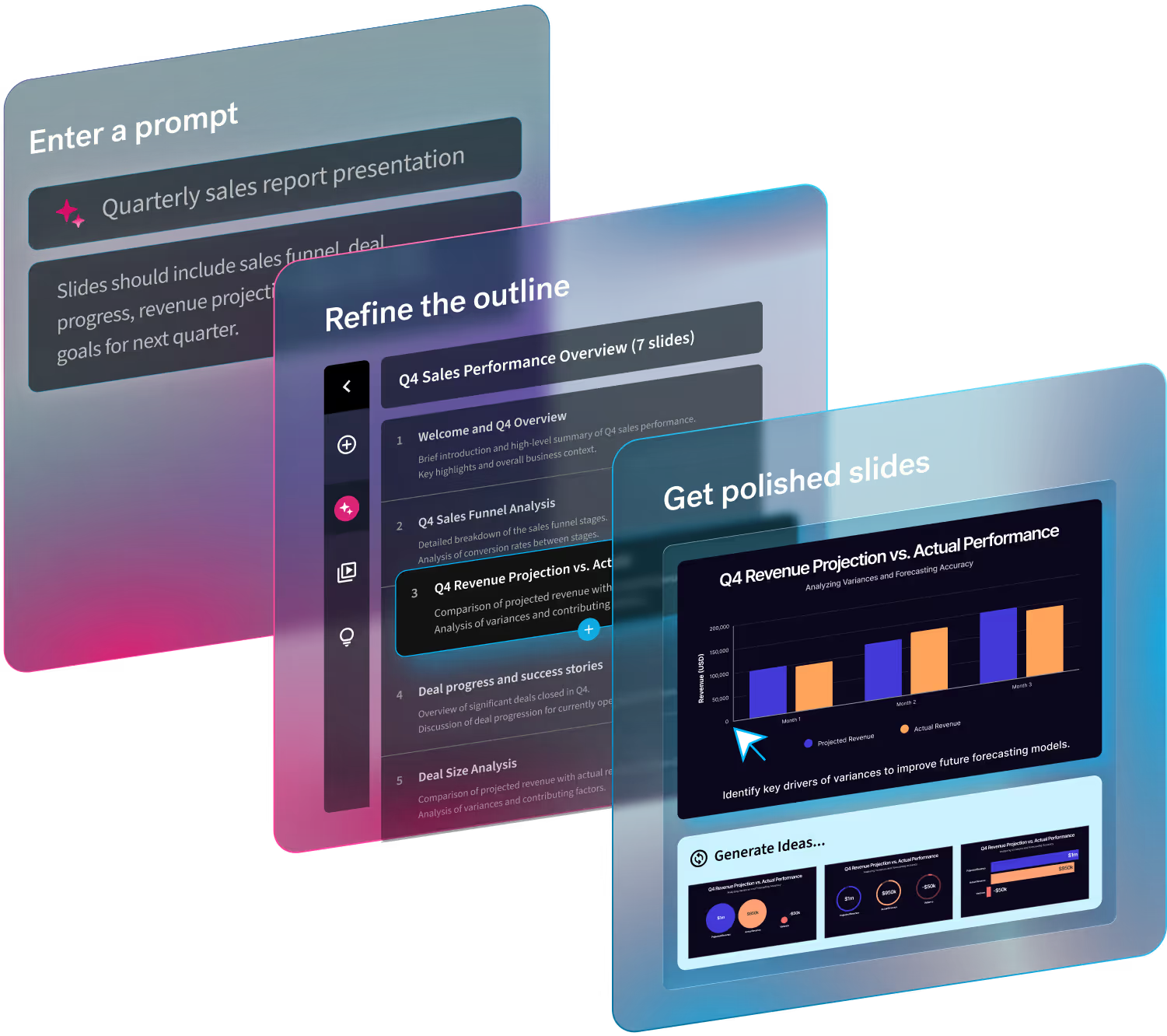
Hi, I’m Mitch Grasso, the CEO and Founder of Beautiful.ai. I wanted to take a moment and explain why I created Beautiful.ai, touch on my personal background a bit, and offer ways you can get the most out of the tool.
First off, Beautiful.ai is different than every other presentation tool you’ve used in the past, and I’m hoping you can reset some of your expectations about how to create presentations. How is it different?
Finally, a tool for non-designers.
Here’s a good piece of advice for every startup entrepreneur, and one that I followed when founding Beautiful.ai: Solve problems that you face yourself. As a designer, I built my previous startup SlideRocket to do just that; I wanted a better authoring tool for designing presentations that gave me more control, more options, and more design features. But I realized I’d fallen into the same trap as every other presentation tool you are probably familiar with. What was that trap? Most people are not designers. They don’t want to spend their valuable time aligning text boxes and shapes, picking the perfect font or color, or figuring out how to best visualize abstract concepts like “time”, “growth”, or “comparison”. What they do want is a simple way to effectively communicate their messages, pitch their ideas, and inform their audiences — all while maintaining a professional design quality.
It’s never been easier to create a beautiful presentation.
We built Beautiful.ai to be the “anti-authoring” tool. What does this mean? We put the rules of good design, as well as presentation best practices, right into Beautiful.ai. This way, the software can be the “expert,” so you didn’t have to be. Our goal of democratizing great design for everyone means that there are no power users of Beautiful.ai: no advanced features to learn, no “how-to” books to read, and very little learning curve.
That being said, there are some helpful things to know, especially for those of you used to traditional presentation software like PowerPoint, Keynote or Google Slides. Here are some specific tips that have been adopted by our most successful users:

Tip #1: Let go and let Beautiful.ai guide you
Think of Beautiful.ai as your own personal designer-in-a-box. Just provide the content, and it will design a beautiful presentation for you. But just like a human designer, it has opinions on what is good design and what are best practices. Sometimes you may find the lack of flexibility frustrating, and you may not be used to the lack of control. But if you let Beautiful.ai guide you and don’t fight against the choices and options it gives you, we guarantee that you’ll be creating more beautiful, more effective presentations. All this in a fraction of the time you’d typically be using PowerPoint or another presentation tool.
Tip #2: Browse all the smart slide templates
Illustrating abstract ideas and concepts in a visual way has always been challenging and time-consuming. It’s often easier to just verbalize your thoughts as text on slide, so most presentations end up abusing bullet points. But visualization of an abstract concept—like “time” or “change” or “growth”—can be so much more compelling to your audience when you use a colorful graph, or gorgeous image, or more interesting visualization of your idea.
When you go to add a new slide to your Beautiful.ai presentation, there are over 60 (and more coming soon) smart slide templates available to you at a click. If you don’t know exactly what type of slide you should add, I recommend that you just spend some time scrolling, or searching through the list, and looking at the thumbnails... or just play and try new stuff! Chances are, something will spark your imagination. And from there, it’s often just a few minutes to a beautifully designed slide.
Tip #3: Explore everything; click everything
Beautiful.ai is built with hundreds of different controls that let you customize and influence your entire presentation’s look, layout and styling. The tool is also designed to keep your slides always looking great, so it will prevent you from making changes that would result in poor design or breaking presentation best practices.
As you explore the different design themes, presentation templates, and smart slides, you will start to discover your favorite features and functionality. Some are shortcuts that will save you time, some are fun design tweaks that let you customize your presentation even more closely to your brand; but all are just a click or two away. Don’t worry: you can’t break anything, and it’s easy to go back to a previous version by visiting Revision History.
Bonus Tip: Give us your feedback
We think Beautiful.ai is a radically new way to allow everyone to create beautiful and more effective presentations quickly and easily. Our challenge has always been finding the balance between the flexibility of a traditional presentation tool like PowerPoint and the ease of a pre-built template. We realize that we don’t always get everything right, so we’d ask that you please give us your feedback. We love to hear from our users, and often prioritize new features based on your input. Simply email info@beautiful.ai.
Work beautiful,
Mitch

