
Practically every successful brand started as a pitch, including those launched by other successful companies. Crunchbase fell into the latter category when the platform was founded in 2007 to track startups featured in articles by parent company TechCrunch. Since its successful launch, Crunchbase has established itself as a go-to source for information and data about both private and public companies.
Crunchbase separated from its parent company in 2015, and the brand continued to grow through a series of fundraising efforts. One of these pivotal junctures occurred in 2019 when the organization raised $30 million from six key investors led by OMERS Ventures. To achieve the remarkable investment, Crunchbase relied on what even we would call an impressive pitch deck (we’re hard critics). It was colorful, informative and engaging, plus it utilized those all-important principles of good design we’re always talking about.
Even though Crunchbase’s 2019 pitch deck was already worthy in its own right, we wanted to try our hand at another PowerPoint makeover. The original pitch deck might be great, but can we make it better? If nothing else, can we make an equally effective pitch deck using Beautiful.ai’s PowerPoint-alternative presentation software? After all, if we can design a professional-quality pitch deck with the help of artificial intelligence, then so can you.

The theme:
Anyone can create a cohesive and professional design using Beautiful.ai. We started this PowerPoint makeover by customizing a theme, including specific colors and typography, that automatically will apply to every slide we add to the presentation. We added a taste of Crunchbase’s brand style guide by selecting a color palette to match. We also customized the slide deck by adding a footer for each slide to illustrate the Crunchbase company logo, which we easily applied using Beautiful.ai’s free library full of stock images, icons and logos.
Check out the customizable Crunchbase Pitch Deck in Beautiful.ai here.
Slide 1: Crunchbase title
Every pitch deck needs a proper title slide, and we redesigned the original Crunchbase title slide with a colorful illustration. Instead of the simple title on the original, we also included the company’s name and logo on our Headline Smart Slide template.

Slides 2: Private opportunities
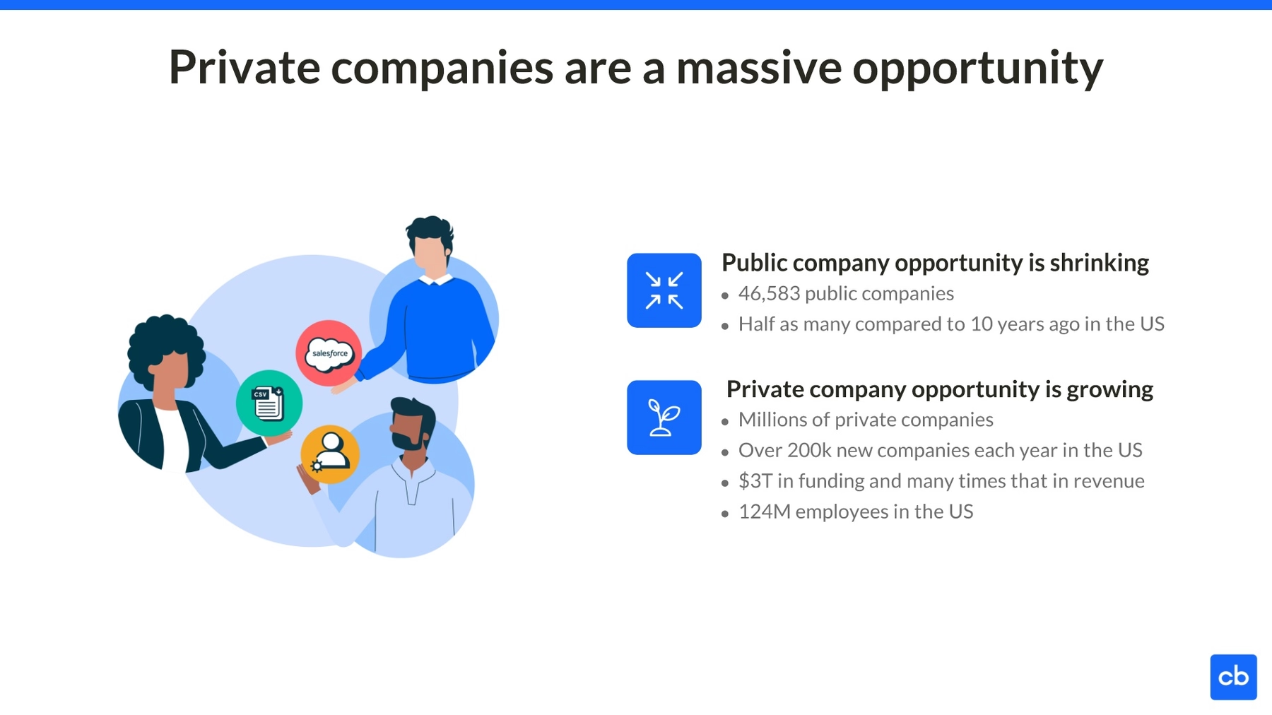
The next slide in the Crunchbase 2019 pitch deck discusses opportunities in the market, and it lays the foundation for a Crunchbase solution. We redesigned this slide using a similar image to the title, establishing a visual theme for the deck. We then animated a series of bullet points to illustrate the pertinent information and engage viewers.
Slide 3: Opportunity demand
In its next 2019 pitch deck slide, Crunchbase highlighted the millions of professionals vying for private company opportunities. Instead of another boring list, we included each of these competing professionals in an XY Plot, which together formed a group to compare to the isolated opportunity on the opposite side. Creating the slide was simple since Beautiful.ai’s special brand of artificial intelligence adjusted the design each time new content was added, ensuring the final result adhered to the professional principles of good design.

Slide 4: Prospecting frustration
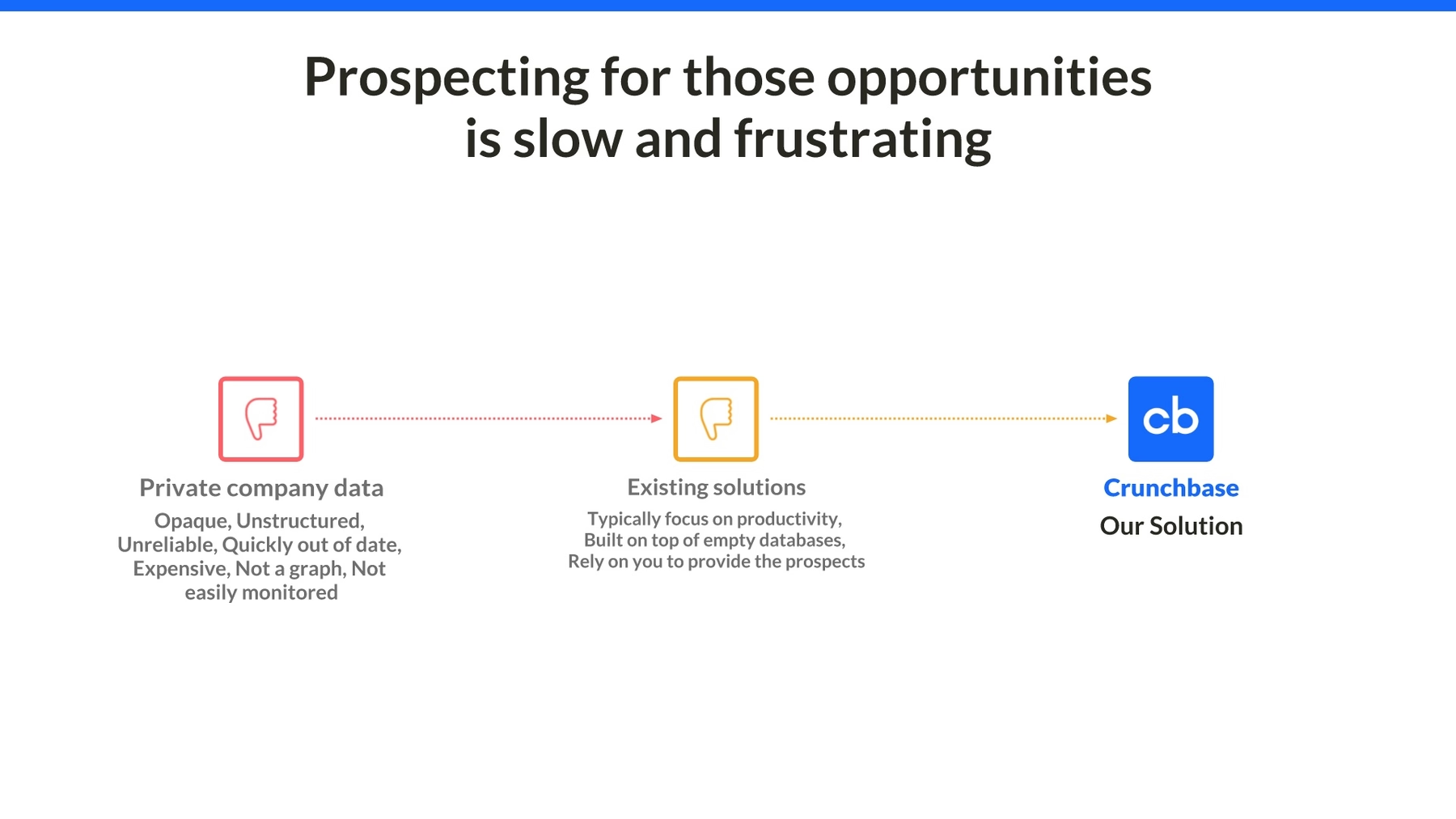
Crunchbase’s next slide in its 2019 pitch deck wasn’t our favorite. The company highlighted the challenges professionals face when prospecting opportunities with yet another boring bulleted list. We brought this content to life in our PowerPoint makeover by illustrating the information with a series of engaging and colorful logos in a Flowchart. We then animated the slide to recapture viewers’ attention.
Slide 5: The Crunchbase solution
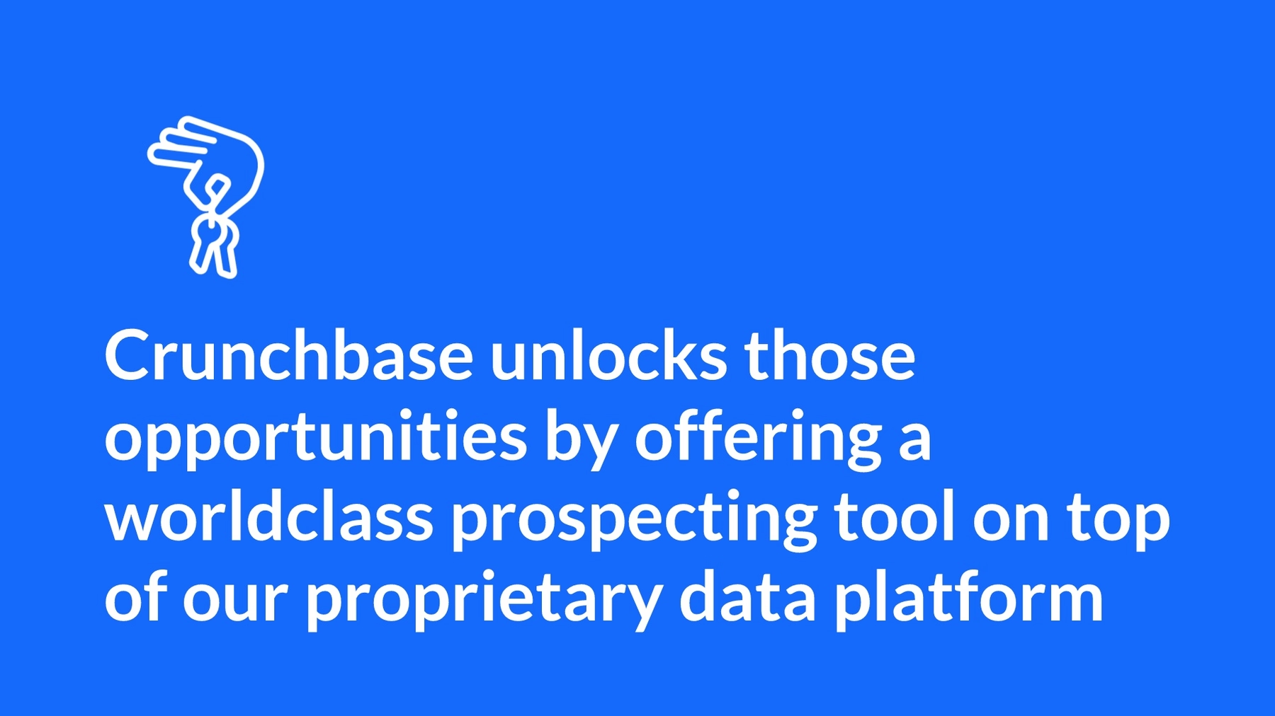
Crunchbase offers itself as a solution with a powerful statement in its next slide. The company then added supporting details in a basic infographic, but we felt the overall slide was a bit much for a single slide. We kept the powerful statement in our PowerPoint makeover, and we gave it its own slide. Thanks to AI and our preset theme, the slide was automatically created using the Crunchbase color profile, and it was designed with the foundation of good design principles.
Slide 6: Trustworthy data
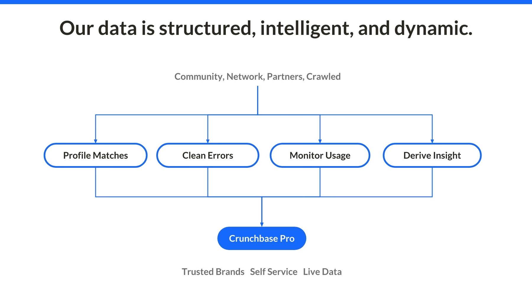
We didn’t entirely omit the additional information from the fifth Crunchbase slide. Instead of overloading viewers with entirely too much information at once, we included an engaging Flowchart on our next slide, illustrating the reasons why Crunchbase is a trusted brand. Because of our preselected theme, the typography and color palette of the slide automatically synced to match the rest of the slide deck.
Slide 7: Crunchbase growth engine
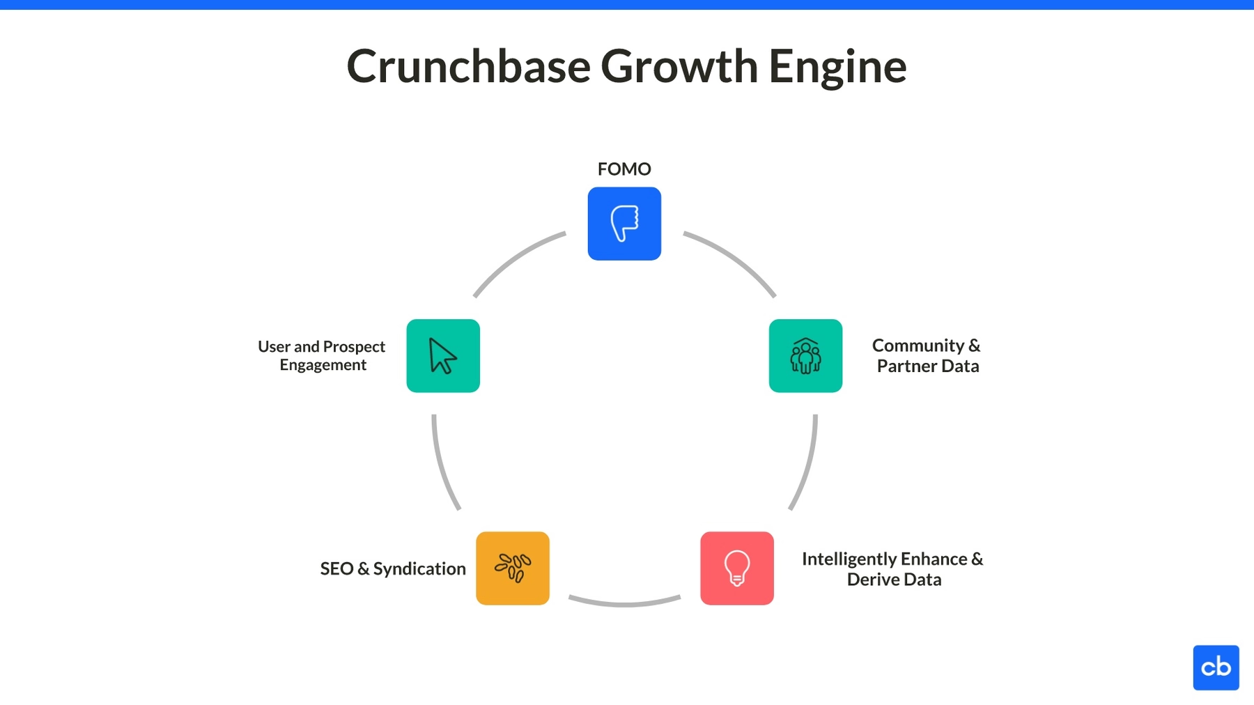
Impressed by the infographic on Crunchbase’s next slide? We recreated the Crunchbase growth engine with ease by using our Cycle Smart Slide template. We selected appropriate icons from Beautiful.ai’s vast image library, then we labeled them and watched as artificial intelligence transformed the basic information into an animated infographic. Let’s not even imagine the headache of crafting a similar design using a traditional software program like PowerPoint!
Slide 8: Increased revenue
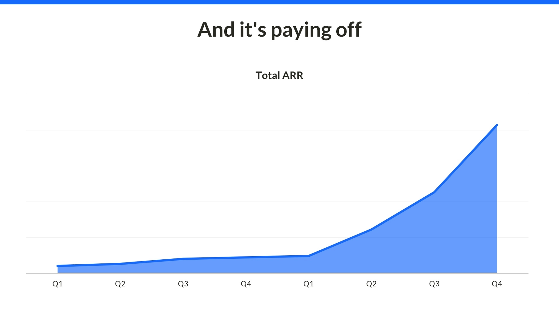
Crunchbase’s next slide in its 2019 pitch deck featured another infographic – this time the company selected a traditional area chart. This creative take on an old-fashioned line graph maps the company’s total ARR over the course of five years. We easily recreated this informative infographic using Beautiful.ai’s Area Chart Smart Slide template, which the AI automatically shaded to match the preselected color palette (which in turn matches the Crunchbase brand style guide).
Slide 9: Crunchbase companies
The original Crunchbase pitch deck featured a slide with Crunchbase companies that followed a similar business model, including LinkedIn, Zillow and Yelp. We simplified this slide by eliminating the clutter and focusing on the company logos, which we quickly and easily added to the slide using Beautiful.ai’s vast library of free logos, icons and stock images. Designing the slide was simple as we selected our Photo Grid Smart Slide template, which was ready to add and format images.
Slide 10: Crunchbase financials
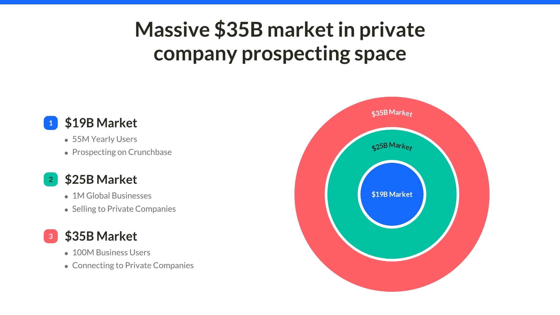
For its next slide, Crunchbase illustrated financial data using a unique modular infographic that encompassed almost the entire slide. We redesigned this slide using our Target Smart Slide template, which allowed us to showcase three different financial values. We then described those values using a bulleted list on the left side of the slide, never fearing that our design would be less than professional thanks to the help of AI.
Slide 11: Crunchbase team
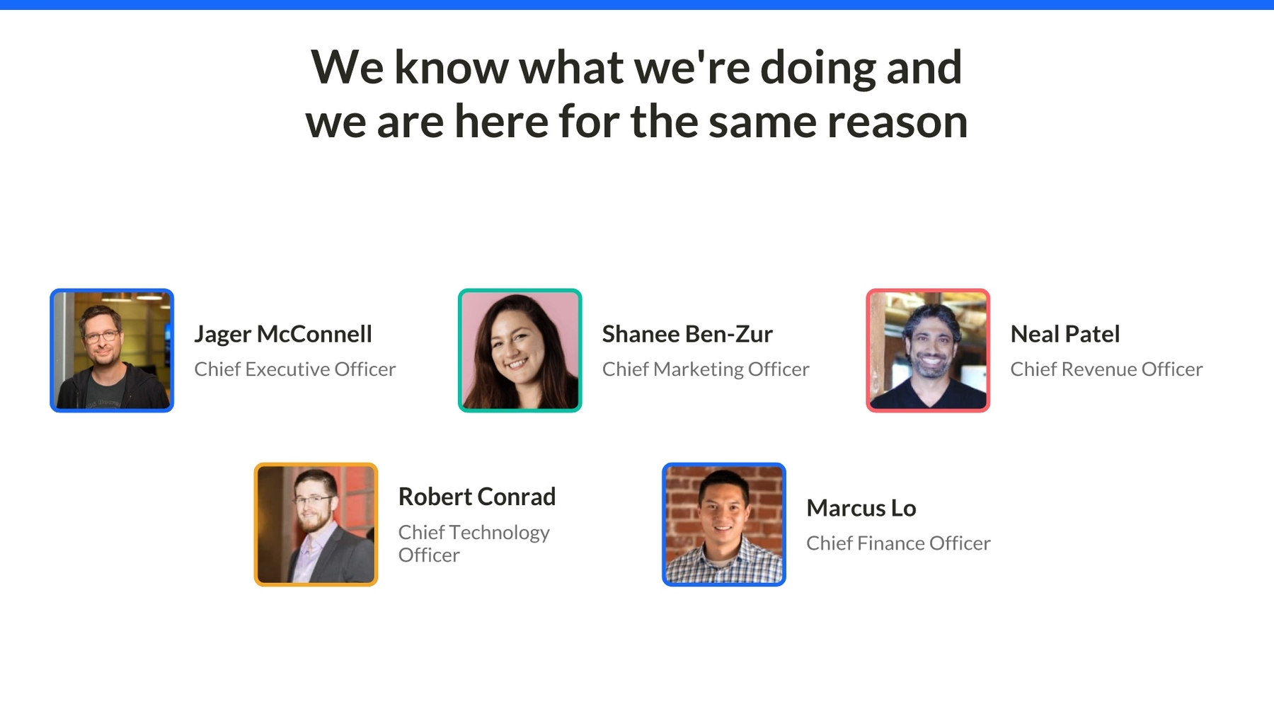
Every professional pitch deck should introduce the company’s principal players to potential investors. The Crunchbase 2019 pitch deck was no exception, but we honestly felt like it overloaded viewers with too much information in a single slide. We simplified the slide and recreated the team presentation with our Team Smart Slide template, perfectly created for just such scenarios. We then engaged viewers and recaptured their attention by animating the appearance of the slide.
Slide 12: Crunchbase comparison
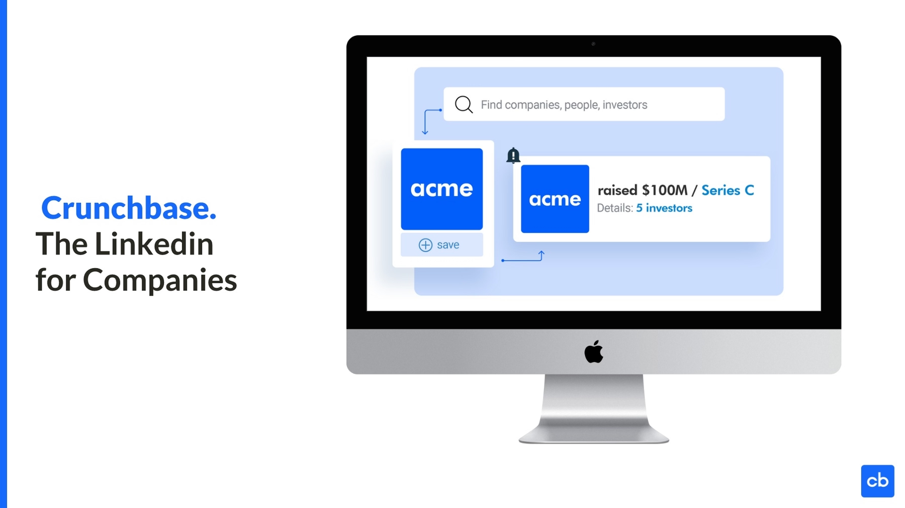
Crunchbase considered itself the LinkedIn for companies, and it expressed this motto on its next slide. The slide also featured an image of a computer screen with a Crunchbase screenshot inside. We recreated this slide with the same slogan using our Product Screenshot Smart Slide template, which also features an image of a computer screen ready for a screenshot to be added inside. Beautiful.ai makes it simple to create professional-quality slides that nobody would guess you designed yourself.
Slide 13: Crunchbase slogan
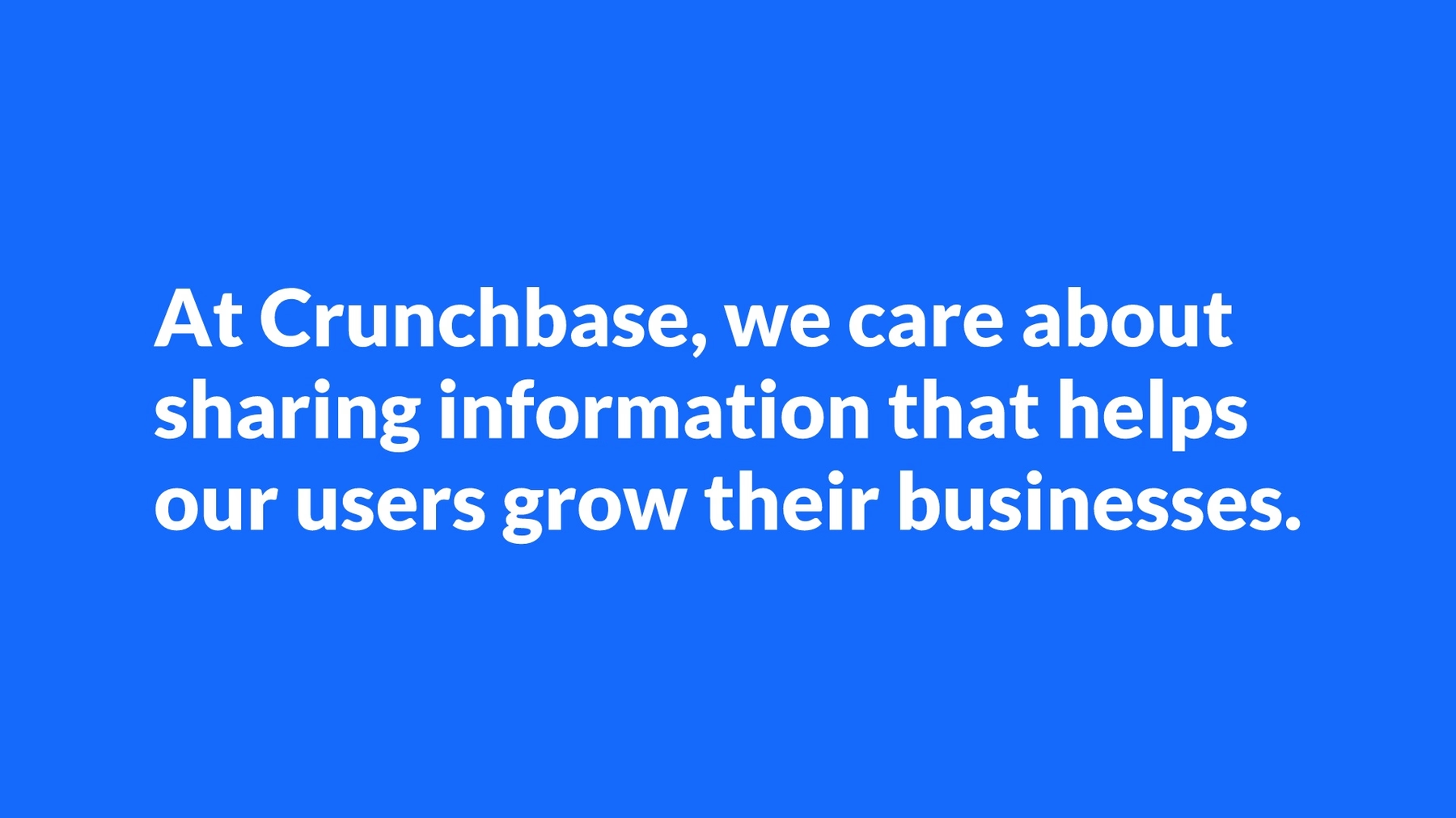
How do you close a professional pitch deck? Crunchbase chose to close its 2019 pitch deck with another title slide, bringing the presentation full circle by matching the theme of its first slide. We chose instead to close the presentation by giving our audience a strong statement to ponder. Presentation designers can create a similar effect with a profound statement or a famous quotation. The slide was simple to craft using Beautiful.ai’s PowerPoint-alternative presentation design software.







.gif)
.gif)
