As anyone who follows our blog knows, we love a good PowerPoint makeover, but we aren’t the only ones. A quick perusal of the internet will reveal scores of redesigned presentations, including a host of slide decks designed with a variety of presentation software tools uploaded to SlideShare. The platform offers users the chance to create basic presentations while sharing decks they’ve designed using PowerPoint or another PowerPoint-alternative presentation software like Beautiful.ai.
One presentation displayed on SlideShare pitches Slack, the Salesforce-owned business communication platform. The presentation was designed and shared in 2015 by the SlideShare user Blevz, and it highlights Slack’s selling points, much as if the presentation were prepared for a potential investor.
We wondered how much better the pitch deck could have been had it been created with presentation software like Beautiful.ai. Since everyone knows how much we love our PowerPoint makeovers, we thought we’d give our AI a shot at improving another deck. What do you think, is our Slack deck makeover “beautiful?”

The theme:
We started off with customizing a theme for our presentation, saving ourselves plenty of time and effort with a couple of quick steps. The selected colors and fonts will automatically apply to every slide in the deck, not only saving us the extra steps but also ensuring our presentation adheres to a cohesive and unified design. We selected a color palette that matches Slack’s brand style guide, and we even added the Slack logo to a custom footer, pulled from Beautiful.ai’s vast image library full of free stock photos, icons and logos.
Slide 1: Slack title
The original Slack deck featured a large graphic of the company’s logo atop a white background for its title slide. We gave the slide the Beautiful.ai treatment and transformed it into an engaging introduction with our Headline Smart Slide template. The slide features a bold purple background and an image of hands reaching across the logo, both from our library of free stock images.

Slide 2: What is Slack?
The next slide in the original Slack deck from SlideShare answered the question, “What is Slack?” The information was all fine and good, but the slide itself left plenty to be desired. Instead of a dull screenshot and a boring set of bullets, we added the same information to our Laptop Smart Slide template, which allows users to place their screenshots inside an image of a computer screen. Designing the slide was simple, we just added the content and watched in amazement as artificial intelligence adjusted the content based on professional principles of good design.

Slide 3: Company makeover
Every good pitch should describe the company’s background. The Slack pitch featured a slide with logos to describe the company’s history, but the result was verging on a hot mess, cluttered and disorganized. We completely redesigned this slide with Beautiful.ai’s Process Diagram Smart Slide template. The infographic was automatically customized to our selected color palette, and we animated it to better engage audiences.

Slides 4-5: Communications and integrations
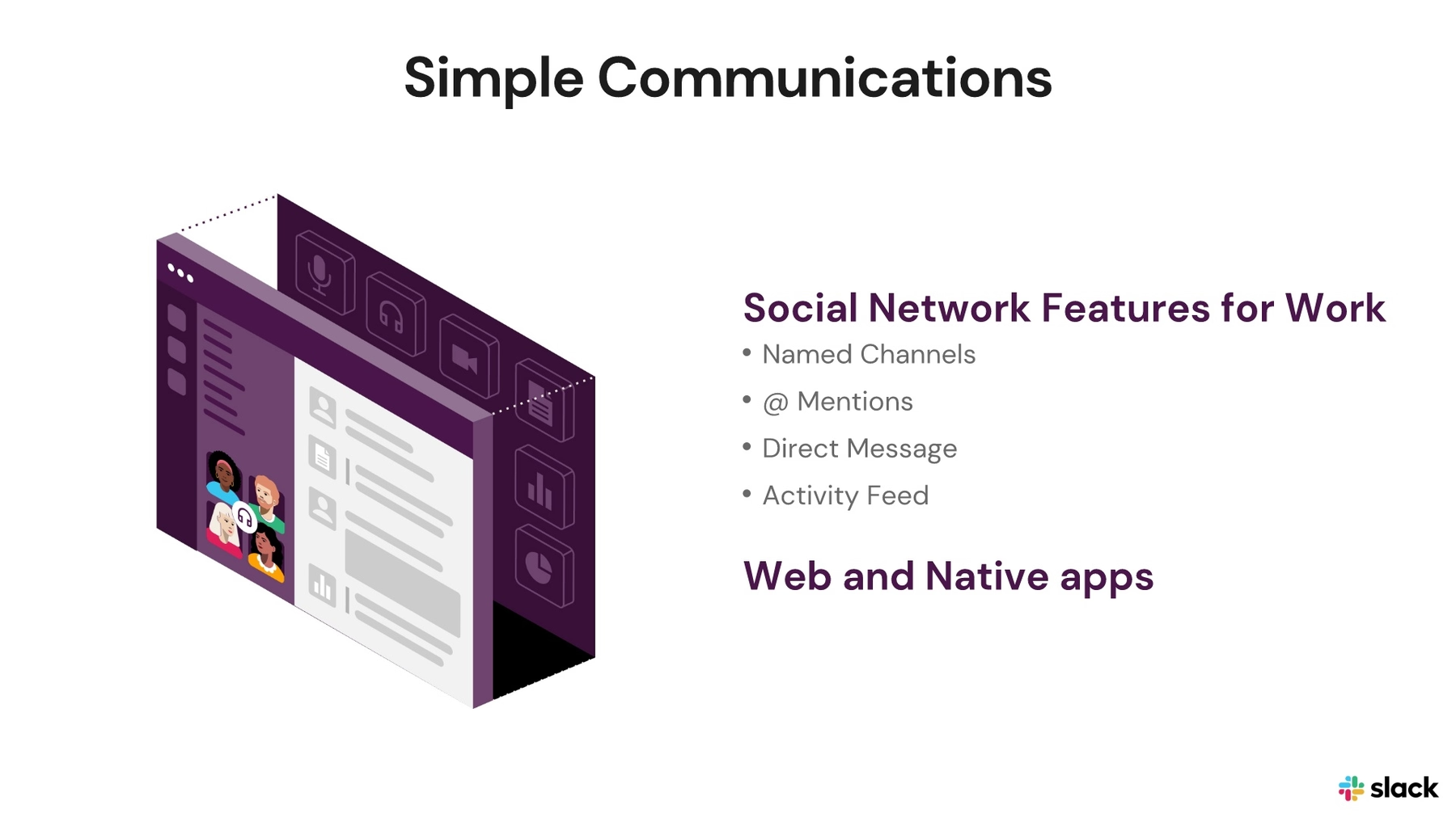
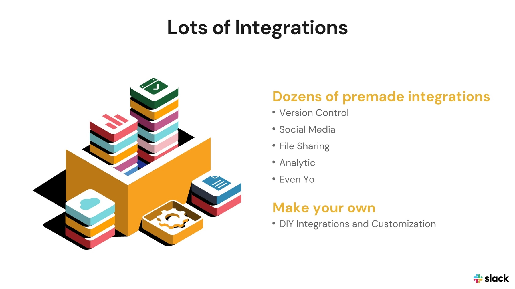
Bullets have their place in a presentation, but audiences aren’t interested in the same boring versions they’ve seen in every other frankendeck. The next slides in the Slack deck were more boring lists, and we wanted to give them the Beautiful.ai treatment. We recreated the lists, but our PowerPoint-alternative presentation software ensured it was designed with those all-important principles of professional design. We added images that correspond with our custom color palette for good measure.
Slide 6: Secret sauce
The original Slack deck’s next slide featured what the designer called the company’s “secret sauce,” in which it highlighted the business’s primary selling points. Great information, but the design could have put audiences to sleep in an actual pitch meeting. Instead of another boring list, we engaged audiences and transformed the content into an infographic by placing the terms into our Cycle Smart Slide template. We further captured viewers’ attention with movement by animating the infographic.

Slide 7: Daily active users
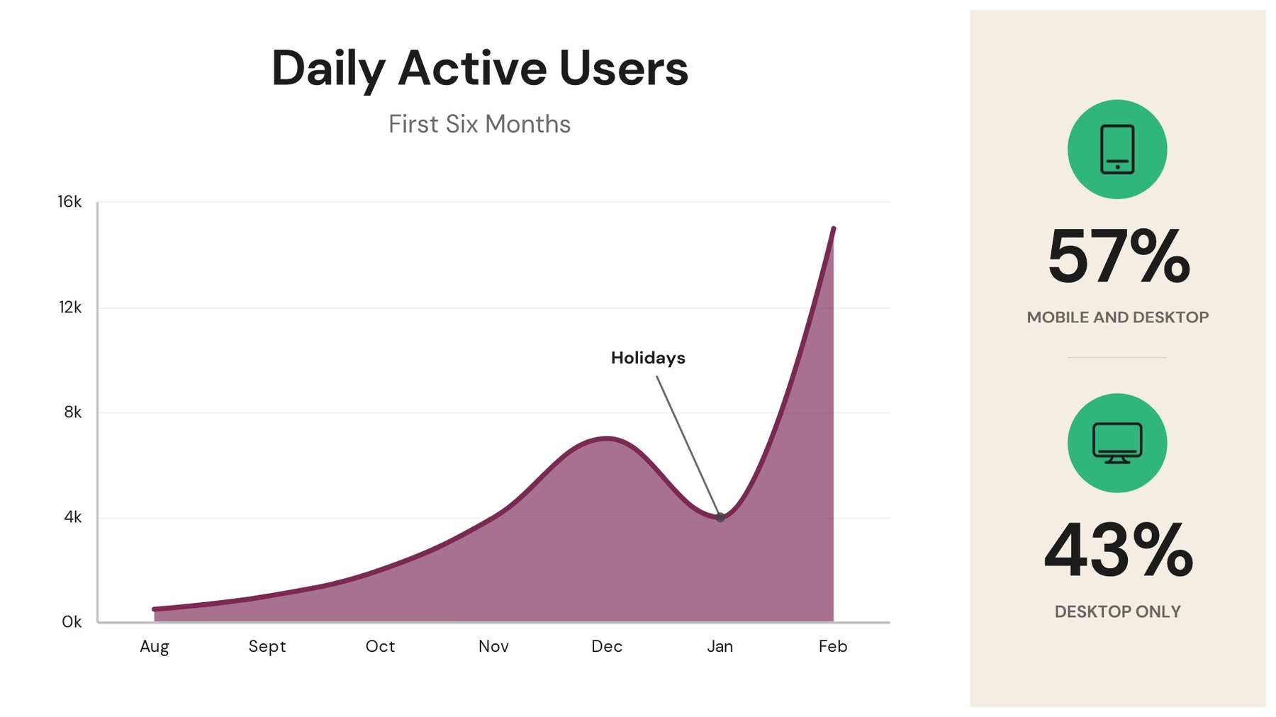
We couldn’t just recreate the original Slack deck slide for slide. To truly make the deck what we could consider “beautiful,” we needed to add some extra engagement, and we did so in the form of an informative infographic. Using our Line Graph Smart Slide template, we charted Slack’s daily active users over the company’s first six months. Designing infographics is simple with Beautiful.ai. Just choose the best template, input your data and watch as AI designs a perfectly proportioned data visualization, including popular choices like bar graphs and pie charts.
Slide 8: Competition
It’s completely appropriate to name competitors in a pitch… but another boring list? Yikes! Instead of listing company names in our PowerPoint makeover, we communicated the same information by displaying the competitor company logos, each found using Beautiful.ai’s free library. We also kept up the engagement with our slide deck by continuing the animations.

Slide 9: Slack future
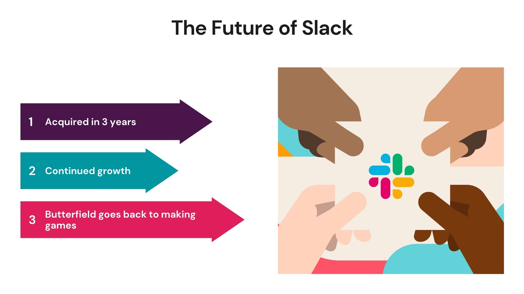
What does the future hold for the company? Future plans are an important element of a pitch, and we wanted to include the same information in our redesigned slide deck. But another bulleted list? No, thanks! We much prefer an animated infographic, so we chose to add the content to colorful moving arrows using our Infographic Smart Slide template alongside an engaging image from our library.
Slide 10: Powerful close
Every pitch needs a powerful closing slide, and while there are a lot of ways to go about it, the Slack presentation ended with a quote… a very long quote. We totally agree that ending with a quote can give audiences something to think about after the presentation has concluded, but nobody is going to pay attention to a wall of text. Instead, we highlighted the final sentence of the longer quote and placed it onto Beautiful.ai’s Quotation Smart Slide template, perfectly tailored for the occasion.


