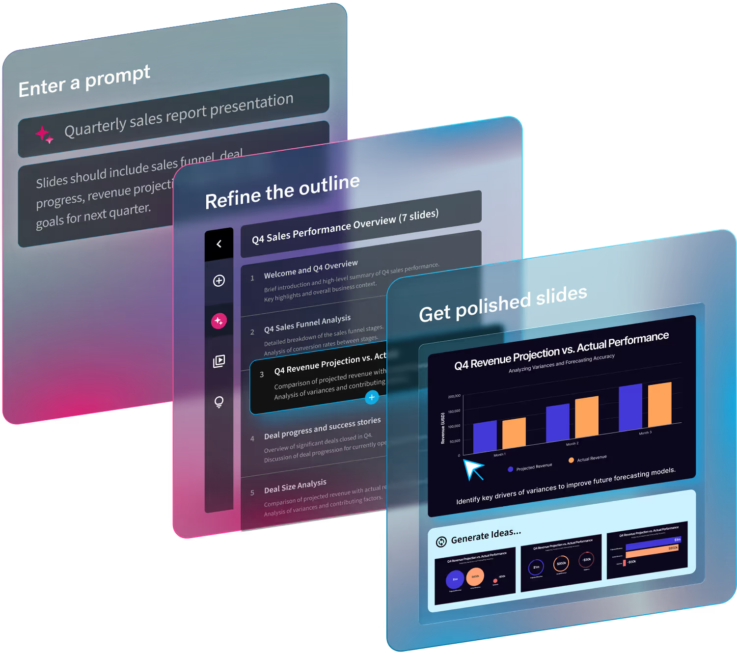
Presentations are a lifeline for many businesses, but they’re especially important for startups and small teams. Between startup pitch presentations and internal business plans, presentations act as a vessel to deliver information that will contribute to how quickly companies scale. They help to align strategies, share wins, and secure funding. Simply put, they’re an essential pillar of communication.
We’ve talked about startup pitch decks time and time again. What makes it effective? A successful pitch is straight to the point, on brand, professional, and has the right statistics to back up the story. The same best practices for a startup presentation can be applied to internal business plans, budget proposals, and year end reviews for small teams too.
In this blog we share our best tips for startups and small teams who need to make a big impact with little resources.
Start with the right presentation software
We recognize that startups and small businesses are scrappy. Because they may not have the resources to recruit a fully stacked team, each team member has to step up and wear many hats. Thankfully, there are countless tools that can help with the efficiencies of workflows for startups. Insert: Beautiful.ai.
Part of nailing your presentation is having the right presentation software to take on the heavy lifting of deck design. Beautiful.ai is great because our Smart Slides act as a resident designer so that your colleagues don’t have to be. Our design AI works its magic as you add your content so that your startup presentations can always look professional, without having to hire a professional designer.
Know your why
What is the problem or gap in the market or your business, and how do you plan to solve it? That’s your “why”. Regardless of whether you’re pitching to investors, or working on your business strategy with your team, knowing your why is pivotal for developing your story. And you should always start with a story before you even think about crafting a deck.
Make branding a priority
In any presentation, branding should be at the forefront of a deck. Especially for younger brands who are trying to establish brand familiarity among prospective clients and investors. Branding builds trust among customers, but it also gives the company a more professional, polished appearance which is important in any stage of a business.
Branding is a piece of cake in Beautiful.ai. Team librarians or deck owners can set a custom theme with brand colors, fonts, and logos so that the branding is locked in across every slide throughout the deck. The theme will be automatically applied to the slides, regardless of content, so that the presentation is always on brand no matter what departments are collaborating on it.
Keep it clear and concise
Guy Kawasaki’s 10/20/30 rule is a good rule of thumb for startup investor presentations. Kawasaki recommends all presentations are limited to 10 slides, have a 20 minute cap, and use 30 point font or larger. Investors are no stranger to pitches. In fact, they have probably sat through their fair share of startup presentations that went longer than necessary and fell flat. To get your point across quickly and effectively, keep your presentation clear and concise. This goes for internal decks, too. You want your audience to stay engaged so that you don’t lose them to boredom or slide overkill.
Check out the only 10 slides you need in your startup pitch— according to Guy Kawasaki— here.
Use data visualization
Numbers are your strongest asset when it comes to presenting your story. It’s because they don’t lie, and can back up your message with real, quantifiable proof. But they can also be the hardest to digest. For startups and small teams, data can help get colleagues and partners up to speed on the health of the business, as well as expected growth and goals. Data visualization can help you deliver important figures and statistics in bite sized chunks so that everyone can understand them.
Using the right charts and graphs for your data visualization can be the difference between a slide that resonates well with the audience and one that misses the mark. Beautiful.ai has a wide variety of infographics and charts to help you make sense of your data. Simply pick a template, and our Smart Slides will adapt as you customize it and add your content.
Collaborate with other stakeholders
Teamwork makes the dream work, right? So why take on the burden of presentation design alone when your teammates can contribute to parts relevant to their responsibilities. For example, you might have your data analyst add the most meaningful data from their recent reports. Not only does this make presentation design more efficient, it makes it more accurate. Collaboration ensures that everyone is on the same page, and that nothing falls through the cracks.
Beautiful.ai’s Teams plan makes collaboration seamless for teams of all sizes. With content management and controls, you can work in tandem with your team without having to worry about losing branding or pertinent information.


.avif)
.avif)
