
Every startup needs a compelling pitch to attract investors — and capital. With a beautifully designed and intentional presentation, you can showcase the best aspects of your startup to help you secure the funding you need.
But what should you include in your presentation? And how do you design it to stand out? Guy Kawasaki has a famous startup pitch deck formula we’d love to share with you.
Guy Kawasaki’s approach to pitching
Guy Kawasaki is a Chief Evangelist, the person who promotes or advocates for a brand on a large scale. You may recognize his name, as he’s been the Chief Evangelist of Apple and currently serves as Chief Evangelist of Canva. As an evangelist, Guy’s main priority is to spread the good news about the products a brand creates.
That is exactly what he wants to help you do with your pitch: essentially act as the evangelist for your brand so investors can’t help but buy in.
When it comes to presentations, Guy also has a rule: 10-20-30. Whether you are trying to make a sale, raise capital, or develop a partnership, you should keep your pitch to ten slides, present for no longer than twenty minutes, and use a font of at least thirty points.
This philosophy has worked for Guy, who has helped grow some of the biggest brands in the world!
The 10-20-30 rule
Let’s break down Guy’s 10-20-30 rule so you can see exactly what you need in your startup pitch deck to really make the most out of your presentation:
Ten slides.
You only need ten slides to convey your business concept, goals, financial requirements, current business position, and achievements. We’ll dig into which slides down below. According to Guy, it’s important to keep the slides to only ten because this is how you boil down the most important and impactful information — without creating a boring presentation that investors have seen a thousand times over.
Twenty minutes.
Technical issues happen all the time, delaying the start of a meeting. People show up late, again delaying start time. Keep your message to twenty minutes to ensure you cover the basics even if your window of time gets cut short. Plus, when you get the presentation to twenty minutes, you give yourself plenty of time to dazzle your audience during post-presentation discussion.
Thirty-point font.
Many presenters crowd their slides with unnecessary words typed out in ten-point font and then read the slides verbatim, making for a boring presentation. Avoid this common mistake by using a thirty-point font on each of your slides; this will allow you to convey important ideas while still engaging with your audience.
Now that you have the 10-20-30 rule down, let’s talk about what actually goes into your startup pitch presentation.
The Guy Kawasaki pitch deck: Which slides to include?
As you now know, Guy recommends keeping your presentation to just ten slides. This might seem like a low number, especially if you’re asking for a ton of money from investors. The key, though, is to use this small slide real estate to your advantage. Below, we’ll share some tips to help you make the most of these ten slides.
The title slide

The title slide is critical because it sets the tone for your entire presentation and provides the first impression of your business. The “title” slide is an obvious but impactful template to use for this one because it is clean, looks professional, and allows you to include essential information like your company’s name and contact information.
For users of our presentation software, consider putting a spin on the title slide, with our headline or image and photo grid slides. Guy’s pitch deck also uses the title slide as a contact slide, so don’t be afraid to include your info here.
The problem/opportunity slide
Every business should solve a problem or improve customers’ lives in some way. Use this slide to clearly state the problem and how your business works to fix it. You can provide statistics with Beautiful.ai’s data slide or employ the numbered list or bulleted list slide to highlight all the issues that your business exists to fix. You could also use the image slide to tell the story of how your business came to be in a visually dynamic way.
The value proposition
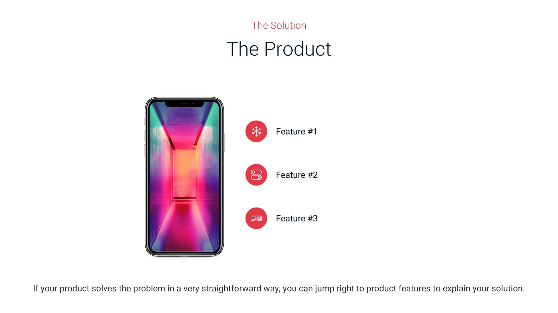
It is a no-brainer that you should discuss the value of your business, but common startup pitch decks overlook it! Don’t skip it. Ask yourself: What customer pain points do you fix? How do you serve your customers? What makes your business different? Use this slide to tell investors exactly why they should invest. The simplicity of our headline slide gives you the freedom to clearly state your value proposition, without crowding the slide with too much information. Want to make it visual? Add an impactful image or chart to the slide.
The underlying magic
The investors know your unique value proposition by now, but what’s the real special sauce? What can only your team bring to life? To really score here, avoid over-relying on text. Instead, use this opportunity to show what you can do. A video slide taking the audience through your process works well here, as does a flowchart slide or a prototype, mockup, or demo.
Business model
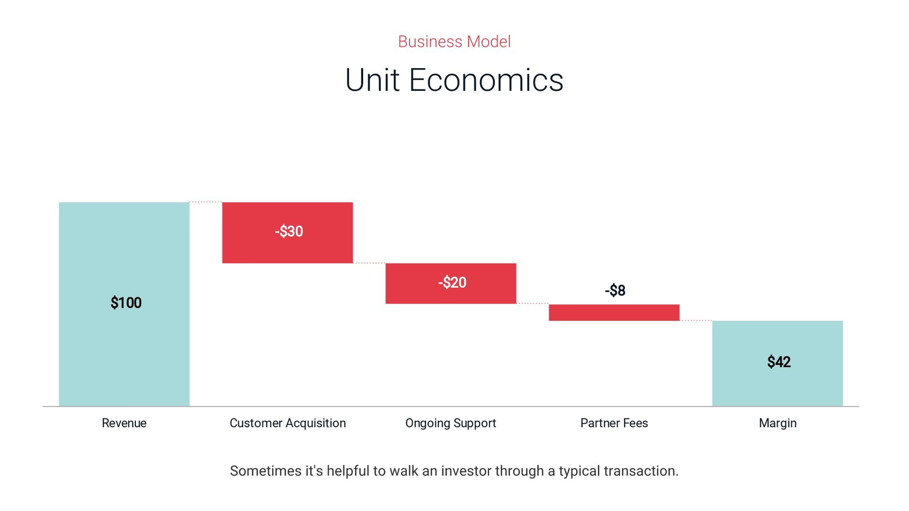
So, what is your plan? Any investor will want to know. Use a data slide, funnel slide, target slide, or hub and spoke slide to show your audience the different stages of your plan in a visually appealing way. You can also use a table slide or waterfall chart slide to demonstrate projected results and value over time.
Go-to market plan
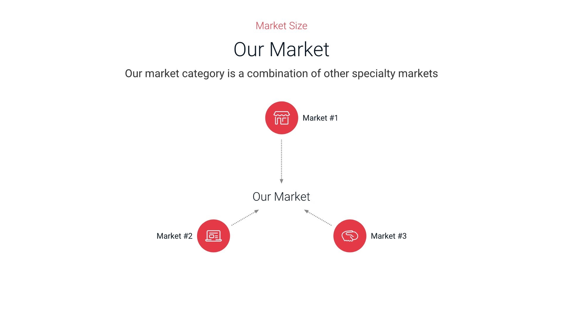
It is essential to tell investors how you plan to attract new customers, as well as compete in your space. How will you launch your product/offer and start selling it? This shows your investors you know how to make this thing work, so use the right slide to showcase it. You can use the hub and spoke slide or process diagram slide to demonstrate the different elements of your strategy.
Competitive analysis
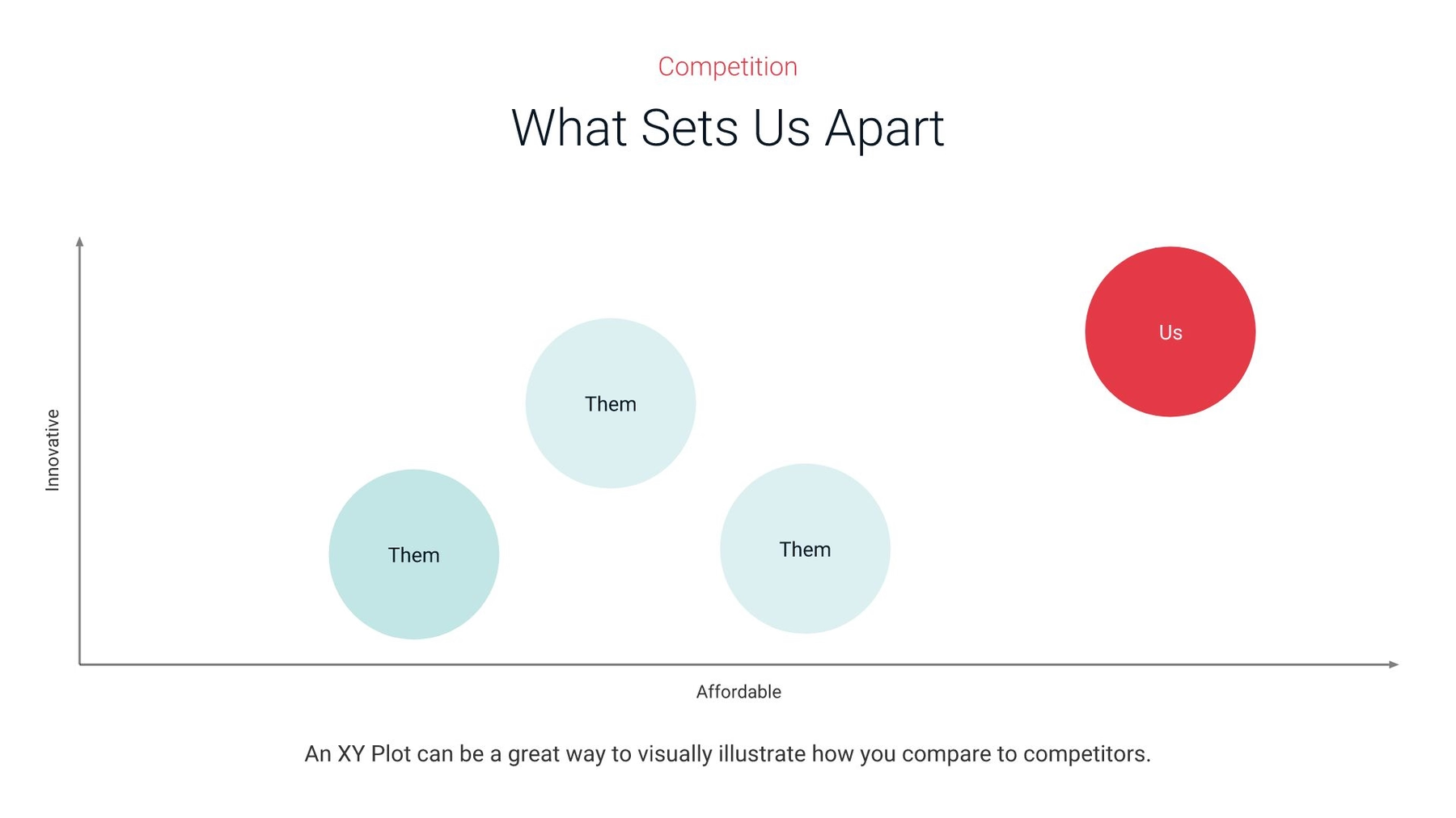
Let your audience know that you get what the competition is doing. Use an XY plot, line chart or area chart slide to identify your performance patterns compared to those of your competitors. This is also a great opportunity to demonstrate your achievements by highlighting companies that have had the pleasure of working with you using a logo grid slide.
Management team
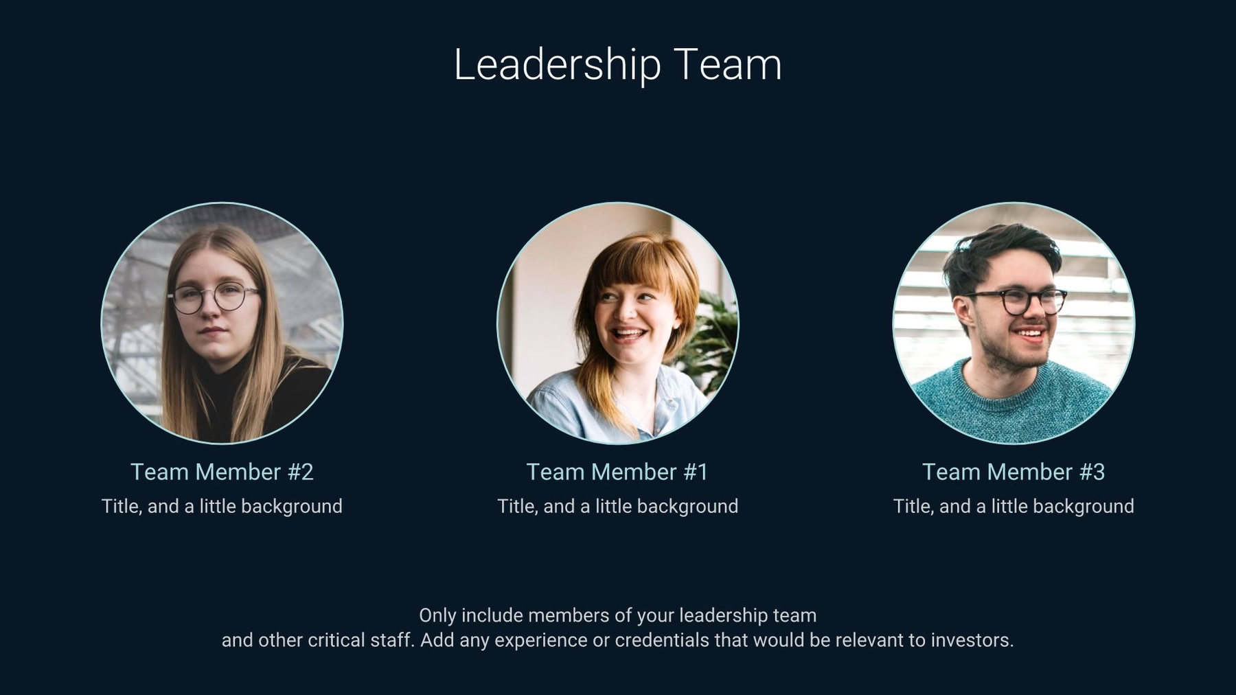
Potential investors want to know about the key players on your team. Use the team slide or about us slide to help them understand your biggest asset: your people.
Financial projections and key metrics
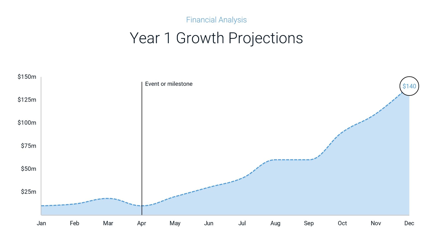
Be upfront: What would potential investors be getting into if they invested? Focus on a three-year, bottom-up focused forecast. Use the data comparison slide or area chart slide to demonstrate and discuss your projected growth over the years.
Current status, accomplishments, timeline, and use of funds
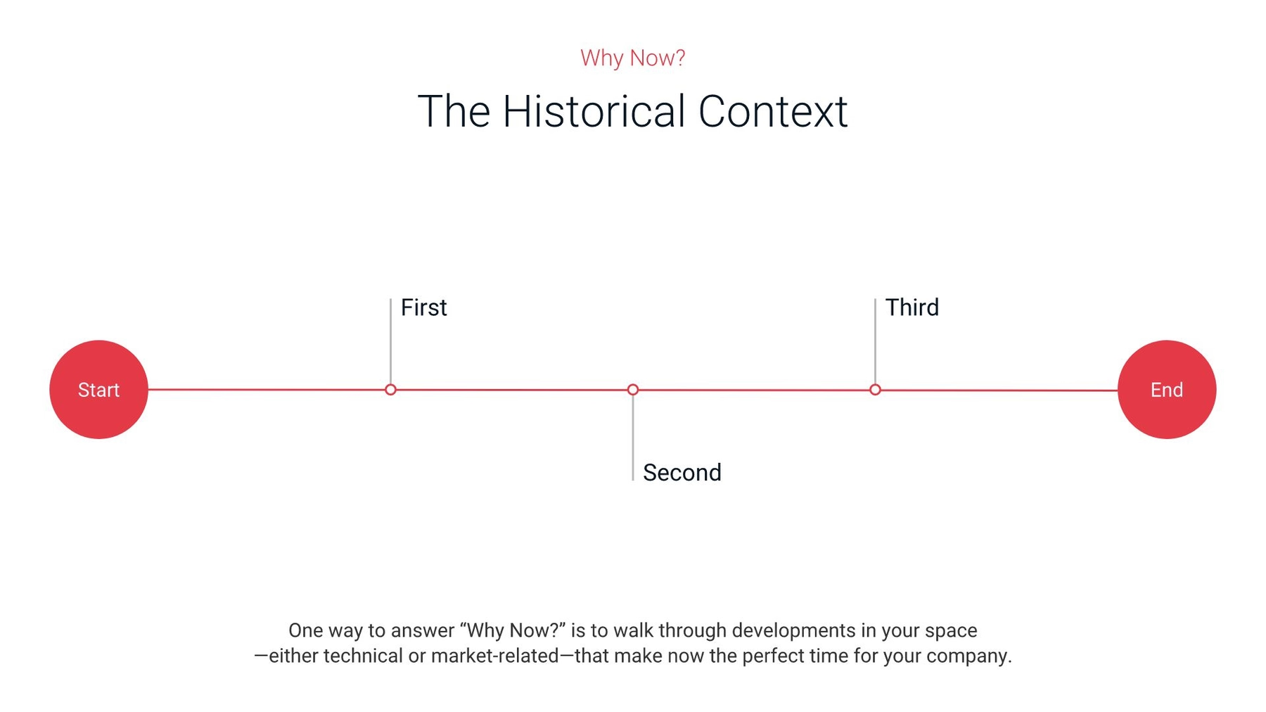
The future is important, but so is the present. Use this slide to address your current business situation, what the immediate future holds, and your plans for any capital raised right now. The timeline or process slides can help you effectively communicate exciting next steps for your business. This is also a slide where you need to really think about how to condense information into what’s most important. Your investors will be at the tail-end of their 20-minute presentation, and you want to make sure you go out with a bang.
Make your startup pitch deck pitch-worthy
When you’re getting ready to pitch your startup to investors, you’re going to want a presentation that stands out. Guy Kawasaki’s 10-20-30 rule will help you make sure the most important information is clearly presented… but what about the design?
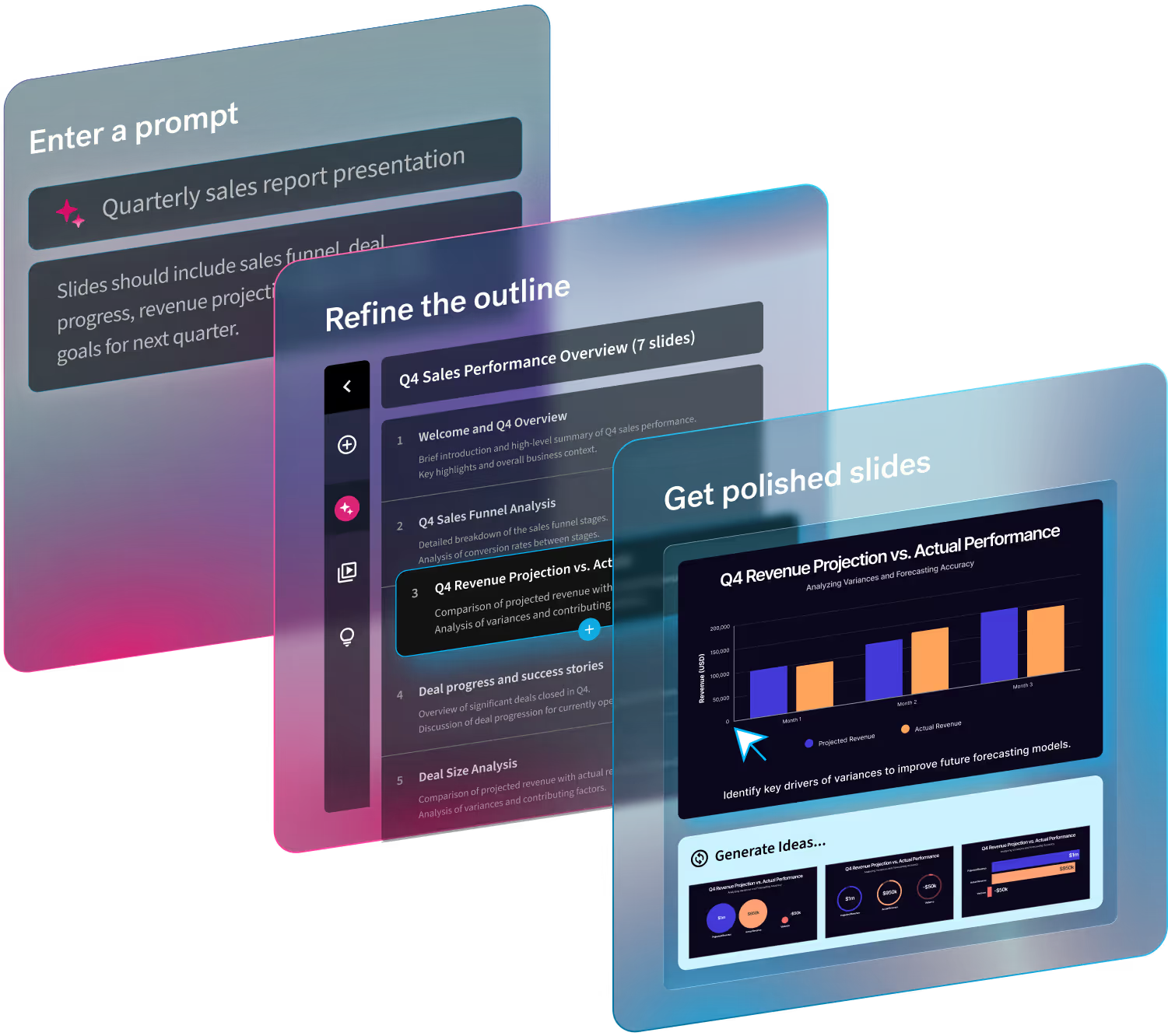
With Beautiful.ai, we’ll make sure that your presentation is dynamic, streamlined, and (most importantly) easy to design. Put your best foot forward and get the funding you need to succeed with Beautiful.ai. We have startup pitch decks and successful pitch decks from brands like Netflix, AirBnB, and more to help you get inspired.



.avif)


