YouTube Pitch Deck Template

Overview
YouTube was acquired by Google in 2006 for $1.6 billion. Like Facebook, this company doesn’t require any introduction.
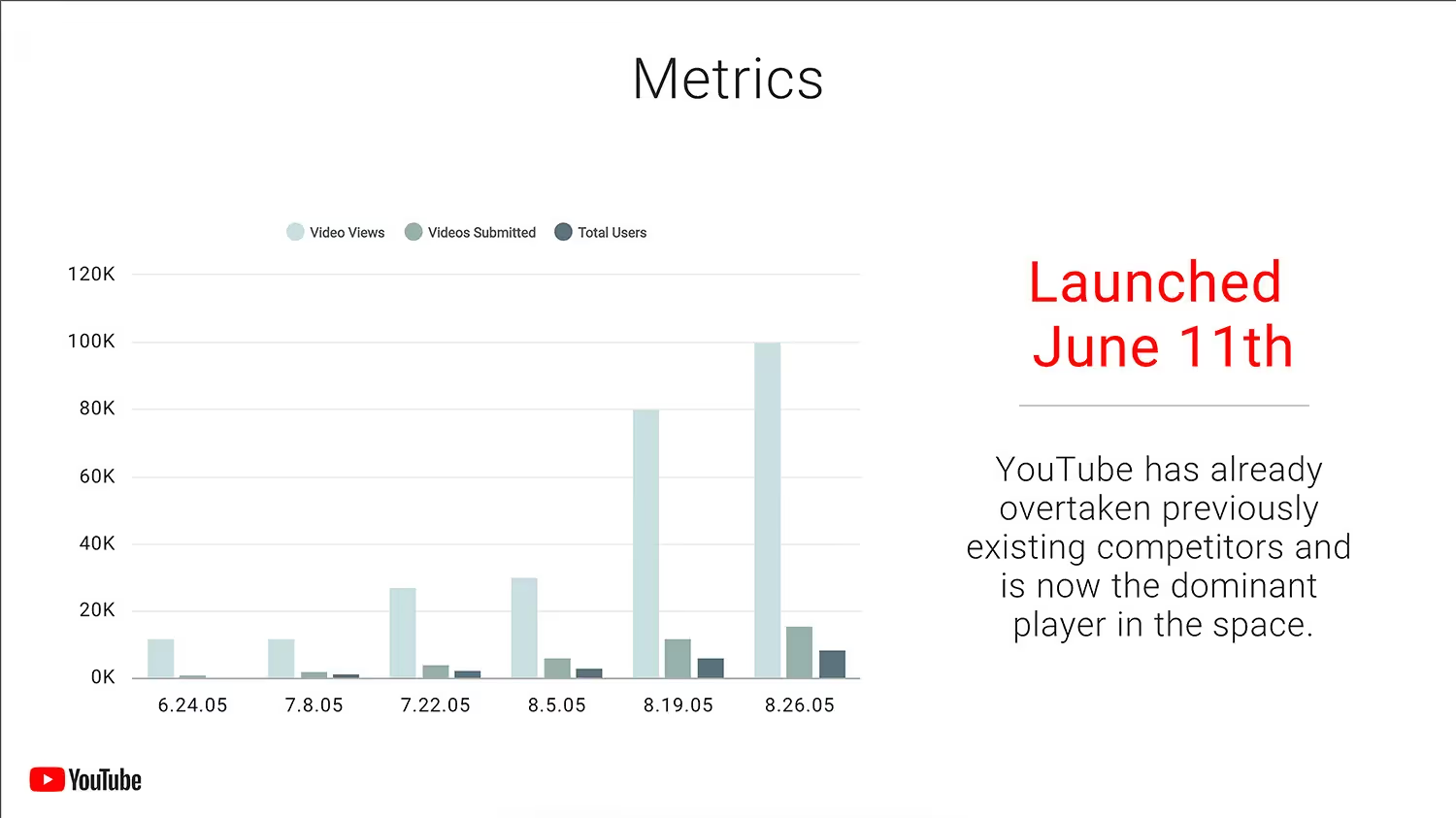
In 2005, video-sharing website, YouTube, started with $3.5M in seed funding from investors. Sure, the media platform has seen exponential growth since 2005, but the YouTube original pitch deck could have been better considering their creative roots.
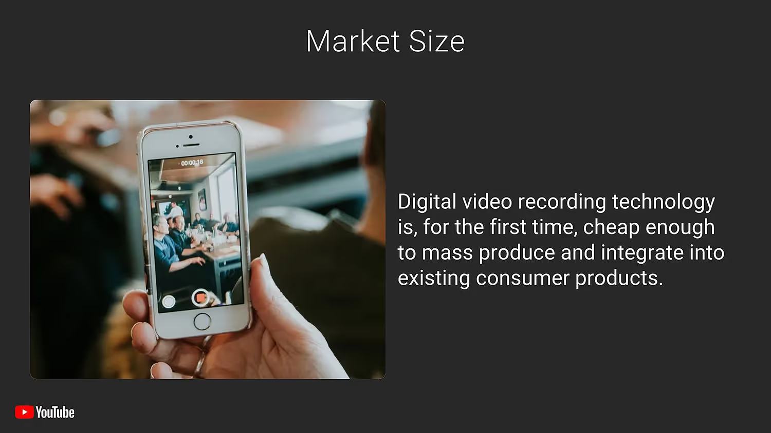
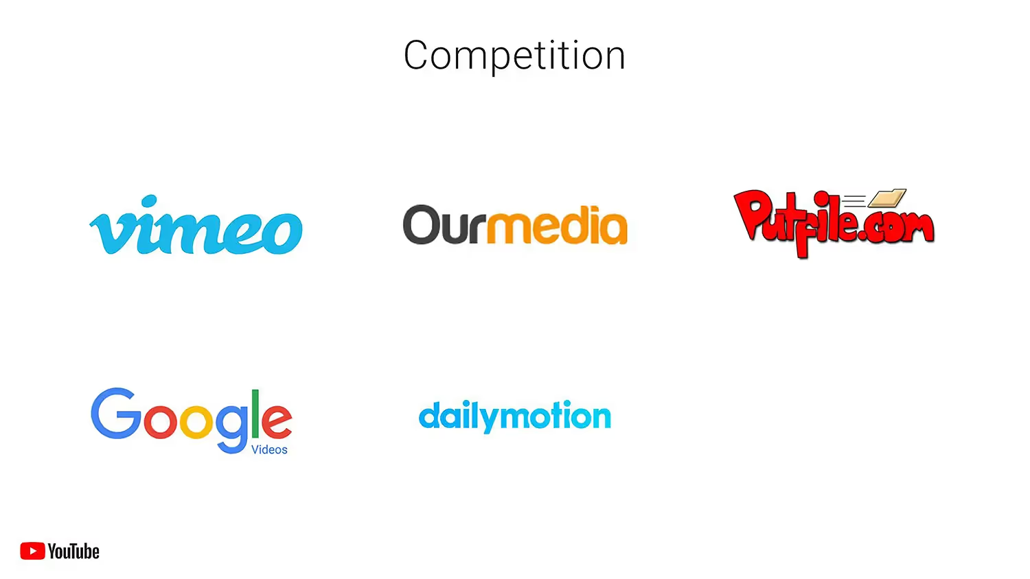
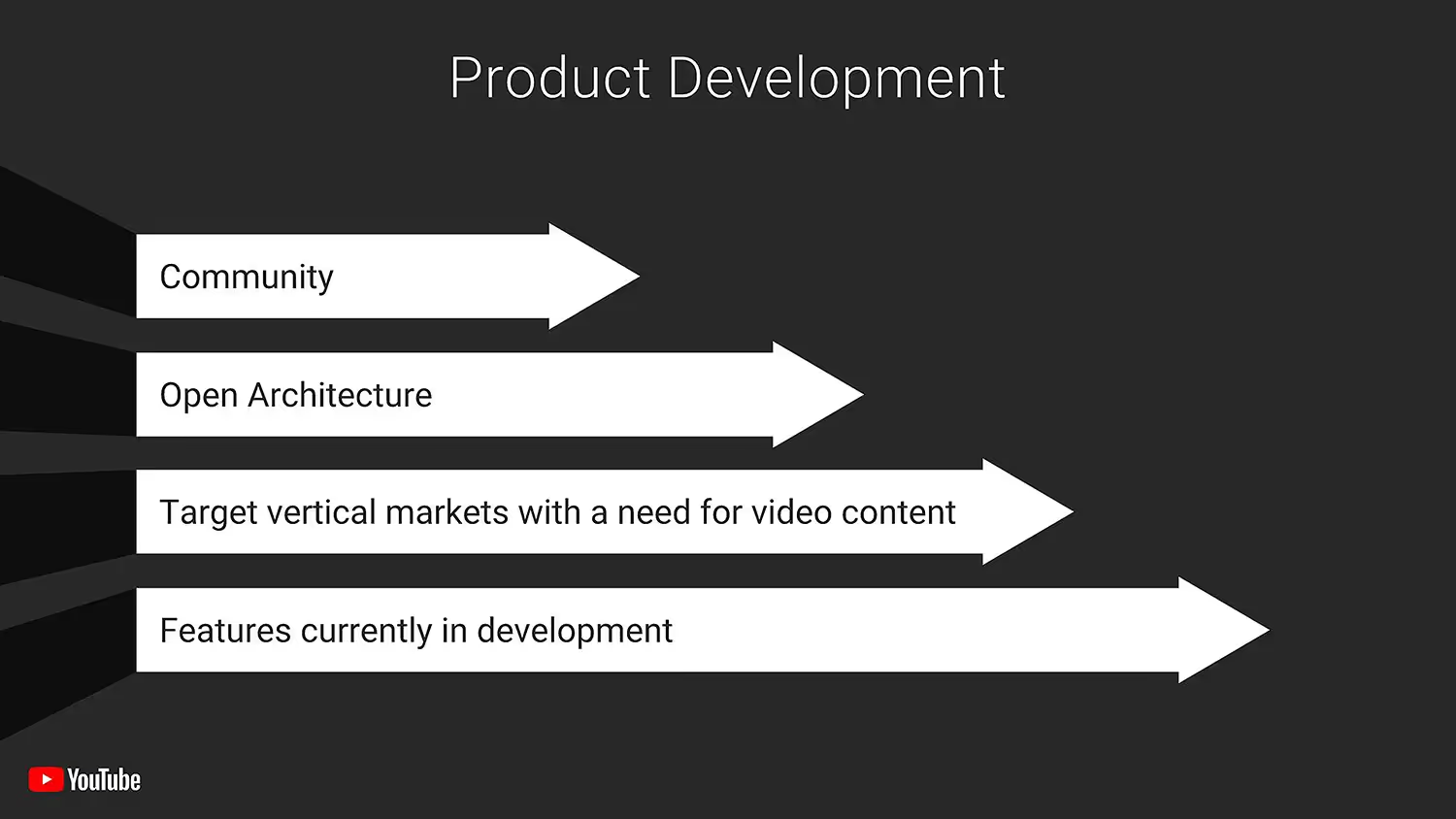
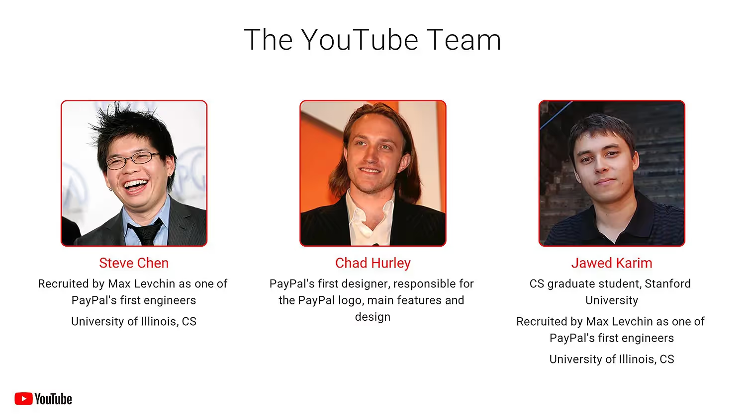
The YouTube pitch deck has become a favorite reference for entrepreneurs around the world. To show how Beautiful.ai’s presentation templates can help you with your pitch deck, we gave the YouTube pitch deck a design refresh.
Breakdown of YouTube Pitch Deck Slides


Pro Tips for Creating Successful Pitch Decks
Be brief and concise
Each slide makes an impact
Keep it simple
Use Visual Aids
Related templates
Total Addressable Market (TAM) Presentation Template

Construction Industry Business Pitch Presentation Template

Fundraising Presentation Template
The AI presentation maker for faster impact
With AI that kickstarts your deck and Smart Slides that handle the formatting, you can focus on your story, not the alignment. Go from create, edit, to present with designer-level polish and in a fraction of the time.
Features to ideate, edit, collaborate, and present.
We’re a complete presentation platform. Everything you need is in one place.
Smart Slides
Smart Slides auto-align, resize, and animate your content as you edit, so you focus on the message, not formatting.
Create with AI
Kickstart your ideas with AI. Just enter a prompt, add extra context, and get a beautiful presentation in seconds.
Themes & brand control
Define colors, fonts, logos, icons, and footers once. Save and reuse brand themes across decks and teams.
Data visualization
Instantly create animated charts and graphs. Link any spreadsheet for fast edits and live updates.
Image libraries
Get direct access to an expansive library of free, real-life stock images and videos, no need to leave your slide.
Presentation templates
Discover our gallery of professionally designed presentation templates, multi–slide decks built to give you a head start.
Presentation workflows
Shared slide libraries, real-time collaboration, user permissions, locked themes, and more.
Viewer analytics
Control access, and track engagement so you know what resonates, and when to follow up.
Animation & narration
Add embedded voice or video context to any slide - so your message lands clearly even when async.



Related blog posts
.png)
How Do I Give My Presentation a Polished Look?
.gif)
The Ultimate Guide to AI Presentation Prompts: How To Get Better Slides From an AI Presentation Maker
.gif)
Best Practices for AI Presentations in Global Teams

Try it free for 14 days
Start building Beautiful presentations.


