Quora Pitch Deck Template
.avif)
.avif)
Overview
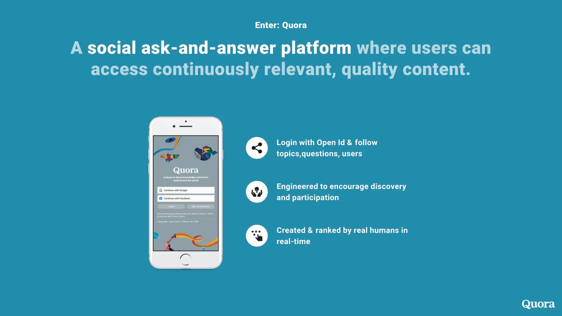
Founded in 2009, Quora is the self-proclaimed ‘sweet spot’ of the internet: a place where audiences can discover relevant, high-quality content in the form of a question-and-answer platform. The ultimate goal? To bring users from all across the internet into one space, reducing their time spent elsewhere searching through scattered information, never finding the answers they need.
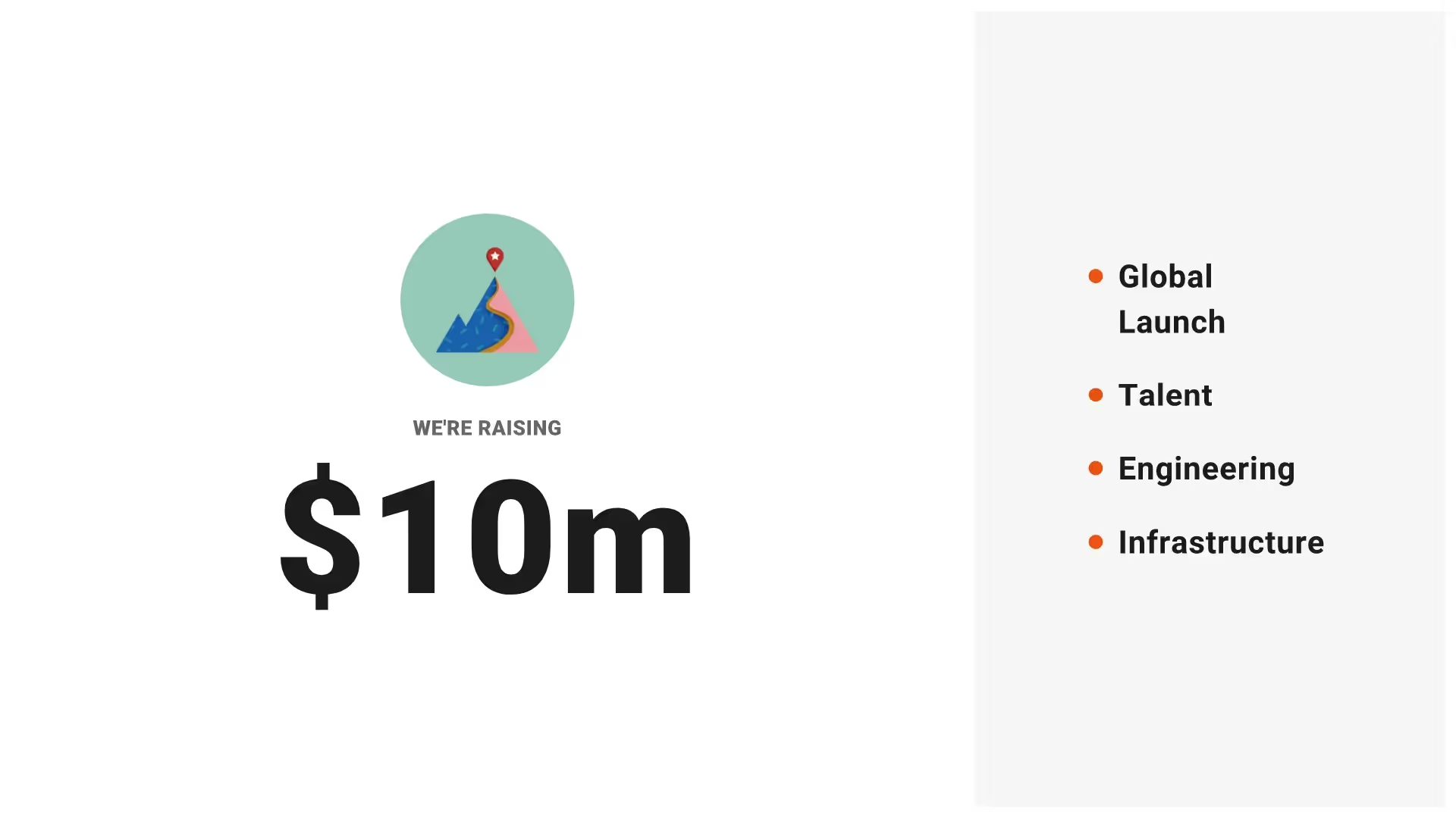
And the Quora co-founders succeeded in that goal. Today, the platform sees 300 million active users a month. To get there, though, they first needed buy-in from investors with a Quora pitch deck. While the presentation helped seal the deal, it called for a redesign that feels less amateur — one that reflects the ingenuity and excitement of the Quora platform we know and use today. The result: a Quora pitch deck with a more sophisticated design, strong color palette, and sleek (but subtle) animations.
Use this Quora pitch deck template to create your presentations for:
- Multimedia pitches
- Podcast and webinar pitches
- App pitches
Explore the Quora Pitch Deck redesigned using Beautiful.ai
.avif)
.avif)
.avif)
.avif)
.avif)
How to create your own Quora Pitch Deck
Ask questions
Simplify your data
Use visual aids
Less is more
Related templates

Total Addressable Market (TAM) Presentation Template

Construction Industry Business Pitch Presentation Template

Fundraising Presentation Template
The AI presentation maker for faster impact
With AI that kickstarts your deck and Smart Slides that handle the formatting, you can focus on your story, not the alignment. Go from create, edit, to present with designer-level polish and in a fraction of the time.
Features to ideate, edit, collaborate, and present.
We’re a complete presentation platform. Everything you need is in one place.
Smart Slides
Smart Slides auto-align, resize, and animate your content as you edit, so you focus on the message, not formatting.
Create with AI
Kickstart your ideas with AI. Just enter a prompt, add extra context, and get a beautiful presentation in seconds.
Themes & brand control
Define colors, fonts, logos, icons, and footers once. Save and reuse brand themes across decks and teams.
Data visualization
Instantly create animated charts and graphs. Link any spreadsheet for fast edits and live updates.
Image libraries
Get direct access to an expansive library of free, real-life stock images and videos, no need to leave your slide.
Presentation templates
Discover our gallery of professionally designed presentation templates, multi–slide decks built to give you a head start.
Presentation workflows
Shared slide libraries, real-time collaboration, user permissions, locked themes, and more.
Viewer analytics
Control access, and track engagement so you know what resonates, and when to follow up.
Animation & narration
Add embedded voice or video context to any slide - so your message lands clearly even when async.


Related blog posts
.png)
How Do I Give My Presentation a Polished Look?
.gif)
The Ultimate Guide to AI Presentation Prompts: How To Get Better Slides From an AI Presentation Maker
.gif)
Best Practices for AI Presentations in Global Teams

Try it free for 14 days
Start building Beautiful presentations.


