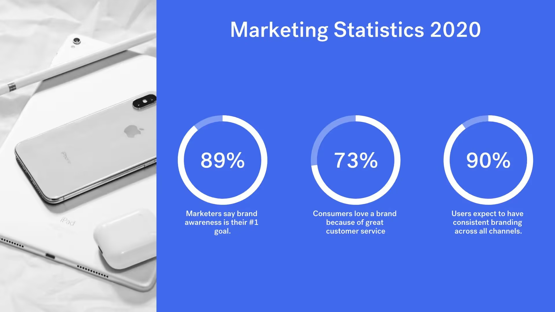
Data Comparison Slide

Overview
For a visually interesting twist on a plain bar chart, add a data comparison slide to your presentation. Our data comparison template is similar to a bar graph, using bars of varying lengths to display measured data. The data comparison template, however, displays percentages instead of exact numbers. One of the best things about using our data comparison slide? You can customize it for your presentation. Create a horizontal or vertical slide, remove or add grid lines, play with its design, and more.
Use Beautiful.ai’s data comparison slide to:
- Track data changes
- Point out trends or patterns
- Show data in percentages
Pro Tips for a Data Comparison Slide


Browse more templates
AI-powered Smart Slides that do the design for you
Build your next presentation using Smart Slides—the intelligent building blocks behind every Beautiful.ai presentation. Each Smart Slide is customizable, editable with AI, and automatically adapts layout and spacing as your content changes.
Smart Slides are your built-in designer
Smart Slides auto-align, resize, and animate your content as you edit, so you focus on the message, not formatting.

Start your way, refine with Smart Slides Short heading here
Begin with AI, a deck template, or one slide at a time. No matter how you start, all our presentations are powered by Smart Slides.

Add a designer slide layout
Choose from over 300 Smart Slide layouts for any purpose: data, comparisons, quotes, timelines, image grids, and more.

Edit at superspeed
Add your content and the Smart Slide design logic auto-adjusts spacing, text, and visuals as you edit. Say goodbye to nudging text boxes.

Present & impress
Wow your audience with built-in slide animations, and data visualizations that make your story come alive.
Ready-to-use presentation templates for creating full, polished decks.


Pitch Decks


Reports & Reviews


Plans & Strategies

Try it free for 14 days
Start building Beautiful presentations.


