Waterfall Chart

Overview
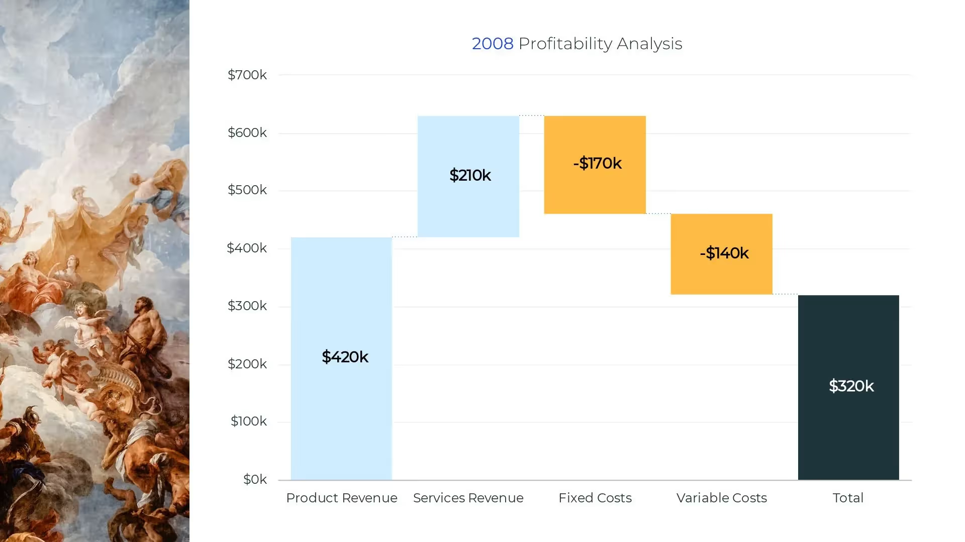
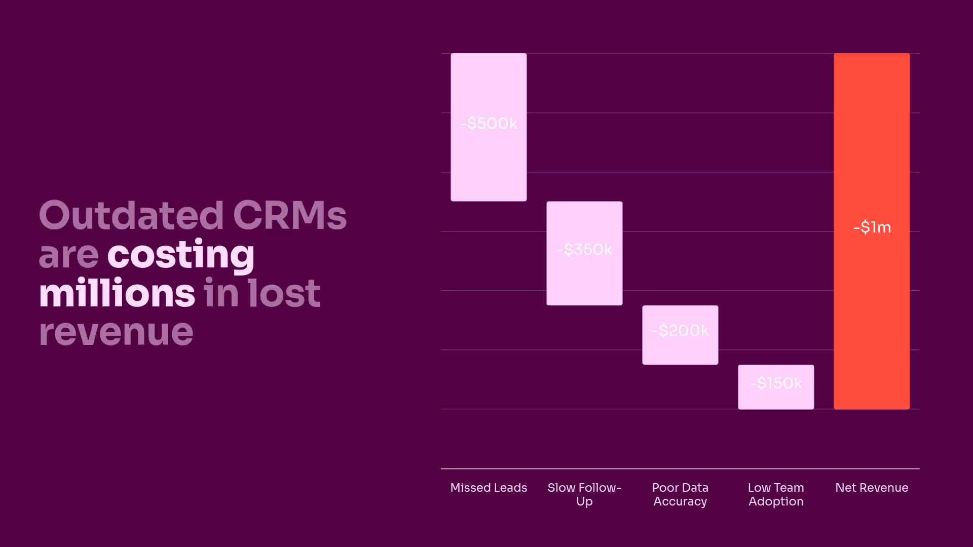
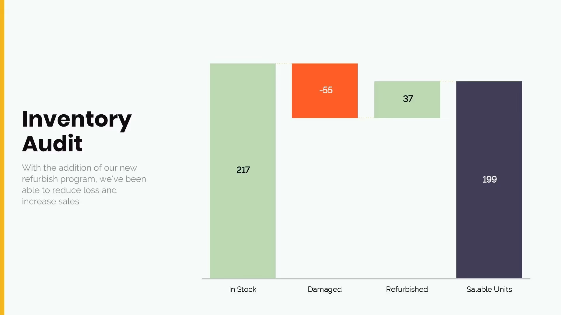
A waterfall chart is used to show how an initial value is affected by various factors. The chart shows a running total as values are added or subtracted. A waterfall chart is an ideal way to visualize a starting value, the positive and negative changes made to that value, and the resulting end value.
No matter what industry you work in, at some point you will need to analyze a value over time. When doing so, it is helpful to see where you started and how you arrived at the final value.
A waterfall template can be used for a variety of scenarios, such as:
- Evaluating company profit
- Highlighting budget changes on a project
- Analyzing inventory or sales over a period of time
The Beautiful.ai waterfall template makes creating a waterfall chart effortless. Simply enter your data with just one click watch your slides automatically adapt. A complex chart made uncomplicated with Beautiful.ai.
Pro Tips for Waterfall Charts


Browse more templates
AI-powered Smart Slides that do the design for you
Build your next presentation using Smart Slides—the intelligent building blocks behind every Beautiful.ai presentation. Each Smart Slide is customizable, editable with AI, and automatically adapts layout and spacing as your content changes.
Smart Slides are your built-in designer
Smart Slides auto-align, resize, and animate your content as you edit, so you focus on the message, not formatting.

Start your way, refine with Smart Slides Short heading here
Begin with AI, a deck template, or one slide at a time. No matter how you start, all our presentations are powered by Smart Slides.

Add a designer slide layout
Choose from over 300 Smart Slide layouts for any purpose: data, comparisons, quotes, timelines, image grids, and more.

Edit at superspeed
Add your content and the Smart Slide design logic auto-adjusts spacing, text, and visuals as you edit. Say goodbye to nudging text boxes.

Present & impress
Wow your audience with built-in slide animations, and data visualizations that make your story come alive.
Ready-to-use presentation templates for creating full, polished decks.


Pitch Decks


Reports & Reviews


Plans & Strategies

Try it free for 14 days
Start building Beautiful presentations.


