XY Plot

Overview
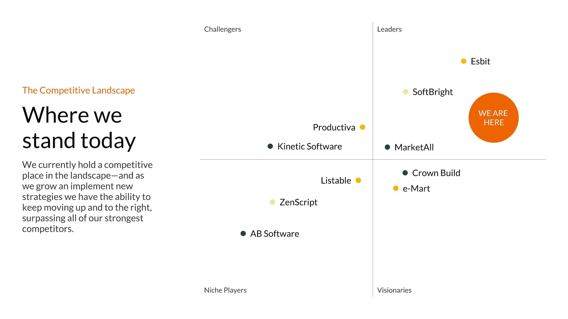
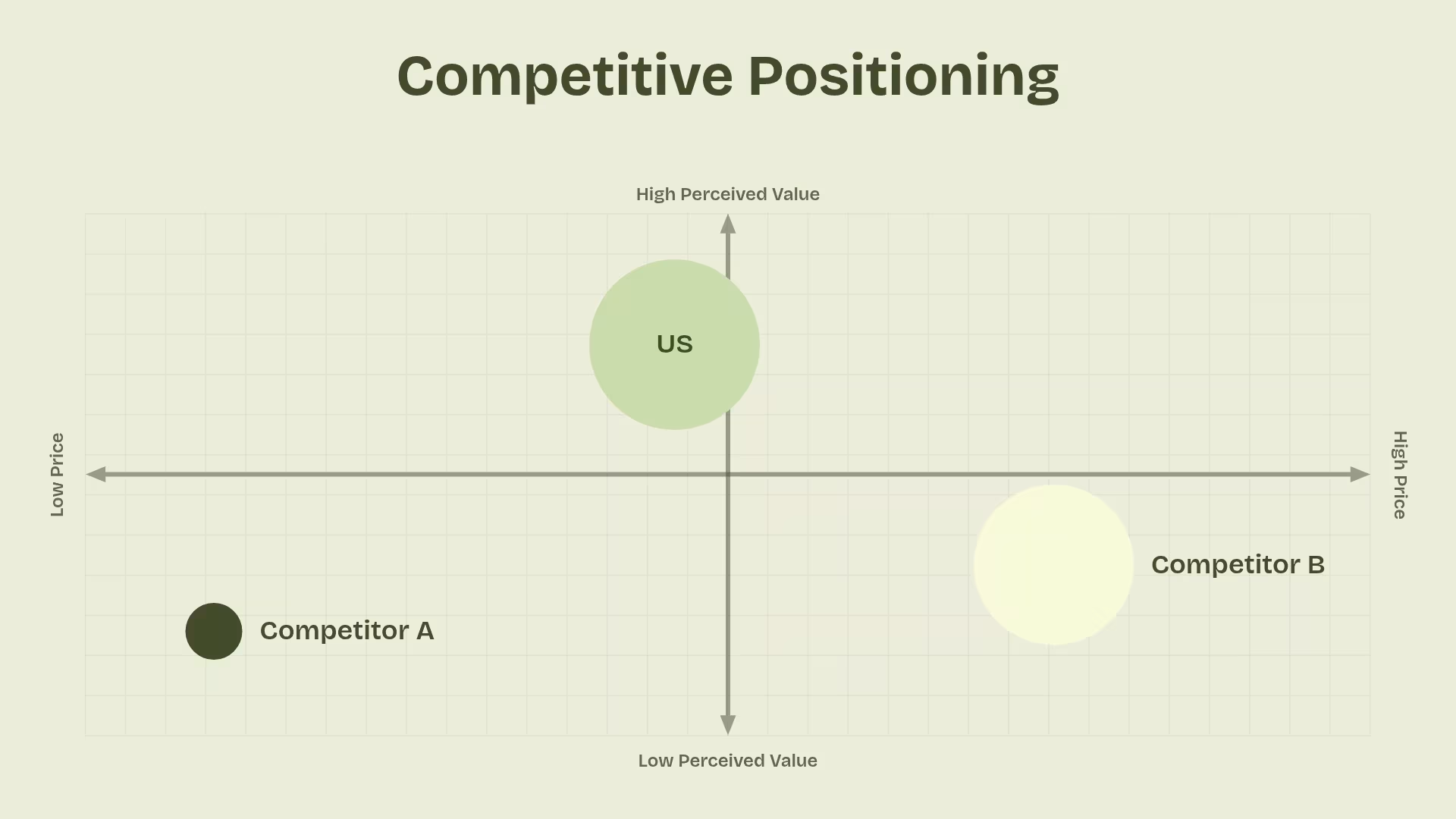
Also called a scatter plot, XY graph or a scatter graph, an XY plot displays values for variables using dots on a grid. An XY graph template in your presentation can show a pattern or a relationship across a set of multiple data points. They are often used to discuss data in business presentations, such as revenue, sales, profit and losses, and so on.
Use the XY plot template to:
- Predict future trends
- Spot patterns in customer or audience behavior
- Display changes over time
Pro Tips for using an XY Plot Template

.avif)
.avif)

Browse more templates
AI-powered Smart Slides that do the design for you
Build your next presentation using Smart Slides—the intelligent building blocks behind every Beautiful.ai presentation. Each Smart Slide is customizable, editable with AI, and automatically adapts layout and spacing as your content changes.
Smart Slides are your built-in designer
Smart Slides auto-align, resize, and animate your content as you edit, so you focus on the message, not formatting.

Start your way, refine with Smart Slides Short heading here
Begin with AI, a deck template, or one slide at a time. No matter how you start, all our presentations are powered by Smart Slides.

Add a designer slide layout
Choose from over 300 Smart Slide layouts for any purpose: data, comparisons, quotes, timelines, image grids, and more.

Edit at superspeed
Add your content and the Smart Slide design logic auto-adjusts spacing, text, and visuals as you edit. Say goodbye to nudging text boxes.

Present & impress
Wow your audience with built-in slide animations, and data visualizations that make your story come alive.
Ready-to-use presentation templates for creating full, polished decks.


Pitch Decks


Reports & Reviews


Plans & Strategies

Try it free for 14 days
Start building Beautiful presentations.


